Guide to CSS Viewport Units: vw, vh, vmin, vmax
Viewport-percentage lengths, or viewport units as they are more frequently referred to, are responsive CSS units that allow you to define dimensions as a percentage of the width or the length of the viewport. Viewport units can be quite useful in cases in which other responsive CSS units, such as percentages, are hard to make work.
Although W3C’s documentation on viewport units contains everything that can be put into theory, it’s not very verbose. So, in this article, we’ll have a look at how these CSS units work in practice.
Read Also: Guide to CSS Grid Layout Fr Unit
Viewport height (vh) & viewport width (vw)
W3C defines viewport as “size of the initial containing block”. In other words, viewport is the area contained within the browser window or any other viewing area on a screen.
The vw and vh units stand for the percentage of the width and height of the actual viewport. They can take a value between 0 and 100 according to the following rules:
100vw = 100% of viewport width
1vw = 1% of viewport width

100vh = 100% of viewport height
1vh = 1% of viewport height
Differences to percentage units
So, how are viewport units different from percentage units? Percentage units inherit the size of their parent element while viewport units don’t. Viewport units are always calculated as the percentage of the viewport size. As a result, an element defined by viewport units can exceed the size of its parent.
Example: Full-screen sections
Full-screen sections are probably the most widely-known use cases of viewport units.
The HTML is quite simple; we just have three sections under each other and we want each of them to cover the whole screen (but not more).
<body>
  <section class="section-1"></section>
  <section class="section-2"></section>
  <section class="section-3"></section>
</body>
In the CSS, we use 100vh as a height value and 100% as width. We don’t use the vw unit here as by default, scrollbars are also added to the viewport size. So, if we used the width: 100vw; rule a horizontal scrollbar would appear at the bottom of the browser window.
* {
  margin: 0;
  padding: 0;
}
section {
  background-size: cover;
  background-position: center;
  width: 100%;
  height: 100vh;
}
.section-1 {
  background-image: url('https://assets.hongkiat.com/uploads/css-viewport-units-vw-vh-wmin-vmax/img1.jpg');
}
.section-2 {
  background-image: url('https://assets.hongkiat.com/uploads/css-viewport-units-vw-vh-wmin-vmax/img2.jpg');
}
.section-3 {
  background-image: url('https://assets.hongkiat.com/uploads/css-viewport-units-vw-vh-wmin-vmax/img3.jpg');
}
On the gif demo below, you can see that vh is truly a responsive unit.

According to the W3C docs, the aforementioned horizontal scrollbar issue can be solved by adding the overflow: auto; rule to the root element. This solution only works partially, though. The horizontal scrollbar, indeed, disappears but width is still calculated based on the viewport width (the sidebar included), so the elements will be slightly larger than they should be.
I would say, I wouldn’t dare use the vw unit on sizing full-screen elements because of this reason. We don’t even need it, as the width: 100%; rule works perfectly. With fullscreen layouts, the real challenge has always been how to set a proper height value and the vh unit gives a brilliant solution for that.
Other use cases
If you are interested in other use cases vw and vh Lullabot has a great article that lists a handful of real-life examples (with Codepen demos), such as:
- Fixed-ratio cards.
- Keeping an element shorter than the screen.
- Scaling text.
- Breaking out of the container.
Opera.dev also has a short tutorial on how you can take leverage of the vw unit in creating responsive typography.
You can’t only use viewport units on the width and height properties but on any other one. For instance, you can set the size of paddings and margins using the vw and vh units, too.
Viewport min (vmin) & viewport max (vmax)
The vmin and vmax units allow you to access the size of the smaller or the larger side of the viewport, according to the following rules:
100vmin = 100vw or 100vh, whichever is smaller
1vmin = 1vw or 1vh, whichever is smaller

100vmax = 100vw or 100vh, whichever is larger
1vmax = 1vw or 1vh, whichever is larger
So, in case of a portrait orientation, 100vmin is equal to 100vw, as the viewport is smaller horizontally than vertically. For the same reason, 100vmax will be equal to 100vh.
Similarly, in case of a landscape orientation, 100vmin is equal to 100vh, as the viewport is smaller vertically than horizontally. And, of course, 100vmax will be equal to 100vw here.
Example: Make hero texts readable on every screen
The vmin and vmax units are much less widely-known than vw and vh. However, they can be excellently used as a substitute for orientation @media queries. For instance, vmin and vmax can come in handy when you have elements that may look strange at different aspect ratios.
The New Code has a great tutorial in which they discuss how you can keep hero text readable on every screen, using the vmin unit. Hero texts are prone to look too small on mobile and too big on large monitors.
Here is the main idea of their solution:
h1 {
  font-size: 20vmin;
  font-family: Avenir, sans-serif;
  font-weight: 900;
  text-align: center;
}
In the Codepen demo, you can check out how vmin solves the readability problem of hero texts. Access the “Full Page” view on Codepen, then resize your browser window both horizontally and vertically to see how the hero text changes.
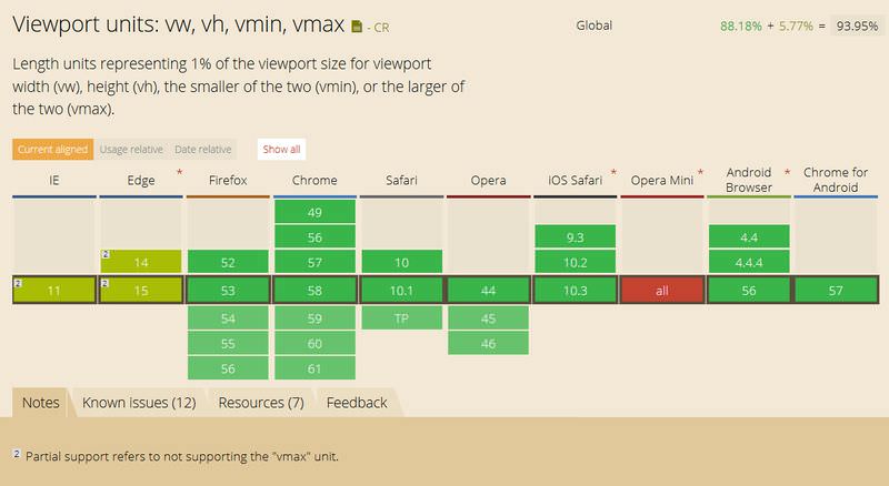
Browser support
As you can see on the CanIUse chart below, browser support is relatively good for viewport units. However, keep in mind that some versions of IE and Edge don’t support vmax. Also, iOS 6 and 7 have an issue with the vh unit, which was fixed in iOS 8.
Read Also: A Look Into CSS Units: Pixels, EM, and Percentage