8 Design Tips for a Stellar Email on Small Screens
How many users are opening emails from you on a phone or tablet? It might be a higher percentage than you think. According to Litmus, which provides email tracking software, 54 percent of all emails were opened on a mobile device in 2016.
That means that most of your emails are being seen on a phone. Are you designing an email that makes the most of it? Here are tips to make your email design more mobile-friendly.
2 Million+ Digital Assets, With Unlimited Downloads
Get unlimited downloads of 2 million+ design resources, themes, templates, photos, graphics and more. Envato Elements starts at $16 per month, and is the best creative subscription we've ever seen.


Ditch the Columns
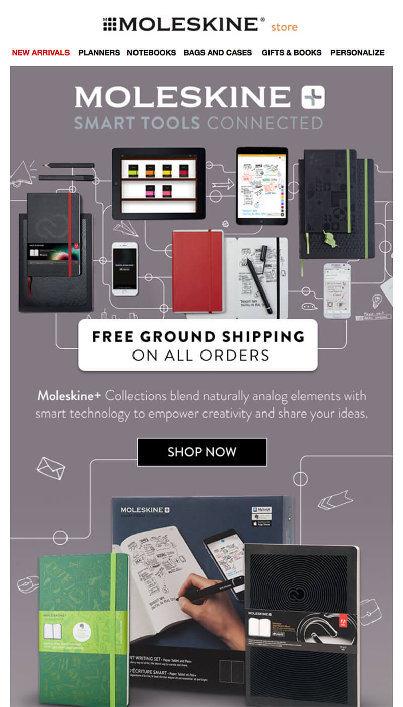
While many emails might look great with multiple column formats on desktop screens, they fall short on mobile devices. Most responsive templates stack columns so you can end up with overly-long scrolling emails or awkward content flow.
Opt for a one-column format instead. That way you know your content will have a consistent look and feel from device to device and it will be easy to read and navigate. Even on desktop monitors, the preferred format is a one column view thanks to so many users viewing emails in smaller preview panes versus full-screen.
A one-column format will help you design for the one-thought-per-email pattern as well. Give users one thing to think about and one direct action to take from a single email. Adding multiple levels of messaging can dizzy users that have short attention spans and keep them from converting. Make it easy by only giving users one choice to act.
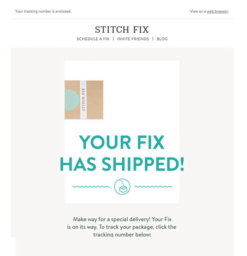
Use Buttons for Links
Inline text links should be avoided on mobile. They can be hard for users to tap. Opt for a button instead. A button is an obvious place to touch on a small screen and should be large enough that other elements are not activated by mistake.
Use bright colors and large, descriptive text for buttons so users know exactly what to expect. Buttons can lead to other websites, making a purchase, sharing content or any number of actions. Consider large style buttons that fill much of the width of small screens so they are easy to reach regardless of how a user might be holding a device.
Include buttons in the first part of the scroll as well. The visual cue lets email recipients know right away that the message includes an action they need to take.
Bump Up Text Sizes
Small text is a mobile-email killer. Most email software programs with responsive templates will “size up” text sizes to match the appropriate screen size, but it doesn’t always happen.
- Start with at least a 14-point text size for the body copy in emails. (And it never hurts to go bigger; even 16 points is a good guideline.)
- Jump to 22 points or more for headlines, and consider bold or a color to make the headline stand out even more.
- Subheads should be at least 18 points and can go larger based on headline size.
Resize Images
Images need to fit the screen properly. Think about the shape, size and content of images so that they are readable on small devices.
Many emails include a full-width distinct horizontal crop of an image that sometimes includes text in the header. This doesn’t necessarily convert well onto smaller screens.
Larger, more square images will render best on mobile devices. Consider using the max-width responsive image technique or check with your email service provider, such as Emma, MailChimp or Constant Contact, to see what image resizing options are available.
Include Plenty of Space
Increase padding around elements and line spacing between blocks of text to make everything easier to read on a smaller screen. A readable email is one that will convert users.
Here’s the thing: The minute a user opens the email on a phone, that message is marked as read making the chances of the user coming back to it on another device pretty slim. So you can’t hope that a messy, cluttered or hard-to-read email will just remind users to come back. They will abandon your message.
White space can make the message feel lighter, more accessible and more readable. It should be easy to scan and understand at a glance. Think and design minimally for the best results – and click through rates.
Consider Image Blocking
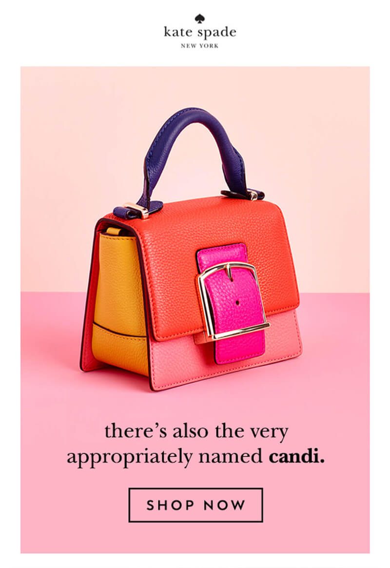
Image blocking is a real consideration with email marketing. Particularly for business users that are using clients such as Microsoft outlooks. Design for the what-if. Assume that some users will never see images in your emails.
Do this by including alt text for images; bulletproof buttons that are made with HTML and CSS, not as image files; balance in the design and a good mix of text and imagery.
There’s a whole school of thought that doesn’t use images in emails at all. And while that’s not the solution for everyone, it can be a consideration depending on our content type.
Keep Headlines Short
Long headlines seem even longer on small screens. Figure out what you need to say and do it succinctly. This applies to subject lines as well. You need to entice users in the small space – and character count – in the subject preview to even get the message opened.
Use active verbs and strong imagery to help entice users. Include the most important words in the first 40 characters of the subject line to maximize the chance that users will see it before opening the email.
Pair subject and headline combinations. Consider an even more condensed version of a headline for the subject line. Ask a question with the subject line and answer it in the headline. Give users a reason to want to know more and interact with the email you are providing. (But don’t be too spammy-sounding or you will turn away users in a snap.)
Conclusion
There’s no magic formula that will make people open your emails. But chances are when they do click to open, it’s on a phone making it imperative that every message looks great and is easy to read at small sizes.
The best way to create emails that users will open on mobile devices is through testing. Every audience is somewhat different. Look at past emails to see which ones had the highest mobile open or click rates. Do they have common design elements that make them more appealing to mobile users? Also take a hard look at the emails you receive and the design of emails you open. What are they doing to get your attention?