Frontend United: Start using CSS Grid Layout today!
3 likes2,202 views

Grid Layout is here! What is it? Why is it different to flexbox? How do I get started? What about old browsers? All these questions and more in a high speed tour of the spec.


![.Prose {
display: grid;
grid-template-columns:
[full-start] minmax(1em, 1fr)
[main-start] minmax(0, 40em) [main-end]
minmax(1em, 1fr) [full-end];
}
.Prose > * {
grid-column: main;
}
.Prose-splash {
grid-column: full;
}
Just do this!
Magic occurs.](https://image.slidesharecdn.com/start-using-css-grid-layout-170527050555/85/Frontend-United-Start-using-CSS-Grid-Layout-today-29-320.jpg)
![.grid {
display: grid;
grid-gap: 20px;
grid-template-columns:
[full-start] minmax(1em, 1fr)
[main-start] minmax(0, 40em) [main-end]
minmax(1em, 1fr) [full-end];
}
.grid > * {
grid-column: main-start ;
}
.grid > .full {
grid-column: full-start / full-end;
}
Naming lines on the grid
We can now position the items using
their line names.](https://image.slidesharecdn.com/start-using-css-grid-layout-170527050555/85/Frontend-United-Start-using-CSS-Grid-Layout-today-34-320.jpg)

![.grid {
display: grid;
grid-gap: 20px;
grid-template-columns:
[full-start] minmax(1em, 1fr)
[main-start] minmax(0, 40em) [main-end]
minmax(1em, 1fr) [full-end];
}
.grid > * {
grid-column: main;
}
.grid > .full {
grid-column: full;
}
‘main’and‘full’
These line names don’t exist
anywhere in our grid definition.](https://image.slidesharecdn.com/start-using-css-grid-layout-170527050555/85/Frontend-United-Start-using-CSS-Grid-Layout-today-38-320.jpg)
![.grid {
display: grid;
grid-gap: 20px;
grid-template-columns:
100px [main-start]
100px 100px 100px [main-end]
100px 100px;
grid-template-rows:
100px [main-start]
100px 100px [main-end] 100px;
}
.item {
grid-area: main;
}
Implicit named areas
Created by having named lines using
an ident with *-start and *-end.
https://codepen.io/rachelandrew/pen/
eWoKmd/](https://image.slidesharecdn.com/start-using-css-grid-layout-170527050555/85/Frontend-United-Start-using-CSS-Grid-Layout-today-41-320.jpg)
![https://www.w3.org/TR/css-grid-1/#placement-shorthands
“[when using grid-row and grid-column
shorthands] … When the second value is omitted,
if the first value is a <custom-ident>, the grid-row-
end/grid-column-end longhand is also set to
that <custom-ident>; otherwise, it is set to auto.”](https://image.slidesharecdn.com/start-using-css-grid-layout-170527050555/85/Frontend-United-Start-using-CSS-Grid-Layout-today-43-320.jpg)


More Related Content
What's hot (20)
Similar to Frontend United: Start using CSS Grid Layout today! (19)


More from Rachel Andrew (11)


Recently uploaded (20)


Frontend United: Start using CSS Grid Layout today!
- 1. START USING CSS GRID LAYOUT TODAY! @rachelandrew @ Frontend United
- 2. March 2017 March 2017 March 2017 March 2017 March 2017 Soooooon!
- 3. Rachel Andrew ▸ CSS Working Group Invited Expert ▸ Google Developer Expert ▸ co-founder Perch CMS ▸ Old Nerd. ▸ You can find me in most places as @rachelandrew you can email me@rachelandrew.co.uk or check out my site at https://rachelandrew.co.uk
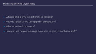
- 4. Start using CSS Grid Layout Today ▸ What is grid & why is it different to flexbox? ▸ How do I get started using grid in production? ▸ What about old browsers? ▸ How can we help encourage browsers to give us cool new stuff?
- 5. Why not use flexbox? CSS Grid Layout
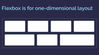
- 6. Flexbox is for one-dimensional layout
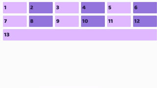
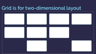
- 8. Grid is for two-dimensional layout
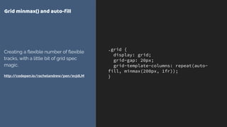
- 10. .grid { display: grid; grid-gap: 20px; grid-template-columns: repeat(auto- fill, minmax(200px, 1fr)); } Grid minmax() and auto-fill Creating a flexible number of flexible tracks, with a little bit of grid spec magic. http://codepen.io/rachelandrew/pen/evjdLM
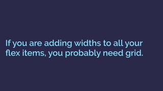
- 11. If you are adding widths to all your flex items, you probably need grid.
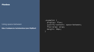
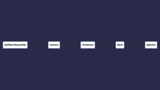
- 12. .example1 { display: flex; justify-content: space-between; flex-wrap: wrap; margin: 30px; } Flexbox Using space-between http://codepen.io/rachelandrew/pen/MpBbwX
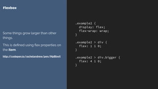
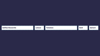
- 14. .example2 { display: flex; flex-wrap: wrap; } .example2 > div { flex: 1 1 0; } .example2 > div.bigger { flex: 4 1 0; } Flexbox Some things grow larger than other things. This is defined using flex properties on the item. http://codepen.io/rachelandrew/pen/MpBbwX
- 16. Grid works from the container in
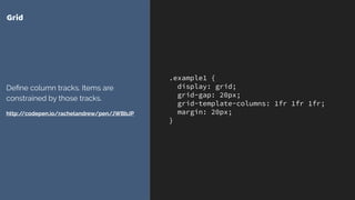
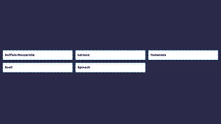
- 17. .example1 { display: grid; grid-gap: 20px; grid-template-columns: 1fr 1fr 1fr; margin: 20px; } Grid Define column tracks. Items are constrained by those tracks. http://codepen.io/rachelandrew/pen/JWBbJP
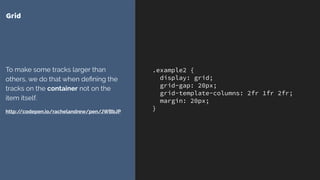
- 19. .example2 { display: grid; grid-gap: 20px; grid-template-columns: 2fr 1fr 2fr; margin: 20px; } Grid To make some tracks larger than others, we do that when defining the tracks on the container not on the item itself. http://codepen.io/rachelandrew/pen/JWBbJP
- 21. Other layout methods start with the item.
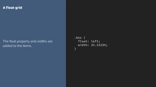
- 22. .box { float: left; width: 33.3333%; } A float grid The float property and widths are added to the items.
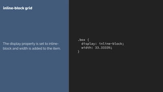
- 23. .box { display: inline-block; width: 33.3333%; } inline-block grid The display property is set to inline- block and width is added to the item.
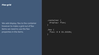
- 24. .container { display: flex; } .box { flex: 0 0 33.3333%; } Flex grid We add display: flex to the container however to make a grid out of flex items we need to use the flex properties in the items.
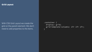
- 25. .container { display: grid; grid-template-columns: 1fr 1fr 1fr; } Grid Layout With CSS Grid Layout we create the grid on the parent element. We don’t need to add properties to the items.
- 26. Grid is all about the container
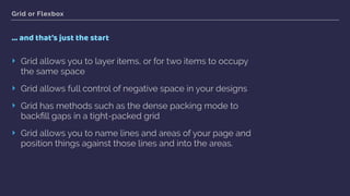
- 27. Grid or Flexbox … and that’s just the start ‣ Grid allows you to layer items, or for two items to occupy the same space ‣ Grid allows full control of negative space in your designs ‣ Grid has methods such as the dense packing mode to backfill gaps in a tight-packed grid ‣ Grid allows you to name lines and areas of your page and position things against those lines and into the areas.
- 29. .Prose { display: grid; grid-template-columns: [full-start] minmax(1em, 1fr) [main-start] minmax(0, 40em) [main-end] minmax(1em, 1fr) [full-end]; } .Prose > * { grid-column: main; } .Prose-splash { grid-column: full; } Just do this! Magic occurs.
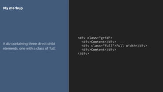
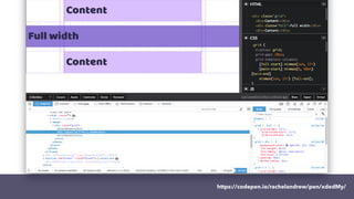
- 30. <div class="grid"> <div>Content</div> <div class="full">Full width</div> <div>Content</div> </div> My markup A div containing three direct child elements, one with a class of ‘full’.
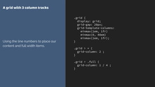
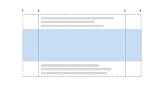
- 31. .grid { display: grid; grid-gap: 20px; grid-template-columns: minmax(1em, 1fr) minmax(0, 40em) minmax(1em, 1fr); } .grid > * { grid-column: 2 ; } .grid > .full { grid-column: 1 / 4 ; } A grid with 3 column tracks Using the line numbers to place our content and full width items.
- 32. 1 2 3 4
- 33. 1 2 3 4 grid-column: 2; grid-column: 1 / 4; grid-column: 2;
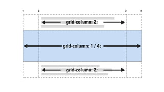
- 34. .grid { display: grid; grid-gap: 20px; grid-template-columns: [full-start] minmax(1em, 1fr) [main-start] minmax(0, 40em) [main-end] minmax(1em, 1fr) [full-end]; } .grid > * { grid-column: main-start ; } .grid > .full { grid-column: full-start / full-end; } Naming lines on the grid We can now position the items using their line names.
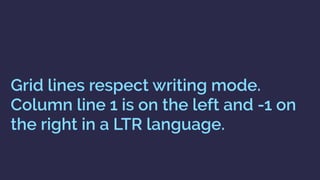
- 35. full-start main-start main-end full-end
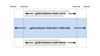
- 36. grid-column: main-start; grid-column: full-start / full-end; full-start main-start main-end full-end grid-column: main-start;
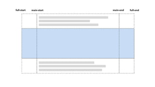
- 37. grid-column: main; grid-column: full; full-start main-start main-end full-end grid-column: main;
- 38. .grid { display: grid; grid-gap: 20px; grid-template-columns: [full-start] minmax(1em, 1fr) [main-start] minmax(0, 40em) [main-end] minmax(1em, 1fr) [full-end]; } .grid > * { grid-column: main; } .grid > .full { grid-column: full; } ‘main’and‘full’ These line names don’t exist anywhere in our grid definition.
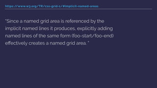
- 39. https://www.w3.org/TR/css-grid-1/#implicit-named-areas “Since a named grid area is referenced by the implicit named lines it produces, explicitly adding named lines of the same form (foo-start/foo-end) effectively creates a named grid area. ”
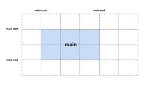
- 41. .grid { display: grid; grid-gap: 20px; grid-template-columns: 100px [main-start] 100px 100px 100px [main-end] 100px 100px; grid-template-rows: 100px [main-start] 100px 100px [main-end] 100px; } .item { grid-area: main; } Implicit named areas Created by having named lines using an ident with *-start and *-end. https://codepen.io/rachelandrew/pen/ eWoKmd/
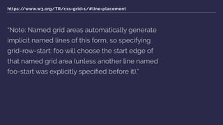
- 42. https://www.w3.org/TR/css-grid-1/#line-placement “Note: Named grid areas automatically generate implicit named lines of this form, so specifying grid-row-start: foo will choose the start edge of that named grid area (unless another line named foo-start was explicitly specified before it).”
- 43. https://www.w3.org/TR/css-grid-1/#placement-shorthands “[when using grid-row and grid-column shorthands] … When the second value is omitted, if the first value is a <custom-ident>, the grid-row- end/grid-column-end longhand is also set to that <custom-ident>; otherwise, it is set to auto.”
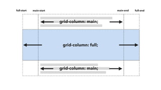
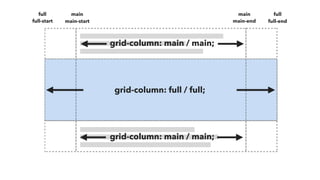
- 44. grid-column: main; grid-column: full; full-start main-start main-end full-end grid-column: main;
- 45. grid-column: main / main; grid-column: full / full; full-start main-start main-end full-end grid-column: main / main; full fullmain main
- 47. Grid gives us powerful tools to control layout via the containing element.
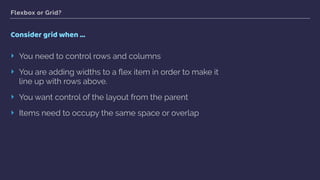
- 48. Flexbox or Grid? Use Flexbox when … ‣ Your content is a row OR a column ‣ You want the size of items to dictate their layout ‣ You want to distribute space
- 49. Flexbox or Grid? Consider grid when … ‣ You need to control rows and columns ‣ You are adding widths to a flex item in order to make it line up with rows above. ‣ You want control of the layout from the parent ‣ Items need to occupy the same space or overlap
- 50. Using grid in production CSS Grid Layout
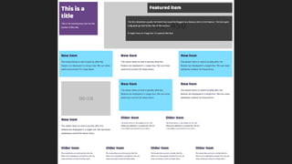
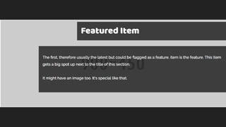
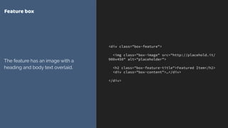
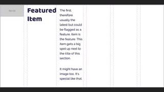
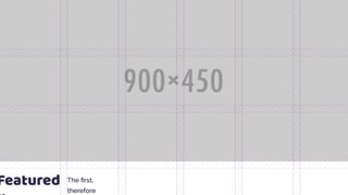
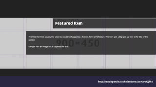
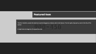
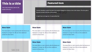
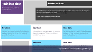
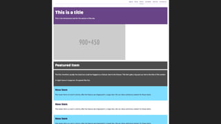
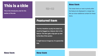
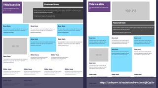
- 53. <div class="box-feature"> <img class="box-image" src="http://placehold.it/ 900x450" alt="placeholder"> <h2 class="box-feature-title">Featured Item</h2> <div class="box-content">…</div> </div> Feature box The feature has an image with a heading and body text overlaid.
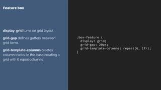
- 54. .box-feature { display: grid; grid-gap: 20px; grid-template-columns: repeat(6, 1fr); } Feature box display: grid turns on grid layout grid-gap defines gutters between grid items grid-template-columns creates column tracks. In this case creating a grid with 6 equal columns.
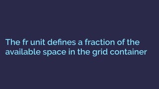
- 55. The fr unit defines a fraction of the available space in the grid container
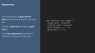
- 57. .box-feature .box-image { align-self: stretch; justify-self: stretch; grid-column: 1 / -1; grid-row: 1 / 4; } Feature box The image starts at grid column line 1 and ends at -1, which is the end line. It starts at grid row 1, ending at grid row 4. Using box alignment properties to stretch the image over that area.
- 58. Grid lines respect writing mode. Column line 1 is on the left and -1 on the right in a LTR language.
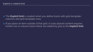
- 59. Explicit vs. Implicit Grid ▸ The Explicit Grid is created when you define tracks with grid-template- columns and grid-template-rows ▸ If you place an item outside of that grid, or auto-placed content requires further row or column tracks these are added by grid as the Implicit Grid.
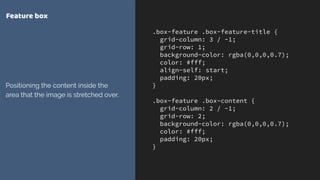
- 61. .box-feature .box-feature-title { grid-column: 3 / -1; grid-row: 1; background-color: rgba(0,0,0,0.7); color: #fff; align-self: start; padding: 20px; } .box-feature .box-content { grid-column: 2 / -1; grid-row: 2; background-color: rgba(0,0,0,0.7); color: #fff; padding: 20px; } Feature box Positioning the content inside the area that the image is stretched over.
- 63. Layering items on the grid ▸ You can position items into the same grid cells ▸ Items further down in the source appear on top of earlier items ▸ Control the stack using z-index
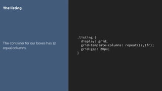
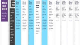
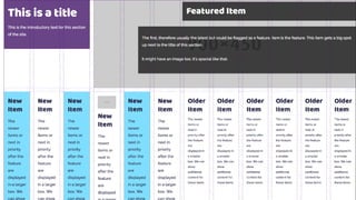
- 66. .listing { display: grid; grid-template-columns: repeat(12,1fr); grid-gap: 20px; } The listing The container for our boxes has 12 equal columns.
- 69. .box-title { grid-column: 1 / 4; grid-row: 1 / 2; } .box-feature { grid-column: 4 / -1; grid-row: 1 / 2; } The listing Positioning the title top left and the feature top right
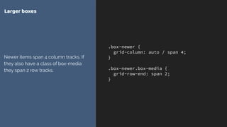
- 71. .box-newer { grid-column: auto / span 4; } .box-newer.box-media { grid-row-end: span 2; } Larger boxes Newer items span 4 column tracks. If they also have a class of box-media they span 2 row tracks.
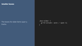
- 72. .box-older { grid-column: auto / span 3; } Smaller boxes The boxes for older items span 3 tracks.
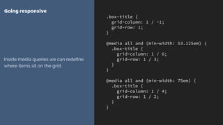
- 75. .box-title { grid-column: 1 / -1; grid-row: 1; } @media all and (min-width: 53.125em) { .box-title { grid-column: 1 / 6; grid-row: 1 / 3; } } @media all and (min-width: 75em) { .box-title { grid-column: 1 / 4; grid-row: 1 / 2; } } Going responsive Inside media queries we can redefine where items sit on the grid.
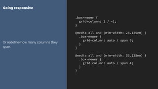
- 76. .box-newer { grid-column: 1 / -1; } @media all and (min-width: 28.125em) { .box-newer { grid-column: auto / span 6; } } @media all and (min-width: 53.125em) { .box-newer { grid-column: auto / span 4; } } Going responsive Or redefine how many columns they span.
- 78. What about old browsers? CSS Grid Layout
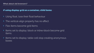
- 79. What about old browsers? If using display: grid on a container, child items: ‣ Using float, lose their float behaviour ‣ The vertical-align property has no effect ‣ Flex items become grid items ‣ Items set to display: block or inline-block become grid items ‣ Items set to display: table-cell stop creating anonymous boxes
- 80. You do not need to build “two layouts”
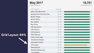
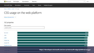
- 81. It makes sense to start using grid on new sites right now.
- 82. Grid Layout: 84%
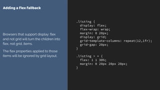
- 84. .listing { display: flex; flex-wrap: wrap; margin: 0 20px; display: grid; grid-template-columns: repeat(12,1fr); grid-gap: 20px; } .listing > * { flex: 1 1 30%; margin: 0 20px 20px 20px; } Adding a flex fallback Browsers that support display: flex and not grid will turn the children into flex, not grid, items. The flex properties applied to those items will be ignored by grid layout.
- 85. Feature Queries are your new best friend
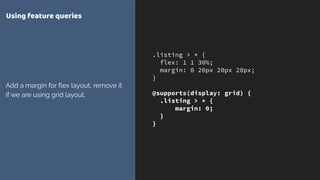
- 87. .listing > * { flex: 1 1 30%; margin: 0 20px 20px 20px; } @supports(display: grid) { .listing > * { margin: 0; } } Using feature queries Add a margin for flex layout, remove it if we are using grid layout.
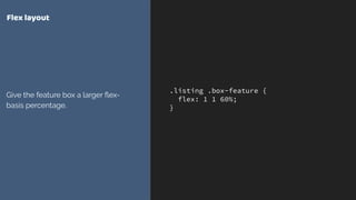
- 89. .listing .box-feature { flex: 1 1 60%; } Flex layout Give the feature box a larger flex- basis percentage.
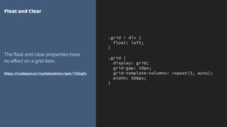
- 91. .grid > div { float: left; } .grid { display: grid; grid-gap: 10px; grid-template-columns: repeat(3, auto); width: 500px; } Float and Clear The float and clear properties have no effect on a grid item. https://codepen.io/rachelandrew/pen/YZeqZv
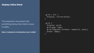
- 92. .grid > div { display: inline-block; } .grid { display: grid; grid-gap: 10px; grid-template-columns: repeat(3, auto); width: 500px; } display: inline-block The properties associated with something being inline-block cease to apply. https://codepen.io/rachelandrew/pen/vxdGjQ
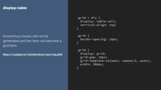
- 93. .grid > div { display: table-cell; vertical-align: top; } .grid { border-spacing: 10px; } .grid { display: grid; grid-gap: 10px; grid-template-columns: repeat(3, auto); width: 500px; } display: table Anonymous boxes will not be generated and the item will become a grid item. https://codepen.io/rachelandrew/pen/bqLpQN
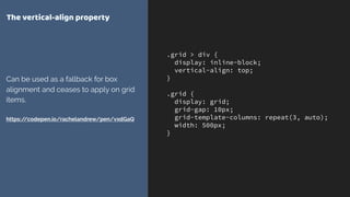
- 94. .grid > div { display: inline-block; vertical-align: top; } .grid { display: grid; grid-gap: 10px; grid-template-columns: repeat(3, auto); width: 500px; } The vertical-align property Can be used as a fallback for box alignment and ceases to apply on grid items. https://codepen.io/rachelandrew/pen/vxdGaQ
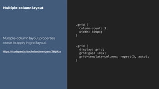
- 95. .grid { column-count: 3; width: 500px; } .grid { display: grid; grid-gap: 10px; grid-template-columns: repeat(3, auto); } Multiple-column layout Multiple-column layout properties cease to apply in grid layout. https://codepen.io/rachelandrew/pen/JWpXxv
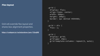
- 96. .grid { display: flex; align-items: center; width: 500px; height: 200px; border: 1px dotted #694486; } .grid > div { flex: 1; } .grid { display: grid; grid-gap: 10px; grid-template-columns: repeat(3, auto); } Flex layout Grid will override flex layout and shares box alignment properties. https://codepen.io/rachelandrew/pen/YZeqMB
- 97. Overrides inside @supports are mostly widths & margins
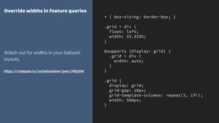
- 98. * { box-sizing: border-box; } .grid > div { float: left; width: 33.333%; } @supports (display: grid) { .grid > div { width: auto; } } .grid { display: grid; grid-gap: 10px; grid-template-columns: repeat(3, 1fr); width: 500px; } Override widths in feature queries Watch out for widths in your fallback layouts. https://codepen.io/rachelandrew/pen/JWpXNr
- 100. Edge Grid implementation ▸ Currently tied to the IE10 implementation ▸ Prefixed with -ms ▸ No auto-placement or grid-template-areas layout ▸ For simple line-based positioning it works ▸ More at https://rachelandrew.co.uk/archives/2017/04/04/edge-starts-work- on-their-grid-implementation-update/
- 101. IE / Edge Tips ▸ Update to Autoprefixer 7 - previous versions would add -ms-grid prefixes. You don’t generally want this! ▸ Post from Greg Whitworth of Microsoft if you are using Feature Queries and want to support future Edge: http://gwhitworth.com/blog/2017/05/ accurately-checking-for-css-grid-support-in-microsoft-edge
- 102. March 2017 March 2017 March 2017 March 2017 March 2017 Soooooon!
- 103. Let browser vendors know which features you want.
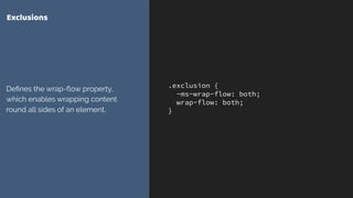
- 107. .exclusion { -ms-wrap-flow: both; wrap-flow: both; } Exclusions Defines the wrap-flow property, which enables wrapping content round all sides of an element.
- 109. You can get involved in the future of CSS.
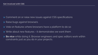
- 112. Get involved with CSS ▸ Comment on or raise new issues against CSS specifications ▸ Raise bugs against browsers ▸ Vote on features where browsers have a platform to do so ▸ Write about new features - it demonstrates we want them ▸ Be nice while doing it. Browser engineers and spec editors work within constraints just as you do in your projects.
- 113. is here! CSS Grid
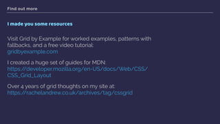
- 114. Find out more I made you some resources Visit Grid by Example for worked examples, patterns with fallbacks, and a free video tutorial: gridbyexample.com I created a huge set of guides for MDN: https://developer.mozilla.org/en-US/docs/Web/CSS/ CSS_Grid_Layout Over 4 years of grid thoughts on my site at: https://rachelandrew.co.uk/archives/tag/cssgrid
- 115. THANK YOU! @rachelandrew Resources & code: https://rachelandrew.co.uk/speaking/event/frontend-united-2017