ASO — 13 Jun 2017
10 App Store Screenshots Optimization Tactics Used by Popular Apps
 Liza Knotko
This guest post was created by Josh Kocaurek, a founder of Appsposure – a marketing agency specializing in mobile marketing and app store optimization. Josh helps app development companies get more organic users and increase conversions in their user acquisition funnel.
There are tons of strategies to market an app for sure. Nevertheless, perfecting your app store screenshots should hold highest positions on your priority list once you proceed with App Store Optimization.
Just like people judge a book by its cover, people will also judge an app by its app store screenshots. In fact, screenshots design improvements tend to increase an app conversion rate by 18% on the average. Yet, many publishers wonder what great app screenshots actually look like.
When it comes to design related affairs on the app store page, it’s usually difficult to put core principles into words without seeing real examples. That’s why in this post I’ll deconstruct 10 unique app store screenshots and identify what makes them great.
First off, let’s direct our attention to an overview of traits that make app screenshots great and ones that fail to give positive results.
You should ditch the chronological app mindset if you want to get a perfect set of app store screenshots for your app. Users don’t have time to pick through eye-catching yet vapid shots to get to crucial and significant ones.
Your designs should explain why your app is awesome and trigger a desire to learn more about your product, thus encouraging users to move onto the next shot. In the same vein, users don’t want to see an overly detailed screenshot as their first exposure to an app. Including too much text or obnoxious design will probably result in people’s eyes glazing over.
The best way to get inside users heads via app store screenshots is by showing a feature that they’ll like, (for example, notifications or personalization). In case you develop games, it’s a good idea to deliver a sense of progression your app offers.
There’s no need to use app’s actual visuals to accomplish this—sometimes it’s enough to have an effectively designed screen which captures multiple concepts artistically. Let’s study all these through the example of a few efficient screenshots for app store.
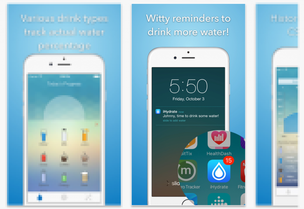
Why it’s unique. This iHydrate app store screenshot does a great job getting to the point by showing the user’s perspective of what the notifications from the app will look like. It’s also cool that the app combines two prominent features and shows off both notification styles in one shot.
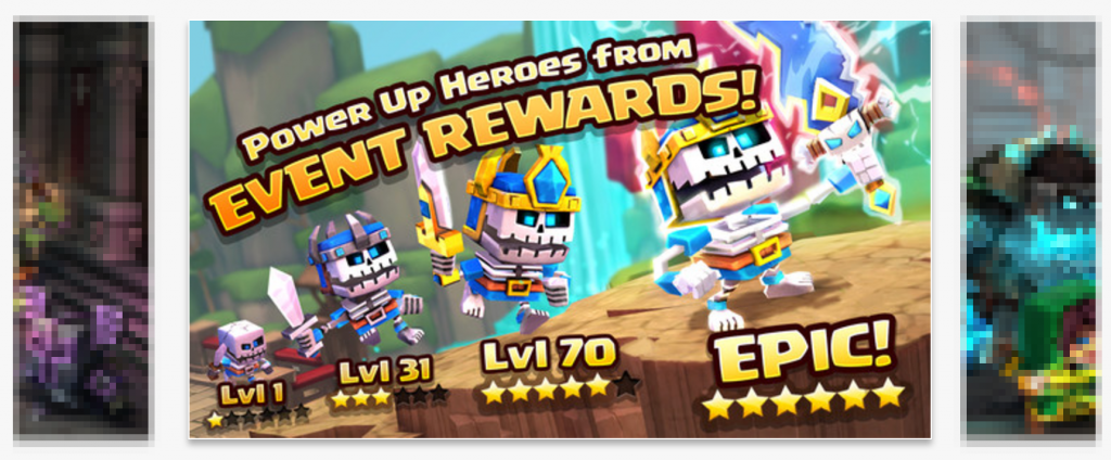
Why it’s unique. This Dungeon Boss app store screenshot takes the concept of getting into user’s head a bit differently. One of the best feelings anyone can get while gaming is the satisfaction of leveling up or upgrading.
This screen taps into that feeling and gives users a taste of it before they even start playing. Additionally, the text introduces another feature—event rewards—which leaves a user curious and wanting to learn more.
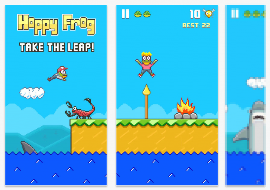
Why it’s unique. This Hoppy Frog app store screenshot does a great job combining multiple concepts into one single screen. The traditional “splash screen” resembles the look of the actual gameplay while including the title and a catchphrase as well. As a user scrolls from left to right, the screens line up with each other which draws customers in by mimicking the feeling of actually playing the game.
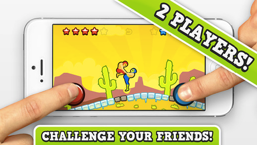
Why it’s unique. Simple and effective, this Wrestle Jump screen shows users what they’re in for immediately: a simple 1-button, 2-player game that friends can play against each other using only one device. Moreover, landscape app store screenshot orientation assists in conveying gameplay feeling.
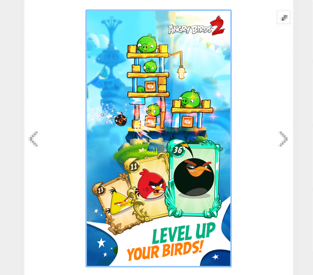
Why it’s unique. We know this Angry Birds 2 screen is great not only because of its appealing layout but because its powerful converting ability was genuinely proven in this case study. It’s interesting that the portrait orientation of the app store screenshot showed way better conversion, even though the game is played in landscape.
The screen doesn’t only show snaps of the actual gameplay along with the close-ups of the famous Angry Birds characters, it also promotes the ability to level up, much like the Dungeon Boss screen mentioned above
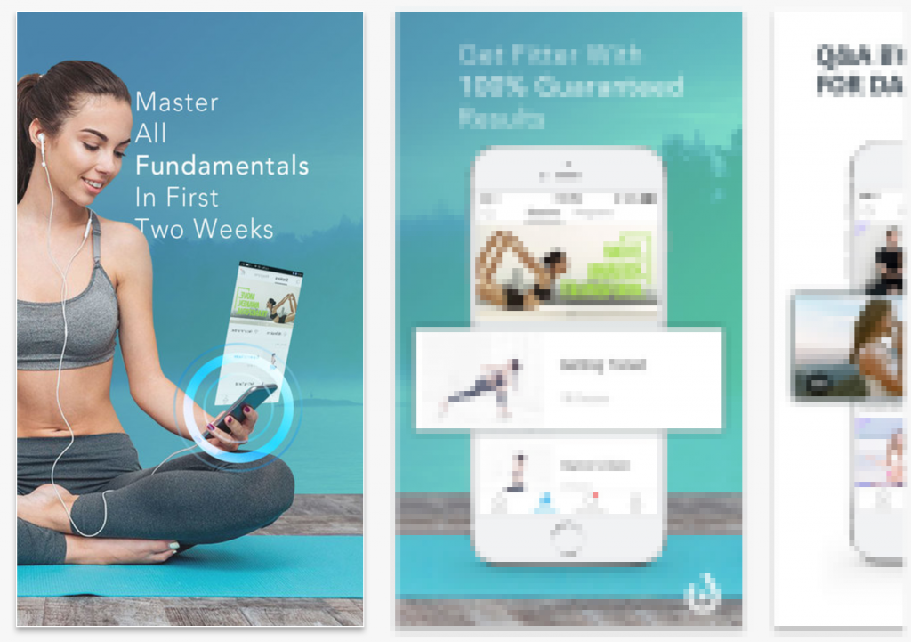
Why it’s unique. This Daily Yoga store screenshot is unique because it combines a “real life” visual with a snapshot of what users will see when they look at the app on their phone. The woman’s line of sight is also a nice touch which guides a user’s eye towards the phone. In general, an image of happy people using an app works really good.
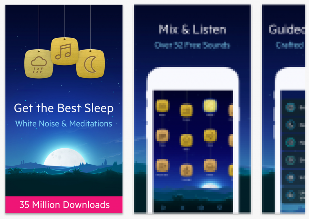
Why it’s unique. This Relax Melodies app store screenshot is simple yet effective. The caption at the top explains the features while the “35 Million Downloads” banner assists in building social proof. If 35 million people already love it, why wouldn’t you?
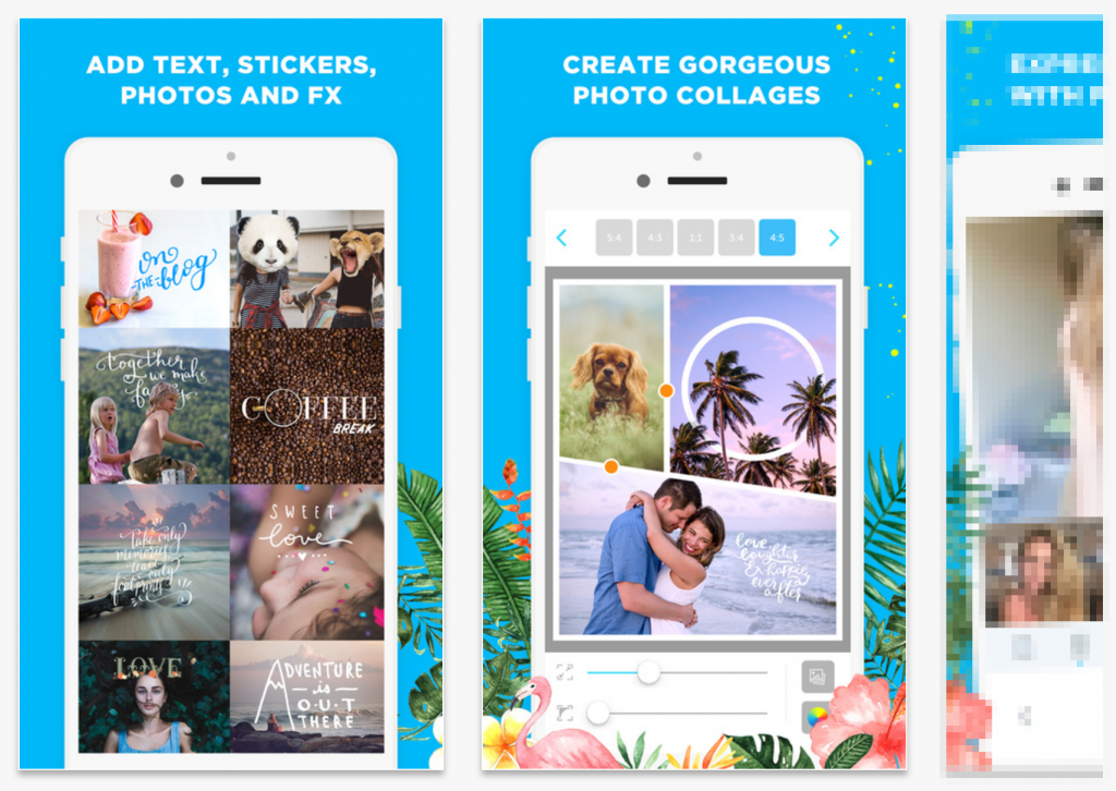
Why it’s unique. Like the Hoppy Frog screenshot above, the designs for PicLab from each screen overlap each other, making each image part of a larger, more intriguing story. Users perceive it as a puzzle worth cracking.
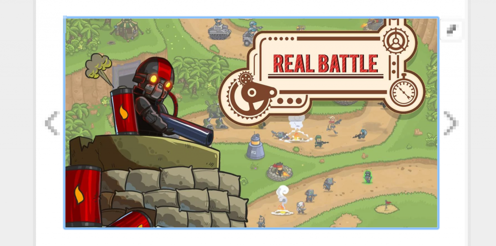
Why it’s unique. This Steampunk Defense app store screenshot takes a different approach and opts to highlight the style of the game and its characters rather than core features. The unique banner is also a nice touch which matches the steampunk style of the game.
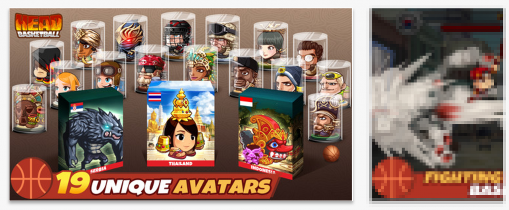
Why it’s unique. Instead of including more gameplay screens, this Head Basketball app promotes the depth of the game by showing the diverse set of characters a player will be able to choose from. Such variety means deeper users personalization within the game.
It’s critical to understand that guessing and liking an idea doesn’t guarantee its impressive performance. Remember that screenshots you pick randomly may deteriorate app’s overall conversion.
There are dozens of ideas for effective screenshots which are capable of boosting conversion. However, remember to conduct mobile AB testing with either Google Experiments or SplitMetrics before implementing any changes. Thus, you’ll always use variations with the highest conversion rate and your ASO game will be on point.