Grid and Flexbox - Smashing Conf SF
8 likes3,079 views
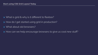
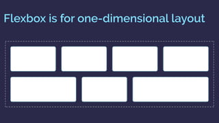
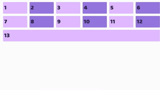
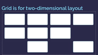
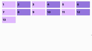
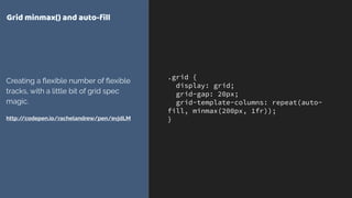
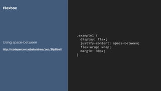
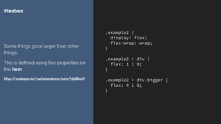
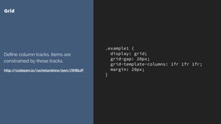
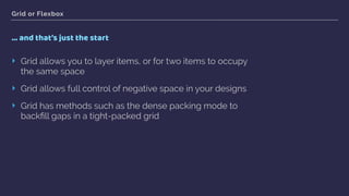
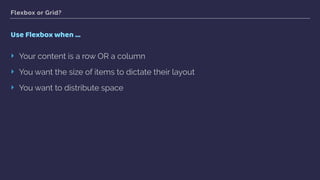
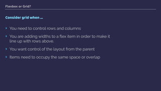
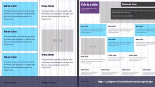
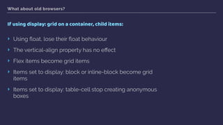
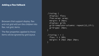
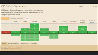
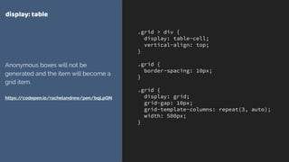
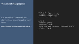
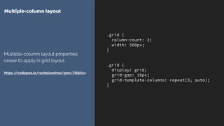
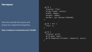
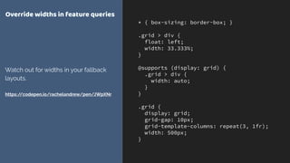
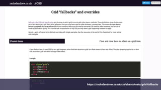
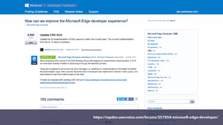
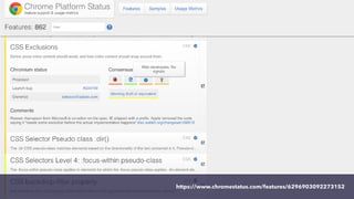
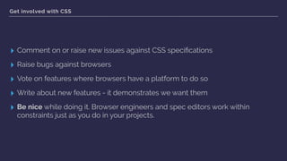
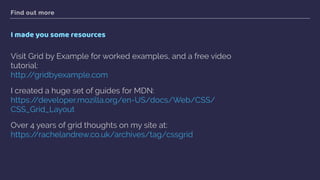
Rachel Andrew presented on CSS Grid Layout and Flexbox at Smashing Conf SF. She began by explaining the differences between Grid and Flexbox - Grid is for two-dimensional layout while Flexbox is for one-dimensional. She demonstrated examples of layouts using Grid and why it may be preferable to Flexbox in certain cases. Rachel then covered using Grid in production, responsive design with Grid, fallback options for older browsers, and ways for developers to encourage browser vendors to support new features. She provided several resources for learning more about Grid.
1 of 94
Downloaded 65 times






























Recommended
CSS Grid for html5j by Rachel Andrew, has 71 slides with 1102 views.This document introduces CSS Grid Layout and provides an overview of its key concepts and features, including:
- Defining a grid with display: grid and grid-template properties
- Placing grid items on the grid using line numbers, line names, and grid-area
- Automatic placement of grid items with grid-auto-flow
- Accessibility considerations for maintaining source order
- When to use Grid versus Flexbox for layout needs
- Animating grid properties and using feature queries for fallback support


CSS Grid for html5jRachel Andrew
71 slides•1.1K views
This document introduces CSS Grid Layout and provides an overview of its key concepts and features, including:
- Defining a grid with display: grid and grid-template properties
- Placing grid items on the grid using line numbers, line names, and grid-area
- Automatic placement of grid items with grid-auto-flow
- Accessibility considerations for maintaining source order
- When to use Grid versus Flexbox for layout needs
- Animating grid properties and using feature queries for fallback supportFrontend United: Start using CSS Grid Layout today! by Rachel Andrew, has 115 slides with 2202 views.Grid Layout is here! What is it? Why is it different to flexbox? How do I get started? What about old browsers? All these questions and more in a high speed tour of the spec.


Frontend United: Start using CSS Grid Layout today!Rachel Andrew
115 slides•2.2K views
Grid Layout is here! What is it? Why is it different to flexbox? How do I get started? What about old browsers? All these questions and more in a high speed tour of the spec.Laying out the future by Rachel Andrew, has 79 slides with 1806 views.Rachel Andrew discusses modern CSS layout techniques like Flexbox and CSS Grid Layout. She explains how these new specifications allow for responsive design that adapts to different screen sizes in a fluid, flexible way. Andrew also emphasizes the importance of accessibility and maintaining proper source order when using these techniques. The talk explores various properties, functions, and examples to demonstrate how Flexbox and CSS Grid can be used to create responsive layouts in a semantic and accessible manner.


Laying out the futureRachel Andrew
79 slides•1.8K views
Rachel Andrew discusses modern CSS layout techniques like Flexbox and CSS Grid Layout. She explains how these new specifications allow for responsive design that adapts to different screen sizes in a fluid, flexible way. Andrew also emphasizes the importance of accessibility and maintaining proper source order when using these techniques. The talk explores various properties, functions, and examples to demonstrate how Flexbox and CSS Grid can be used to create responsive layouts in a semantic and accessible manner.AEA Chicago CSS Grid Layout by Rachel Andrew, has 143 slides with 1642 views.This document discusses CSS Grid Layout and provides examples of how to define grids and place items on grids using CSS Grid properties. Some key points:
- CSS Grid allows defining a grid on any element using display: grid and then placing child elements into the grid with grid-column, grid-row and other properties.
- Grids can be defined explicitly with grid-template-columns/rows or implicitly with auto-placement of items.
- Fraction units (fr), minmax(), repeat() and auto-fill can create flexible and responsive grid layouts.
- Items can be placed on grids by line number, named lines, or named grid areas.
- Grid layout can be redefined


AEA Chicago CSS Grid LayoutRachel Andrew
143 slides•1.6K views
This document discusses CSS Grid Layout and provides examples of how to define grids and place items on grids using CSS Grid properties. Some key points:
- CSS Grid allows defining a grid on any element using display: grid and then placing child elements into the grid with grid-column, grid-row and other properties.
- Grids can be defined explicitly with grid-template-columns/rows or implicitly with auto-placement of items.
- Fraction units (fr), minmax(), repeat() and auto-fill can create flexible and responsive grid layouts.
- Items can be placed on grids by line number, named lines, or named grid areas.
- Grid layout can be redefinedCSS Grid Layout - All Things Open by Rachel Andrew, has 137 slides with 1886 views.This document summarizes Rachel Andrew's presentation on CSS Grid Layout. Some key points include:
- CSS Grid Layout provides a two-dimensional grid system for CSS layout, as an alternative to floats and positioning.
- Grid uses line-based placement rather than block/inline flows, allowing items to be placed precisely on the grid.
- Defining a grid involves setting grid-template-columns, grid-template-rows and other properties to establish the structure and tracks.
- Items can then be placed on the grid using grid-row and grid-column to position them across specific row and column lines.


CSS Grid Layout - All Things OpenRachel Andrew
137 slides•1.9K views
This document summarizes Rachel Andrew's presentation on CSS Grid Layout. Some key points include:
- CSS Grid Layout provides a two-dimensional grid system for CSS layout, as an alternative to floats and positioning.
- Grid uses line-based placement rather than block/inline flows, allowing items to be placed precisely on the grid.
- Defining a grid involves setting grid-template-columns, grid-template-rows and other properties to establish the structure and tracks.
- Items can then be placed on the grid using grid-row and grid-column to position them across specific row and column lines.Render Conf: Start using CSS Grid Layout Today by Rachel Andrew, has 80 slides with 3639 views.A new talk for Render in Oxford - my first since Grid shipped into browsers. How do we start to use Grid now?


Render Conf: Start using CSS Grid Layout TodayRachel Andrew
80 slides•3.6K views
A new talk for Render in Oxford - my first since Grid shipped into browsers. How do we start to use Grid now?CSSConf.asia - Laying out the future by Rachel Andrew, has 83 slides with 1290 views.Rachel Andrew gives a presentation on modern CSS layout techniques including Flexbox and CSS Grid Layout. She discusses how these techniques allow for flexible and responsive design that separates layout from the semantic structure of the content. Flexbox is well-suited for one-dimensional layouts while Grid Layout enables two-dimensional positioning. Feature queries can help support these new techniques for browsers that do not yet support them.


CSSConf.asia - Laying out the futureRachel Andrew
83 slides•1.3K views
Rachel Andrew gives a presentation on modern CSS layout techniques including Flexbox and CSS Grid Layout. She discusses how these techniques allow for flexible and responsive design that separates layout from the semantic structure of the content. Flexbox is well-suited for one-dimensional layouts while Grid Layout enables two-dimensional positioning. Feature queries can help support these new techniques for browsers that do not yet support them.CSS Grid Layout for Frontend NE by Rachel Andrew, has 143 slides with 2862 views.CSS Grid Layout allows for two-dimensional page layouts using rows and columns to position elements. It offers several methods for defining the grid including explicit definition with grid-template-columns/rows, implicit definition by letting grid create tracks automatically, and using fractional units and repeat functions for flexible layouts. Elements can then be placed on the grid using line-based positioning with grid-column/row or named grid areas. Media queries allow the grid definition and element placement to adapt at different breakpoints.


CSS Grid Layout for Frontend NERachel Andrew
143 slides•2.9K views
CSS Grid Layout allows for two-dimensional page layouts using rows and columns to position elements. It offers several methods for defining the grid including explicit definition with grid-template-columns/rows, implicit definition by letting grid create tracks automatically, and using fractional units and repeat functions for flexible layouts. Elements can then be placed on the grid using line-based positioning with grid-column/row or named grid areas. Media queries allow the grid definition and element placement to adapt at different breakpoints.Introducing CSS Grid Layout by Rachel Andrew, has 143 slides with 4819 views.This document introduces CSS Grid Layout and provides examples of how to define a grid, place items on the grid using line numbers and names, create named grid areas, and redefine the grid at different breakpoints. Key aspects covered include defining grid columns and rows using fractional units and repeat functions, creating gaps between rows and columns, positioning items on the grid using line-based placement properties, and describing layouts using grid-template-areas.


Introducing CSS Grid LayoutRachel Andrew
143 slides•4.8K views
This document introduces CSS Grid Layout and provides examples of how to define a grid, place items on the grid using line numbers and names, create named grid areas, and redefine the grid at different breakpoints. Key aspects covered include defining grid columns and rows using fractional units and repeat functions, creating gaps between rows and columns, positioning items on the grid using line-based placement properties, and describing layouts using grid-template-areas.Talk Web Design: Get Ready For CSS Grid Layout by Rachel Andrew, has 119 slides with 4983 views.- CSS Grid Layout provides a new two-dimensional grid-based layout system for CSS. It allows developers to divide available space on a page into columns and rows, and place elements into those areas.
- The document discusses defining a CSS grid with properties like grid-template-columns, grid-template-rows, and grid-template-areas. It also covers positioning items onto the grid using line-based placement with grid-column, grid-row etc. or named grid areas.
- CSS Grid Layout offers developers greater control over page layout compared to older methods and allows the layout to be redefined responsively with media queries.


Talk Web Design: Get Ready For CSS Grid LayoutRachel Andrew
119 slides•5K views
- CSS Grid Layout provides a new two-dimensional grid-based layout system for CSS. It allows developers to divide available space on a page into columns and rows, and place elements into those areas.
- The document discusses defining a CSS grid with properties like grid-template-columns, grid-template-rows, and grid-template-areas. It also covers positioning items onto the grid using line-based placement with grid-column, grid-row etc. or named grid areas.
- CSS Grid Layout offers developers greater control over page layout compared to older methods and allows the layout to be redefined responsively with media queries.Next-level CSS by Rachel Andrew, has 109 slides with 2754 views.The document provides an overview and examples of various CSS features, including box alignment, Flexbox, CSS Grid Layout, CSS Shapes, Feature Queries, Initial Letter styling, Writing Modes, and CSS Custom Properties. Codepen examples are included to demonstrate the features discussed. The document covers the purpose and usage of each feature at a high level.


Next-level CSSRachel Andrew
109 slides•2.8K views
The document provides an overview and examples of various CSS features, including box alignment, Flexbox, CSS Grid Layout, CSS Shapes, Feature Queries, Initial Letter styling, Writing Modes, and CSS Custom Properties. Codepen examples are included to demonstrate the features discussed. The document covers the purpose and usage of each feature at a high level.Laracon Online: Grid and Flexbox by Rachel Andrew, has 86 slides with 1952 views.My presentation for Laracon Online. Related code can be found at http://codepen.io/collection/XJRERz/


Laracon Online: Grid and FlexboxRachel Andrew
86 slides•2K views
My presentation for Laracon Online. Related code can be found at http://codepen.io/collection/XJRERz/CSS Grid Layout by Rachel Andrew, has 132 slides with 2356 views.This document discusses CSS Grid Layout and provides examples of how to define grids and place items on grids. Some key points:
- CSS Grid Layout allows dividing available space into columns and rows to position elements.
- Grids are defined on parent elements using properties like grid-template-columns, grid-template-rows, and grid-template-areas.
- Child elements can be placed on the grid using line-based placement with properties like grid-column and grid-row, or by targeting named lines and areas.
- Grids can be redefined at different breakpoints to create responsive layouts without changing HTML structure.


CSS Grid LayoutRachel Andrew
132 slides•2.4K views
This document discusses CSS Grid Layout and provides examples of how to define grids and place items on grids. Some key points:
- CSS Grid Layout allows dividing available space into columns and rows to position elements.
- Grids are defined on parent elements using properties like grid-template-columns, grid-template-rows, and grid-template-areas.
- Child elements can be placed on the grid using line-based placement with properties like grid-column and grid-row, or by targeting named lines and areas.
- Grids can be redefined at different breakpoints to create responsive layouts without changing HTML structure.CSS Grid Layout - An Event Apart Orlando by Rachel Andrew, has 150 slides with 973 views.My slides from An Event Apart Orlando. Also take a look at the code examples and resources at https://rachelandrew.co.uk/speaking/event/an-event-apart-orlando-special-edition-2016


CSS Grid Layout - An Event Apart OrlandoRachel Andrew
150 slides•973 views
My slides from An Event Apart Orlando. Also take a look at the code examples and resources at https://rachelandrew.co.uk/speaking/event/an-event-apart-orlando-special-edition-2016An Event Apart Seattle - New CSS Layout Meets the Real World by Rachel Andrew, has 146 slides with 568 views.The document discusses several new CSS layout techniques including the media object, magazine-style layouts, and fancy headers.
[1] The media object pattern is demonstrated using CSS Grid Layout, with an image and text wrapping around it. Flexbox is also used to make the object flexible. [2] Magazine-style multi-column layouts are created with grid areas, minmax rows, and object-fit for images. [3] Fancy headers are made with circles and curved text using border-radius, shape-outside, and flexbox alignment. Feature queries allow fallback styles for older browsers.


An Event Apart Seattle - New CSS Layout Meets the Real WorldRachel Andrew
146 slides•568 views
The document discusses several new CSS layout techniques including the media object, magazine-style layouts, and fancy headers.
[1] The media object pattern is demonstrated using CSS Grid Layout, with an image and text wrapping around it. Flexbox is also used to make the object flexible. [2] Magazine-style multi-column layouts are created with grid areas, minmax rows, and object-fit for images. [3] Fancy headers are made with circles and curved text using border-radius, shape-outside, and flexbox alignment. Feature queries allow fallback styles for older browsers.What I discovered about layout vis CSS Grid by Rachel Andrew, has 92 slides with 9481 views.The document summarizes key concepts the author learned about CSS Grid layout. Some key points include:
- CSS Grid handles box alignment and positioning in a logical way based on writing direction rather than physical positioning.
- The display property controls how elements generate boxes and formatting contexts for child elements. Grid items are always blockified.
- Features like subgrid, display: contents, and logical properties give more control over layout.
- Understanding how CSS Grid handles boxes and positioning provides tools to build flexible and accessible layouts.


What I discovered about layout vis CSS GridRachel Andrew
92 slides•9.5K views
The document summarizes key concepts the author learned about CSS Grid layout. Some key points include:
- CSS Grid handles box alignment and positioning in a logical way based on writing direction rather than physical positioning.
- The display property controls how elements generate boxes and formatting contexts for child elements. Grid items are always blockified.
- Features like subgrid, display: contents, and logical properties give more control over layout.
- Understanding how CSS Grid handles boxes and positioning provides tools to build flexible and accessible layouts.Introduction to CSS Grid Layout by Rachel Andrew, has 73 slides with 3620 views.This document introduces CSS Grid Layout and provides examples of how to implement a grid using CSS Grid properties. Key points include:
- CSS Grid Layout allows positioning of elements within a grid system defined entirely through CSS. This avoids layout hacks and redundant markup needed with previous methods.
- Grid properties like grid-template-columns, grid-template-rows define the structure of the grid. grid-column, grid-row position elements within the grid.
- Named lines, grid areas, and media queries allow defining different grid layouts for different screen sizes without changing markup order.
- Repeating tracks, flexible track sizes (fr units), and line spanning provide powerful grid configuration options.


Introduction to CSS Grid LayoutRachel Andrew
73 slides•3.6K views
This document introduces CSS Grid Layout and provides examples of how to implement a grid using CSS Grid properties. Key points include:
- CSS Grid Layout allows positioning of elements within a grid system defined entirely through CSS. This avoids layout hacks and redundant markup needed with previous methods.
- Grid properties like grid-template-columns, grid-template-rows define the structure of the grid. grid-column, grid-row position elements within the grid.
- Named lines, grid areas, and media queries allow defining different grid layouts for different screen sizes without changing markup order.
- Repeating tracks, flexible track sizes (fr units), and line spanning provide powerful grid configuration options.Confoo: The New CSS Layout by Rachel Andrew, has 81 slides with 1205 views.The document summarizes Rachel Andrew's presentation on modern CSS layout techniques including Flexbox and CSS Grid Layout. Some key points include:
- Flexbox and CSS Grid Layout provide improved tools for page layout compared to older methods like floats.
- These techniques separate logical structure from visual presentation, allow responsive design, and give more control over alignment.
- Features like grid-auto-flow can automatically position items but authors must be careful not to compromise accessibility or semantics.
- Flexbox is well-suited for one-dimensional layouts while Grid excels at two-dimensional layouts like pages with columns.


Confoo: The New CSS LayoutRachel Andrew
81 slides•1.2K views
The document summarizes Rachel Andrew's presentation on modern CSS layout techniques including Flexbox and CSS Grid Layout. Some key points include:
- Flexbox and CSS Grid Layout provide improved tools for page layout compared to older methods like floats.
- These techniques separate logical structure from visual presentation, allow responsive design, and give more control over alignment.
- Features like grid-auto-flow can automatically position items but authors must be careful not to compromise accessibility or semantics.
- Flexbox is well-suited for one-dimensional layouts while Grid excels at two-dimensional layouts like pages with columns.New CSS Meets the Real World by Rachel Andrew, has 141 slides with 1402 views.My talk from An Event Apart San Francisco. How do we navigate the real world of old browsers and still get to use shiny new CSS?


New CSS Meets the Real WorldRachel Andrew
141 slides•1.4K views
My talk from An Event Apart San Francisco. How do we navigate the real world of old browsers and still get to use shiny new CSS?CSS Day: CSS Grid Layout by Rachel Andrew, has 122 slides with 9992 views.This document summarizes CSS Grid Layout, a new two-dimensional grid system being added to CSS. It discusses some of the limitations of existing CSS layout methods and how Grid Layout addresses them. Key points include: Grid Layout uses line-based placement to position items, grid tracks can be flexible or fixed widths, areas can be explicitly or implicitly named, and the system avoids hacks and limitations of previous methods.


CSS Day: CSS Grid Layout Rachel Andrew
122 slides•10K views
This document summarizes CSS Grid Layout, a new two-dimensional grid system being added to CSS. It discusses some of the limitations of existing CSS layout methods and how Grid Layout addresses them. Key points include: Grid Layout uses line-based placement to position items, grid tracks can be flexible or fixed widths, areas can be explicitly or implicitly named, and the system avoids hacks and limitations of previous methods.An Event Apart Nashville: CSS Grid Layout by Rachel Andrew, has 138 slides with 1665 views.The document summarizes Rachel Andrew's presentation on CSS Grid Layout. Some key points:
- CSS Grid Layout provides a new two-dimensional grid system for CSS layout, addressing limitations of floats and flexbox.
- Grid uses line-based placement, with grid tracks defined by grid-template-columns/rows and items placed using grid-column/row properties.
- Common layouts like Holy Grail can be easily created with Grid. Grid also allows rearranging layouts responsively.
- Grid introduces concepts like implicit and explicit grid lines, fr units, and named grid areas to semantically define layout structures.


An Event Apart Nashville: CSS Grid LayoutRachel Andrew
138 slides•1.7K views
The document summarizes Rachel Andrew's presentation on CSS Grid Layout. Some key points:
- CSS Grid Layout provides a new two-dimensional grid system for CSS layout, addressing limitations of floats and flexbox.
- Grid uses line-based placement, with grid tracks defined by grid-template-columns/rows and items placed using grid-column/row properties.
- Common layouts like Holy Grail can be easily created with Grid. Grid also allows rearranging layouts responsively.
- Grid introduces concepts like implicit and explicit grid lines, fr units, and named grid areas to semantically define layout structures.CSS Grid by Digital Surgeons , has 33 slides with 4056 views.This document provides an overview of CSS Grid layout and its properties for creating grid-based page layouts. CSS Grid allows dividing available space into columns and rows, and placing elements into specific areas. Key properties include display: grid;, grid-template-columns/rows to define the grid structure, and grid-column/row to position items. Grid provides a two-dimensional layout system as opposed to the one-dimensional Flexbox, and is well-suited for page-level layouts rather than component-level layouts.


CSS GridDigital Surgeons
33 slides•4.1K views
This document provides an overview of CSS Grid layout and its properties for creating grid-based page layouts. CSS Grid allows dividing available space into columns and rows, and placing elements into specific areas. Key properties include display: grid;, grid-template-columns/rows to define the grid structure, and grid-column/row to position items. Grid provides a two-dimensional layout system as opposed to the one-dimensional Flexbox, and is well-suited for page-level layouts rather than component-level layouts.CSS Grid Layout. Implementation status and roadmap (Webkit Contributors Meeti... by Igalia, has 23 slides with 1514 views.The document discusses CSS Grid Layout, which provides a mechanism for dividing space into rows and columns to define a grid-based layout. It allows precise placement of elements, reflowing optimally for different devices. The document covers grid concepts like lines, tracks, cells and areas. It also describes the syntax for defining track breadths and placing items in the grid. Implementation status is provided, with grid layout already shipped in IE and work ongoing in Blink and WebKit.


CSS Grid Layout. Implementation status and roadmap (Webkit Contributors Meeti...Igalia
23 slides•1.5K views
The document discusses CSS Grid Layout, which provides a mechanism for dividing space into rows and columns to define a grid-based layout. It allows precise placement of elements, reflowing optimally for different devices. The document covers grid concepts like lines, tracks, cells and areas. It also describes the syntax for defining track breadths and placing items in the grid. Implementation status is provided, with grid layout already shipped in IE and work ongoing in Blink and WebKit.CSS Grid Layout: An Event Apart Boston 2016 by Rachel Andrew, has 137 slides with 2910 views.This document provides an overview and introduction to CSS Grid Layout. It discusses defining a grid with properties like display: grid, grid-template-columns, grid-template-rows, and fr units. It covers placing items on the grid using line numbers, line names, and grid areas. It also demonstrates rearranging the layout at different breakpoints and using implicit rows.


CSS Grid Layout: An Event Apart Boston 2016Rachel Andrew
137 slides•2.9K views
This document provides an overview and introduction to CSS Grid Layout. It discusses defining a grid with properties like display: grid, grid-template-columns, grid-template-rows, and fr units. It covers placing items on the grid using line numbers, line names, and grid areas. It also demonstrates rearranging the layout at different breakpoints and using implicit rows.Making the most of New CSS Layout by Rachel Andrew, has 105 slides with 1338 views.My talk on new CSS Layout methods for SmartWeb in Bucharest. Covering Flexbox, CSS Grid, Box Alignment and CSS Feature Queries.


Making the most of New CSS LayoutRachel Andrew
105 slides•1.3K views
My talk on new CSS Layout methods for SmartWeb in Bucharest. Covering Flexbox, CSS Grid, Box Alignment and CSS Feature Queries.Introducing CSS Grid by Jason Yingling, has 27 slides with 3447 views.Learn the basics of CSS Grid including terminology, how to use t safely now, and even more resources to improve your CSS Grid skills.


Introducing CSS GridJason Yingling
27 slides•3.4K views
Learn the basics of CSS Grid including terminology, how to use t safely now, and even more resources to improve your CSS Grid skills.The New CSS Layout - dotCSS by Rachel Andrew, has 68 slides with 38898 views.The document discusses new CSS layout techniques including Flexbox and CSS Grid Layout. These allow for precise control of alignment both horizontally and vertically, separation of document structure from visual display, and responsive and flexible layouts by default. Examples are provided showing how Flexbox and Grid Layout can be used to create common layout patterns like equal height columns and reordering of content in a responsive way.


The New CSS Layout - dotCSSRachel Andrew
68 slides•38.9K views
The document discusses new CSS layout techniques including Flexbox and CSS Grid Layout. These allow for precise control of alignment both horizontally and vertically, separation of document structure from visual display, and responsive and flexible layouts by default. Examples are provided showing how Flexbox and Grid Layout can be used to create common layout patterns like equal height columns and reordering of content in a responsive way.The Right Layout Tool for the Job by Rachel Andrew, has 112 slides with 2991 views.My talk for WebExpo Prague on CSS Layout and how we are getting to a point where we have decisions we can make over which layout method to use.


The Right Layout Tool for the JobRachel Andrew
112 slides•3K views
My talk for WebExpo Prague on CSS Layout and how we are getting to a point where we have decisions we can make over which layout method to use.Start Using CSS Grid Layout Today - RuhrJS by Rachel Andrew, has 94 slides with 1004 views.This document provides an introduction and overview of CSS Grid Layout. It explains the differences between Grid and other layout methods like Flexbox. It provides examples of how to implement common layout patterns using Grid and addresses concerns about browser support and fallbacks. Key topics covered include grid template areas, responsive design with Grid, and ways for developers to get involved in advancing browser support for new CSS features.


Start Using CSS Grid Layout Today - RuhrJSRachel Andrew
94 slides•1K views
This document provides an introduction and overview of CSS Grid Layout. It explains the differences between Grid and other layout methods like Flexbox. It provides examples of how to implement common layout patterns using Grid and addresses concerns about browser support and fallbacks. Key topics covered include grid template areas, responsive design with Grid, and ways for developers to get involved in advancing browser support for new CSS features.Laying out the future with grid & flexbox - Smashing Conf Freiburg by Rachel Andrew, has 112 slides with 2435 views.Practical advice for using grid and flexbox in production, supporting older browsers and helping to improve the web.


Laying out the future with grid & flexbox - Smashing Conf FreiburgRachel Andrew
112 slides•2.4K views
Practical advice for using grid and flexbox in production, supporting older browsers and helping to improve the web.More Related Content
What's hot (20)
Introducing CSS Grid Layout by Rachel Andrew, has 143 slides with 4819 views.This document introduces CSS Grid Layout and provides examples of how to define a grid, place items on the grid using line numbers and names, create named grid areas, and redefine the grid at different breakpoints. Key aspects covered include defining grid columns and rows using fractional units and repeat functions, creating gaps between rows and columns, positioning items on the grid using line-based placement properties, and describing layouts using grid-template-areas.


Introducing CSS Grid LayoutRachel Andrew
143 slides•4.8K views
This document introduces CSS Grid Layout and provides examples of how to define a grid, place items on the grid using line numbers and names, create named grid areas, and redefine the grid at different breakpoints. Key aspects covered include defining grid columns and rows using fractional units and repeat functions, creating gaps between rows and columns, positioning items on the grid using line-based placement properties, and describing layouts using grid-template-areas.Talk Web Design: Get Ready For CSS Grid Layout by Rachel Andrew, has 119 slides with 4983 views.- CSS Grid Layout provides a new two-dimensional grid-based layout system for CSS. It allows developers to divide available space on a page into columns and rows, and place elements into those areas.
- The document discusses defining a CSS grid with properties like grid-template-columns, grid-template-rows, and grid-template-areas. It also covers positioning items onto the grid using line-based placement with grid-column, grid-row etc. or named grid areas.
- CSS Grid Layout offers developers greater control over page layout compared to older methods and allows the layout to be redefined responsively with media queries.


Talk Web Design: Get Ready For CSS Grid LayoutRachel Andrew
119 slides•5K views
- CSS Grid Layout provides a new two-dimensional grid-based layout system for CSS. It allows developers to divide available space on a page into columns and rows, and place elements into those areas.
- The document discusses defining a CSS grid with properties like grid-template-columns, grid-template-rows, and grid-template-areas. It also covers positioning items onto the grid using line-based placement with grid-column, grid-row etc. or named grid areas.
- CSS Grid Layout offers developers greater control over page layout compared to older methods and allows the layout to be redefined responsively with media queries.Next-level CSS by Rachel Andrew, has 109 slides with 2754 views.The document provides an overview and examples of various CSS features, including box alignment, Flexbox, CSS Grid Layout, CSS Shapes, Feature Queries, Initial Letter styling, Writing Modes, and CSS Custom Properties. Codepen examples are included to demonstrate the features discussed. The document covers the purpose and usage of each feature at a high level.


Next-level CSSRachel Andrew
109 slides•2.8K views
The document provides an overview and examples of various CSS features, including box alignment, Flexbox, CSS Grid Layout, CSS Shapes, Feature Queries, Initial Letter styling, Writing Modes, and CSS Custom Properties. Codepen examples are included to demonstrate the features discussed. The document covers the purpose and usage of each feature at a high level.Laracon Online: Grid and Flexbox by Rachel Andrew, has 86 slides with 1952 views.My presentation for Laracon Online. Related code can be found at http://codepen.io/collection/XJRERz/


Laracon Online: Grid and FlexboxRachel Andrew
86 slides•2K views
My presentation for Laracon Online. Related code can be found at http://codepen.io/collection/XJRERz/CSS Grid Layout by Rachel Andrew, has 132 slides with 2356 views.This document discusses CSS Grid Layout and provides examples of how to define grids and place items on grids. Some key points:
- CSS Grid Layout allows dividing available space into columns and rows to position elements.
- Grids are defined on parent elements using properties like grid-template-columns, grid-template-rows, and grid-template-areas.
- Child elements can be placed on the grid using line-based placement with properties like grid-column and grid-row, or by targeting named lines and areas.
- Grids can be redefined at different breakpoints to create responsive layouts without changing HTML structure.


CSS Grid LayoutRachel Andrew
132 slides•2.4K views
This document discusses CSS Grid Layout and provides examples of how to define grids and place items on grids. Some key points:
- CSS Grid Layout allows dividing available space into columns and rows to position elements.
- Grids are defined on parent elements using properties like grid-template-columns, grid-template-rows, and grid-template-areas.
- Child elements can be placed on the grid using line-based placement with properties like grid-column and grid-row, or by targeting named lines and areas.
- Grids can be redefined at different breakpoints to create responsive layouts without changing HTML structure.CSS Grid Layout - An Event Apart Orlando by Rachel Andrew, has 150 slides with 973 views.My slides from An Event Apart Orlando. Also take a look at the code examples and resources at https://rachelandrew.co.uk/speaking/event/an-event-apart-orlando-special-edition-2016


CSS Grid Layout - An Event Apart OrlandoRachel Andrew
150 slides•973 views
My slides from An Event Apart Orlando. Also take a look at the code examples and resources at https://rachelandrew.co.uk/speaking/event/an-event-apart-orlando-special-edition-2016An Event Apart Seattle - New CSS Layout Meets the Real World by Rachel Andrew, has 146 slides with 568 views.The document discusses several new CSS layout techniques including the media object, magazine-style layouts, and fancy headers.
[1] The media object pattern is demonstrated using CSS Grid Layout, with an image and text wrapping around it. Flexbox is also used to make the object flexible. [2] Magazine-style multi-column layouts are created with grid areas, minmax rows, and object-fit for images. [3] Fancy headers are made with circles and curved text using border-radius, shape-outside, and flexbox alignment. Feature queries allow fallback styles for older browsers.


An Event Apart Seattle - New CSS Layout Meets the Real WorldRachel Andrew
146 slides•568 views
The document discusses several new CSS layout techniques including the media object, magazine-style layouts, and fancy headers.
[1] The media object pattern is demonstrated using CSS Grid Layout, with an image and text wrapping around it. Flexbox is also used to make the object flexible. [2] Magazine-style multi-column layouts are created with grid areas, minmax rows, and object-fit for images. [3] Fancy headers are made with circles and curved text using border-radius, shape-outside, and flexbox alignment. Feature queries allow fallback styles for older browsers.What I discovered about layout vis CSS Grid by Rachel Andrew, has 92 slides with 9481 views.The document summarizes key concepts the author learned about CSS Grid layout. Some key points include:
- CSS Grid handles box alignment and positioning in a logical way based on writing direction rather than physical positioning.
- The display property controls how elements generate boxes and formatting contexts for child elements. Grid items are always blockified.
- Features like subgrid, display: contents, and logical properties give more control over layout.
- Understanding how CSS Grid handles boxes and positioning provides tools to build flexible and accessible layouts.


What I discovered about layout vis CSS GridRachel Andrew
92 slides•9.5K views
The document summarizes key concepts the author learned about CSS Grid layout. Some key points include:
- CSS Grid handles box alignment and positioning in a logical way based on writing direction rather than physical positioning.
- The display property controls how elements generate boxes and formatting contexts for child elements. Grid items are always blockified.
- Features like subgrid, display: contents, and logical properties give more control over layout.
- Understanding how CSS Grid handles boxes and positioning provides tools to build flexible and accessible layouts.Introduction to CSS Grid Layout by Rachel Andrew, has 73 slides with 3620 views.This document introduces CSS Grid Layout and provides examples of how to implement a grid using CSS Grid properties. Key points include:
- CSS Grid Layout allows positioning of elements within a grid system defined entirely through CSS. This avoids layout hacks and redundant markup needed with previous methods.
- Grid properties like grid-template-columns, grid-template-rows define the structure of the grid. grid-column, grid-row position elements within the grid.
- Named lines, grid areas, and media queries allow defining different grid layouts for different screen sizes without changing markup order.
- Repeating tracks, flexible track sizes (fr units), and line spanning provide powerful grid configuration options.


Introduction to CSS Grid LayoutRachel Andrew
73 slides•3.6K views
This document introduces CSS Grid Layout and provides examples of how to implement a grid using CSS Grid properties. Key points include:
- CSS Grid Layout allows positioning of elements within a grid system defined entirely through CSS. This avoids layout hacks and redundant markup needed with previous methods.
- Grid properties like grid-template-columns, grid-template-rows define the structure of the grid. grid-column, grid-row position elements within the grid.
- Named lines, grid areas, and media queries allow defining different grid layouts for different screen sizes without changing markup order.
- Repeating tracks, flexible track sizes (fr units), and line spanning provide powerful grid configuration options.Confoo: The New CSS Layout by Rachel Andrew, has 81 slides with 1205 views.The document summarizes Rachel Andrew's presentation on modern CSS layout techniques including Flexbox and CSS Grid Layout. Some key points include:
- Flexbox and CSS Grid Layout provide improved tools for page layout compared to older methods like floats.
- These techniques separate logical structure from visual presentation, allow responsive design, and give more control over alignment.
- Features like grid-auto-flow can automatically position items but authors must be careful not to compromise accessibility or semantics.
- Flexbox is well-suited for one-dimensional layouts while Grid excels at two-dimensional layouts like pages with columns.


Confoo: The New CSS LayoutRachel Andrew
81 slides•1.2K views
The document summarizes Rachel Andrew's presentation on modern CSS layout techniques including Flexbox and CSS Grid Layout. Some key points include:
- Flexbox and CSS Grid Layout provide improved tools for page layout compared to older methods like floats.
- These techniques separate logical structure from visual presentation, allow responsive design, and give more control over alignment.
- Features like grid-auto-flow can automatically position items but authors must be careful not to compromise accessibility or semantics.
- Flexbox is well-suited for one-dimensional layouts while Grid excels at two-dimensional layouts like pages with columns.New CSS Meets the Real World by Rachel Andrew, has 141 slides with 1402 views.My talk from An Event Apart San Francisco. How do we navigate the real world of old browsers and still get to use shiny new CSS?


New CSS Meets the Real WorldRachel Andrew
141 slides•1.4K views
My talk from An Event Apart San Francisco. How do we navigate the real world of old browsers and still get to use shiny new CSS?CSS Day: CSS Grid Layout by Rachel Andrew, has 122 slides with 9992 views.This document summarizes CSS Grid Layout, a new two-dimensional grid system being added to CSS. It discusses some of the limitations of existing CSS layout methods and how Grid Layout addresses them. Key points include: Grid Layout uses line-based placement to position items, grid tracks can be flexible or fixed widths, areas can be explicitly or implicitly named, and the system avoids hacks and limitations of previous methods.


CSS Day: CSS Grid Layout Rachel Andrew
122 slides•10K views
This document summarizes CSS Grid Layout, a new two-dimensional grid system being added to CSS. It discusses some of the limitations of existing CSS layout methods and how Grid Layout addresses them. Key points include: Grid Layout uses line-based placement to position items, grid tracks can be flexible or fixed widths, areas can be explicitly or implicitly named, and the system avoids hacks and limitations of previous methods.An Event Apart Nashville: CSS Grid Layout by Rachel Andrew, has 138 slides with 1665 views.The document summarizes Rachel Andrew's presentation on CSS Grid Layout. Some key points:
- CSS Grid Layout provides a new two-dimensional grid system for CSS layout, addressing limitations of floats and flexbox.
- Grid uses line-based placement, with grid tracks defined by grid-template-columns/rows and items placed using grid-column/row properties.
- Common layouts like Holy Grail can be easily created with Grid. Grid also allows rearranging layouts responsively.
- Grid introduces concepts like implicit and explicit grid lines, fr units, and named grid areas to semantically define layout structures.


An Event Apart Nashville: CSS Grid LayoutRachel Andrew
138 slides•1.7K views
The document summarizes Rachel Andrew's presentation on CSS Grid Layout. Some key points:
- CSS Grid Layout provides a new two-dimensional grid system for CSS layout, addressing limitations of floats and flexbox.
- Grid uses line-based placement, with grid tracks defined by grid-template-columns/rows and items placed using grid-column/row properties.
- Common layouts like Holy Grail can be easily created with Grid. Grid also allows rearranging layouts responsively.
- Grid introduces concepts like implicit and explicit grid lines, fr units, and named grid areas to semantically define layout structures.CSS Grid by Digital Surgeons , has 33 slides with 4056 views.This document provides an overview of CSS Grid layout and its properties for creating grid-based page layouts. CSS Grid allows dividing available space into columns and rows, and placing elements into specific areas. Key properties include display: grid;, grid-template-columns/rows to define the grid structure, and grid-column/row to position items. Grid provides a two-dimensional layout system as opposed to the one-dimensional Flexbox, and is well-suited for page-level layouts rather than component-level layouts.


CSS GridDigital Surgeons
33 slides•4.1K views
This document provides an overview of CSS Grid layout and its properties for creating grid-based page layouts. CSS Grid allows dividing available space into columns and rows, and placing elements into specific areas. Key properties include display: grid;, grid-template-columns/rows to define the grid structure, and grid-column/row to position items. Grid provides a two-dimensional layout system as opposed to the one-dimensional Flexbox, and is well-suited for page-level layouts rather than component-level layouts.CSS Grid Layout. Implementation status and roadmap (Webkit Contributors Meeti... by Igalia, has 23 slides with 1514 views.The document discusses CSS Grid Layout, which provides a mechanism for dividing space into rows and columns to define a grid-based layout. It allows precise placement of elements, reflowing optimally for different devices. The document covers grid concepts like lines, tracks, cells and areas. It also describes the syntax for defining track breadths and placing items in the grid. Implementation status is provided, with grid layout already shipped in IE and work ongoing in Blink and WebKit.


CSS Grid Layout. Implementation status and roadmap (Webkit Contributors Meeti...Igalia
23 slides•1.5K views
The document discusses CSS Grid Layout, which provides a mechanism for dividing space into rows and columns to define a grid-based layout. It allows precise placement of elements, reflowing optimally for different devices. The document covers grid concepts like lines, tracks, cells and areas. It also describes the syntax for defining track breadths and placing items in the grid. Implementation status is provided, with grid layout already shipped in IE and work ongoing in Blink and WebKit.CSS Grid Layout: An Event Apart Boston 2016 by Rachel Andrew, has 137 slides with 2910 views.This document provides an overview and introduction to CSS Grid Layout. It discusses defining a grid with properties like display: grid, grid-template-columns, grid-template-rows, and fr units. It covers placing items on the grid using line numbers, line names, and grid areas. It also demonstrates rearranging the layout at different breakpoints and using implicit rows.


CSS Grid Layout: An Event Apart Boston 2016Rachel Andrew
137 slides•2.9K views
This document provides an overview and introduction to CSS Grid Layout. It discusses defining a grid with properties like display: grid, grid-template-columns, grid-template-rows, and fr units. It covers placing items on the grid using line numbers, line names, and grid areas. It also demonstrates rearranging the layout at different breakpoints and using implicit rows.Making the most of New CSS Layout by Rachel Andrew, has 105 slides with 1338 views.My talk on new CSS Layout methods for SmartWeb in Bucharest. Covering Flexbox, CSS Grid, Box Alignment and CSS Feature Queries.


Making the most of New CSS LayoutRachel Andrew
105 slides•1.3K views
My talk on new CSS Layout methods for SmartWeb in Bucharest. Covering Flexbox, CSS Grid, Box Alignment and CSS Feature Queries.Introducing CSS Grid by Jason Yingling, has 27 slides with 3447 views.Learn the basics of CSS Grid including terminology, how to use t safely now, and even more resources to improve your CSS Grid skills.


Introducing CSS GridJason Yingling
27 slides•3.4K views
Learn the basics of CSS Grid including terminology, how to use t safely now, and even more resources to improve your CSS Grid skills.The New CSS Layout - dotCSS by Rachel Andrew, has 68 slides with 38898 views.The document discusses new CSS layout techniques including Flexbox and CSS Grid Layout. These allow for precise control of alignment both horizontally and vertically, separation of document structure from visual display, and responsive and flexible layouts by default. Examples are provided showing how Flexbox and Grid Layout can be used to create common layout patterns like equal height columns and reordering of content in a responsive way.


The New CSS Layout - dotCSSRachel Andrew
68 slides•38.9K views
The document discusses new CSS layout techniques including Flexbox and CSS Grid Layout. These allow for precise control of alignment both horizontally and vertically, separation of document structure from visual display, and responsive and flexible layouts by default. Examples are provided showing how Flexbox and Grid Layout can be used to create common layout patterns like equal height columns and reordering of content in a responsive way.The Right Layout Tool for the Job by Rachel Andrew, has 112 slides with 2991 views.My talk for WebExpo Prague on CSS Layout and how we are getting to a point where we have decisions we can make over which layout method to use.


The Right Layout Tool for the JobRachel Andrew
112 slides•3K views
My talk for WebExpo Prague on CSS Layout and how we are getting to a point where we have decisions we can make over which layout method to use.CSS Grid Layout. Implementation status and roadmap (Webkit Contributors Meeti... by Igalia, has 23 slides with 1514 views.The document discusses CSS Grid Layout, which provides a mechanism for dividing space into rows and columns to define a grid-based layout. It allows precise placement of elements, reflowing optimally for different devices. The document covers grid concepts like lines, tracks, cells and areas. It also describes the syntax for defining track breadths and placing items in the grid. Implementation status is provided, with grid layout already shipped in IE and work ongoing in Blink and WebKit.


CSS Grid Layout. Implementation status and roadmap (Webkit Contributors Meeti...Igalia
23 slides•1.5K views
Similar to Grid and Flexbox - Smashing Conf SF (20)
Start Using CSS Grid Layout Today - RuhrJS by Rachel Andrew, has 94 slides with 1004 views.This document provides an introduction and overview of CSS Grid Layout. It explains the differences between Grid and other layout methods like Flexbox. It provides examples of how to implement common layout patterns using Grid and addresses concerns about browser support and fallbacks. Key topics covered include grid template areas, responsive design with Grid, and ways for developers to get involved in advancing browser support for new CSS features.


Start Using CSS Grid Layout Today - RuhrJSRachel Andrew
94 slides•1K views
This document provides an introduction and overview of CSS Grid Layout. It explains the differences between Grid and other layout methods like Flexbox. It provides examples of how to implement common layout patterns using Grid and addresses concerns about browser support and fallbacks. Key topics covered include grid template areas, responsive design with Grid, and ways for developers to get involved in advancing browser support for new CSS features.Laying out the future with grid & flexbox - Smashing Conf Freiburg by Rachel Andrew, has 112 slides with 2435 views.Practical advice for using grid and flexbox in production, supporting older browsers and helping to improve the web.


Laying out the future with grid & flexbox - Smashing Conf FreiburgRachel Andrew
112 slides•2.4K views
Practical advice for using grid and flexbox in production, supporting older browsers and helping to improve the web.Evergreen websites for Evergreen browsers by Rachel Andrew, has 124 slides with 1484 views.Grid is for two-dimensional layout, while flexbox is for one-dimensional layout. Grid allows control of layout from the parent container by defining column and row tracks on the container, rather than adding properties to child items. This allows child items to be positioned and overlap in the grid space without adding widths or heights to them directly. Feature queries can be used to provide an enhanced grid-based layout for supporting browsers while avoiding conflicts with non-supporting browsers.


Evergreen websites for Evergreen browsersRachel Andrew
124 slides•1.5K views
Grid is for two-dimensional layout, while flexbox is for one-dimensional layout. Grid allows control of layout from the parent container by defining column and row tracks on the container, rather than adding properties to child items. This allows child items to be positioned and overlap in the grid space without adding widths or heights to them directly. Feature queries can be used to provide an enhanced grid-based layout for supporting browsers while avoiding conflicts with non-supporting browsers.DevFest Nantes - Start Using CSS Grid Layout today by Rachel Andrew, has 114 slides with 1084 views.The document discusses using CSS Grid Layout for page layout. It provides examples of how to create a grid with multiple equal columns using grid-template-columns, position elements within the grid using grid-column and grid-row, and make the layout responsive by redefining grid placements in media queries. It also addresses backwards compatibility by providing flexbox fallbacks and using feature queries.


DevFest Nantes - Start Using CSS Grid Layout todayRachel Andrew
114 slides•1.1K views
The document discusses using CSS Grid Layout for page layout. It provides examples of how to create a grid with multiple equal columns using grid-template-columns, position elements within the grid using grid-column and grid-row, and make the layout responsive by redefining grid placements in media queries. It also addresses backwards compatibility by providing flexbox fallbacks and using feature queries.View Source London: Solving Layout Problems with CSS Grid & Friends by Rachel Andrew, has 85 slides with 1028 views.This document provides an overview of solving layout problems with CSS Grid and related technologies. It discusses when to use Flexbox versus Grid, how Grid works from the container out compared to other frameworks, tracks sizing with fractions and minmax, nested grids, new sizing keywords, and dealing with older browsers. It also covers subgrids and potential future directions like masonry layouts.


View Source London: Solving Layout Problems with CSS Grid & FriendsRachel Andrew
85 slides•1K views
This document provides an overview of solving layout problems with CSS Grid and related technologies. It discusses when to use Flexbox versus Grid, how Grid works from the container out compared to other frameworks, tracks sizing with fractions and minmax, nested grids, new sizing keywords, and dealing with older browsers. It also covers subgrids and potential future directions like masonry layouts.Solving Layout Problems with CSS Grid & Friends - DevFest17 by Rachel Andrew, has 96 slides with 2126 views.This document summarizes Rachel Andrew's presentation on solving layout problems with CSS Grid and friends. It discusses how CSS Grid creates an actual grid structure, unlike float-based or flexbox grids which only mimic a grid. Key features of CSS Grid like grid-template-columns, repeat, minmax, and fr units for column sizing are explained. The document also covers using features like float or flexbox as fallbacks for older browsers, and potential future additions to grid like subgrids and masonry layouts.


Solving Layout Problems with CSS Grid & Friends - DevFest17Rachel Andrew
96 slides•2.1K views
This document summarizes Rachel Andrew's presentation on solving layout problems with CSS Grid and friends. It discusses how CSS Grid creates an actual grid structure, unlike float-based or flexbox grids which only mimic a grid. Key features of CSS Grid like grid-template-columns, repeat, minmax, and fr units for column sizing are explained. The document also covers using features like float or flexbox as fallbacks for older browsers, and potential future additions to grid like subgrids and masonry layouts.Google Developers Experts Summit 2017 - CSS Layout by Rachel Andrew, has 93 slides with 1358 views.My presentation for the GDE Summit - about various interesting things I learned about layout while working with CSS Grid.


Google Developers Experts Summit 2017 - CSS Layout Rachel Andrew
93 slides•1.4K views
My presentation for the GDE Summit - about various interesting things I learned about layout while working with CSS Grid.Devoxx Belgium: CSS Grid Layout by Rachel Andrew, has 137 slides with 1222 views.This document discusses CSS Grid Layout and how it provides a designed-for-purpose layout system. It describes how grid is defined using CSS properties like display: grid and grid-template-columns. Elements can then be precisely positioned on the grid using line-based placement with properties like grid-column and grid-row. The document provides examples of common layout patterns like the holy grail layout implemented with grid. It also covers topics like implicit and explicit grid lines, named lines and areas, and redefining the grid at different breakpoints.


Devoxx Belgium: CSS Grid LayoutRachel Andrew
137 slides•1.2K views
This document discusses CSS Grid Layout and how it provides a designed-for-purpose layout system. It describes how grid is defined using CSS properties like display: grid and grid-template-columns. Elements can then be precisely positioned on the grid using line-based placement with properties like grid-column and grid-row. The document provides examples of common layout patterns like the holy grail layout implemented with grid. It also covers topics like implicit and explicit grid lines, named lines and areas, and redefining the grid at different breakpoints.An Event Apart SF: CSS Grid Layout by Rachel Andrew, has 137 slides with 1667 views.The document summarizes Rachel Andrew's presentation on CSS Grid Layout. Some key points:
- CSS Grid Layout provides a new display value and properties to create grid-based layouts, addressing issues with floats, tables, flexbox.
- Grid uses line-based placement, with grid-template-columns/rows to define the grid, and grid-column/row to position.
- The fr unit distributes space proportionally. Implicit tracks are created when content is placed outside defined lines.
- Grid allows redefining layouts responsively by changing templates with media queries.


An Event Apart SF: CSS Grid LayoutRachel Andrew
137 slides•1.7K views
The document summarizes Rachel Andrew's presentation on CSS Grid Layout. Some key points:
- CSS Grid Layout provides a new display value and properties to create grid-based layouts, addressing issues with floats, tables, flexbox.
- Grid uses line-based placement, with grid-template-columns/rows to define the grid, and grid-column/row to position.
- The fr unit distributes space proportionally. Implicit tracks are created when content is placed outside defined lines.
- Grid allows redefining layouts responsively by changing templates with media queries.CSS Grid Layout for Topconf, Linz by Rachel Andrew, has 116 slides with 185176 views.This document summarizes Rachel Andrew's presentation on CSS Grid Layout. Some key points:
- CSS Grid Layout provides a new two-dimensional layout system for CSS that solves many of the problems of previous methods like floats and flexbox.
- Grid uses line-based placement, with grid lines that can be explicit or implicit, to position items on the page. Properties like grid-column and grid-row position items within the grid.
- The grid template establishes the structure of rows and columns. Items can span multiple tracks. Fraction units like fr distribute space proportionally.
- Common layouts like Holy Grail are easily achieved with Grid. The structure can also adapt at breakpoints by redefining


CSS Grid Layout for Topconf, LinzRachel Andrew
116 slides•185.2K views
This document summarizes Rachel Andrew's presentation on CSS Grid Layout. Some key points:
- CSS Grid Layout provides a new two-dimensional layout system for CSS that solves many of the problems of previous methods like floats and flexbox.
- Grid uses line-based placement, with grid lines that can be explicit or implicit, to position items on the page. Properties like grid-column and grid-row position items within the grid.
- The grid template establishes the structure of rows and columns. Items can span multiple tracks. Fraction units like fr distribute space proportionally.
- Common layouts like Holy Grail are easily achieved with Grid. The structure can also adapt at breakpoints by redefiningSolving Layout Problems with CSS Grid & Friends - NordicJS by Rachel Andrew, has 85 slides with 2741 views.I explain some of the common layout problems that CSS Grid and related specifications attempt to solve - while answering some of the common questions I am asked about Grid Layout.


Solving Layout Problems with CSS Grid & Friends - NordicJSRachel Andrew
85 slides•2.7K views
I explain some of the common layout problems that CSS Grid and related specifications attempt to solve - while answering some of the common questions I am asked about Grid Layout.Solving Layout Problems With CSS Grid and Friends by FITC, has 96 slides with 587 views.Presented at Web Unleashed 2017. More info at www.fitc.ca/webu
Presented by Rachel Andrew, Perch CMS
Overview
CSS Grid Layout launched into the majority of our browsers in 2017. As designers and developers have started to use Grid Rachel has been answering a lot of questions about the specifications. In this talk she’ll answer some of the common questions about Grid Layout in production – from dealing with old browsers to what might come next in CSS for layout. There will be plenty of practical tips for you to use in your projects today.
Objective
To give attendees practical ways in which they can use new CSS to solve tricky problems
Target Audience
Front-end developers
Assumed Audience Knowledge
Some CSS knowledge
Five Things Audience Members Will Learn
CSS Grid
Flexbox
Box alignment
Feature queries
CSS tips and tricks


Solving Layout Problems With CSS Grid and FriendsFITC
96 slides•587 views
Presented at Web Unleashed 2017. More info at www.fitc.ca/webu
Presented by Rachel Andrew, Perch CMS
Overview
CSS Grid Layout launched into the majority of our browsers in 2017. As designers and developers have started to use Grid Rachel has been answering a lot of questions about the specifications. In this talk she’ll answer some of the common questions about Grid Layout in production – from dealing with old browsers to what might come next in CSS for layout. There will be plenty of practical tips for you to use in your projects today.
Objective
To give attendees practical ways in which they can use new CSS to solve tricky problems
Target Audience
Front-end developers
Assumed Audience Knowledge
Some CSS knowledge
Five Things Audience Members Will Learn
CSS Grid
Flexbox
Box alignment
Feature queries
CSS tips and tricksSolving Layout Problems with CSS Grid & Friends - WEBU17 by Rachel Andrew, has 96 slides with 908 views.In my talk at FITC Web Unleashed I explain some of the features of CSS Grid Layout, and some of the things that might come soon.


Solving Layout Problems with CSS Grid & Friends - WEBU17Rachel Andrew
96 slides•908 views
In my talk at FITC Web Unleashed I explain some of the features of CSS Grid Layout, and some of the things that might come soon.404.ie: Solving Layout Problems with CSS Grid & Friends by Rachel Andrew, has 85 slides with 915 views.Rachel Andrew presented on solving layout problems with CSS Grid and friends. CSS Grid allows for two-dimensional page layouts directly in the markup, without needing additional wrapper elements. Grid items can be placed into rows and columns precisely without needing to set widths. Older techniques like floats and flexbox can be used as fallbacks for browsers without Grid support. Subgrids and masonry layouts may be added to Grid in the future. Grid is a native part of CSS with good browser support.


404.ie: Solving Layout Problems with CSS Grid & FriendsRachel Andrew
85 slides•915 views
Rachel Andrew presented on solving layout problems with CSS Grid and friends. CSS Grid allows for two-dimensional page layouts directly in the markup, without needing additional wrapper elements. Grid items can be placed into rows and columns precisely without needing to set widths. Older techniques like floats and flexbox can be used as fallbacks for browsers without Grid support. Subgrids and masonry layouts may be added to Grid in the future. Grid is a native part of CSS with good browser support.CSS Grid Layout by Rachel Andrew, has 120 slides with 128473 views.The document discusses CSS Grid Layout as a new method for controlling page layout with CSS. It provides examples of using Grid Layout properties like grid-template-columns, grid-template-rows, and grid-column to define a grid structure and position elements within that grid. Key benefits highlighted include describing the layout solely in CSS, ability to redefine the layout at different breakpoints, and eliminating the need for layout hacks or non-semantic markup used by older methods.


CSS Grid LayoutRachel Andrew
120 slides•128.5K views
The document discusses CSS Grid Layout as a new method for controlling page layout with CSS. It provides examples of using Grid Layout properties like grid-template-columns, grid-template-rows, and grid-column to define a grid structure and position elements within that grid. Key benefits highlighted include describing the layout solely in CSS, ability to redefine the layout at different breakpoints, and eliminating the need for layout hacks or non-semantic markup used by older methods.But what about old browsers? by Rachel Andrew, has 97 slides with 861 views.My talk on modern layout methods for Fronteers 2015. Covering flexbox, CSS Grid Layout and the Box Alignment spec.


But what about old browsers?Rachel Andrew
97 slides•861 views
My talk on modern layout methods for Fronteers 2015. Covering flexbox, CSS Grid Layout and the Box Alignment spec.Flexbox and Grid Layout by Rachel Andrew, has 101 slides with 2611 views.This document summarizes a talk given by Rachel Andrew on new CSS layout methods Flexbox and Grid Layout. It discusses some of the challenges with traditional layout techniques and how Flexbox and Grid Layout allow for more semantic, flexible and responsive layouts by treating items as parts of a complete layout. Key features covered include separation of document structure from visual presentation, precise control of horizontal and vertical alignment, and responsive design being built into the new specifications.


Flexbox and Grid LayoutRachel Andrew
101 slides•2.6K views
This document summarizes a talk given by Rachel Andrew on new CSS layout methods Flexbox and Grid Layout. It discusses some of the challenges with traditional layout techniques and how Flexbox and Grid Layout allow for more semantic, flexible and responsive layouts by treating items as parts of a complete layout. Key features covered include separation of document structure from visual presentation, precise control of horizontal and vertical alignment, and responsive design being built into the new specifications.Fluent: Making Sense of the New CSS Layout by Rachel Andrew, has 82 slides with 7731 views.The document discusses the new CSS layout capabilities of Flexbox and CSS Grid Layout. It provides examples of how Flexbox can be used to create responsive and flexible layouts with precise control of alignment both horizontally and vertically. It also shows how CSS Grid Layout allows for true separation of document structure from visual layout, and enables full control over alignment and automatic placement of items. The document argues these new techniques provide a modern system for building layouts in a way that is responsive and flexible by default.


Fluent: Making Sense of the New CSS LayoutRachel Andrew
82 slides•7.7K views
The document discusses the new CSS layout capabilities of Flexbox and CSS Grid Layout. It provides examples of how Flexbox can be used to create responsive and flexible layouts with precise control of alignment both horizontally and vertically. It also shows how CSS Grid Layout allows for true separation of document structure from visual layout, and enables full control over alignment and automatic placement of items. The document argues these new techniques provide a modern system for building layouts in a way that is responsive and flexible by default.Future Layout & Performance by Rachel Andrew, has 87 slides with 1840 views.The document discusses new CSS layout techniques including Flexbox and CSS Grid Layout. Some key points:
- Flexbox is well supported for one-dimensional layouts while Grid Layout allows two-dimensional positioning of elements.
- Grid Layout introduces the concept of explicit and implicit grid lines to control element placement. Items can be placed using line-based positioning.
- Both techniques allow separation of visual layout from semantic source order and precise control of alignment both horizontally and vertically.
- Features like flex-grow, flex-shrink and fr units make layouts responsive and flexible by default.


Future Layout & PerformanceRachel Andrew
87 slides•1.8K views
The document discusses new CSS layout techniques including Flexbox and CSS Grid Layout. Some key points:
- Flexbox is well supported for one-dimensional layouts while Grid Layout allows two-dimensional positioning of elements.
- Grid Layout introduces the concept of explicit and implicit grid lines to control element placement. Items can be placed using line-based positioning.
- Both techniques allow separation of visual layout from semantic source order and precise control of alignment both horizontally and vertically.
- Features like flex-grow, flex-shrink and fr units make layouts responsive and flexible by default.CSS Grid Layout by All Things Open, has 137 slides with 719 views.Rachel Andrew
Co-founder of Perch CMS
Find more by Rachel Andrew: http://www.slideshare.net/rachelandrew
All Things Open
October 26-27, 2016
Raleigh, North Carolina


CSS Grid LayoutAll Things Open
137 slides•719 views
Rachel Andrew
Co-founder of Perch CMS
Find more by Rachel Andrew: http://www.slideshare.net/rachelandrew
All Things Open
October 26-27, 2016
Raleigh, North CarolinaLaying out the future with grid & flexbox - Smashing Conf Freiburg by Rachel Andrew, has 112 slides with 2435 views.Practical advice for using grid and flexbox in production, supporting older browsers and helping to improve the web.


Laying out the future with grid & flexbox - Smashing Conf FreiburgRachel Andrew
112 slides•2.4K views
More from Rachel Andrew (12)
All Day Hey! Unlocking The Power of CSS Grid Layout by Rachel Andrew, has 113 slides with 2245 views.- The document provides an overview and examples of CSS Grid Layout features such as grid-template-columns, grid-template-rows, grid-gap, grid-column, grid-row, and more.
- It demonstrates how to size grid tracks using fixed, intrinsic, and flexible sizing functions like fr units, minmax(), auto, fit-content(), and others.
- Examples are given for aligning and aligning content within grids using properties like justify-content, align-content, justify-items, align-items and more.


All Day Hey! Unlocking The Power of CSS Grid LayoutRachel Andrew
113 slides•2.2K views
- The document provides an overview and examples of CSS Grid Layout features such as grid-template-columns, grid-template-rows, grid-gap, grid-column, grid-row, and more.
- It demonstrates how to size grid tracks using fixed, intrinsic, and flexible sizing functions like fr units, minmax(), auto, fit-content(), and others.
- Examples are given for aligning and aligning content within grids using properties like justify-content, align-content, justify-items, align-items and more.SmashingConf SF: Unlocking the Power of CSS Grid Layout by Rachel Andrew, has 113 slides with 2356 views.
UNLOCKING THE POWER OF CSS GRID LAYOUT
Once you have grasped the basics of CSS Grid, you quickly discover how it enables many existing design patterns in a streamlined, elegant way. However, we shouldn’t see Grid in isolation. Understanding how other parts of CSS work together with Grid is key, in order to get the most out of our new abilities.
In this talk Rachel will be concentrating on a couple of these areas, CSS Box Alignment and CSS Sizing. Rachel will show you practical ways in which a little bit of knowledge in these areas can unlock the full potential of the Grid Specification. You’ll learn how to create useful components and to start thinking of ways in which you can solve design and interface problems in more creative ways.


SmashingConf SF: Unlocking the Power of CSS Grid LayoutRachel Andrew
113 slides•2.4K views
UNLOCKING THE POWER OF CSS GRID LAYOUT
Once you have grasped the basics of CSS Grid, you quickly discover how it enables many existing design patterns in a streamlined, elegant way. However, we shouldn’t see Grid in isolation. Understanding how other parts of CSS work together with Grid is key, in order to get the most out of our new abilities.
In this talk Rachel will be concentrating on a couple of these areas, CSS Box Alignment and CSS Sizing. Rachel will show you practical ways in which a little bit of knowledge in these areas can unlock the full potential of the Grid Specification. You’ll learn how to create useful components and to start thinking of ways in which you can solve design and interface problems in more creative ways.Unlocking the Power of CSS Grid Layout by Rachel Andrew, has 113 slides with 2003 views.The document provides a summary of a WordPress Meetup on CSS Grid Layout. It discusses various grid sizing techniques like intrinsic sizing with auto, min-content, max-content, and fit-content. It also covers flexible sizing with fr units and minimum and maximum sizing with minmax(). Other topics include alignment of tracks with align-content and justify-content, alignment of items with align-items and justify-items, and writing modes. Throughout it provides code examples and links to further resources.


Unlocking the Power of CSS Grid LayoutRachel Andrew
113 slides•2K views
The document provides a summary of a WordPress Meetup on CSS Grid Layout. It discusses various grid sizing techniques like intrinsic sizing with auto, min-content, max-content, and fit-content. It also covers flexible sizing with fr units and minimum and maximum sizing with minmax(). Other topics include alignment of tracks with align-content and justify-content, alignment of items with align-items and justify-items, and writing modes. Throughout it provides code examples and links to further resources.The Creative New World of CSS by Rachel Andrew, has 144 slides with 2015 views.A talk demonstrating some of the new things in CSS, from layout to variable fonts, blend modes and animations.


The Creative New World of CSSRachel Andrew
144 slides•2K views
A talk demonstrating some of the new things in CSS, from layout to variable fonts, blend modes and animations.Into the Weeds of CSS Layout by Rachel Andrew, has 93 slides with 1477 views.The document provides a summary of Rachel Andrew's presentation on CSS layout at Smashing Conf London. It includes links to various CSS specifications and code examples demonstrating different CSS layout techniques like grid sizing, intrinsic sizing, flexible lengths with fr units, minimum and maximum sizing, and responsive design patterns using media queries and feature queries.


Into the Weeds of CSS LayoutRachel Andrew
93 slides•1.5K views
The document provides a summary of Rachel Andrew's presentation on CSS layout at Smashing Conf London. It includes links to various CSS specifications and code examples demonstrating different CSS layout techniques like grid sizing, intrinsic sizing, flexible lengths with fr units, minimum and maximum sizing, and responsive design patterns using media queries and feature queries.Graduating to Grid by Rachel Andrew, has 143 slides with 1636 views.Grid layout has now landed in all of the mainstream desktop browsers. It's exciting but how do we start to move to using grid layout, and why should we?


Graduating to GridRachel Andrew
143 slides•1.6K views
Grid layout has now landed in all of the mainstream desktop browsers. It's exciting but how do we start to move to using grid layout, and why should we?Web Summer Camp Keynote by Rachel Andrew, has 103 slides with 1903 views.This document discusses the evolving nature of front-end development over time. It notes that in the past, skills like knowing HTML and CSS were highly marketable on their own. However, the field has grown increasingly complex with many new techniques and tools. The document encourages focusing on core fundamentals first before jumping to new tools, and stresses the importance of contributing to standards and open web platforms through techniques like filing issues to improve interoperability.


Web Summer Camp KeynoteRachel Andrew
103 slides•1.9K views
This document discusses the evolving nature of front-end development over time. It notes that in the past, skills like knowing HTML and CSS were highly marketable on their own. However, the field has grown increasingly complex with many new techniques and tools. The document encourages focusing on core fundamentals first before jumping to new tools, and stresses the importance of contributing to standards and open web platforms through techniques like filing issues to improve interoperability.New CSS Layout Meets the Real World by Rachel Andrew, has 149 slides with 893 views.The document discusses using CSS grid layout to create magazine-style page layouts and fancy headers. It provides examples of creating a flexible "media object" with images and text that can stack on mobile. It also demonstrates making a "half-border box" and positioning elements in a "magazine-style layout" with multiple images and a caption. Finally, it shows how to style a run header with the distance in a circular shape and background image.


New CSS Layout Meets the Real WorldRachel Andrew
149 slides•893 views
The document discusses using CSS grid layout to create magazine-style page layouts and fancy headers. It provides examples of creating a flexible "media object" with images and text that can stack on mobile. It also demonstrates making a "half-border box" and positioning elements in a "magazine-style layout" with multiple images and a caption. Finally, it shows how to style a run header with the distance in a circular shape and background image.An Event Apart DC - New CSS Layout meets the Real World by Rachel Andrew, has 147 slides with 411 views.The document discusses using CSS Grid Layout and other modern CSS techniques to create magazine-style layouts and interfaces. Some key points:
- The Media Object pattern is demonstrated using CSS Grid Layout, with images and text arranged in columns and rows.
- Flexbox and minmax() are used to create flexible layouts with auto-sizing elements.
- Feature queries allow applying styles conditionally based on browser support for CSS features.
- Techniques like shape-outside and grid areas are used to create magazine-style layouts with images, captions, and floating elements. Fancy headers with circular elements are also demonstrated.


An Event Apart DC - New CSS Layout meets the Real WorldRachel Andrew
147 slides•411 views
The document discusses using CSS Grid Layout and other modern CSS techniques to create magazine-style layouts and interfaces. Some key points:
- The Media Object pattern is demonstrated using CSS Grid Layout, with images and text arranged in columns and rows.
- Flexbox and minmax() are used to create flexible layouts with auto-sizing elements.
- Feature queries allow applying styles conditionally based on browser support for CSS features.
- Techniques like shape-outside and grid areas are used to create magazine-style layouts with images, captions, and floating elements. Fancy headers with circular elements are also demonstrated.Perch, Patterns and Old Browsers by Rachel Andrew, has 55 slides with 1815 views.A talk for Patterns Day in Brighton about rebuilding the Perch UI using Fractal as the pattern library.


Perch, Patterns and Old BrowsersRachel Andrew
55 slides•1.8K views
A talk for Patterns Day in Brighton about rebuilding the Perch UI using Fractal as the pattern library.Where does CSS come from? by Rachel Andrew, has 51 slides with 2785 views.The document discusses the origins and development process of CSS specifications. It explains that specs originate from browser vendors, other software companies, and the CSS working group. New specs are developed through a multi-stage process involving drafts, implementations, feedback, and standardization. The community can influence this process by testing experimental implementations, providing feedback, and reporting issues.


Where does CSS come from?Rachel Andrew
51 slides•2.8K views
The document discusses the origins and development process of CSS specifications. It explains that specs originate from browser vendors, other software companies, and the CSS working group. New specs are developed through a multi-stage process involving drafts, implementations, feedback, and standardization. The community can influence this process by testing experimental implementations, providing feedback, and reporting issues.Confoo: You can use CSS for that! by Rachel Andrew, has 109 slides with 1503 views.Today we have CSS specifications for animation and transitions, complex layout, custom properties and much more. In addition to the breadth of modern CSS specifications, our evergreen, auto-updating browsers sneak in new features with every release.
In this talk, I’ll be taking a look at some of the things that CSS is capable of, some of which you might think you need a JavaScript framework or at least a pre-processor to achieve.


Confoo: You can use CSS for that!Rachel Andrew
109 slides•1.5K views
Today we have CSS specifications for animation and transitions, complex layout, custom properties and much more. In addition to the breadth of modern CSS specifications, our evergreen, auto-updating browsers sneak in new features with every release.
In this talk, I’ll be taking a look at some of the things that CSS is capable of, some of which you might think you need a JavaScript framework or at least a pre-processor to achieve.Recently uploaded (20)
The Five Pillars of AI Readiness Webinar by BrainSell Technologies, has 24 slides with 61 views.AI adoption is moving fast, but most organizations are struggling with AI readiness as they jump in before ensuring data, strategy, and governance are in place.


The Five Pillars of AI Readiness WebinarBrainSell Technologies
24 slides•61 views
AI adoption is moving fast, but most organizations are struggling with AI readiness as they jump in before ensuring data, strategy, and governance are in place.Elevating AI Workflows: Integrating Azure API Management and Azure Functions ... by Callon Campbell, has 39 slides with 72 views.Explore the seamless integration of Azure API Management and Azure Functions with OpenAI to create intelligent, scalable, and secure applications. This presentation will delve into how API Management can enhance control, security, and monitoring of AI API calls, while Azure Functions provide event-driven processing and efficient handling of data flows. I will demonstrate practical scenarios where this combination optimizes AI-driven solutions, including chatbot development, data processing automation, and more. Attendees will gain insights into best practices for setting up API Management policies, writing Azure Functions, and leveraging OpenAI's powerful AI capabilities. Join me to unlock the full potential of Azure services in your AI projects.


Elevating AI Workflows: Integrating Azure API Management and Azure Functions ...Callon Campbell
39 slides•72 views
Explore the seamless integration of Azure API Management and Azure Functions with OpenAI to create intelligent, scalable, and secure applications. This presentation will delve into how API Management can enhance control, security, and monitoring of AI API calls, while Azure Functions provide event-driven processing and efficient handling of data flows. I will demonstrate practical scenarios where this combination optimizes AI-driven solutions, including chatbot development, data processing automation, and more. Attendees will gain insights into best practices for setting up API Management policies, writing Azure Functions, and leveraging OpenAI's powerful AI capabilities. Join me to unlock the full potential of Azure services in your AI projects.
Effect of fertilizers and chiseling techniques on optimizing growth of cotton... by Advances in Agriculture and Biology, has 9 slides with 33 views.Cotton contributes significantly to the production of oilseeds and textile fiber globally, and it is an important component of the socioeconomic and political environment. This study aims to evaluate the effects of commercial sulfuric acid and nitrogen, irrigation intervals, phosphatic fertilizer application, and chiseling on cotton growth and yield. The investigation was carried out using a split-plot setup with three replications at the Central Cotton Research Institute (CCRI), Multan, Pakistan. Nitrogen levels (N1 = 50 kg ha-1, N2 = 100 kg ha-1, N3 =150 kg ha-1) were kept in main plots, while sulphuric acid (S1= 0 kg ha-1, S2= 125 kg ha-1, S3 = 250 kg ha-1 and S4 = 375 kg ha-1) was randomized in sub plots respectively. The results showed that watering interval and chiseling had a substantial impact on plant height and the quantity of fruiting parts per plant. Compared to other treatments, interculturing produced higher plant height and more fruiting parts when paired with chiseling and an 8-day irrigation interval. The height and fruiting sections of cotton plants showed a positive link with the long-term effects of phosphatic fertilizer application in wheat crop. The impact of several phosphorus delivery techniques on plant height and fruiting parts varied in bed-furrow planting; hand application without mixing prior to sowing yielded the best results. The application of commercial sulfuric acid, in conjunction with nitrogen, positively affected both plant height and fruiting parts. Increased fruiting parts and plant height were a result of higher sulfuric acid dosages; nitrogen application had no visible impact. These findings can contribute to the development of effective strategies for cotton cultivation, leading to increased productivity and profitability for cotton farmers.
Cotton holds a significant role in various aspects of daily life, impacting human existence from infancy to the end of life. Its influence is universal reaching into socio-economic and political affairs on a global scale (Kairon et al., 2004). The cultivation, processing, and trade of cotton not only serve as sources of substantial revenue but also form the backbone of livelihoods in numerous countries. As the leading natural textile fiber worldwide, cotton also ranks as the fourth largest oilseeds crop, addressing 40 % of the global textile demand and contributing 3.3 % to the overall production of edible oil (Ali et al., 2012; Zia et al., 2015; Shuli et al., 2018). Pakistan stands prominently as the fourth largest contributor to global cotton production, emphasizing its crucial role in the cotton industry (Zia et al., 2018a, 2018b). Additionally, it holds the third position in consumption and distinguishes itself as a leading exporter of yarn (International Cotton Advisory Committee [ICAC], 2012). 


Effect of fertilizers and chiseling techniques on optimizing growth of cotton...Advances in Agriculture and Biology
9 slides•33 views
Cotton contributes significantly to the production of oilseeds and textile fiber globally, and it is an important component of the socioeconomic and political environment. This study aims to evaluate the effects of commercial sulfuric acid and nitrogen, irrigation intervals, phosphatic fertilizer application, and chiseling on cotton growth and yield. The investigation was carried out using a split-plot setup with three replications at the Central Cotton Research Institute (CCRI), Multan, Pakistan. Nitrogen levels (N1 = 50 kg ha-1, N2 = 100 kg ha-1, N3 =150 kg ha-1) were kept in main plots, while sulphuric acid (S1= 0 kg ha-1, S2= 125 kg ha-1, S3 = 250 kg ha-1 and S4 = 375 kg ha-1) was randomized in sub plots respectively. The results showed that watering interval and chiseling had a substantial impact on plant height and the quantity of fruiting parts per plant. Compared to other treatments, interculturing produced higher plant height and more fruiting parts when paired with chiseling and an 8-day irrigation interval. The height and fruiting sections of cotton plants showed a positive link with the long-term effects of phosphatic fertilizer application in wheat crop. The impact of several phosphorus delivery techniques on plant height and fruiting parts varied in bed-furrow planting; hand application without mixing prior to sowing yielded the best results. The application of commercial sulfuric acid, in conjunction with nitrogen, positively affected both plant height and fruiting parts. Increased fruiting parts and plant height were a result of higher sulfuric acid dosages; nitrogen application had no visible impact. These findings can contribute to the development of effective strategies for cotton cultivation, leading to increased productivity and profitability for cotton farmers.
Cotton holds a significant role in various aspects of daily life, impacting human existence from infancy to the end of life. Its influence is universal reaching into socio-economic and political affairs on a global scale (Kairon et al., 2004). The cultivation, processing, and trade of cotton not only serve as sources of substantial revenue but also form the backbone of livelihoods in numerous countries. As the leading natural textile fiber worldwide, cotton also ranks as the fourth largest oilseeds crop, addressing 40 % of the global textile demand and contributing 3.3 % to the overall production of edible oil (Ali et al., 2012; Zia et al., 2015; Shuli et al., 2018). Pakistan stands prominently as the fourth largest contributor to global cotton production, emphasizing its crucial role in the cotton industry (Zia et al., 2018a, 2018b). Additionally, it holds the third position in consumption and distinguishes itself as a leading exporter of yarn (International Cotton Advisory Committee [ICAC], 2012). The Digi Web Store – MS Office Setup Service Provider (2).pptx by lonenmoay, has 10 slides with 37 views.The Digi Web Store is a trusted provider of professional browser solutions, helping users and businesses optimize their web browsing experience. Specializing in the setup, configuration, and maintenance of all major browsers, they ensure faster performance, enhanced security, and seamless compatibility across devices. Their expert team handles everything from extension management and privacy settings to troubleshooting and updates. Whether you're looking to improve speed, block ads, or secure your browsing environment, The Digi Web Store offers tailored solutions to meet your needs. Rely on them for a smoother, safer, and more efficient digital browsing experience.


The Digi Web Store – MS Office Setup Service Provider (2).pptxlonenmoay
10 slides•37 views
The Digi Web Store is a trusted provider of professional browser solutions, helping users and businesses optimize their web browsing experience. Specializing in the setup, configuration, and maintenance of all major browsers, they ensure faster performance, enhanced security, and seamless compatibility across devices. Their expert team handles everything from extension management and privacy settings to troubleshooting and updates. Whether you're looking to improve speed, block ads, or secure your browsing environment, The Digi Web Store offers tailored solutions to meet your needs. Rely on them for a smoother, safer, and more efficient digital browsing experience.CitrineOS: Bridging the Past and Future of EV Charging with OCPP 1.6 & 2.x Su... by DanBrown980551, has 15 slides with 166 views.Join us for an exclusive webinar showcasing the latest advancements in CitrineOS, the open-source, API-first Charge Station Management System. With expanded support for OCPP 1.6 alongside full OCPP 2.x compatibility, CitrineOS is now more adaptable than ever—allowing operators to seamlessly manage both legacy and next-generation EV chargers. Discover how our new dynamic UI enhances operational efficiency, providing native EV charging network management with intuitive TimeSeries data views for authorizations, transactions, charging stations, and locations. Learn about technical upgrades, including the addition of GraphQL, improved file storage flexibility, and a refactored core designed to support multiple OCPP protocols. Don’t miss this opportunity to see how CitrineOS is redefining charge station management with a future-proof platform that evolves with the industry. Register now to stay ahead in the rapidly changing EV charging landscape! 


CitrineOS: Bridging the Past and Future of EV Charging with OCPP 1.6 & 2.x Su...DanBrown980551
15 slides•166 views
Join us for an exclusive webinar showcasing the latest advancements in CitrineOS, the open-source, API-first Charge Station Management System. With expanded support for OCPP 1.6 alongside full OCPP 2.x compatibility, CitrineOS is now more adaptable than ever—allowing operators to seamlessly manage both legacy and next-generation EV chargers. Discover how our new dynamic UI enhances operational efficiency, providing native EV charging network management with intuitive TimeSeries data views for authorizations, transactions, charging stations, and locations. Learn about technical upgrades, including the addition of GraphQL, improved file storage flexibility, and a refactored core designed to support multiple OCPP protocols. Don’t miss this opportunity to see how CitrineOS is redefining charge station management with a future-proof platform that evolves with the industry. Register now to stay ahead in the rapidly changing EV charging landscape! Meet, Greet, and Explore Agentic AI with UiPath Scotland by UiPathCommunity, has 16 slides with 126 views.After a long break, we're excited to reconnect and reignite our community. Join us for this engaging 'Meet & Greet' event, where you'll have the opportunity to connect with fellow RPA enthusiasts, industry professionals, and AI innovators.
In this introductory session, we'll delve into the fascinating world of agentic AI, exploring how AI-powered agents are revolutionizing automation by bringing intelligence, autonomy, and decision-making capabilities to RPA workflows.
📕 What to expect:
Networking opportunities with the UiPath Community in Scotland
A clear and engaging introduction to agentic AI
Interactive Q&A session to clarify your questions and ideas
Whether you're an experienced developer, a business leader, or completely new to automation, come along to learn, share, and connect.
Let's innovate together with UiPath Community Scotland!
Speaker/Chapter Leader:
👨🏫Gunashekhar Kotla, UiPath MVP, AI Automation Consultant @EY
This session streamed live on April 10, 2025, 14:00 GMT.
Check out all our upcoming UiPath Community sessions at:
👉 https://community.uipath.com/events/#...
Join UiPath Community Scotland chapter:
👉 https://community.uipath.com/scotland...


Meet, Greet, and Explore Agentic AI with UiPath ScotlandUiPathCommunity
16 slides•126 views
After a long break, we're excited to reconnect and reignite our community. Join us for this engaging 'Meet & Greet' event, where you'll have the opportunity to connect with fellow RPA enthusiasts, industry professionals, and AI innovators.
In this introductory session, we'll delve into the fascinating world of agentic AI, exploring how AI-powered agents are revolutionizing automation by bringing intelligence, autonomy, and decision-making capabilities to RPA workflows.
📕 What to expect:
Networking opportunities with the UiPath Community in Scotland
A clear and engaging introduction to agentic AI
Interactive Q&A session to clarify your questions and ideas
Whether you're an experienced developer, a business leader, or completely new to automation, come along to learn, share, and connect.
Let's innovate together with UiPath Community Scotland!
Speaker/Chapter Leader:
👨🏫Gunashekhar Kotla, UiPath MVP, AI Automation Consultant @EY
This session streamed live on April 10, 2025, 14:00 GMT.
Check out all our upcoming UiPath Community sessions at:
👉 https://community.uipath.com/events/#...
Join UiPath Community Scotland chapter:
👉 https://community.uipath.com/scotland...Transcript: On the rise: Book subjects on the move in the Canadian market - T... by BookNet Canada, has 14 slides with 57 views.This webinar explores emerging trends in the types of books Canadians are buying. Using the most up-to-date data, we find out if Romantasy titles are still flying off the shelves at a feverish pace, whether Taylor Swift can sell books as well as she sells concert tickets, and how other sociocultural and demographic shifts are reflected in book-buying behaviour. BookNet Canada’s SalesData & LibraryData team, Lily Dwyer and Kalpna Patel, dig deep into the data to show you which subjects are on the move.
Link to presentation slides and recording: https://bnctechforum.ca/sessions/on-the-rise-book-subjects-on-the-move-in-the-canadian-market/
Presented by BookNet Canada on March 27, 2025, with support from the Department of Canadian Heritage.


Transcript: On the rise: Book subjects on the move in the Canadian market - T...BookNet Canada
14 slides•57 views
This webinar explores emerging trends in the types of books Canadians are buying. Using the most up-to-date data, we find out if Romantasy titles are still flying off the shelves at a feverish pace, whether Taylor Swift can sell books as well as she sells concert tickets, and how other sociocultural and demographic shifts are reflected in book-buying behaviour. BookNet Canada’s SalesData & LibraryData team, Lily Dwyer and Kalpna Patel, dig deep into the data to show you which subjects are on the move.
Link to presentation slides and recording: https://bnctechforum.ca/sessions/on-the-rise-book-subjects-on-the-move-in-the-canadian-market/
Presented by BookNet Canada on March 27, 2025, with support from the Department of Canadian Heritage.AC3-SCRUM-Agile concepts in an enterprise environment by Dennis Van Aelst, has 18 slides with 106 views.What is scrum?


AC3-SCRUM-Agile concepts in an enterprise environmentDennis Van Aelst
18 slides•106 views
What is scrum?Implementing Function Calling LLMs without Fear.pdf by Benjamin Bengfort, has 33 slides with 20 views.For an AI system to be an agent rather than a simple chatbot, it needs to be able to do work on behalf of its users, often accomplished through the use of Function Calling LLMs. Instruction-based models can identify external functions to call for additional input or context before creating a final response without the need for any additional training. However, giving an AI system access to databases, APIs, or even tools like our calendars is fraught with security concerns and task validation nightmares. In this talk, we'll discuss the basics of how Function Calling works and think through the best practices and techniques to ensure that your agents work for you, not against you!


Implementing Function Calling LLMs without Fear.pdfBenjamin Bengfort
33 slides•20 views
For an AI system to be an agent rather than a simple chatbot, it needs to be able to do work on behalf of its users, often accomplished through the use of Function Calling LLMs. Instruction-based models can identify external functions to call for additional input or context before creating a final response without the need for any additional training. However, giving an AI system access to databases, APIs, or even tools like our calendars is fraught with security concerns and task validation nightmares. In this talk, we'll discuss the basics of how Function Calling works and think through the best practices and techniques to ensure that your agents work for you, not against you!Below the Wing: The Stories Behind Etihad’s Agile Transformation by Peter Lin... by Agile ME, has 33 slides with 51 views.In this session, we will explore the stories behind Etihad's agile transformation journey. We'll share stories of successes, lessons learned, and the cultural shifts required to transition from traditional waterfall methodologies to iterative product development.
Discover how cross-functional teams and teams of teams collaborated to...
- Deliver iteratively at scale
- Innvoate faster
- Collaborate across traditional functional boundaries
And how this resulted in...
- Faster turnaround times
- Enhanced customer experiences
- Increased employee engagement
We'll delve into the challenges faced, the impressive results achieved, and key learnings gained while navigating a challenging period for the airline industry.


Below the Wing: The Stories Behind Etihad’s Agile Transformation by Peter Lin...Agile ME
33 slides•51 views
In this session, we will explore the stories behind Etihad's agile transformation journey. We'll share stories of successes, lessons learned, and the cultural shifts required to transition from traditional waterfall methodologies to iterative product development.
Discover how cross-functional teams and teams of teams collaborated to...
- Deliver iteratively at scale
- Innvoate faster
- Collaborate across traditional functional boundaries
And how this resulted in...
- Faster turnaround times
- Enhanced customer experiences
- Increased employee engagement
We'll delve into the challenges faced, the impressive results achieved, and key learnings gained while navigating a challenging period for the airline industry.Driving Transportation Forward: Real-World Data Solutions by Safe Software, has 61 slides with 148 views.From managing vast infrastructure networks to ensuring road safety, transportation professionals rely on accurate, up-to-date data to keep operations running smoothly. But how can you streamline workflows, automate reporting, and improve decision-making?
Join us and our customer guest speakers from the transportation industry as they share how automation has transformed their data processes. You’ll see live demos showcasing:
🚌 How CT DOT automates public transit data processing, using FME to connect to GTFS data from 9+ transit providers, transforming and processing bus stop and route data for 13,500+ stops and 1,600+ routes – fully automated with FME Flow.
📙 CALTRANS’ Digital Products Catalog & Civil 3D to DGN Conversion – Explore CALTRANS’ digital catalog, which streamlines transportation data, enhances safety, and eliminates data silos across one of the largest U.S. infrastructure networks. Plus, see how they use FME to convert Civil 3D designs to DGN while preserving data integrity.
🚦WV DOT’s HPMS Submissions and LRS Publication – See how WVDOT automates LRS data validation with FME, ensuring accuracy across 70+ event layers and 38,000 miles of roadway while streamlining QA/QC and improving data integrity.
Whether you’re in transportation planning, asset management, or GIS operations, this session will give you the tools and insights to optimize your workflows and drive better results with FME. See you there!


Driving Transportation Forward: Real-World Data SolutionsSafe Software
61 slides•148 views
From managing vast infrastructure networks to ensuring road safety, transportation professionals rely on accurate, up-to-date data to keep operations running smoothly. But how can you streamline workflows, automate reporting, and improve decision-making?
Join us and our customer guest speakers from the transportation industry as they share how automation has transformed their data processes. You’ll see live demos showcasing:
🚌 How CT DOT automates public transit data processing, using FME to connect to GTFS data from 9+ transit providers, transforming and processing bus stop and route data for 13,500+ stops and 1,600+ routes – fully automated with FME Flow.
📙 CALTRANS’ Digital Products Catalog & Civil 3D to DGN Conversion – Explore CALTRANS’ digital catalog, which streamlines transportation data, enhances safety, and eliminates data silos across one of the largest U.S. infrastructure networks. Plus, see how they use FME to convert Civil 3D designs to DGN while preserving data integrity.
🚦WV DOT’s HPMS Submissions and LRS Publication – See how WVDOT automates LRS data validation with FME, ensuring accuracy across 70+ event layers and 38,000 miles of roadway while streamlining QA/QC and improving data integrity.
Whether you’re in transportation planning, asset management, or GIS operations, this session will give you the tools and insights to optimize your workflows and drive better results with FME. See you there!Webinar - Protecting Your Microsoft 365 Data by MSP360, has 11 slides with 87 views.Description
Your organization relies heavily on Microsoft 365 as its’ digital workspace.
However, the use of the cloud has blurred the lines around how your organization’s data is protected. Microsoft provides some data retention capabilities, but whose responsibility is it—Microsoft’s or yours?
Join 4-time Microsoft Cloud and Datacenter MVP Nick Cavalancia on Thursday, April 10th at 11 AM ET, as he explores the best ways to protect your Microsoft 365 data.


Webinar - Protecting Your Microsoft 365 DataMSP360
11 slides•87 views
Description
Your organization relies heavily on Microsoft 365 as its’ digital workspace.
However, the use of the cloud has blurred the lines around how your organization’s data is protected. Microsoft provides some data retention capabilities, but whose responsibility is it—Microsoft’s or yours?
Join 4-time Microsoft Cloud and Datacenter MVP Nick Cavalancia on Thursday, April 10th at 11 AM ET, as he explores the best ways to protect your Microsoft 365 data.Delta Lake Tips, Tricks, and Best Practices WIP.pptx by carlyakerly1, has 18 slides with 120 views.We break down the fundamentals—Delta Lake’s structure, transaction management, and data retention strategies—while showcasing its powerful features like time travel for seamless rollback and vacuuming for efficient cleanup.


Delta Lake Tips, Tricks, and Best Practices WIP.pptxcarlyakerly1
18 slides•120 views
We break down the fundamentals—Delta Lake’s structure, transaction management, and data retention strategies—while showcasing its powerful features like time travel for seamless rollback and vacuuming for efficient cleanup.Auto Pilot For Everyone Series Session 1.pdf by UiPathCommunity, has 14 slides with 53 views.Join us for the debut of our "Autopilot for Everyone Series", where we dive into the world of AI-powered automation starting with Session 1: "UiPath Autopilot Overview". Explore the fundamentals of implementing autopilots - covering general architecture diagrams, installation, and configuration.
📕 Our session will guide you through:
- Context grounding
- Prebuilt automations designed to enhance efficiency and productivity in your workflows.
- We will conclude with an interactive Q&A session, providing you the opportunity to seek guidance and insights from automation experts.
👉 Register for our next Autopilot for Everyone Series - Session 2 Elevate Your Automation Skills: https://bit.ly/4cD3fYg
This is your chance to get acquainted with the power of the UiPath Business Automation Platform in a welcoming community atmosphere. Don't miss out on sharing your ideas and connecting with fellow automation enthusiasts. Sign up now and be part of the journey to revolutionize your business processes!
This session streamed live on April 15, 2025, 18:00 GST.
Check out our upcoming UiPath Community sessions at https://community.uipath.com/events/.


Auto Pilot For Everyone Series Session 1.pdfUiPathCommunity
14 slides•53 views
Join us for the debut of our "Autopilot for Everyone Series", where we dive into the world of AI-powered automation starting with Session 1: "UiPath Autopilot Overview". Explore the fundamentals of implementing autopilots - covering general architecture diagrams, installation, and configuration.
📕 Our session will guide you through:
- Context grounding
- Prebuilt automations designed to enhance efficiency and productivity in your workflows.
- We will conclude with an interactive Q&A session, providing you the opportunity to seek guidance and insights from automation experts.
👉 Register for our next Autopilot for Everyone Series - Session 2 Elevate Your Automation Skills: https://bit.ly/4cD3fYg
This is your chance to get acquainted with the power of the UiPath Business Automation Platform in a welcoming community atmosphere. Don't miss out on sharing your ideas and connecting with fellow automation enthusiasts. Sign up now and be part of the journey to revolutionize your business processes!
This session streamed live on April 15, 2025, 18:00 GST.
Check out our upcoming UiPath Community sessions at https://community.uipath.com/events/.SAP BTP for Application Development and Integration - Techwave.pdf by Anil , has 6 slides with 74 views.SAP Business Technology Platform (BTP) is SAP's integrated offering that brings together application development, integration, data management, analytics, and AI capabilities in a single platform. When it comes to application development and integration, SAP BTP provides powerful tools and services to build, extend, and integrate business applications in a cloud-native environment.


SAP BTP for Application Development and Integration - Techwave.pdfAnil
6 slides•74 views
SAP Business Technology Platform (BTP) is SAP's integrated offering that brings together application development, integration, data management, analytics, and AI capabilities in a single platform. When it comes to application development and integration, SAP BTP provides powerful tools and services to build, extend, and integrate business applications in a cloud-native environment.
Agile at the Crossroads: Navigating a Post-Framework World by Matthew Philip by Agile ME, has 59 slides with 33 views.In an era of increasing complexity, Agile frameworks have become rigid constraints rather than adaptive ways of working. This keynote challenges practitioners and leaders to transcend certification-driven methodologies and rediscover the true essence of agility: responding to complexity with human creativity, complexity thinking and genuine value delivery. Looking at real-life examples, we'll dive deep into why some Agile approaches are failing, how big companies are systematically crushing innovation, and what it truly takes to help organizations reimagine agile as a dynamic, generative approach to navigating unpredictable landscapes.


Agile at the Crossroads: Navigating a Post-Framework World by Matthew PhilipAgile ME
59 slides•33 views
In an era of increasing complexity, Agile frameworks have become rigid constraints rather than adaptive ways of working. This keynote challenges practitioners and leaders to transcend certification-driven methodologies and rediscover the true essence of agility: responding to complexity with human creativity, complexity thinking and genuine value delivery. Looking at real-life examples, we'll dive deep into why some Agile approaches are failing, how big companies are systematically crushing innovation, and what it truly takes to help organizations reimagine agile as a dynamic, generative approach to navigating unpredictable landscapes.Workshop: No (Lab) Jacket Required: Designing Experiments for Learning by Mat... by Agile ME, has 59 slides with 48 views.Hypothesis-Driven Development is thinking about the development of new ideas, products, and services – even organizational change – as a series of experiments to determine whether an expected outcome will be achieved, so we need to know how to design and run experiments properly.
This session helps participants understand the importance of using experiments to help teams and organizations learn and improve while giving hands-on practice in designing experiments to yield measurable evidence for that learning. We’ll even play a couple of inductive-logic games to get us in the mindset of how to write tests to validate — and invalidate — our hypotheses to acquire knowledge.
Whether you’re in product development or organizational improvement, for those wanting to move from projects to experiments in the quest of continuous learning and evolutionary improvement, this session will provide the tools and mindset for going beyond simply calling something an experiment to conduct experiments with the proper rigor to maximize learning.
This session helps participants:
• understand the importance of using experiments to help teams and organizations learn and improve
• gain hands-on practice in designing experiments to yield measurable evidence for that learning
• understand how to properly measure outcomes without confirmation bias


Workshop: No (Lab) Jacket Required: Designing Experiments for Learning by Mat...Agile ME
59 slides•48 views
Hypothesis-Driven Development is thinking about the development of new ideas, products, and services – even organizational change – as a series of experiments to determine whether an expected outcome will be achieved, so we need to know how to design and run experiments properly.
This session helps participants understand the importance of using experiments to help teams and organizations learn and improve while giving hands-on practice in designing experiments to yield measurable evidence for that learning. We’ll even play a couple of inductive-logic games to get us in the mindset of how to write tests to validate — and invalidate — our hypotheses to acquire knowledge.
Whether you’re in product development or organizational improvement, for those wanting to move from projects to experiments in the quest of continuous learning and evolutionary improvement, this session will provide the tools and mindset for going beyond simply calling something an experiment to conduct experiments with the proper rigor to maximize learning.
This session helps participants:
• understand the importance of using experiments to help teams and organizations learn and improve
• gain hands-on practice in designing experiments to yield measurable evidence for that learning
• understand how to properly measure outcomes without confirmation biasHealth Promotion explained ppt.pptx by MohamedIbrahim354734, has 10 slides with 108 views.This is a seminar on health promotion, hope it will help you understanding the topic


Health Promotion explained ppt.pptxMohamedIbrahim354734
10 slides•108 views
This is a seminar on health promotion, hope it will help you understanding the topicUnlocking advanced keyword analysis with machine learning and NLP for SEOs by Sante J. Achille, has 30 slides with 41 views.Google Search Console is a treasure trove of data that many SEOs underutilise. While paid keyword
research tools have their place, GSC provides the most accurate representation of how users find your
website through organic search. This guide demonstrates how to leverage this often-neglected data using
machine learning and natural language processing techniques to:
• Automatically analyse thousands of search terms.
• Segment them into primary topics and more granular "nuanced topics”.
• Categorise terms in a way that reveals user intent.
• Create actionable editorial guidelines for content creation.
This approach allows for a more sophisticated understanding of your audience's search behaviour,
enabling you to develop highly targeted content strategies based on actual user data rather than third-party
estimates.
Why This Matters for SEOs
Many SEOs lack the data science knowledge and traditional coding skills to perform these tasks.
However, you can implement these advanced techniques regardless of your technical expertise level by
understanding the core principles and leveraging the provided code examples.
With this process, you'll be able to:
• Scale your keyword research beyond manual capacity
• Identify content opportunities others miss
• Create more precisely targeted content
• Measure and improve your content strategy systematically
Read the PDF and learn how to leverage Principle Component Analysis to leverage scale Keyword Analysis using Google Search Console data and how to automate the process with Machine Learning.


Unlocking advanced keyword analysis with machine learning and NLP for SEOsSante J. Achille
30 slides•41 views
Google Search Console is a treasure trove of data that many SEOs underutilise. While paid keyword
research tools have their place, GSC provides the most accurate representation of how users find your
website through organic search. This guide demonstrates how to leverage this often-neglected data using
machine learning and natural language processing techniques to:
• Automatically analyse thousands of search terms.
• Segment them into primary topics and more granular "nuanced topics”.
• Categorise terms in a way that reveals user intent.
• Create actionable editorial guidelines for content creation.
This approach allows for a more sophisticated understanding of your audience's search behaviour,
enabling you to develop highly targeted content strategies based on actual user data rather than third-party
estimates.
Why This Matters for SEOs
Many SEOs lack the data science knowledge and traditional coding skills to perform these tasks.
However, you can implement these advanced techniques regardless of your technical expertise level by
understanding the core principles and leveraging the provided code examples.
With this process, you'll be able to:
• Scale your keyword research beyond manual capacity
• Identify content opportunities others miss
• Create more precisely targeted content
• Measure and improve your content strategy systematically
Read the PDF and learn how to leverage Principle Component Analysis to leverage scale Keyword Analysis using Google Search Console data and how to automate the process with Machine Learning.Elevating AI Workflows: Integrating Azure API Management and Azure Functions ... by Callon Campbell, has 39 slides with 72 views.Explore the seamless integration of Azure API Management and Azure Functions with OpenAI to create intelligent, scalable, and secure applications. This presentation will delve into how API Management can enhance control, security, and monitoring of AI API calls, while Azure Functions provide event-driven processing and efficient handling of data flows. I will demonstrate practical scenarios where this combination optimizes AI-driven solutions, including chatbot development, data processing automation, and more. Attendees will gain insights into best practices for setting up API Management policies, writing Azure Functions, and leveraging OpenAI's powerful AI capabilities. Join me to unlock the full potential of Azure services in your AI projects.


Elevating AI Workflows: Integrating Azure API Management and Azure Functions ...Callon Campbell
39 slides•72 views
Effect of fertilizers and chiseling techniques on optimizing growth of cotton... by Advances in Agriculture and Biology, has 9 slides with 33 views.Cotton contributes significantly to the production of oilseeds and textile fiber globally, and it is an important component of the socioeconomic and political environment. This study aims to evaluate the effects of commercial sulfuric acid and nitrogen, irrigation intervals, phosphatic fertilizer application, and chiseling on cotton growth and yield. The investigation was carried out using a split-plot setup with three replications at the Central Cotton Research Institute (CCRI), Multan, Pakistan. Nitrogen levels (N1 = 50 kg ha-1, N2 = 100 kg ha-1, N3 =150 kg ha-1) were kept in main plots, while sulphuric acid (S1= 0 kg ha-1, S2= 125 kg ha-1, S3 = 250 kg ha-1 and S4 = 375 kg ha-1) was randomized in sub plots respectively. The results showed that watering interval and chiseling had a substantial impact on plant height and the quantity of fruiting parts per plant. Compared to other treatments, interculturing produced higher plant height and more fruiting parts when paired with chiseling and an 8-day irrigation interval. The height and fruiting sections of cotton plants showed a positive link with the long-term effects of phosphatic fertilizer application in wheat crop. The impact of several phosphorus delivery techniques on plant height and fruiting parts varied in bed-furrow planting; hand application without mixing prior to sowing yielded the best results. The application of commercial sulfuric acid, in conjunction with nitrogen, positively affected both plant height and fruiting parts. Increased fruiting parts and plant height were a result of higher sulfuric acid dosages; nitrogen application had no visible impact. These findings can contribute to the development of effective strategies for cotton cultivation, leading to increased productivity and profitability for cotton farmers.
Cotton holds a significant role in various aspects of daily life, impacting human existence from infancy to the end of life. Its influence is universal reaching into socio-economic and political affairs on a global scale (Kairon et al., 2004). The cultivation, processing, and trade of cotton not only serve as sources of substantial revenue but also form the backbone of livelihoods in numerous countries. As the leading natural textile fiber worldwide, cotton also ranks as the fourth largest oilseeds crop, addressing 40 % of the global textile demand and contributing 3.3 % to the overall production of edible oil (Ali et al., 2012; Zia et al., 2015; Shuli et al., 2018). Pakistan stands prominently as the fourth largest contributor to global cotton production, emphasizing its crucial role in the cotton industry (Zia et al., 2018a, 2018b). Additionally, it holds the third position in consumption and distinguishes itself as a leading exporter of yarn (International Cotton Advisory Committee [ICAC], 2012). 


Effect of fertilizers and chiseling techniques on optimizing growth of cotton...Advances in Agriculture and Biology
9 slides•33 views
CitrineOS: Bridging the Past and Future of EV Charging with OCPP 1.6 & 2.x Su... by DanBrown980551, has 15 slides with 166 views.Join us for an exclusive webinar showcasing the latest advancements in CitrineOS, the open-source, API-first Charge Station Management System. With expanded support for OCPP 1.6 alongside full OCPP 2.x compatibility, CitrineOS is now more adaptable than ever—allowing operators to seamlessly manage both legacy and next-generation EV chargers. Discover how our new dynamic UI enhances operational efficiency, providing native EV charging network management with intuitive TimeSeries data views for authorizations, transactions, charging stations, and locations. Learn about technical upgrades, including the addition of GraphQL, improved file storage flexibility, and a refactored core designed to support multiple OCPP protocols. Don’t miss this opportunity to see how CitrineOS is redefining charge station management with a future-proof platform that evolves with the industry. Register now to stay ahead in the rapidly changing EV charging landscape! 


CitrineOS: Bridging the Past and Future of EV Charging with OCPP 1.6 & 2.x Su...DanBrown980551
15 slides•166 views
Transcript: On the rise: Book subjects on the move in the Canadian market - T... by BookNet Canada, has 14 slides with 57 views.This webinar explores emerging trends in the types of books Canadians are buying. Using the most up-to-date data, we find out if Romantasy titles are still flying off the shelves at a feverish pace, whether Taylor Swift can sell books as well as she sells concert tickets, and how other sociocultural and demographic shifts are reflected in book-buying behaviour. BookNet Canada’s SalesData & LibraryData team, Lily Dwyer and Kalpna Patel, dig deep into the data to show you which subjects are on the move.
Link to presentation slides and recording: https://bnctechforum.ca/sessions/on-the-rise-book-subjects-on-the-move-in-the-canadian-market/
Presented by BookNet Canada on March 27, 2025, with support from the Department of Canadian Heritage.


Transcript: On the rise: Book subjects on the move in the Canadian market - T...BookNet Canada
14 slides•57 views
Below the Wing: The Stories Behind Etihad’s Agile Transformation by Peter Lin... by Agile ME, has 33 slides with 51 views.In this session, we will explore the stories behind Etihad's agile transformation journey. We'll share stories of successes, lessons learned, and the cultural shifts required to transition from traditional waterfall methodologies to iterative product development.
Discover how cross-functional teams and teams of teams collaborated to...
- Deliver iteratively at scale
- Innvoate faster
- Collaborate across traditional functional boundaries
And how this resulted in...
- Faster turnaround times
- Enhanced customer experiences
- Increased employee engagement
We'll delve into the challenges faced, the impressive results achieved, and key learnings gained while navigating a challenging period for the airline industry.


Below the Wing: The Stories Behind Etihad’s Agile Transformation by Peter Lin...Agile ME
33 slides•51 views
Agile at the Crossroads: Navigating a Post-Framework World by Matthew Philip by Agile ME, has 59 slides with 33 views.In an era of increasing complexity, Agile frameworks have become rigid constraints rather than adaptive ways of working. This keynote challenges practitioners and leaders to transcend certification-driven methodologies and rediscover the true essence of agility: responding to complexity with human creativity, complexity thinking and genuine value delivery. Looking at real-life examples, we'll dive deep into why some Agile approaches are failing, how big companies are systematically crushing innovation, and what it truly takes to help organizations reimagine agile as a dynamic, generative approach to navigating unpredictable landscapes.


Agile at the Crossroads: Navigating a Post-Framework World by Matthew PhilipAgile ME
59 slides•33 views
Workshop: No (Lab) Jacket Required: Designing Experiments for Learning by Mat... by Agile ME, has 59 slides with 48 views.Hypothesis-Driven Development is thinking about the development of new ideas, products, and services – even organizational change – as a series of experiments to determine whether an expected outcome will be achieved, so we need to know how to design and run experiments properly.
This session helps participants understand the importance of using experiments to help teams and organizations learn and improve while giving hands-on practice in designing experiments to yield measurable evidence for that learning. We’ll even play a couple of inductive-logic games to get us in the mindset of how to write tests to validate — and invalidate — our hypotheses to acquire knowledge.
Whether you’re in product development or organizational improvement, for those wanting to move from projects to experiments in the quest of continuous learning and evolutionary improvement, this session will provide the tools and mindset for going beyond simply calling something an experiment to conduct experiments with the proper rigor to maximize learning.
This session helps participants:
• understand the importance of using experiments to help teams and organizations learn and improve
• gain hands-on practice in designing experiments to yield measurable evidence for that learning
• understand how to properly measure outcomes without confirmation bias


Workshop: No (Lab) Jacket Required: Designing Experiments for Learning by Mat...Agile ME
59 slides•48 views
Unlocking advanced keyword analysis with machine learning and NLP for SEOs by Sante J. Achille, has 30 slides with 41 views.Google Search Console is a treasure trove of data that many SEOs underutilise. While paid keyword
research tools have their place, GSC provides the most accurate representation of how users find your
website through organic search. This guide demonstrates how to leverage this often-neglected data using
machine learning and natural language processing techniques to:
• Automatically analyse thousands of search terms.
• Segment them into primary topics and more granular "nuanced topics”.
• Categorise terms in a way that reveals user intent.
• Create actionable editorial guidelines for content creation.
This approach allows for a more sophisticated understanding of your audience's search behaviour,
enabling you to develop highly targeted content strategies based on actual user data rather than third-party
estimates.
Why This Matters for SEOs
Many SEOs lack the data science knowledge and traditional coding skills to perform these tasks.
However, you can implement these advanced techniques regardless of your technical expertise level by
understanding the core principles and leveraging the provided code examples.
With this process, you'll be able to:
• Scale your keyword research beyond manual capacity
• Identify content opportunities others miss
• Create more precisely targeted content
• Measure and improve your content strategy systematically
Read the PDF and learn how to leverage Principle Component Analysis to leverage scale Keyword Analysis using Google Search Console data and how to automate the process with Machine Learning.


Unlocking advanced keyword analysis with machine learning and NLP for SEOsSante J. Achille
30 slides•41 views
Grid and Flexbox - Smashing Conf SF
- 1. LAYING OUT THE FUTURE WITH GRID & FLEXBOX @rachelandrew @ Smashing Conf SF
- 2. YOU CAN START USING CSS GRID LAYOUT TODAY! @rachelandrew @ Smashing Conf SF
- 3. March 2017 March 2017 March 2017 March 2017 March 2017 Soooooon!
- 4. Rachel Andrew ▸ CSS Working Group Invited Expert ▸ Google Developer Expert ▸ co-founder Perch CMS ▸ Old Nerd. ▸ You can find me in most places as @rachelandrew you can email me@rachelandrew.co.uk or check out my site at https://rachelandrew.co.uk
- 5. Start using CSS Grid Layout Today ▸ What is grid & why is it different to flexbox? ▸ How do I get started using grid in production? ▸ What about old browsers? ▸ How can we help encourage browsers to give us cool new stuff?
- 6. Why not use flexbox? CSS Grid Layout
- 7. Flexbox is for one-dimensional layout
- 9. Grid is for two-dimensional layout
- 11. .grid { display: grid; grid-gap: 20px; grid-template-columns: repeat(auto- fill, minmax(200px, 1fr)); } Grid minmax() and auto-fill Creating a flexible number of flexible tracks, with a little bit of grid spec magic. http://codepen.io/rachelandrew/pen/evjdLM
- 12. If you are adding widths to all your flex items, you probably need grid.
- 13. .example1 { display: flex; justify-content: space-between; flex-wrap: wrap; margin: 30px; } Flexbox Using space-between http://codepen.io/rachelandrew/pen/MpBbwX
- 15. .example2 { display: flex; flex-wrap: wrap; } .example2 > div { flex: 1 1 0; } .example2 > div.bigger { flex: 4 1 0; } Flexbox Some things grow larger than other things. This is defined using flex properties on the item. http://codepen.io/rachelandrew/pen/MpBbwX
- 17. Grid works from the container in
- 18. .example1 { display: grid; grid-gap: 20px; grid-template-columns: 1fr 1fr 1fr; margin: 20px; } Grid Define column tracks. Items are constrained by those tracks. http://codepen.io/rachelandrew/pen/JWBbJP
- 20. .example2 { display: grid; grid-gap: 20px; grid-template-columns: 2fr 1fr 2fr; margin: 20px; } Grid To make some tracks larger than others, we do that when defining the tracks on the container not on the item itself. http://codepen.io/rachelandrew/pen/JWBbJP
- 22. Other layout methods start with the item.
- 23. .box { float: left; width: 33.3333%; } A float grid The float property and widths are added to the items.
- 24. .box { display: inline-block; width: 33.3333%; } inline-block grid The display property is set to inline- block and width is added to the item.
- 25. .container { display: flex; } .box { flex: 0 0 33.3333%; } Flex grid We add display: flex to the container however to make a grid out of flex items we need to use the flex properties in the items.
- 26. .container { display: grid; grid-template-columns: 1fr 1fr 1fr; } Grid Layout With CSS Grid Layout we create the grid on the parent element. We don’t need to add properties to the items.
- 27. Grid is all about the container
- 28. Grid or Flexbox … and that’s just the start ‣ Grid allows you to layer items, or for two items to occupy the same space ‣ Grid allows full control of negative space in your designs ‣ Grid has methods such as the dense packing mode to backfill gaps in a tight-packed grid
- 29. Flexbox or Grid? Use Flexbox when … ‣ Your content is a row OR a column ‣ You want the size of items to dictate their layout ‣ You want to distribute space
- 30. Flexbox or Grid? Consider grid when … ‣ You need to control rows and columns ‣ You are adding widths to a flex item in order to make it line up with rows above. ‣ You want control of the layout from the parent ‣ Items need to occupy the same space or overlap
- 31. Using grid in production CSS Grid Layout
- 34. <div class="box-feature"> <img class="box-image" src="http://placehold.it/ 900x450" alt="placeholder"> <h2 class="box-feature-title">Featured Item</h2> <div class="box-content">…</div> </div> Feature box The feature has an image with a heading and body text overlaid.
- 35. .box-feature { display: grid; grid-gap: 20px; grid-template-columns: repeat(6, 1fr); } Feature box display: grid turns on grid layout grid-gap defines gutters between grid items grid-template-columns creates column tracks. In this case creating a grid with 6 equal columns.
- 36. The fr unit defines a fraction of the available space in the grid container
- 38. .box-feature .box-image { align-self: stretch; justify-self: stretch; grid-column: 1 / -1; grid-row: 1 / 4; } Feature box The image starts at grid column line 1 and ends at -1, which is the end line. It starts at grid row 1, ending at grid row 4. Using box alignment properties to stretch the image over that area.
- 39. Grid lines respect writing mode. Column line 1 is on the left and -1 on the right in a LTR language.
- 40. Explicit vs. Implicit Grid ▸ The Explicit Grid is created when you define tracks with grid-template- columns and grid-template-rows ▸ If you place an item outside of that grid, or auto-placed content requires further row or column tracks these are added by grid as the Implicit Grid.
- 42. .box-feature .box-feature-title { grid-column: 3 / -1; grid-row: 1; background-color: rgba(0,0,0,0.7); color: #fff; align-self: start; padding: 20px; } .box-feature .box-content { grid-column: 2 / -1; grid-row: 2; background-color: rgba(0,0,0,0.7); color: #fff; padding: 20px; } Feature box Positioning the content inside the area that the image is stretched over.
- 43. http://codepen.io/rachelandrew/pen/evQjMx
- 44. Layering items on the grid ▸ You can position items into the same grid cells ▸ Items further down in the source appear on top of earlier items ▸ Control the stack using z-index
- 47. .listing { display: grid; grid-template-columns: repeat(12,1fr); grid-gap: 20px; } The listing The container for our boxes has 12 equal columns.
- 50. .box-title { grid-column: 1 / 4; grid-row: 1 / 2; } .box-feature { grid-column: 4 / -1; grid-row: 1 / 2; } The listing Positioning the title top left and the feature top right
- 52. .box-newer { grid-column: auto / span 4; } .box-newer.box-media { grid-row-end: span 2; } Larger boxes Newer items span 4 column tracks. If they also have a class of box-media they span 2 row tracks.
- 53. .box-older { grid-column: auto / span 3; } Smaller boxes The boxes for older items span 3 tracks.
- 54. http://codepen.io/rachelandrew/pen/Opaopw
- 55. Going responsive CSS Grid
- 56. .box-title { grid-column: 1 / -1; grid-row: 1; } @media all and (min-width: 53.125em) { .box-title { grid-column: 1 / 6; grid-row: 1 / 3; } } @media all and (min-width: 75em) { .box-title { grid-column: 1 / 4; grid-row: 1 / 2; } } Going responsive Inside media queries we can redefine where items sit on the grid.
- 57. .box-newer { grid-column: 1 / -1; } @media all and (min-width: 28.125em) { .box-newer { grid-column: auto / span 6; } } @media all and (min-width: 53.125em) { .box-newer { grid-column: auto / span 4; } } Going responsive Or redefine how many columns they span.
- 58. http://codepen.io/rachelandrew/pen/gmQdgz
- 59. What about old browsers? CSS Grid Layout
- 60. What about old browsers? If using display: grid on a container, child items: ‣ Using float, lose their float behaviour ‣ The vertical-align property has no effect ‣ Flex items become grid items ‣ Items set to display: block or inline-block become grid items ‣ Items set to display: table-cell stop creating anonymous boxes
- 61. You do not need to build “two layouts”
- 63. .listing { display: flex; flex-wrap: wrap; margin: 0 20px; display: grid; grid-template-columns: repeat(12,1fr); grid-gap: 20px; } .listing > * { flex: 1 1 30%; margin: 0 20px 20px 20px; } Adding a flex fallback Browsers that support display: flex and not grid will turn the children into flex, not grid, items. The flex properties applied to those items will be ignored by grid layout.
- 64. Feature Queries are your new best friend
- 66. .listing > * { flex: 1 1 30%; margin: 0 20px 20px 20px; } @supports(display: grid) { .listing > * { margin: 0; } } Using feature queries Add a margin for flex layout, remove it if we are using grid layout.
- 68. .listing .box-feature { flex: 1 1 60%; } Flex layout Give the feature box a larger flex- basis percentage.
- 69. http://codepen.io/rachelandrew/pen/jBQpXv
- 70. .grid > div { float: left; } .grid { display: grid; grid-gap: 10px; grid-template-columns: repeat(3, auto); width: 500px; } Float and Clear The float and clear properties have no effect on a grid item. https://codepen.io/rachelandrew/pen/YZeqZv
- 71. .grid > div { display: inline-block; } .grid { display: grid; grid-gap: 10px; grid-template-columns: repeat(3, auto); width: 500px; } display: inline-block The properties associated with something being inline-block cease to apply. https://codepen.io/rachelandrew/pen/vxdGjQ
- 72. .grid > div { display: table-cell; vertical-align: top; } .grid { border-spacing: 10px; } .grid { display: grid; grid-gap: 10px; grid-template-columns: repeat(3, auto); width: 500px; } display: table Anonymous boxes will not be generated and the item will become a grid item. https://codepen.io/rachelandrew/pen/bqLpQN
- 73. .grid > div { display: inline-block; vertical-align: top; } .grid { display: grid; grid-gap: 10px; grid-template-columns: repeat(3, auto); width: 500px; } The vertical-align property Can be used as a fallback for box alignment and ceases to apply on grid items. https://codepen.io/rachelandrew/pen/vxdGaQ
- 74. .grid { column-count: 3; width: 500px; } .grid { display: grid; grid-gap: 10px; grid-template-columns: repeat(3, auto); } Multiple-column layout Multiple-column layout properties cease to apply in grid layout. https://codepen.io/rachelandrew/pen/JWpXxv
- 75. .grid { display: flex; align-items: center; width: 500px; height: 200px; border: 1px dotted #694486; } .grid > div { flex: 1; } .grid { display: grid; grid-gap: 10px; grid-template-columns: repeat(3, auto); } Flex layout Grid will override flex layout and shares box alignment properties. https://codepen.io/rachelandrew/pen/YZeqMB
- 76. Overrides inside @supports are mostly widths & margins
- 77. * { box-sizing: border-box; } .grid > div { float: left; width: 33.333%; } @supports (display: grid) { .grid > div { width: auto; } } .grid { display: grid; grid-gap: 10px; grid-template-columns: repeat(3, 1fr); width: 500px; } Override widths in feature queries Watch out for widths in your fallback layouts. https://codepen.io/rachelandrew/pen/JWpXNr
- 78. https://rachelandrew.co.uk/css/cheatsheets/grid-fallbacks
- 79. Edge Grid implementation ▸ Currently tied to the IE10 implementation ▸ Prefixed with -ms ▸ No auto-placement or grid-template-areas layout ▸ For simple line-based positioning it works ▸ More at https://rachelandrew.co.uk/archives/2017/04/04/edge-starts-work- on-their-grid-implementation-update/
- 80. Beware autoprefixer!
- 81. March 2017 March 2017 March 2017 March 2017 March 2017 Soooooon!
- 82. Let browser vendors know which features you want.
- 83. https://wpdev.uservoice.com/forums/257854-microsoft-edge-developer/
- 84. https://developer.microsoft.com/en-us/microsoft-edge/platform/usage/
- 85. http://codepen.io/rachelandrew/pen/YqpRdq/
- 86. .exclusion { -ms-wrap-flow: both; wrap-flow: both; } Exclusions Defines the wrap-flow property, which enables wrapping content round all sides of an element.
- 87. https://www.chromestatus.com/features/6296903092273152
- 88. You can get involved in the future of CSS.
- 89. https://github.com/w3c/csswg-drafts/issues
- 90. https://github.com/w3c/csswg-drafts/issues/499
- 91. Get involved with CSS ▸ Comment on or raise new issues against CSS specifications ▸ Raise bugs against browsers ▸ Vote on features where browsers have a platform to do so ▸ Write about new features - it demonstrates we want them ▸ Be nice while doing it. Browser engineers and spec editors work within constraints just as you do in your projects.
- 92. is here! CSS Grid
- 93. Find out more I made you some resources Visit Grid by Example for worked examples, and a free video tutorial: http://gridbyexample.com I created a huge set of guides for MDN: https://developer.mozilla.org/en-US/docs/Web/CSS/ CSS_Grid_Layout Over 4 years of grid thoughts on my site at: https://rachelandrew.co.uk/archives/tag/cssgrid
- 94. THANK YOU! @rachelandrew Talk resources & code: https://rachelandrew.co.uk/speaking/event/smashingsf-2017

