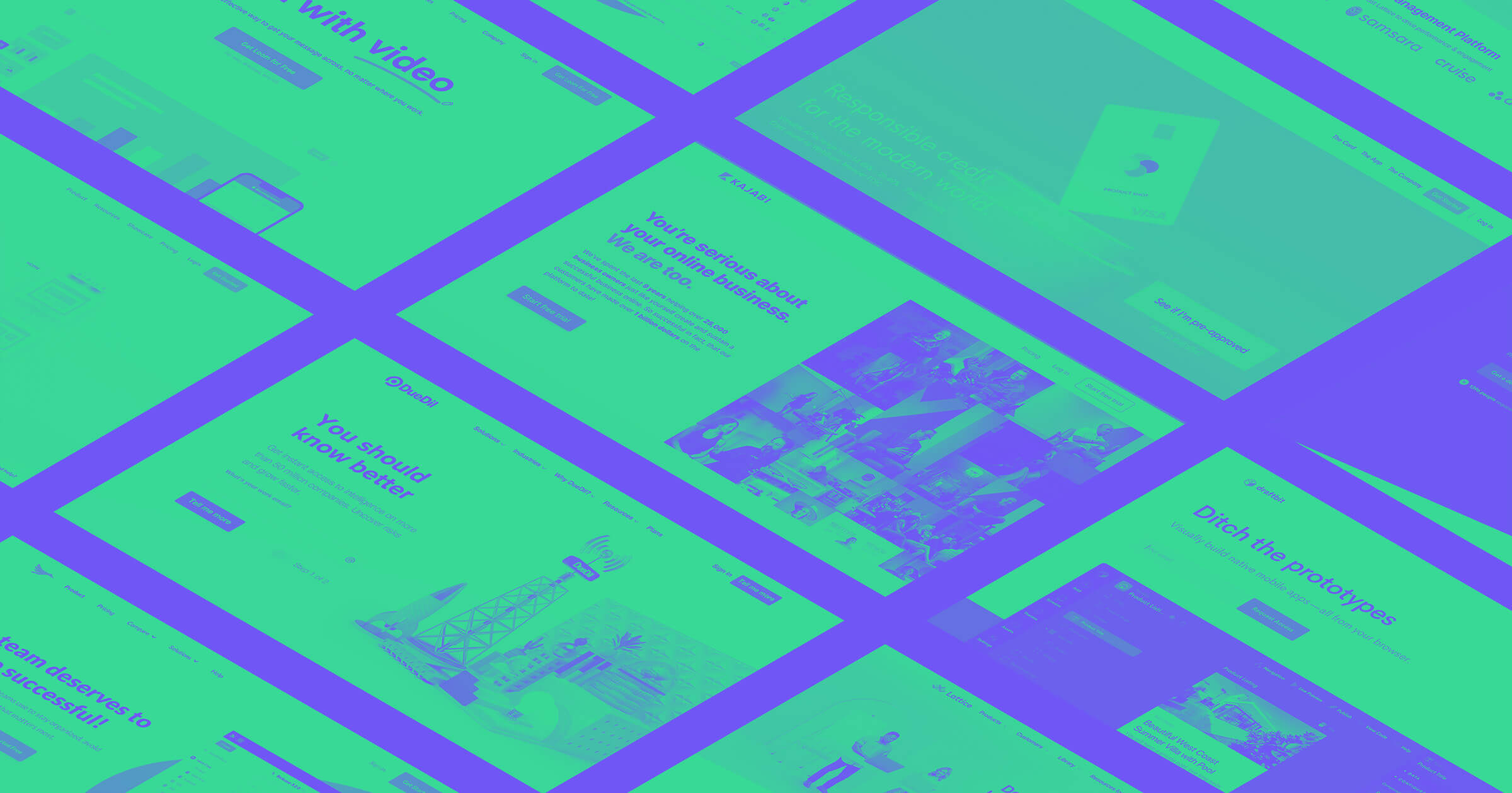
At ChartMogul, we’ve spent the last few weeks analyzing over 100 B2B SaaS landing pages to identify the top web UX design trends and conventions when selling to businesses. I want to quickly share five insights we found after countless hours of data gathering.
You can read the full SaaS landing pages study on the ChartMogul blog. There’s also a Pinterest board with full-length screenshots of the pages we analyzed — it’s a great source of inspiration and examples of what SaaS thought leaders are doing in 2017. Enjoy!
1. Content belongs everywhere
In the SaaS universe, the phrase “content is king” has been thrown around for some time. But, that hasn’t always translated into businesses giving content first-class treatment on the site — often left buried in a “blog” link in a “resources” dropdown menu item.
In 2017, content is leaking from the blog to other parts of company websites, including the landing page. An increasing number of businesses are using small sections of their landing page to highlight original content (this can include downloadable content, articles, news etc.)
The has some key positive effects:
- It keeps the landing page feeling dynamic, with fresh content shown each time they visit
- It helps position the company as a thought leader or educator in their field
- In the case of lead-generating content, it offers a fallback lead- generation mechanism other than the product signup. If a user leaves with a downloaded PDF whitepaper, that’s still a win.

2. Video has (finally) hit the mainstream
For years, vendors and marketers have been touting video as the “next big thing” to drive higher engagement on websites. This may have been the case for some time in other industries, but it’s only this year that we’re really seeing mainstream adoption of video on SaaS landing pages.
Over half of the landing pages in our analysis used some form of video.
Companies in our analysis are now putting video front and center on the page, often in the hero section. It’s quite clear that users are expected to watch the video before they do anything else on the page. We see oversized play buttons, screenshots that are actually autoplaying demo videos, and other techniques for capturing more eyeballs than is possible with static images.

Master the fundamental concepts of web design, including typography, color theory, visual design, and so much more.
Master the fundamental concepts of web design, including typography, color theory, visual design, and so much more.
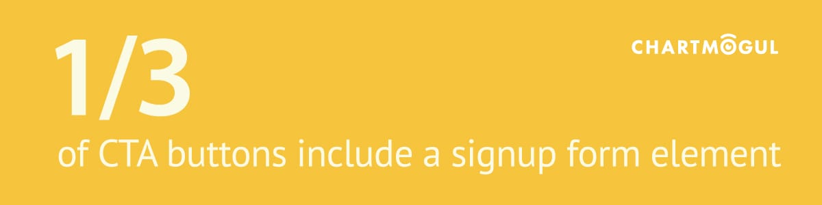
3. Inline form fields for CTAs
Historically, B2B landing pages have pursued the holy grail: a click of the call to action (CTA). This often meant stripping out any element on the page that added friction to the process of "converting."
In 2017, we’re seeing businesses taking a more considered approach to the signup flow, by including one or more form fields in the landing page alongside the CTA — this usually means the user enters at least their email, before clicking.
This is likely for a couple of reasons:
- Removes friction from the rest of the signup flow: If the next step after the landing page is filling out a giant form with multiple fields, the drop-off rate is going to be high. Adding a little bit of friction up-front removes some from the next step of the process (that is to say, it’s a trade-off).
- Captures warm leads from abandoned signups: If the user bails at any point after the first step, you’re at least left with a (very well-qualified) lead who at one point had the intention to sign up. That’s valuable!
4. Secondary CTAs catch enterprise users
Again, we see a trend that seemingly flouts the golden rule of landing pages (i.e., guide the user towards one CTA, and only one). Many businesses now add a secondary CTA, usually right next to the primary one. It often carries a bit less visual emphasis (e.g., is gray instead of blue), but it’s still quite prominent. This technique is increasingly common among companies selling to both small and enterprise-level businesses, because it supports a sales flow that’s closely linked to enterprise deals: the sales demo.
Adding a “Request Demo” CTA catches those users who are never going to sign up through your self-service flow. It’s just not how they do business — they want to be sold to.

5. Rich social proof (logos aren’t enough anymore)
It’s 2017, and regular visitors to B2B SaaS sites are becoming logo-blind. Allow me to explain.
Customer logos are the staple social proof of most enterprise businesses. They’re everywhere, and this has caused an unfortunate effect among users: We don’t pay attention to them any more. It’s the same problem ad tech companies face with display ads on the web. If you’re simply placing a row of logos on your website and hoping it’ll inspire confidence in potential leads, you need to do more.
Plus, there’s anecdotal evidence of businesses faking testimonials and displaying logos of companies who have never actually done business with the vendor. This only serves to lessen users’ trust.
In our analysis, we saw businesses’ customer stories, testimonials, and other forms of social proof front and center — in some cases, even before the product itself! Many examples of company logos included links to rich customer stories, or even videos.