Today we’re launching version 2.0 of our Homepage & Category Usability study, based on a new round of usability benchmarking of the top 50 grossing US e-commerce sites.
This benchmark has been conducted twice, first in October 2013 and then again for this most recent 2017 version 2.0 of the study. The combined Homepage & Category benchmark database now contains 7,900 navigation elements manually reviewed and scored by Baymard’s team of UX researchers, along with more than 4,500 categorized best and worst practice implementation examples from leading e-commerce sites.
In this article we’ll analyze this dataset to provide you with the current state of e-commerce Homepage & Category usability, show how it has evolved since 2013, and outline common design flaws and strategic oversights applicable to most e-commerce sites.
The Current State of E-commerce Homepage & Category UX
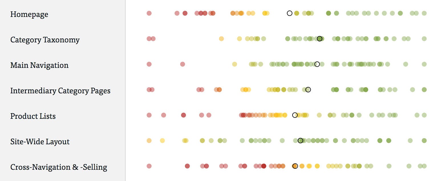
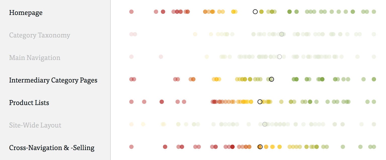
The dots are color-coded in accordance with their usability performance, with red dots indicating “poor” usability, yellow representing “acceptable,” and green “good.” The benchmark average is denoted with a back circle. (Tip: you can also browse a free interactive version of this scatterplot.)
For this analysis we’ve summarized the 3,950 usability scores for 2017 across 7 core sub-elements of the homepage and category navigational experience, and plotted the 50 benchmarked sites’ UX performance across these in the scatterplot above. Each dot therefore represents the summarized UX score of one site, across the 7-13 guidelines within that respective sub-element.
If we look at the average site’s Homepage & Category UX performance it’s surprisingly good; an impressive 28 of 50 sites have a “State of the Art” UX implementation (a performance scoring more than 1,000).
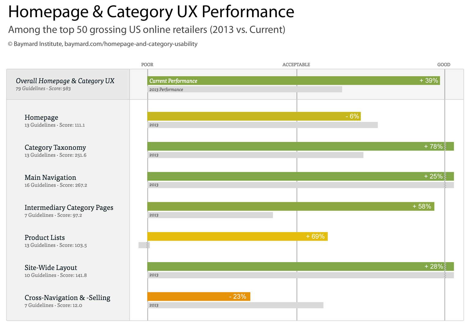
.. compared to 2013, the average site has improved their Homepage & Category UX performance by 39% ..
In comparison, in most of the other e-commerce UX studies we conduct at Baymard Institute the average UX performance is typically “mediocre” as sites suffer from massive usability issues – for instance, in our Mobile E-commerce, Product Lists & Filtering, and Checkout studies, not a single site achieves an overall “State of the Art” UX performance score.
How the average UX performance has developed since 2013 across the 7 core elements of Homepage & Category UX.
This great UX performance also shows when comparing it to the previous Homepage & Category UX benchmark. Compared to the late 2013 performance, based on UX best practices the average site has improved their overall Homepage & Category UX performance by 39% – revealing that major US e-commerce sites in the past couple of years have focused intensely on improving the UX of especially their Category Taxonomy, Main Navigation, Intermediary Category Pages, and Site-Wide Layout functionality.
However, with that said, the benchmark dataset also shows that there’s still room for improvements when looking within specific sub-elements of the user experience – such as the UX of the Homepage, Intermediary Category Pages, Product Lists, and Cross-Navigation, where there’s still some generally “missed opportunities” within the e-commerce industry as a whole. Also, note that this is an analysis of the average performance across the 50 top-selling US e-commerce sites. When analyzing a specific site there’s nearly always a handful of critical UX issues along with a larger a collection of worthwhile improvements – this is the case even when we conduct usability audits for Fortune 500 clients.
In the following we’ll provide a walkthrough of the UX performance of the 4 most interesting of the 7 sub-elements of Homepage & Category UX: Homepage, Category Taxonomy, Intermediary Category Pages, and Cross-Navigation & -Selling – outlining how they have improved since 2013, along with general issues to be aware of for each of the following topics.
Homepage UX

Within the sub-element “Homepage UX” the average site performs decently, slightly above acceptable. Behind that average is a very scattered distribution of performances, with 40% of sites performing either mediocre or poorly.
A common homepage issue is using a high amount of “banner-styled” content or newsletter overlays on page load. During usability testing we observe that the severity is closely linked to how much the content visually resembles “banner ads,” and that a poor first impression can easily permeate the rest of the user’s site experience.
Two of the most commonly observed Homepage issues are the following:
- Setting a poor first impression by placing “banner ad” looking content in primary areas of the homepage or using overlay dialogs on the homepage (typically promoting newsletter signups) – see item #4 and #5 in Avoid These 5 Types of E-Commerce Graphics. This is still an issue at 40% of all e-commerce sites, unchanged from 2013.
- Not assisting users in selecting a well-defined scope right from the homepage. This issue is observed at 60% of sites – an aspect of homepage design which has actually worsened since 2013 where “only” 44% had such issues. The decrease in homepage performance within this area can largely be isolated to the specific sub-issue of promoting narrow “deal-scopes” on the homepage, which during testing was observed to “silo” users.
Compared to 2013 the overall Homepage UX performance is one of the few sub-elements for this study where the performance has decreased, although with a modest -5%. There are however also a few bright spots when it comes to Homepage implementations since 2013:
- Users’ ability to infer the type of site they’ve landed on and its product catalog has increased, as 80% of e-commerce sites now visually feature at least 30% of their main categories among the homepage content. A topic covered in detail in Homepage Usability: Can Users Infer the Breadth of Your Product Catalog?.
- The number of e-commerce sites that use a homepage carousel has decreased from 52% in 2013 to just 32%. This is good news, because while a homepage carousel can work in theory, they in practice seldomly perfrom well, due to very a large number of usability pitfalls that are resource intensive to work your way around – as outlined in 8 UX Requirements for Designing a User-Friendly Homepage Carousel.
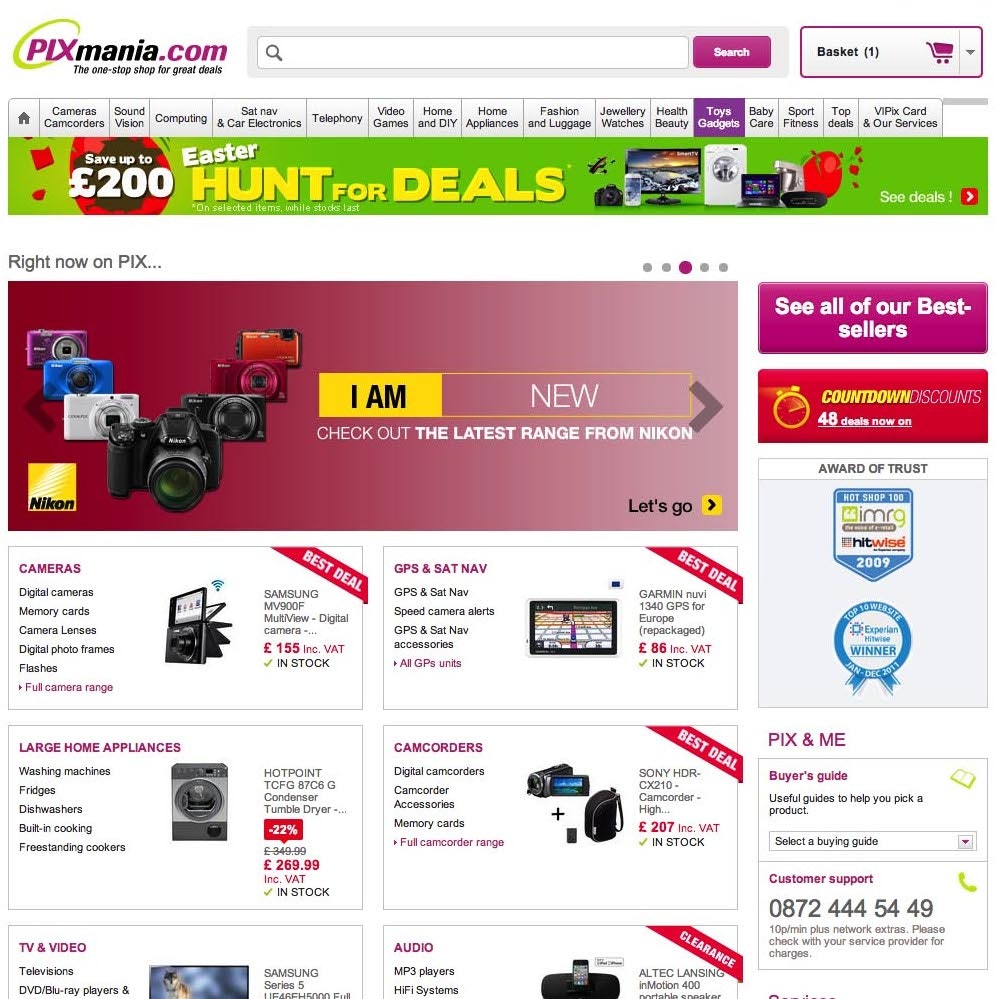
For inspiration on “State of the Art” homepage implementations, see Walmart, Sephora, and Home Depot.
Category Taxonomy

When it comes to “Category Taxonomy” the average site performance has improved a whopping 78% since 2013. Back then, 40% of sites had an overall poorly performing category taxonomy – this is now down to just 6% of e-commerce sites.
For instance, the past issue of redundant and overlapping categories, which in 2013 was an issue for 68% of sites, is now almost completely alleviated with just 12% of sites observed to have category-redundancy issues. Similar overall improvements have been observed for past issues such as “shallow parent categories” and the inability to find accessories within high-level categories – which with a 90+% compliance rate is now a bygone era at most e-commerce sites.
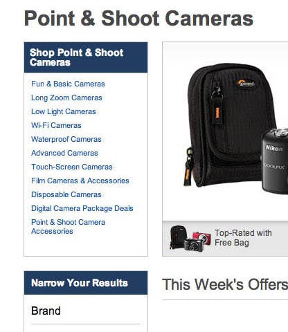
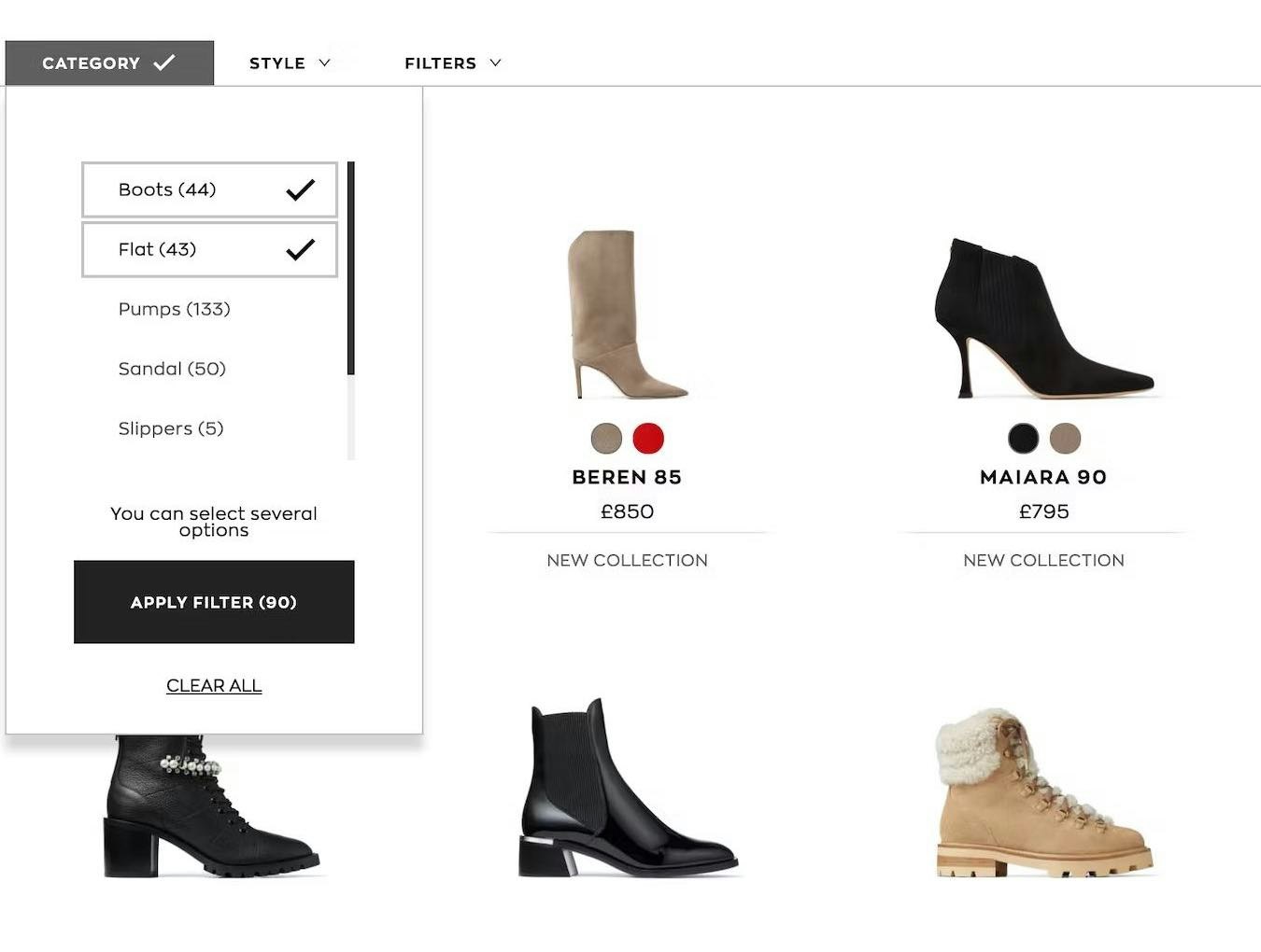
Over-categorization is still the main taxonomy issue at 54% of e-commerce sites. For example, note at Best Buy how “Point & Shoot Cameras” suffers from over-categorization as the different “camera types” are implemented sub-categories – making it impossible for users to get a list of all point & shoot cameras, forcing them to select between overly narrow and overlapping sub-categories.
While the general taxonomy performances have improved massively, the highly severe issue of over-categorization still lingers. Over-categorization, in the form of product attributes wrongly implemented as categories instead of “product-type filters,” has seen only modest improvements since 2013, when 64% of sites had issues, to now 54% of sites that still have the issue. This makes over-categorization the single most important category-based navigational improvement for the average e-commerce site – see Over-Categorization: Avoid Implementing Product Types as Categories (54% Get it Wrong).
The only sub-areas in the site taxonomy that have seen a significant performance decline since 2013 is the option to use “promoted filters” (see Consider ‘Promoting’ Important Product Filters) and having a “what’s new” category or filter – while not elements that will break the overall taxonomy performance, they are important components if the goal is to perfect it. Additionally, when sites sell compatibility-dependent items (meaning nearly all sites that sell either consumer electronics or accessories for them) it becomes important to invest resources in compatibility-based product list pages (see 6 Use Cases for Compatibility Databases on E-Commerce Sites) – something that around 30% of sites selling such products are still lacking.
Intermediary Category Pages

According to our UX statistics, 22% of major e-commerce sites still lack “Intermediary Category Pages” for (at least) the first level of their product hierarchy. This is despite our large-scale testing continuously showing that Intermediary Category Pages at the top of the hierarchy serve an important navigational purpose with their ability to properly promote sub-categories, each of which is represented by a category thumbnail, along with other auxiliary content. (For more on why this is so important see our article Implement the First 1-2 Levels of the E-Commerce Hierarchy as Intermediary Category Pages.)
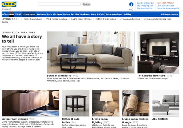
While the number of sites that use an Intermediary Category Page remains almost unchanged (78%, up from 76% in 2013), the performance of these pages has increased significantly. This is mainly due to sites, such as IKEA seen here, actively working to avoid category thumbnail ambiguity, using sub-sub-category links, avoiding sub-dividing lists of featured products, adding inspirational content, etc.
Impressively, of the 78% of sites that do have these category pages, performance has improved a massive 58% since 2013. This performance increase can be attributed to the following:
- 54% of sites (up from just 24% in 2013) now avoid misleading their users into believing the sub-category thumbnails represent specific products. Sites are simply better at indicating that the thumbnails represent a category by using one of the two design patterns we’ve verified during usability testing: (1) either heavily crop the product that the thumbnail depicts or (2) include multiple products in the thumbnail, both of which help clarify that this doesn’t represent a specific product but rather a collection of items. While this has improved, it remains the key area of improvement for Intermediary Category Page implementations in general.
- 96% of sites avoid sub-dividing featured product lists on the Intermediary Category Pages – up from 60% in 2013.
For those seeking to perfect the Intermediary Category Page implementation, consider displaying sub-sub-category links beneath each sub-category, something that 52% of sites still neglect (see prior article Sub-Sub-Category Links: a Vital Feature in E-Commerce Navigation). Additionally, inspirational content should be added to aid exploration. If the categories differ greatly in popularity, it may also be worth indicating the most popular paths by varying the category thumbnail sizes to make their visual footprints match their respective importance.
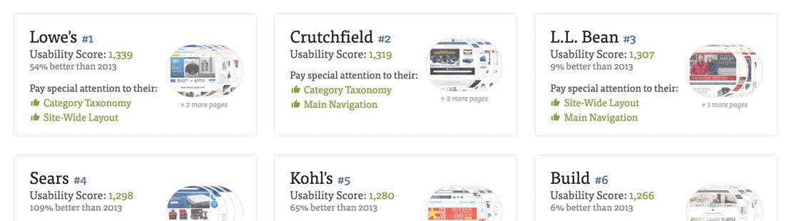
For “State of the Art” Intermediary Category Page implementations see Lowe’s, Office Depot, and Williams-Sonoma.
Cross-Navigation & -Selling

Within the topic of Cross-Navigation & -Selling, 62% of e-commerce sites have poor or mediocre performance. In fact, Cross-Navigation & -Selling is the only area where the average site’s UX performance has decreased significantly since 2013. When compared to late-2013 performance, the average site’s UX performance has decreased by 23%. This decrease can largely be attributed to two core aspects that now represent generally “missed opportunities” within the e-commerce industry:
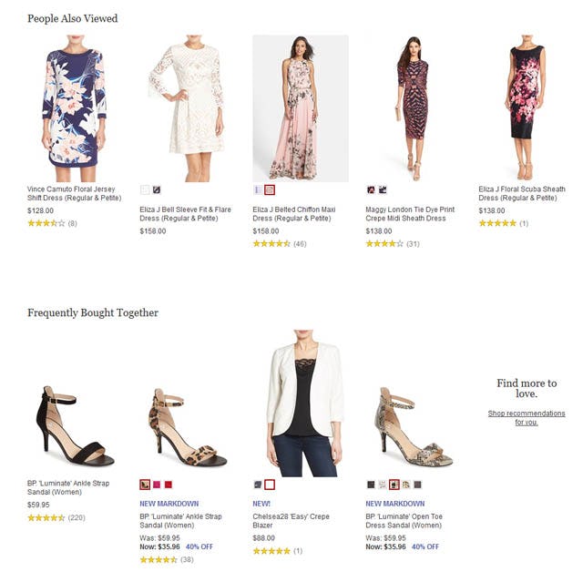
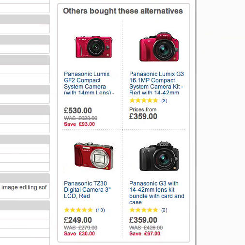
Nordstrom is among the few 22% of e-commerce sites that has separate cross-sell sections for alternative and supplementary products. Note how users on, for example, a product page for a dress, are first suggested alternative dresses, and then, in a separate section, suggested supplementary products that match the dress.
- 34% of sites lack the all-important hierarchy-based breadcrumbs, with an additional 54% of sites lacking a history-based “back” breadcrumb. This is despite the fact that the combination of history- and hierarchy-based breadcrumbs continues to perform well in large-scale usability testing – as it allows both powerful cross-navigation via scope jumping and ensures filtering persistence for the product list – as detailed in E-Commerce Sites Need 2 Types of Breadcrumbs.
- A massive 16% of sites do not provide any cross-sells, 10% rely only on “social” cross-sells like “users also viewed/purchased,” and an additional 52% only provide cross-sell sections that suggest either supplementary or alternative products. Or put differently, just a small fraction of sites provide their users with the highly powerful cross-navigation achieved from having two separate cross-sell sections: one section for suggesting supplementary products (like accessories) and another separate section for suggesting alternative products. This concept is explored in detail in Product Page Usability: Recommend Both Alternative & Supplementary Products.
For inspiration, sites with generally excellent Cross-Navigation performance are Cabela’s, Home Depot, and Wayfair.
Homepage & Category UX
While average performances are up 39% for the Homepage & Category navigational experience, individual sites still have room for important site-specific improvements.
For inspiration on other sites’ implementations and to see how they perform, head to the publicly available part of the Homepage & Category benchmark. Here you can browse the 50 benchmarked sites and compare their 2013 designs and UX performances against their current designs and UX performance.
You can also freely navigate the benchmarked sites by type of page, for instance viewing 50 design examples of “Main navigation,” “Homepages,” etc.
Note to Baymard customers: All customers that have purchased “Full Access” to the Homepage & Category study in the past can access the updated version of the study by signing into their Baymard Pro account). This update expands the “Full Access” content with 50 new report pages (with new state-of-the-art implementation examples), along with a benchmark database that now has 4,500 categorized best- and worst-practice examples, and 50 new UX performance scorecards with Year-Over-Year comparisons.
All ongoing website audits will be delivered using the new UX performance scoring.