Yotspot

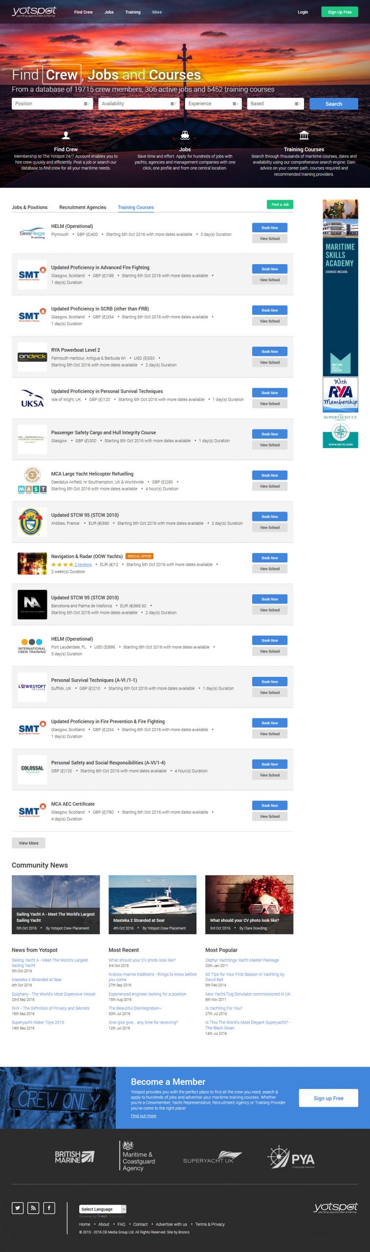
Note : Since this case study was written Yotspot has undergone numerous changes, including a new homepage design. You can read more about this here.
On first appearances Yotspot may look like any other job board tailored to a particulare niche; in this case Yachting. But over the years it’s grown to provide both crew and employers with a wealth of features that marks Yotspot as a leader within their market.
Background
Bronco first began working with Yotspot in 2010 helping them create the first version of the Yotspot website. Even at launch the website was loaded with features; the most unique of these being the crew matching system which ranks job applicants on how well they met the different criteria of the job advertised.

Over the following 5 years numerous other features (recruitment agencies, career paths, training courses) have been added and refined to make the website an even greater resource for it’s users. At the same time as new features have launched small design changes have been made to update the look of the website. These have mostly centered on the homepage with smaller changes made elsewhere, however large parts of the website have gone unchanged since launch.

Responsive Update
Even though Responsive Web Design has become the standard way to build almost any new website we still have a number of clients whose websites were last updated before the inception of responsive design; Yotspot are one such client. So in 2015 Yotspot approached us about converting their site to become responsive.
At Bronco our position has always been that it’s best to start with a new design when builidng a responsive site rather than attempt to convert what already exists. To do otherwise often means the opportunity for growth is diminshed as the original design hasn’t been built in a way that considers the various challenges of designing for different devices and screen sizes.
This is especially true of a website like Yotspot that is the size and age it is. Through a full redesign we could deliver something that is far better for the users and will provide a more solid base for future developments.
Responsive isn’t solely about screen sizes either as the devices those screens appear on are just as important. For example, it’s great to deliver a website that fits more suitably on a mobile device but if that website is loading slowly when that mobile device is on a poor data connection all the design improvements in the world won’t make for a good user experience.
Given the industry Yotspot serve it’s clear to understand that they serve a worldwide audience; on both land and sea. They have users in some of the most remote places where hard wired Internet just isn’t possible. So when redesigning the site we had to take extra care to make sure the website is as fast as possible too.
What a difference 6 years makes
When you look back at a site you designed and built a number of years ago you cringe at the things you had to do to achieve a particular effect; something that is often far simpler to achieve now.
Take for example the buttons on the old Yotspot design. These employed a range of effects and gradients as well as a non-standard webfont which all resulted in the decision to create these as individual images. A technique that was barely acceptable just 6 years ago is most certainly a rareity now.
Later design updates adopted a more flat style (as seen in the 2015 screenshot) in addition to @font-face to allow us to create buttons faster and edit the text far more easily in future. The downside to this was the website displaying two styles of buttons in addition to any other incremental changes in the design that occur over such a time period.
With a growing Frankensteins Monster of design styles a reset was needed to bring some order back to the website.
Taking cues from web apps
When approaching the redesign we divided the site into four main templates:
- Home page
- Website pages
- Application pages
- Crew profile page
While the design within the first two templates are similar each template would be formed around pages that felt distinct from the rest of the website but similar to it’s grouped siblings. Of course all would adopt an overarching design style that would permiate through all pages but each template would look distinctly different from one another.
The biggest change from the old website was the application pages. Given the My Account, and some public pages, are more focused on a user achieveing a known goal we took inspiration from a number of web applications that take a more minimal approach to design in order to negate distracting the user from completing a specific task.

The biggest casualty of this approach was colour and imagery. In the old design each page would include an image within the header and the page overall would look far more colourful. In the new site we dropped (almost) all imagery that did not serve a valid purpose or increase user understanding and then used colour primarily to highlight specific controls to guide the user through any particular process. While this creates a more stark page with lots of white it does focus the user towards specific elements which we wish them to use in order to complete specific tasks.

In addition to this we wanted to create greater harmony between different sections of the website rather than have too much custom styling. While this can mean some information isn’t as obvious as it maybe could be it does provide a familarity as the user moves through all the pages.

Our goal was to do as much as possible with as little code as possible, creating modular elements that could work throughout the website and cleaning up the account pages to put the functionality front and center.
A visual shop front
While the application pages are more stark and action orientated it was still necessary to have pages that were more delightful and visually interesting. This style of page would cover some of the more traditional website pages such as About, Contact and FAQ’s but also our Membership Options pages that would be focused on communicating the benefits of a Yotspot account to new users.

Stack
While many developers will argue that replacing standard form elements is bad, myself included the implementation of the <select> input element on the iPhone is terrible as it will cut off any long text strings.

To combat this and also plug a few other holes such as browsers that don’t yet support the custom <date> input we created a JavaScript plugin that we called Stack. It’s main purpose is to ensure that the user can see the entire contents of an <option> tag and not be frustrated by the alternative.

Yotspot is the first website where we’ve used it as widely as we have and thankfully there have been no issues since launch. Yet our hope is that at some point this plugin will become unnecessary as the default form controls improve, especially on the iPhone.
The result
The result is the responsive redesign of one of the most complex websites we manage. Launched in Q1 2016 the client was quickly tasking us with the next run of features they wanted to add after a positive reception from their users.
Our goal is that the users will enjoy an experience that allows them to achieve their goals much faster no matter the device they’re using and their location in the world, and that our client benefits from this through increased customers and revenue.
Share this case study
Like what you’ve read, then why not tell others about it... they might enjoy it too