
It is hard to argue that the adoption of mobile devices hasn’t exploded with popularity. Most searches are being performed on mobile devices, with more searches expected to continue on mobile.
Mobile is not only important for organic performance but for conversions from all types of traffic including email and paid channels. It is important to understand your mobile traffic to focus on the channels that convert the most on those devices. For some websites, mobile devices might bring in the majority of your traffic but the conversions might not be as high as desktop searches, because of less focus on the mobile experience.
Today, most websites are built with a responsive design to help make it mobile friendly, but that doesn’t mean marketers should stop there. Instead, marketers should optimize the entire mobile experience to enhance conversions and overall performance. To help you out, we built a list of actionable tips to make sure your site is mobile friendly from three categories: SEO for mobile devices, mobile content, and mobile conversions.
Mobile SEO Tactics
#1 – Choosing the right mobile website setup
When choosing your website setup, make sure you understand what mobile design you want. There are three main types of mobile sites including:
- Responsive design
- Dynamic site
- Mobile only site (m.example.com)
Google recommends using a responsive design for your website to help make sure it is mobile friendly, but any option works when done correctly.
TopRank Marketing tip: Analyze your audience to understand what the best option is for your site. Not all sites need to have a responsive design, considering a mobile only site can be tailored to your mobile audience easier in some cases.
#2 – Test your site for mobile friendliness
There are multiple ways to test if your site is mobile friendly including the Google Usability Test, Google Search Console report, and Chrome Developer tools. Use multiple tools to be sure that your mobile site is rendering correctly instead of assuming that your site is mobile friendly.
TopRank Marketing tip: Use the Chrome Developer Tools to get a better idea of how your website looks like on certain devices by selecting the “inspect” element. Then in the bottom left-hand corner, select the button that looks like a mobile device (see below).
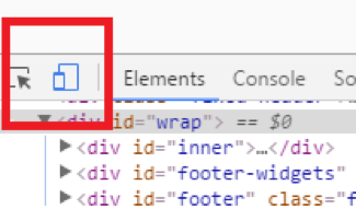
The screenshot below shows the look on a mobile device. You can choose between a responsive site by pixel size or actual mobile phones by selecting the drop down at the top of the screen.

#3 – Optimize your metadata
Mobile SERPs (search engine results page) have less real estate for organic listings than desktop SERPs. It is important to understand the search landscape and SERP space available to market yourself over your competitors.
TopRank Marketing tip: Keep your title tags shorter and more concise to avoid your title tags being cut off in the SERP. It is best practice to keep your title tags under, at least, 70 characters for your title tags.
#4 – Optimize for mobile keywords
Have you ever conducted a search with a “near me” signifier attached to it? Near me searches are increasing and doubled in 2015 for all types of users, but especially for mobile users. Mobile keywords can also include more voice queries that people conduct with their phones.
TopRank Marketing tip: Make sure you conduct keyword research for mobile users and target mobile keywords. The search intent of a keyword query can vary based on the device people use so optimizing for all types of keywords will help increase your visibility.
#5 – Content for mobile devices
There are multiple types of content that should be considered when creating content for mobile users and your audience. Most marketers are already considering the type of content to write for their website on the attract, engage, convert model, but there sometimes is a lack of focus on mobile consumption habits. Mobile consumption habits can change depending on the industry, so it is important to consider how your audience interacts with your website.
TopRank Marketing tip: If you are are sending email campaigns, consider your audience’s mobile consumption habits. Most emails are consumed on mobile devices (see below). Create all your content that you are promoting via your email or social media channels to be mobile friendly.
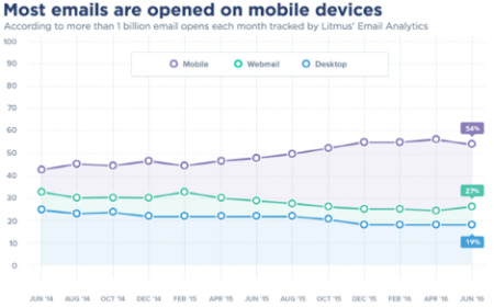
Image via: cdn.emailtoday.com
#6 – Geotargeting on your mobile app
If you have a larger audience that uses your mobile app, you might want to consider geotargeting the users when they are close to a storefront, event, or at a specific location. Geotargeting is a great way to encourage action from your audience when they are located in the right areas at the right time.
TopRank Marketing tip: Consider using different imagery and messaging for users in different locations when they are using your app or website. Also, consider sending notifications to mobile app users to entice action when they are at a physical location.
Mobile Content Creation
#1 – Consider the content length and types
Consider the length and type of content you are creating for your audience, both on mobile and desktop. As we already covered, there typically is a difference in search intent for users on mobile devices compared to desktop computers. With that in mind, you need to be customer-focused and analyze where your audience is within the funnel for your content assets.
TopRank Marketing tip: Develop audience personas to understand the way your audience searches online. Personas can be a powerful tool when creating content for your website.
#2 – Make sure to communicate the value quickly
It is important to communicate your value clearly and quickly to mobile users. Often, banners sometimes push the value proportion below the fold, which may increase the amount of bounces on the page and confuse users where they are on your website.
TopRank Marketing tip: Reduce the amount of unnecessary space or elements on your mobile device to only include what is needed. Less is often more when you are dealing with the limited amount of space on a mobile device.
#3 – App optimization
Mobile websites are a must for your online strategy, but apps can provide even a better user experience. Not all companies need to develop and create a mobile app, but for the ones that do, you need to optimize those experiences. Apps should be tailored to solving the user’s problem or creating an unique experience.
TopRank Marketing tip: Optimize your app for the user experience to solve your audience’s problem. After you create your app, make sure you optimize your App store listing to increase your visibility on other channels.
#4 – QR codes
QR codes are another solid tactic to add to the dedicated mobile experience. When used correctly, you can push users directly to a location easily with QR codes on psychical flyers or other traditional marketing materials.
TopRank Marketing tip: Test using QR codes on physical marketing materials to push people to a section online with their mobile phones that offers an experience dedicated to them.
#5 – SMS messaging
SMS messaging is a way to help you get in front of more of your audience via messaging apps. SMS messaging can be a powerful tool to send notifications to your audience that opted in to encourage specific actions or enhance customer experience.
TopRank Marketing tip: Make your messages personal to help encourage action. Also, make sure to include a clear CTA within the message to see the most value out of your campaign.
Mobile Conversions
#1 – Manually audit your layout on your responsive design
Your site might not be mobile friendly even though it might have a responsive design. A responsive site is typically better than a non-mobile site but sometimes issues can still arise. Some issues we typically see are videos not formatted to the correct screen size, the layout pushes the content below the fold, or the font size is too small.
There could be a vast majority of other issues with a responsive design, so make sure you optimize the layout of each page type.
TopRank Marketing tip: Look at what screen size is being utilized the most on your website within Google Analytics. Navigate in your Google Analytics dashboard to go to Audience ? Mobile ? Overview ? Screen Size to quickly analyze what screen size to optimize for first.
#2 – Consider your thumb reach
Make sure you consider the thumb reach to encourage action on your mobile design. Making your users reach and work out their thumb can create friction and a low-quality user experience.
TopRank Marketing tip: Make your CTAs within a thumbs reach to improve conversions. Also, consider using sticky headers to help mobile users navigate quickly through your site.
#3 – Site speed
Site speed has become more important as a ranking factor for search engines, and rightly so. A fast loading site helps provide a solid user experience and can help increase the crawl rate of the site by search engines. All marketers should be focusing on site speed as a priority item. Below are some tools to test your site speed:
TopRank Marketing tip: Test your mobile site with multiple different tools to get a holistic view on site speed aspects. Prioritize the site speed items to get the most ROI from the work instead of optimizing for every site speed item.
#4 – Image optimization
Similarly to site speed, optimizing images will help site speed and user experience. A responsive site often uses the same image that is not probably sized for each device screen.
TopRank Marketing tip: Use different image sizes that can be used at different viewports to pull in images that are the correct size for the device.
#5 – Form Optimization
Congratulations! Someone has decided to start filling out a form on your site. That is a great goal to accomplish, but nothing is more disappointing than losing that user after they choose to abandon the form. Optimizing your forms for mobile users is a great way to increase conversions.
TopRank Marketing tip: Adjust the type of the keyboard for mobile users to use the right one for the form fields. For example, use the keyword field to show numbers for phone number fields and a different keyboard for email fields.
Your Optimized Mobile Experience
Above are some actionable tactics that you might want to optimize for your mobile website. There are even more areas and opportunities to optimize on your mobile website than listed above. If you’d like to find out if your website passes the mobile test, contact us today to receive a mobile optimization audit.


