How users who made a purchase on your website behaved differently than the users who abandoned your shopping cart?
Both user segments had the intention to make a purchase on your website. But one user segment chose to proceed with the checkout, the other choose to abandon your website.
What can you do to reduce shopping cart abandonment?
Why did customers who came from the Valentines’ day campaign behave differently than the customers who bought at other times of the year? What was their average order value?
Did they spend more money on the website? If yes then how we can bring more users like them for other times of the year.
When is the best time to re-engage with your users? When is the best time for remarketing?
What is the rate at which you should acquire new users to maintain (if not increase) your website conversion rate?
Through cohort analysis, you can get answers to such questions.
We talk about user engagement all the time. But we rarely discuss user disengagement.
User disengagement occurs when a user starts visiting your website less often, spend less time on your website, complete fewer goal conversions, generate little to no sales, unsubscribe from your newsletter and eventually fade into oblivion.
User disengagement is the harsh reality of your online business. No matter what you do to retain your customers/subscribers/users, sooner or later they will move on.
If you send email newsletters to your subscribers, you know that you are going to lose some email subscribers with each new newsletter. The bigger your subscribers base, the more subscribers you are going to lose with each new newsletter. I have seen businesses losing hundreds of subscribers with each new newsletter.
I lose up to a dozen subscribers and sometimes even more with each new email newsletter. That used to hurt but after seeing the same pattern over and over again for so many businesses who do email marketing, I now have come to the conclusion that “user churn” is “normal”.
In the world of constantly changing technology (which gives rise to better alternatives), the emergence of new and powerful competitors and globalization it is just a matter of time and timing when you may end up losing your customer/newsletter subscriber/user for good.
Just look at MySpace. It used to be the top social networking website before Facebook came and took over.
While you can not completely stop user disengagement from occurring, you can certainly reduce the disengagement rate.
By focusing on user disengagement you can effectively reduce your customers/users’ attrition (also known as churn) and re-engage with them before it is too late.
You need to do a lot more than re-engage with existing users. You also need to constantly find new users.
While it is good to have returning users, you need a lot more new users and that too all the time because the majority of users eventually disengaged (visit your website less often, complete fewer conversions, generate fewer sales, etc) from your website and become less profitable over time for no apparent reason.
While I lose up to dozen or more subscribers with each new newsletter, I also at the same time gain new subscribers which are 5 to 10 times more than the subscribers I lost. So eventually I am gaining more subscribers with each new newsletter. This should be the case with every business.
MySpace lost to Facebook because it failed to acquire new users. It failed to innovate in a timely manner, so it also lost existing users.
So not only you need to constantly find new ways to re-engage with your existing users but you also need a constant flow of new users to compensate for the users lost over time and to maintain (if not increase) your website conversion rate.
You should not stop acquiring new traffic at any point and become content with the existing traffic, no matter how much traffic you are currently getting. That would be like signing your own death warrant.
The Cohort Analysis report in Google Analytics is all about user disengagement. It is all about attrition. It is all about the dreaded ‘churn’.
Understanding Cohorts
A cohort is a group/segment of users who showed common characteristics, attributes, or experience in a particular time frame.
The characteristics/attributes of users are time-bound because the same users can show different characteristics in different time periods.
For example, a user may buy product X in Jan but buy product Y in Feb or a user may visit your website on Monday via Laptop but visit your website on Tuesday via smartphone.
Google Analytics defines users’ characteristics/attributes in its reports through dimensions (primary and secondary dimensions) like traffic source, country, city, keyword, product, product category, etc.
All users who visited your website from a particular country belong to the same ‘country’ cohort.
All users who bought a product, say product X, belong to the ‘product X’ cohort.
All users who visited your website for the first time, say on Feb 6, 2015, belong to the ‘Feb 6, 2015’ cohort.
A user can be a member of multiple cohorts at the same time depending upon how you segment and interpret the data.
For example, a user who visited your website from the UK via Google Organic Search on February 14 and bought product X is a member of the following cohorts:
UK cohort – users of your website from the UK
Google traffic cohort – users who visited your website from Google
Search traffic cohort – users who visited your website via search engine listing.
Organic search traffic cohort – users who visited your website via organic search engine listing.
February cohort – users who visited your website in February
February 14 cohort – users who visited your website on February 14
This report (still in beta) is available under the Audience menu of your GA view:
You can analyze cohort behavior through any Google Analytics report.
But the one report which has been specially developed for analyzing cohort behavior of users is the cohort analysis report.
This report is especially useful in understanding the behaviour of different cohorts in response to time-sensitive/short term marketing campaigns like Christmas sales, cyber Monday, tv/radio ads, new email campaigns, etc.
Understanding ‘Cohort Type’ in the Cohort Analysis Report
Cohort type is the dimension that characterizes the cohorts. You can select only one cohort type at a time.
Use the Cohort Type menu to select a dimension:
At present only one cohort type is available in the Cohort Analysis ‘ report which is ‘Acquisition Date‘.
Consequently, through the cohort analysis report, you can analyse the behaviour of only one type of cohort i.e. the group of users with the same acquisition date.
Acquisition date is the date when users started their very first session on your website.
For example:
Day 0 => the day on which users started their very first session on your website. Also known as acquisition date.
Day 1 => the first day after the acquisition date.
Day 2 => the second day after the acquisition date.
Day 3 => the third day after the acquisition date.
Day 4 => the fourth day after the acquisition date.
Understanding ‘Cohort Size’ in the Cohort Analysis Report
Cohort size is the size of the selected cohort.
The value of the cohort size depends upon the cohort type selected.
At present only one cohort type is available in the Cohort Analysis ‘ report which is ‘Acquisition Date’.
So cohort size has been defined only in terms of time frame (by day, by week, by month):
As Google rolls out more cohort types, the list of available cohort sizes is probably going to increase.
Cohort type: acquisition date; Cohort size by day => all users who were acquired on the same day.
Cohort type: acquisition date; Cohort size by week => all users who were acquired during the same week.
Cohort type: acquisition date; Cohort size by Month => all users who were acquired during the same month.
Understanding ‘Metric’ in the Cohort Analysis Report
All the metrics in the cohort analysis report have been divided into 3 categories: ‘Per user’, ‘Retention’, ‘Total’:
Each category contains several metrics. Only the ‘Retention’ category contains just one metric called the ‘User Retention’.
User retention is the percentage of users in a cohort who returned in the Nth day, week, or month.
For example, the percentage of users in a cohort who returned in the 2nd day or percentage of users in the cohort who returned on the 3rd day.
User Retention = number of users in a cohort who returned in the Nth day, week or month / total number of users in the cohort
Note: ‘User Retention’ is the default metric in the cohort analysis report and you can only analyse one metric at a time in this report.
Understanding ‘Date Range’ in the Cohort Analysis Report
Date Range is the time period for which the cohort data should be displayed.
The value of the date range depends upon the ‘cohort size’ selected:
For example if the ‘cohort size’ is ‘by day’ then the value of ‘data range’ could be set to any one of the following:
Last 7 days
Last 14 days
Last 21 days
Last 30 days
Similarly, if the ‘cohort size’ is ‘by month’ then the value of the ‘date range’ could be set to any one of the following:
Last month
Last 2 months
Last 3 months
Interpreting the Cohort Chart
The cohort chart is a line chart that shows the cumulative metric values for the selected cohorts.
You can configure this chart through what Google called the ‘N selected menu’:
Through the menu you can select and compare up to 4 cohorts on the cohort chart:
You can apply up to 4 advanced segments (both default and custom) to the Cohort analysis report and these advanced segments are reflected in the Cohort Chart:
Interpreting the Cohort Data Table
Just below the cohort chart, you can see the cohort data table:
Each row in the cohort table represents a cohort.
‘Jan 31, 2015’ is the first cohort. It contains 4,845 users.
‘Feb 1, 2015’ is the second cohort. It contains 4,781 users.
‘Feb 2, 2015’ is the third cohort. It contains 8,546 users.
The date range you select decides the number of rows/cohorts in the data table. For example, if you select ‘Last 7 days’ as the date range then the data table would contain 8 rows.
The first row or the top row shows the total or average value of all the cohorts for each column. The remaining 7 rows show data for each cohort.
Similarly, if you select ‘Last 30 days’ as the date range then the data table would contain 31 rows. The first/ top row shows the total or average value of all the cohorts for each column. The remaining 30 rows show data for each cohort.
Each column in the Cohort Data table represents cohort size: one day/week/month of data.
The data table contains a fixed number of columns which is 13.
Each cell in the cohort data table contains the value of the metric you selected through the ‘metric’ menu.
For example, if you selected pageviews metric then each cell would contain the total number of pageviews per cohort per time increment.
If you selected ‘session duration’ metric then each cell would contain session duration per cohort per time increment:
The colour intensity in each cell visually indicates the magnitude of the metric value relative to other values in the cohort.
Here I have applied ‘cart abandonment’ ecommerce segment to the cohort report in order to understand when and where do these users disengaged and when and how I should re-market to them.
From the report above I can conclude that majority of users who abandoned the shopping cart do not engage with the website again. Not even 1 day after the acquisition date.
So I have less than 24 hours to re-target them with a new offer and increase my chances of getting the sales.
I also know from the report above that the users who came directly, engaged with my website a bit longer after abandoning their shopping cart.
You can get a similar insight through your cohort report and e-commerce segments.
Cohort Analysis and Data Sampling Issues
I have noticed that the cohort analysis report suffers from data sampling issues much more than any other GA report esp. when I apply advanced segments to it. I am not sure why.
It is a well-known fact that the use of advanced segments creates data sampling issues.
So if you run a high traffic website (10k sessions or more a day) and you do not use Google Analytics premium then avoid applying advanced segments to the cohort analysis report.
The advanced segments can greatly skew your cohort data. Instead, look at the cohort analysis report in a filtered view.
By default, Google Analytics can not track users across devices/browsers as client ID can exist only on the device/browser where it has been set. In a user ID view, you can get a better user count.
Consequently, your cohort analysis is going to be more accurate when done via the user id view.
You may have noticed it by now, that Google Analytics’ cohort analysis is still in its infancy and doesn’t provide the level of cohort analysis you may need to do.
If you want to do better and more cohort analysis then you also need to use other analytics tools like Kissmetric, RJ metrics, Tableau, ‘R’ etc which provide robust cohort analysis capabilities.
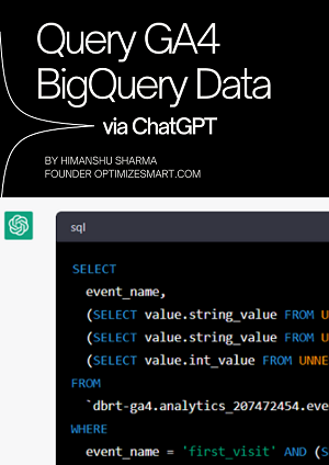
Get weekly practical tips on GA4 and/or BigQuery to accurately track and read your analytics data.
My best selling books on Digital Analytics and Conversion Optimization
Maths and Stats for Web Analytics and Conversion Optimization
This expert guide will teach you how to leverage the knowledge of maths and statistics in order to accurately interpret data and take actions, which can quickly improve the bottom-line of your online business.
Master the Essentials of Email Marketing Analytics
This book focuses solely on the ‘analytics’ that power your email marketing optimization program and will help you dramatically reduce your cost per acquisition and increase marketing ROI by tracking the performance of the various KPIs and metrics used for email marketing.
Attribution Modelling in Google Analytics and BeyondSECOND EDITION OUT NOW!
Attribution modelling is the process of determining the most effective marketing channels for investment. This book has been written to help you implement attribution modelling. It will teach you how to leverage the knowledge of attribution modelling in order to allocate marketing budget and understand buying behaviour.
Attribution Modelling in Google Ads and Facebook
This book has been written to help you implement attribution modelling in Google Ads (Google AdWords) and Facebook. It will teach you, how to leverage the knowledge of attribution modelling in order to understand the customer purchasing journey and determine the most effective marketing channels for investment.
About the Author
Himanshu Sharma
Founder, OptimizeSmart.com
Over 15 years of experience in digital analytics and marketing
Author of four best-selling books on digital analytics and conversion optimization
Nominated for Digital Analytics Association Awards for Excellence
Runs one of the most popular blogs in the world on digital analytics
Consultant to countless small and big businesses over the decade
We use cookies on our website to give you the most relevant experience by remembering your preferences and repeat visits. By clicking “Accept All”, you consent to the use of all the cookies.
This website uses cookies to improve your experience while you navigate through the website. Out of these, the cookies that are categorized as necessary are stored on your browser as they are essential for the working of basic functionalities of the website. We also use third-party cookies that help us analyze and understand how you use this website. These cookies will be stored in your browser only with your consent. You also have the option to opt-out of these cookies. But opting out of some of these cookies may affect your browsing experience.
Necessary cookies are absolutely essential for the website to function properly. These cookies ensure basic functionalities and security features of the website, anonymously.
Cookie
Duration
Description
cookielawinfo-checkbox-analytics
11 months
This cookie is set by GDPR Cookie Consent plugin. The cookie is used to store the user consent for the cookies in the category "Analytics".
cookielawinfo-checkbox-functional
11 months
The cookie is set by GDPR cookie consent to record the user consent for the cookies in the category "Functional".
cookielawinfo-checkbox-necessary
11 months
This cookie is set by GDPR Cookie Consent plugin. The cookies is used to store the user consent for the cookies in the category "Necessary".
cookielawinfo-checkbox-others
11 months
This cookie is set by GDPR Cookie Consent plugin. The cookie is used to store the user consent for the cookies in the category "Other.
cookielawinfo-checkbox-performance
11 months
This cookie is set by GDPR Cookie Consent plugin. The cookie is used to store the user consent for the cookies in the category "Performance".
viewed_cookie_policy
11 months
The cookie is set by the GDPR Cookie Consent plugin and is used to store whether or not user has consented to the use of cookies. It does not store any personal data.
Functional cookies help to perform certain functionalities like sharing the content of the website on social media platforms, collect feedbacks, and other third-party features.
Performance cookies are used to understand and analyze the key performance indexes of the website which helps in delivering a better user experience for the visitors.
Advertisement cookies are used to provide visitors with relevant ads and marketing campaigns. These cookies track visitors across websites and collect information to provide customized ads.
Analytical cookies are used to understand how visitors interact with the website. These cookies help provide information on metrics the number of visitors, bounce rate, traffic source, etc.