How To SEO-Proof Your Mobile Site For Google

Last Updated Jun 25, 2019
Last Updated Jun 25, 2019
Do you know what an eponym is?
Here’s a hint. If you needed to blow your nose, what would you ask me for a facial tissue?
No, because that’s weird. You’d ask for a Kleenex.
But here’s the thing. Kleenex is a brand. The thing you’re blowing your nose with is a facial tissue, but it’s easier to say Kleenex. So an eponym is when you commonly refer to something by a name other than their normal name.

Like Aaron or whatever his name is from accounting
Though marketers call it something different. For us, it’s called total domination. Supplanting something’s name with your brand? Congrats, you’re now the most important player in that space forever.
So when someone asks you to look something up, what do you say?
“Let me Google that quick.”
You don’t say Bing. You don’t say Ask Jeeves unless you’re some ironic hipster. You say Google, because they are the most important player in the search engine game.
And when they make a change, you’re committing website suicide if you don’t pay attention and change with them.
Guess what? They’re making a few big changes that could sink your site into nothingness.
Let me remind you of something. 65% of searches come from using Google. They effectively control the amount of traffic to your site. Hell, one of our guides has over 100,000 searches this year just from Google.
But did you know 60% of all searches come from a mobile device? This year marked the first time mobile overtook desktop in searches.
So follow me with some SAT logic:
Google is a search engine
More searches happen on mobile than desktop
The majority of searches occur on Google
You see where this is going.
Google is getting serious about the mobile experience.
Here’s what I mean. Google wants you to easily find the content you’re looking for on your mobile device. If things take forever to load on your phone or don’t show up at all, that’s a bad experience. Google doesn’t want you to have a bad experience.
That means they’re going to bury sites that don’t have a great mobile experience. And since over 90% of clicks happen on the first page of a search result, living on page two is like living in Wyoming -- you technically exist, but no one will ever visit you.

Fun fact: the most populated city in Wyoming is whatever rest stop you’re currently at
To make sure only the best sites rise to the top of rankings, Google is changing two fundamental ways they score sites.
And boy oh boy, they’re pretty monumental.
Click here to get our Mobile SEO bundle (FREE)
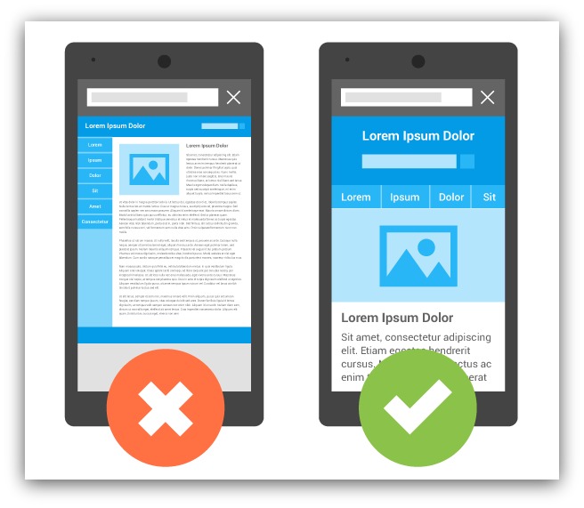
For a lot of you, the last time you heard the word “interstitial” might’ve been at the doctor and it may have ended rather poorly. So seeing this word may make you clench up a smidge.
Here’s what Google describes an interstitial as in their big SEO announcement:
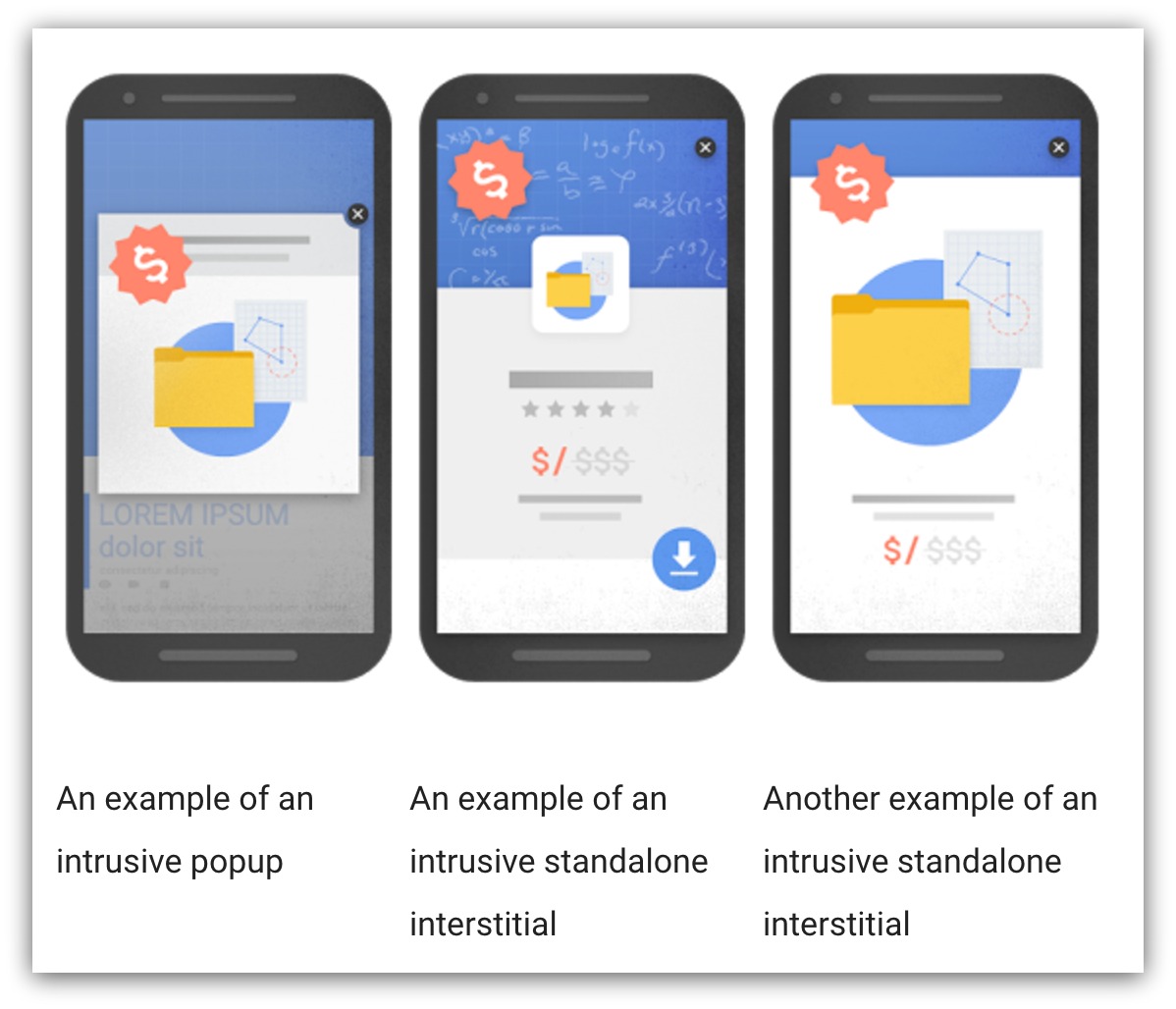
“Although the majority of pages now have text and content on the page that is readable without zooming, we’ve recently seen many examples where these pages show intrusive interstitials to users. While the underlying content is present on the page and available to be indexed by Google, content may be visually obscured by an interstitial. This can frustrate users because they are unable to easily access the content that they were expecting when they tapped on the search result.
Pages that show intrusive interstitials provide a poorer experience to users than other pages where content is immediately accessible. This can be problematic on mobile devices where screens are often smaller. To improve the mobile search experience, pages where content is not easily accessible to a user on the transition from the mobile search results may not rank as highly.
Here are some examples of techniques that make content less accessible to a user:
Interstitials, in Google’s mind? They’re talking about aggressive email-capture tools on mobile.
They made this handy little image to explain it a little more:
I know what a lot of you are thinking right now. “DOWN WITH THE POPUPS ON MY SITE” you might say as you furiously delete your popups faster than you deleted your search history when you were 16 years old.
You don’t want to do that. And here’s three reasons why.
Let’s get real deep and meta for a second. You’re reading this article because Google (an entity you don’t control) changed something that will affect how much traffic you get to your site.
Doesn’t it feel like a hassle when a major driver of traffic and sales to your site suddenly changes the rules and you feel powerless?
Think about all the ways you drive traffic to your site. How many do you actually control:
Social Media (Twitter, YouTube, Facebook, Reddit, Etc.) - Nope. All these sites change their rules all the time. And if they go down, you lose those connections.
Paid Advertising - If an ad vendor shuts down or ups their prices, you’re stuck looking elsewhere or paying even more.
Affiliates - Affiliates are great, but they could ask for more money or their business could tank. Then you lose that audience.
SEO - HAHAHA….oh man. SEO changes every few months it seems. That’s why you’re on this guide, isn’t it? You definitely can’t control this.
But email? You control email no matter what. No one can take your email list away from you, and you can send mail to your audience whenever you want.
You need email capture tools to consistently build that email list. When you shut off your tools, you shut off control of your marketing.
You like money, right? If you have a business, you probably enjoy seeing money go in your bank account.
Google is a business, too. Did you know in 2015 they made $75 billion? It’s not too surprising, seeing as they have their own line of phones, self-driving cars and a bunch of new cool stuff that’ll change our world.
Oh wait. I forgot to mention $67 billion of that money came from Google AdWords and AdSense -- their paid advertising solutions.
For how innovative Google is, 89% of their business still relies on you spending money to advertise on their sites.
Here’s the sad truth. This SEO change by Google will scare some people into deleting their list building tools. Once you cut off your email list, you become more and more reliant on the traffic from Google’s paid solutions.
That’s great for Google...but bad for you. Instead of sending free traffic to your site, you have to pay Google and hope this mysterious audience visits your site. Google will undoubtedly make money from this change.
However, YOU don’t have to give in and sacrifice time, money and your email list.
Why? It’s all because of this next reason…
Funny story. Obviously, Sumo is an email-capture company, so this Google SEO change is relevant to us. But you know what our VP of Engineering said when I forwarded this news to him in August?
“Huh? Interesting.”
And then the engineering team hunkered down like badasses and created a bunch of new ways to comply with Google AND still collect email addresses.

The darkness aids them in their quest for cyber-perfection
They made changes in a few months that would cripple other companies. And here’s how you can use some of these tools to laugh in Google’s face (and build a massive email list).
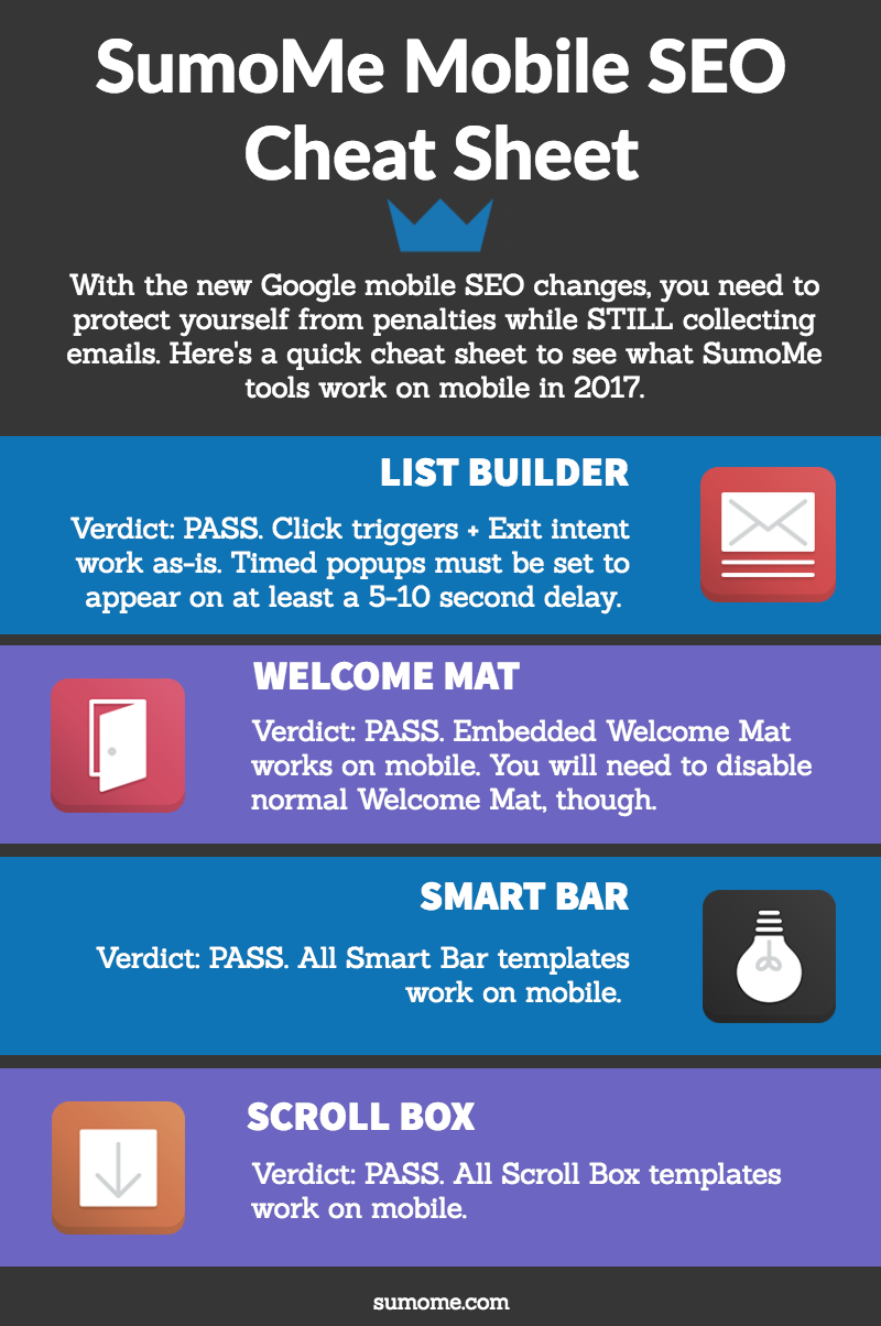
Did you know most list building tools take an “all or nothing” approach?
You either create a popup and it shows on mobile and desktop OR you don’t create the popup at all.
We’re not fans of that. All the list building tools in Sumo give you the option to show your popup on any device you want.
Let’s say you’re not ready to create specific popups for mobile (more on that in a bit). You could simply go into your tools and say “Don’t show my popup on mobile.”
Now, you don’t have to worry about your popups showing up on mobile (and Google penalizing you). With the click of a button, your popups only show up on desktop devices.
I don’t suggest doing this long-term (seeing as you’ll miss HALF of your traffic). But if you need a quick fix while you sort everything out, this works like a charm.
Click triggers is the highest converting tactic we use on this blog. We see upwards of 60-70% conversion rates with click triggers, and they completely fall within the accepted standards of Google’s new mobile SEO rules.
A click trigger is just a popup that appears only when someone clicks a button or link. Instead of the popup appearing after a specific time, the click trigger only shows when someone chooses to see your offer.
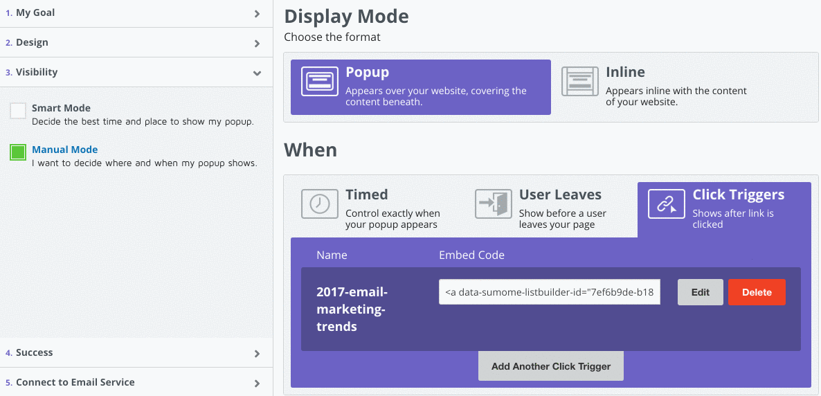
For example, data-sumome-listbuilder-id="fcc79294-e55b-430d-a645-207ddc3b5bfa">click this link. That’s a click trigger. That popup will only show if you click that link. Since it doesn’t show automatically when you loaded this page, Google gives it the thumbs up on mobile.
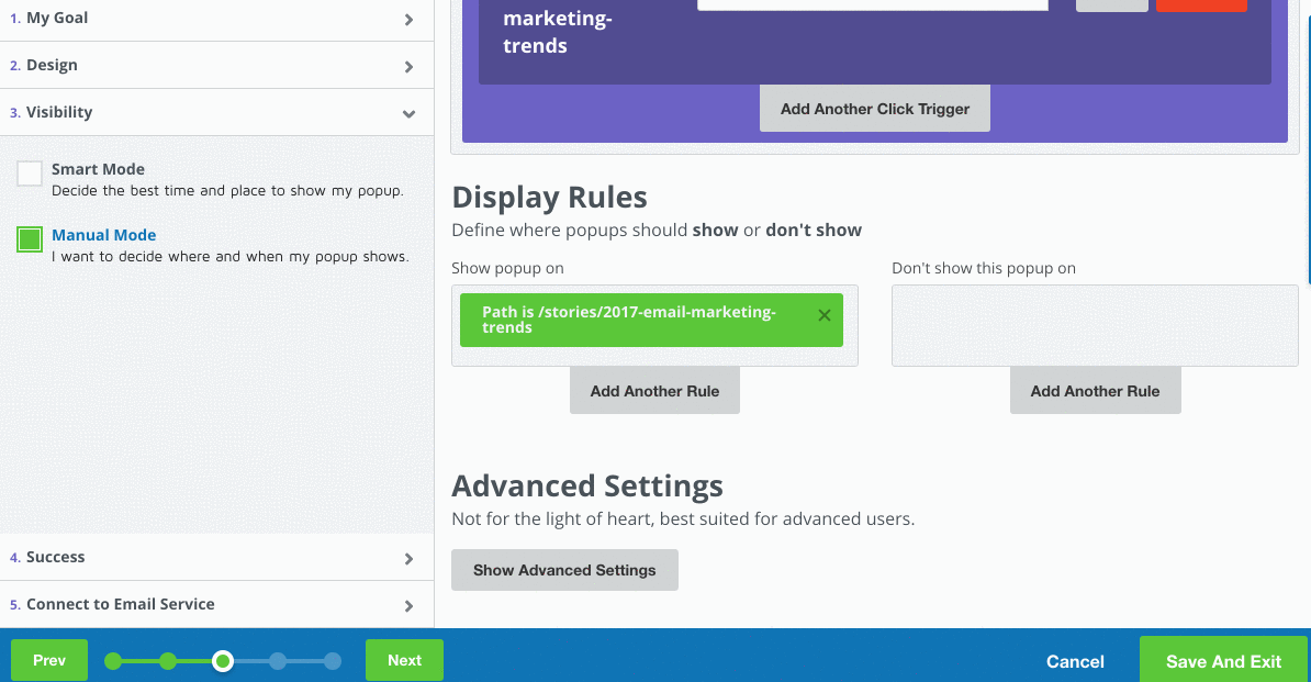
To create one, you simply make a normal popup in List Builder (if you don’t use it, try it for free), but in the “Visibility” section you select “Click Trigger”
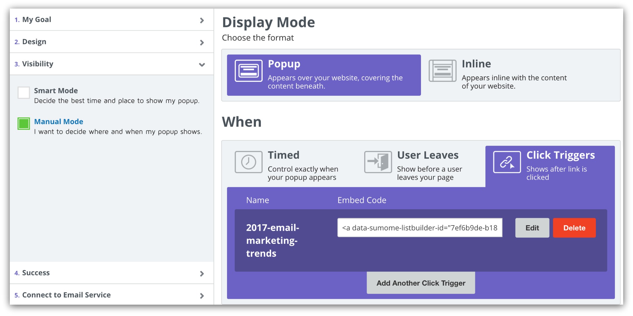
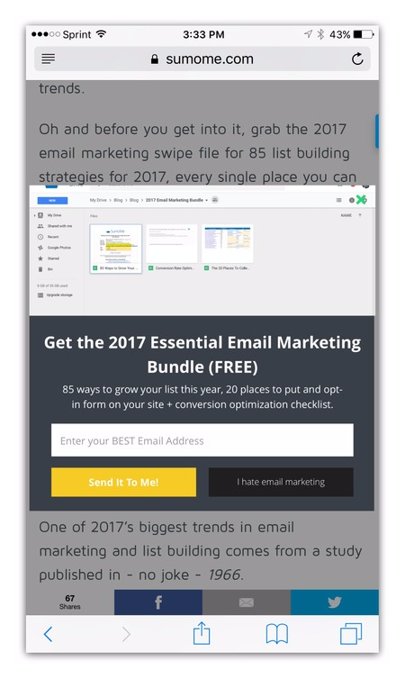
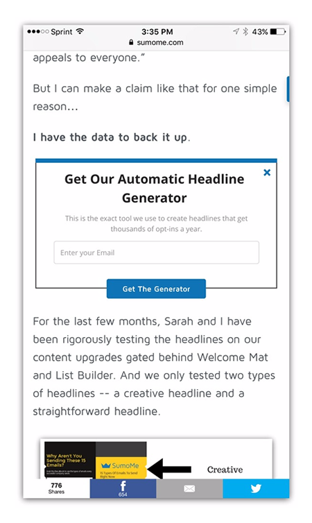
See that link? It works like a regular hyperlink. You just link a word, phrase, image or button with that code and your popup will appear when someone clicks the link. Here’s how it looks on mobile:
Not only does it convert well, but it works the same on mobile and desktop. Set it and forget about it.
This is the newer, cooler cousin of the click trigger. Ever wonder how blogs get those cool in-page signups:
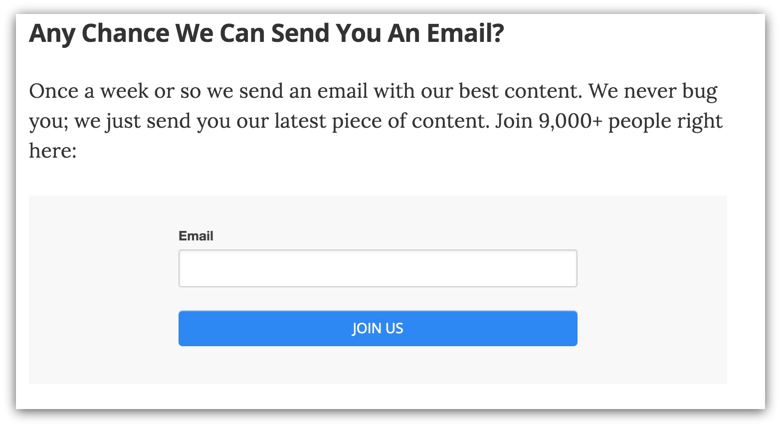
That email form is right in the body of the blog post. Seems like it takes some technical know-how to pull off, but it doesn’t.
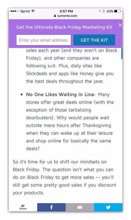
This is called an embedded popup and Google thinks it’s super mobile-friendly. To create one, head into List Builder to make a popup (surprise). BUT, instead of making it a click trigger, you set it as “Inline”:
You take that little snippet of code and paste into the body of your blog post wherever you want it to show up. It looks like this after you hit publish:
Now, instead of clicking a link or having a popup appear automatically, this popup seems like it was part of your blog post all along.
NOTE: You can do the exact same thing with our Welcome Mat tool for a bigger, more visual embedded option.
If popups have never been your thing and you want a more simplistic option, Smart Bar is an easy email capture solution that sits at the top of your page:
It’s completely non-intrusive, only showing up when you first load the page and when you scroll up. Plus, it’s another tool that scales directly to mobile:
It takes five minutes to set up and run. That’s faster than you or I can run a mile.
Scroll Box isn't your average popup. What makes it super cool is when it pops up.
Instead of timing your popup based on how long someone is on a page, you can actually set the popup to appear after a certain percentage of the page is read.
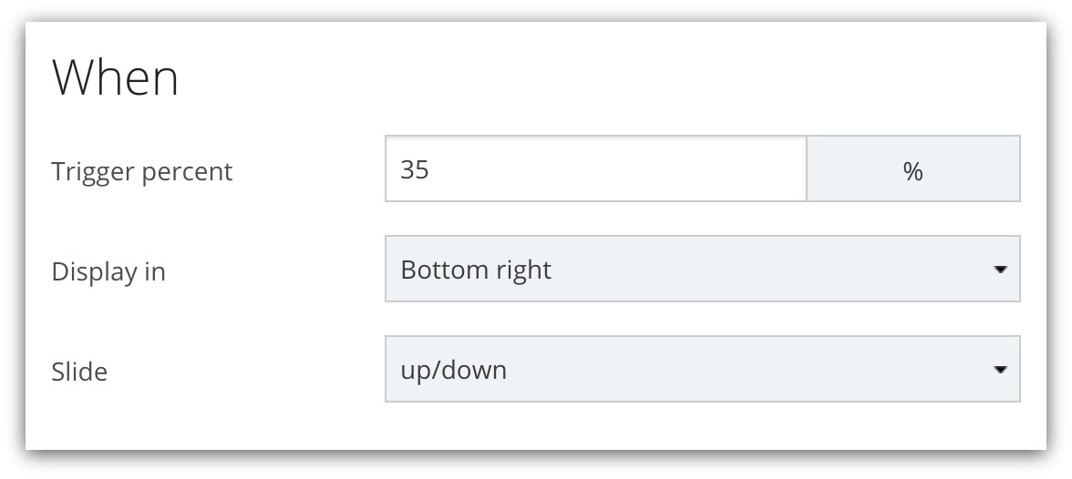
Since the popup doesn't appear right when the page loads, this falls under direct Google compliance. And it scales to mobile automatically:
Every one of these solutions is Google-approved and works on any mobile site. If you’re using any other list building tools NOT named Sumo, make sure you ask them if they’re mobile-compliant.
If not, you could see your visitors and sales numbers drop when Google drops you in the rankings. Remember, you can try out any of the options I showed you just now for free by clicking here.
Deep breaths. Don’t freak out. Everything is going to be alright.
This is a really big change. Since the inception of Google, how your site looked and functioned on desktop was the only thing that mattered. It was only recently (mid-2016) that Google made “mobile-friendly” a bigger ranking factor.
But it was only a factor. Small but powerful, like one of the other hundreds of ranking factors.
Then this announcement came out:
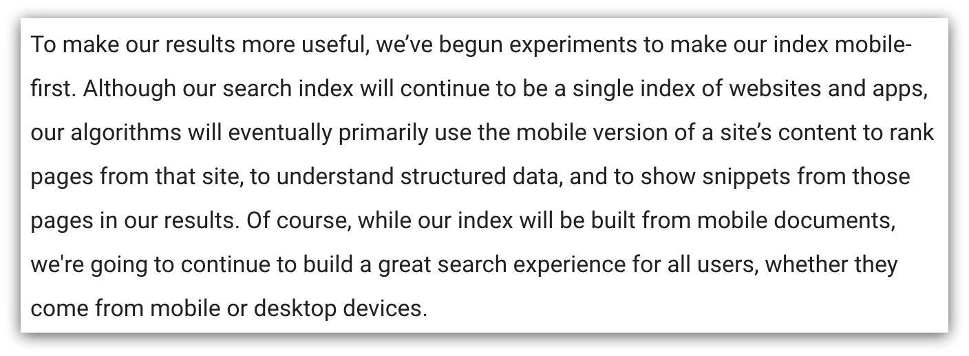
In the span of six months, Google switched from mobile-friendly being merely a search factor and turned it into a primary ranking factor.
They’re calling this “mobile-first indexing.” Basically, instead of seeing your site through a desktop version, they’re going to see your site as if it only existed on mobile.
Open your site on your phone right now. How long did it take to load? Does it look like something only an ant could read? Are images not showing up? Are you even missing pages?
If so, your site is going down the rankings. It doesn’t matter how optimized your site looks on a computer. If it doesn’t work great on mobile, it’s dropping like a stone.
To quote M. Night Shyamalan after watching any of his movies, “You may have questions.”
If those questions revolve around really technical aspects of this switch, I’d suggest checking out this great piece on Search Engine Land that’s basically an FAQ answering those technical questions.
But for the majority of us, we’ll operate under the assumption you have one massive question -- how do I know if my site is mobile-optimized and what steps do I need to take to Make My Site Great Again™?
Like anything, you need to start with an inventory of your site. Because nothing is worse than dropping tens of thousands of dollars on a developer when your site is already mobile-friendly.

Luckily, a lot of this stuff is easy to do and takes maybe 10 minutes to check.
Google Mobile tests are easy. All you do is send me $10 and I…
Kidding. The good folks at Google don’t want you to guess, and they don’t want you to get conflicting opinions from independent developers (or wildly unqualified writers). They built a tool that’ll give you a quick yes or no if your site mobile friendly.
To simplify this down, it’s just checking the design of your site on mobile. They don’t want your site to look too small on mobile because you won’t be able to read or click anything. And they don’t want it too big because you’d have to swipe left and right to see everything (this isn’t Tinder, y’all).
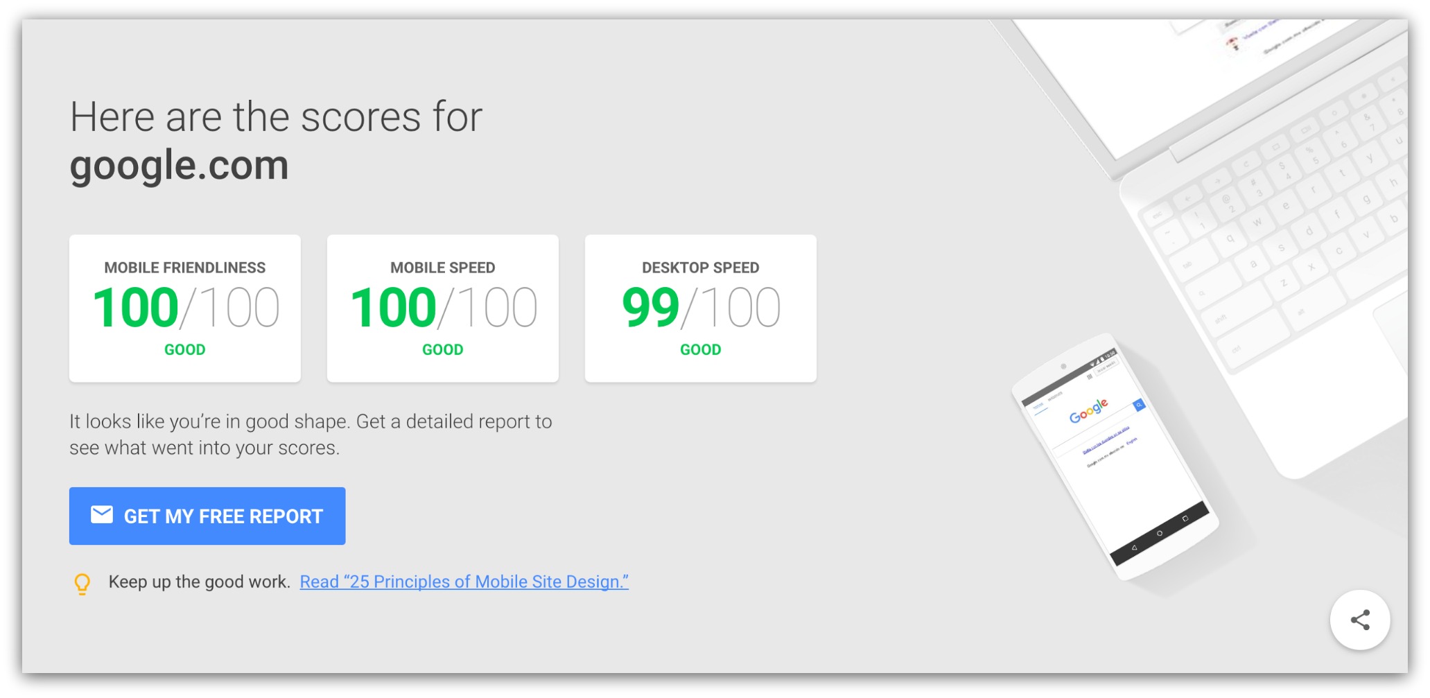
When you go to the tool, you’ll enter your URL. Google does some magic Wizard of Oz stuff behind the curtains and comes back with a response. If your site looks fine on a mobile device, you see this screen:
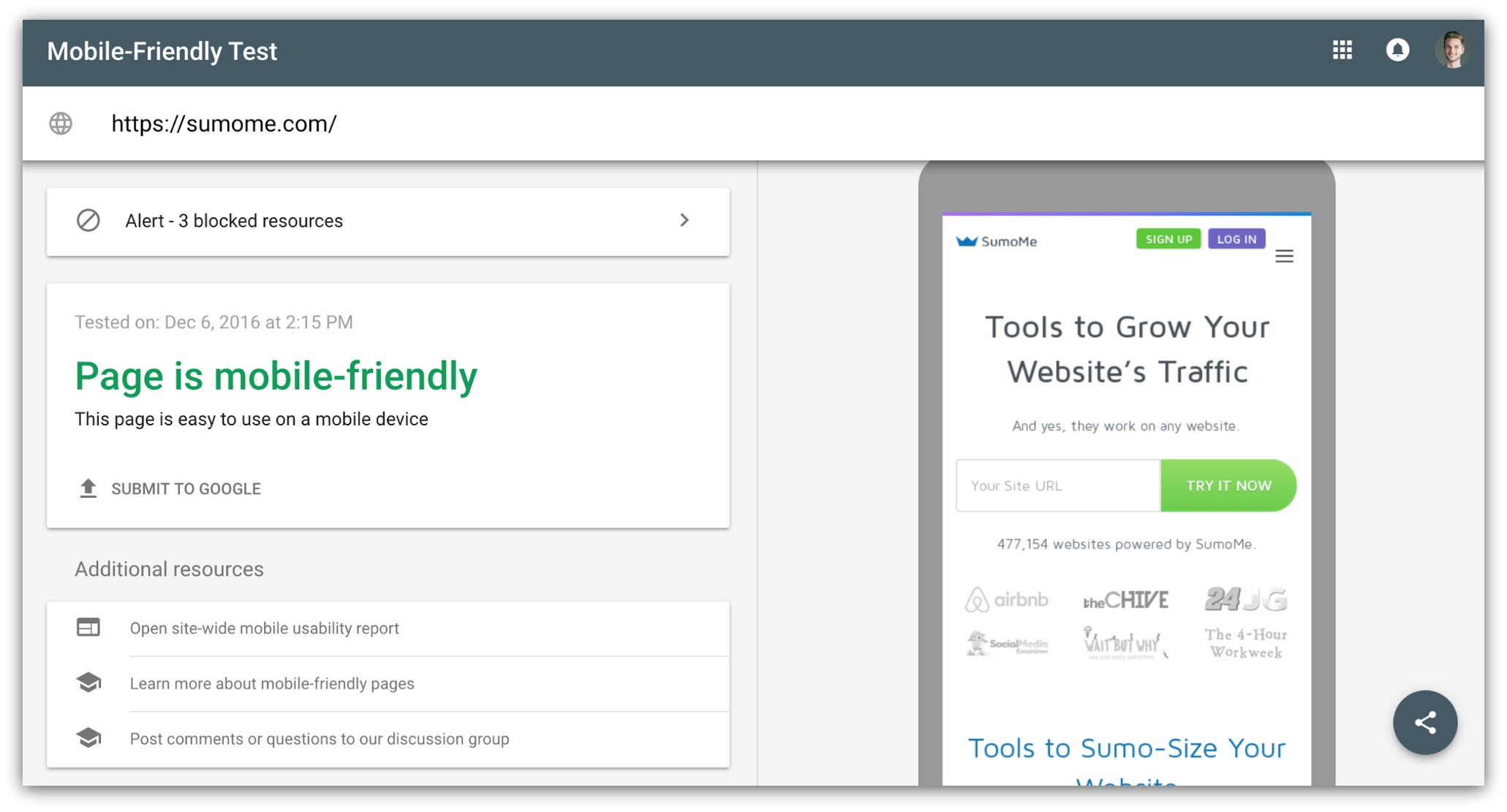
They give us the green light and show what our site looks like on a mobile device. Nothing is squeezed, you only have to scroll up or down and the buttons are easy to access.
On the flip side, if your site isn’t mobile friendly, it’ll look like this:
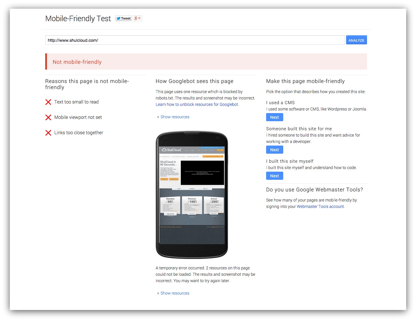
They’ll give you a few design-related reasons why your site didn’t pass, and they’ll show the page on a mobile device.
If this happens to your page, you need to consult a developer. This might seem like a simple test because it spits out a yes or no, but it’s the first thing you need to fix if you want your site to be mobile friendly.
A developer will help you fix your CSS and HTML to make your site responsive. This is the hardest and, most likely, expensive thing to fix on your site. But it needs to get right before you do anything else.
If your site passes the test, you move to the next most important criteria of mobile optimization…
Jimmy Johns, please don’t sue me. I’m just a fan of your “Freaky Fast” line. It was either that or this:

Name the movie
Substitute “America” for “Google” and you basically know how Google feels about site speed -- the faster you load, the better you’ll rank.
And it makes sense. How long do you wait for a site to load before you close out and go to a different site? Five seconds? Ten, if you’re some sort of monk?
Nearly half of web users expect a site to load in two seconds or less, and they tend to abandon a site that isn’t loaded within three seconds.
Speed matters. So you need to use the Google Speed Tool to see exactly how long it takes for your site to load. If your site is already blazing-fast, it looks like this:
Oh look, Google’s site passed. How shocking.
But, if you’re a normal site with some flaws, your test could look like this:
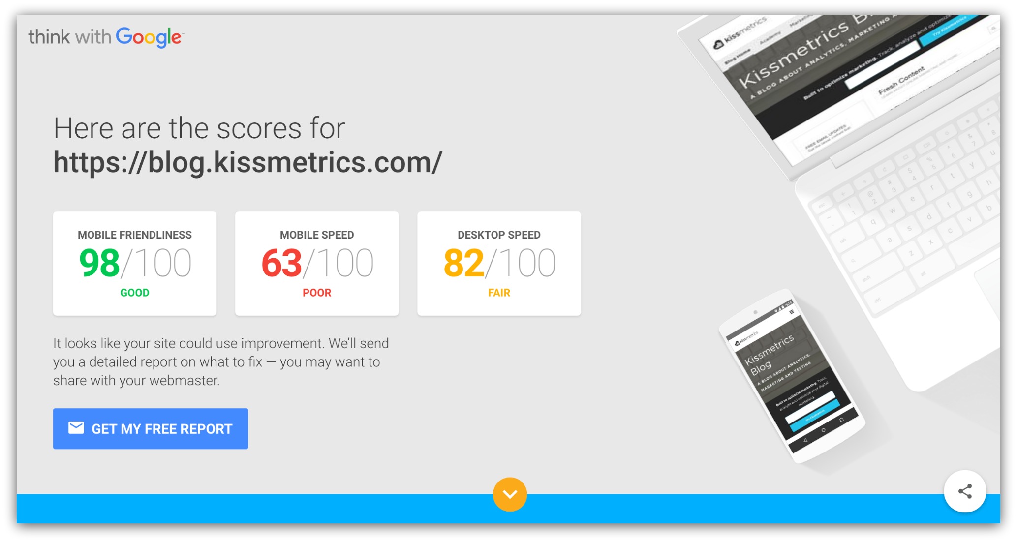
If you don’t pass a certain aspect -- be it mobile or desktop speed -- Google will give you suggestions on how to fix that certain area:
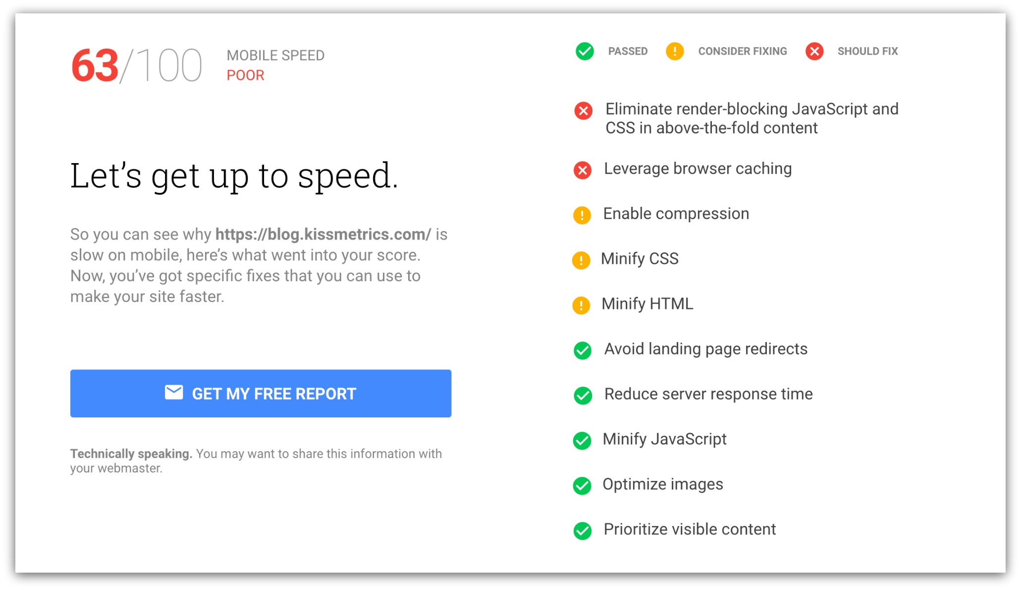
Once you fix those suggestions, your site should be supa dupa fast.
Remember: The faster your site, the less people will leave. The less people leave, the higher your site ranks. The higher your site ranks, the more people visit your site every day.
If you passed the mobile-friendly test and you have a great mobile speed score, you can most likely call your site good to go.
BUT, if you’re a thorough person that wants the peace of mind knowing something is done 100% correctly, you need to spend a few minutes on this step.
What we’re doing is seeing what your pages look like as Google on your mobile device. This helps you see if any of these things are missing:
Menus
Links
Content
Pages
Images
Nothing is more embarassing than someone visiting one of your most important pages and the mobile version looks completely different than the desktop version. If your site is older or you built a separate mobile-specific site, the chances of this are higher than you think.
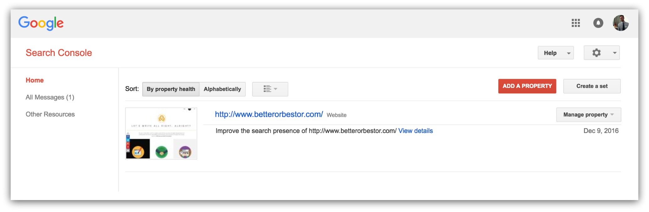
Go into your Google Search Console and click on your site (aka your property). If you don’t see a site listed here, you need to set it up quick by clicking on the “Add A Property” button (don’t worry, it takes five minutes to set up):
Then you go to “Crawl” and select “Fetch as Google.” You’ll see this screen:
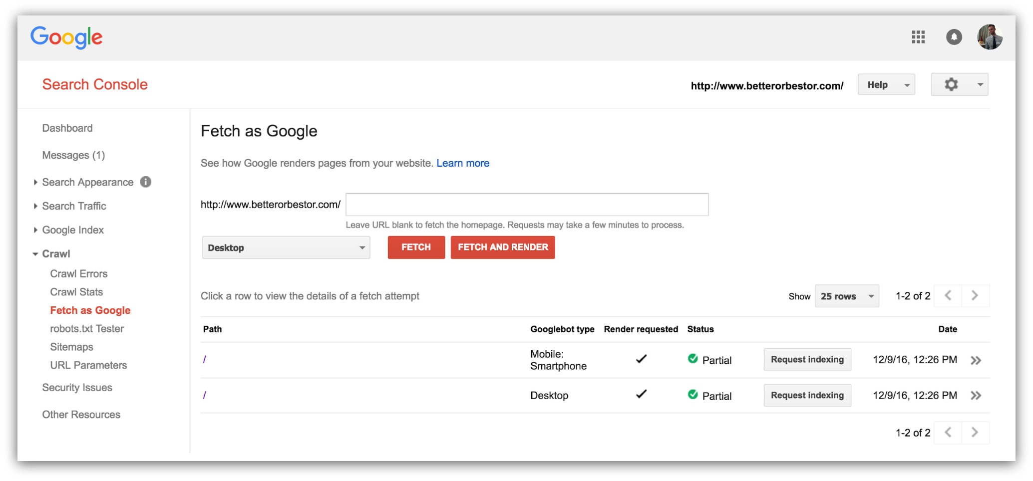
This tool will let you see your site on a mobile device through the eyes of Google and your visitors. Find the 5-10 most important pages on your site and plug them into the URL field.
In the dropdown next to the “Fetch” button, make sure you select “Mobile/Smartphone.” Then click “Fetch and Render.”
Your page will show up with two mobile windows: one is how Google sees your page, the other how visitors see your page:
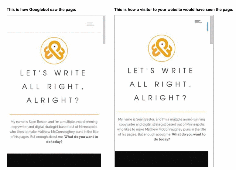
Between the two, there are no differences (which is great). None of my elements are missing from the page and everything appears to work fine.
If you do see things missing, you’ll need to work with a developer to fix the HTML and CSS on your page. Chances are, your mobile site might have certain style elements hidden on accident or purpose.
However, you can breathe a nerdy sigh of relief if your mobile site passes these three checkpoints. Passing means your site shouldn’t take any ranking hits. High fives, y’all.
The worst thing in the world would be reading this guide and watching your rankings go down because you accidentally missed a step.
Luckily, I’ve got you covered. I put together our Sumo Mobile SEO Bundle to help you rank like a badass. This bundle has everything:
Grab this free bundle to get a leg up on your competition.
Comments