Manager-level reporting: how we automate the process
Andrew Marritt
CEO of OrganizationView - AI powered Employee Voice & People Analytics
There was a call a few months ago that those in People Analytics should share more details on how they do their analysis / work. I hope that this is a valuable contribution to that body.
We’ve been doing manager-level reporting since starting OrganizationView almost 7 years ago. Hand-crafting standardized presentations is a time-consuming process and one fraught with potential for errors. Hence we’ve always used technology to automate the process.
What started as automation of slide packs has evolved into the automation of infographics. These days more and more of our clients are using our interactive reporting but given we work with businesses heavily involved in retail or manufacturing where most employees don’t have access to company communications technology printed reports are still needed. In fact we found out recently that one client distributes the reports by pinning the infographics to the toilet-room doors!
I’ll take the example of how we do printed reports from Workometry, our text-centric employee feedback tool. As we’re working for large, global firms we’re often having to produce thousands of individual reports very quickly after a feedback session is finished. Often this means producing reports in multiple languages.
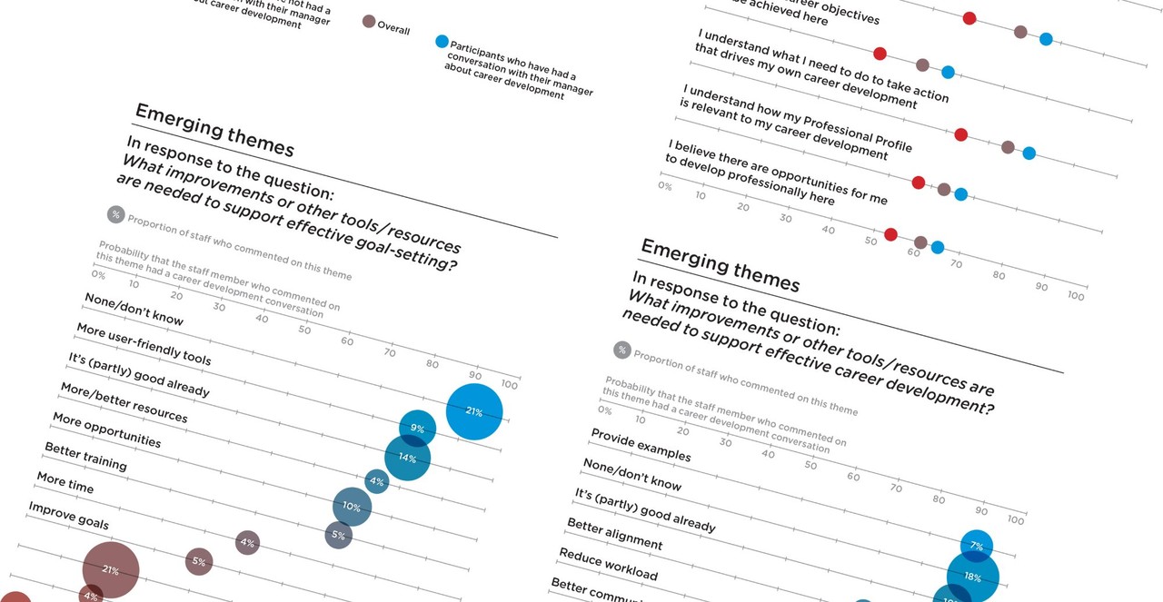
Please note that this covers just the automated reporting to managers. Typically clients are getting interactive reporting that enables them to explore the rich, text data and we’ll usually get some of our data scientists to explore the data in more detail, often using sophisticated models which form the basis of executive presentations.
Getting the data and creating the assets
Workometry data are stored in a ‘big-data’ cloud datastore. We have structured this store to enable us to run very complex analysis over multiple time periods of analysis.
For the ‘print’ reports we access the datastore programmatically from R. Workometry adds metadata to each question explaining what type of question was asked (Open, Lickert, eNPS etc.) which enables us to define appropriate analysis and visualisation techniques depending on the question type.
Once in R we use a script for each report that circles through all the possible reporting ‘options’ that a client wants. At each level we subset the data to include the responses of the relevant group, run the necessary analysis and produce the needed numbers and graphics.
There are two ways typically we create sub-groups. The first is via filtering on demographic details. Workometry uses a schema-free way of storing demographics which gives us great flexibility. Alternatively we use a graph-based data store defining relationships between individuals and then use graph-traversal to identify the needed groups.
Our visualisations use the ggplot2 library in R. We’ve defined our own themes over time which enable us to create great looking visualisations in the company (or client) style. R saves beautiful vector images which keep the print quality super-high. We typically are producing thousands and thousands of images.
Over time we’ve built our own set of R functions which define the graph types and calculations that we need based on what we've found best for each question type. Therefore building a new reporting script is a very time-efficient process - it’s literally bolting together pre-built functions. Given we control how the data is captured we’ve been able to control all elements of the workflow.
The output of our reporting script in R is twofold:
- All of the individual visualisations, scaled and formatted as needed for the report saved as individual PDFs
- data defining what numbers and graphics should be used in each individual report.
Creating beautiful reports
We use Adobe Indesign to create the reports. Indesign is a high-end publishing tool which gives us amazing control over every element of the look and feel of the reports.
In almost every instance now we work with graphic designers to create a template for each report. Some clients have a particular template which they use each time, others create a new template for each feedback run. It might seem a bit of an extravagance but the use of graphic designers really takes the reports to a next level. Our experience is that people associate great looking, professional reports with a high quality of analysis.
Within the Indesign template we can define where the data and graphics should be inserted, sized and styled. Indesign then takes the data from R and inserts it into the relevant places on each report. As well as inserting the numbers it can bring in the visualisations. The output here is a set of pdfs, one for each team.
Back to R
We use R for the final step, mostly because after all these years and hours of writing R code it’s my ‘natural’ tool and we’re reusing code written over many years.
The final R script that we use has three main functions:
- It renames the PDF files to give them a meaningful name
- It adds metadata to define who should see each report
- It uploads it into the manager reporting part of Workometry.
Managers can get their reports from the Workometry tool which provides a secure tool for delivering thousands of reports to the right people as needed. Hence we control and automate the distribution of documents. They still have the ability to explore the data interactively.
The whole of this process can be run in a few minutes, meaning that every manager can have ‘their’ reports as soon as the feedback period closes. Senior managers can have multiple reports - typically their own group and those of all the mangers below them. We can do sophisticated cuts of the data such as ‘people who report into me’ & ‘people who have been on a project that I’ve led’.
Closing thoughts
The commentary about People Analytics is usually about smart models and analysis. However as any analyst knows moving analytics into production is at least as important. Automating key tasks enables you to free-up analyst teams to deliver more valuable, custom work. Hopefully this will give those who are interested enough knowledge to recreate a similar workflow in their businesses.
ABOUT THE AUTHOR
Andrew is one of the pioneers of the European People Analytics scene. He is the founder of OrganizationView, creator of the open-question employee feedback tool Workometry and the co-founder of the People Analytics Switzerland community.
Andrew chaired the first European People Analytics conference - HR Tech World’s 2013 ‘Big Data’ event and has been co-chair of Tucana’s ‘People Analytics’ conference in 2014, 2015 & 2016. He teaches HR Analytics and Data-Driven HR in Europe and Asia and is a member CIPD’s Human Capital Analytics Advisory Group, setting standards and content strategy for HR Analytics content.
To keep informed of all Andrew’s writing, here and elsewhere please subscribe to OrganizationView’s Newsletter or follow him on Twitter.
HR Programs Manager @ Caleres, Inc. | HR Analytics, Systems Administration
7yI derived so many "ah ha's" from this article! Thank you for sharing your process so that others can learn.
Indeed a great writeup and structured.
People Analytics | Directionally Correct - #1 People Analytics Podcast & Substack Newsletter | Workforce Planning & Talent Intelligence | Prolific Writer & Speaker
7yI really appreciate your openness, Andrew Marritt. You know how to cultivate interest and give perspective.
Founder and Managing Partner of Sleeping Giant Capital // Professor at WMU Haworth
7yGreat post. Critical point: "However as any analyst knows moving analytics into production is at least as important"
HR Executive - Building and Optimizing HR Operations, Technology & Analytics
7yAny insight you can share on how the managers are using the reports? How do you know/track? Any use cases on how they are informing decision making? I know companies are challenged with uptake, especially the closer we get to front line management.