
Adding in sliders to your website can be a great way to portray multiple messages you want to get across to your consumers, right? Not exactly.
Surely they make sense? It makes the page look less static, it moves so will grab people’s attention, and you can essentially add more content to the page which is great for SEO purposes. This design trend has actually been slated in the industry for being terrible for conversions and user experience (UX).
Personally, I think sliders won’t be as big of a trend in 2017. Full-screen static images seem to be on the rise, and I am hoping that this trend continues to take over. There are a lot of reasons why I think that sliders are a bad way to display content, so let’s outline some.
1) People react to movement. It may actually be a huge distraction if you have automatic sliders.
Normally call to actions are displayed in sliders to direct people to particular sections of a website, or to advertise certain products or offers. But what about the rest of the page? Your content is important, and users may miss a vital message if they’re too busy watching a slider go round.
2) People like to be in control.
This kind of ties in with the point above. If you have an automatically moving slider, people usually miss information because there’s too much to digest and not enough time to read the content. Not everyone can read sections of content as quickly as others, so it’s best to let people go through a slider at their own leisure. A case study based on this was conducted by the Nielsen Norman group, who are experts in the industry when it comes to User Experience. Have a read of it here. There was also another study conducted by Notre Damn University, outlined in this post here.
3) Site load speed is increased.
There’s an awful lot of resources to load in with a slider. Large background images, text, supporting javascript and in some cases CSS files. All of this adds to the page load speed, which can increase the bounce rate should it take too long to load a page.
4) People may mistake them for ads, so often skip them straight away.
Nobody likes having ads shoved in front of them. When you have around 3 seconds to make people want to stay on your website when they first hit the page, they may mistake a slider for adverts.
5) Users have the instinct to navigate the site straight away.
When a user lands on your website, they usually have a task of finding out a particular piece of information. If this information is hidden within a slider, they will either navigate to another area of the site which leads to missing the information they need or leaving the website altogether.
6) Too much information may lead to the message being lost.
What message are you trying to get across to your users? If you are bombarding them with information, it may make it a very confusing experience for them.
The list could go on as to why sliders are bad for conversions, but I think these are the main points you need to consider. Focus less on the design fads, and focus more on facts, figures, and generating conversions. In order to do this, here are some tips:
- Keep it simple and straight to the point – make your message clear to users. If you have your website built on a Content Management System (such as WordPress), work with your developer so that you are able to change the content of the “slider” area. Make sure it’s static though, to avoid the points we’ve already discussed.
- Take advantage of the large background image design trend, and really make an impact with good website photography.
- If a slider is an absolute must, don’t make it auto scroll. Let users navigate the slider with arrows or a swipe gesture on mobiles/tablets, so they can digest the information at their own pace.
- Try having the background image just change, rather than the content itself
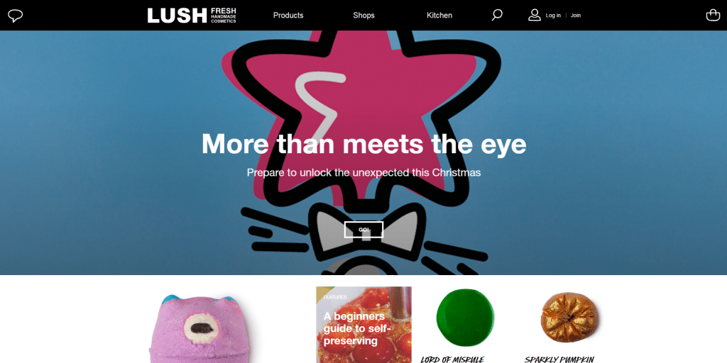
Just to convince you further, static banners with good photography can really make a great impact:

Syts.nl uses a full-screen banner image with good quality photography
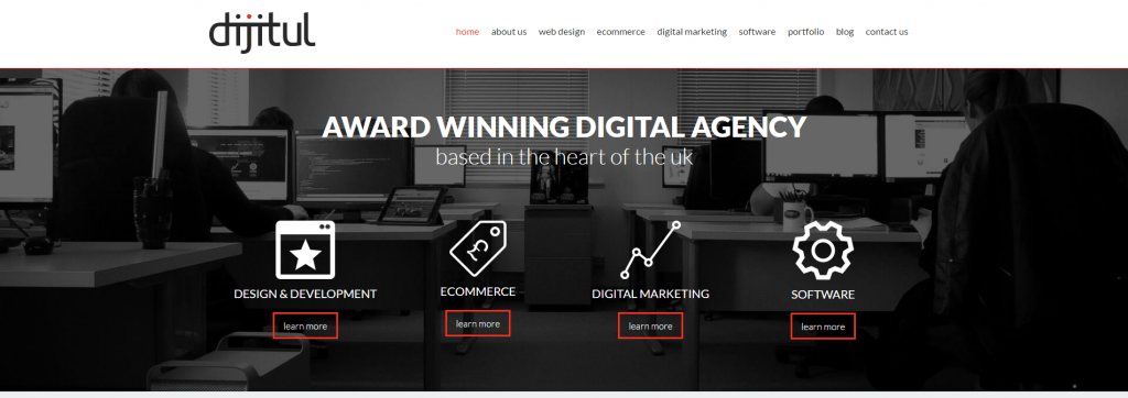
Even we do it!