 First of all, what is a brand? A brand is a symbol. Symbols are designs which represent something else, and a brand is meant to package all of the associations, experiences and characteristics into an abstract construct.
This construct can be evoked using consistent imagery, sounds, phrases and logos with which people come into contact.
Brands are very important as they help you win customers and they also help you to keep them.
They do this by awakening the associations and experiences you previously had with the brand, or have seen through advertising, when you come into contact with the brand at key stages. For example, when deciding what product to purchase out of a selection of similar items.
Here are 9 tips to help you to build a brand with web design.
Brands set expectations, and when faced with uncertainty people tend to pick the safer option. People know what to expect from a brand they know.
Branding is a complex process that is performed across all types of media, from product packaging, TV commercials and magazine ads to interior store decoration and logotype design. Of course branding also applies to web design.
It doesn't matter if you're building a website for a multi-million dollar brand or a personal blog, branding still matters for the reasons outlined above. In the case of a personal blog, branding will help set you apart and make your site memorable.
1. Color
The choice of a good color palette is very important in branding. Color isn't just aesthetics -- it stimulates various emotions and carries with it subconscious associations to various things and characteristics.
For example, the color red may actually increase blood pressure, pulse and respiration. It's a color that symbolizes passion, energy, power and excitement. Because of this, it's usually a good color choice for brands in the entertainment industry.
Other colors carry different associations and effects. Green symbolizes nature, environment, profit, money and health. It's also a calming color, which is why hospitals usually paint their walls pale green.
When picking a color for your brand, research its effects and associations to see if it is an appropriate fit for the type of things your brand represents. Also note that different cultures may associate the same colors with different things, so it's a good idea to check that your colors mean what you think they do in the markets you operate in.
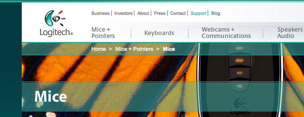
Logitech use teal as the brand's main color. Various shades of teal are used around their website, from background colors to headings and links:
2. Character
Does your brand have character? Infusing your brand with a little personality can help you define what it stands for.
Is the brand all about stability and safety so that your customers can be sure to rely on you? Is the brand fun and down to earth?
Many people in commercialized societies use products and brands to define themselves, so shape your brand's character towards something which your audience will like to associate themselves with.
Anthropomorphism is the attribution of human qualities and characteristics to other things, like animals or objects. Infusing your brand with anthropomorphic elements is a good way to give it character.

Think about the icon for the "Finder" application on Mac OS X. It's a blue square with a distinctive smiling face drawn with a few black lines.
The program it represents is a file browser, but by giving it human characteristics the designers give it a soul.
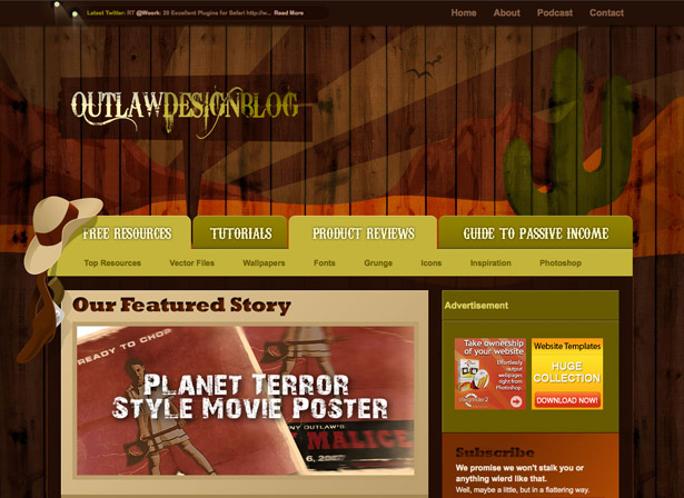
Another great example is the Outlaw Design blog which sticks to a strong Wild West theme throughout the design with a unique mix of wooden textures and flat illustrations, branding itself very effectively:
Twitter's little blue bird mascot has proven very effective; all of the custom media and websites that Twitter fans create usually feature their own variation of it. They may all look a little different, but are still instantly recognizable:

3. Emotion
Emotion is another factor to consider when building your brand. What feelings and emotions do you want people to experience when they visit your site? What sort of things do you want them to associate with your brand?
Crafting the aesthetics of your site shouldn't be about following the latest design trends, it should be about deciding on the emotions and ideas that you want your brand to project, and then working on a design that will do just that.
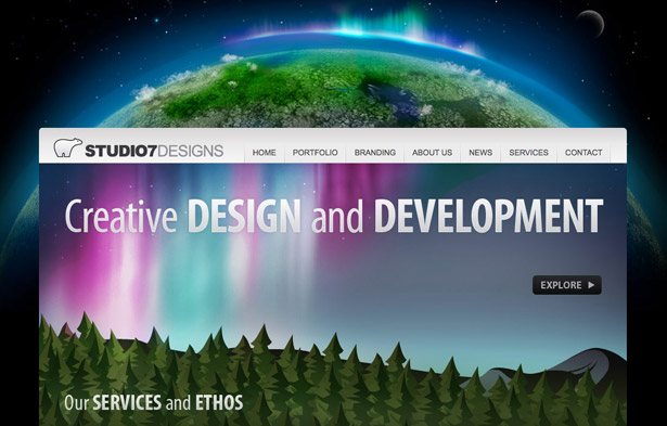
Studio 7 Designs uses vibrant colors and beautiful imagery to create a rich and exciting brand, which is very important for a design agency:
4. Consistency
To build a successful brand you need to make it memorable. What do you do to make people remember things? You repeat them.
Consistency throughout your web design will build on the choices you've made earlier regarding selecting the right personality for the brand and evoking the appropriate emotions. Keep consistent colors, visuals and typography throughout to ensure your website projects a uniform image.
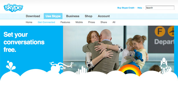
Skype consistently integrate several branding elements throughout all of their marketing media, which include the color palette with a dominant blue, white 2D clouds with illustrations sitting on top of them and multicolored rainbows:
5. Reusing code and visuals
Consistent visuals and layout allows you to reuse more of your content, be it stylesheets or images. This means that your site will load faster as the user's browser doesn't need to download as many things -- old images and CSS are already stored in its cache.
Apple.com integrates their logo with the navigation bar, infusing their brand into the page design:

6. Size and position of the logo
The accepted norm when positioning your site's logo is to put it in the upper left area of the page.
That's the area where most people will look at to see what site they're on. Additionally, it's best practice to link the logo image to the site's home page. But position is only one element -- size is also important. Ensure your logo is big enough to be the second or third thing that people will notice when they arrive on your site.
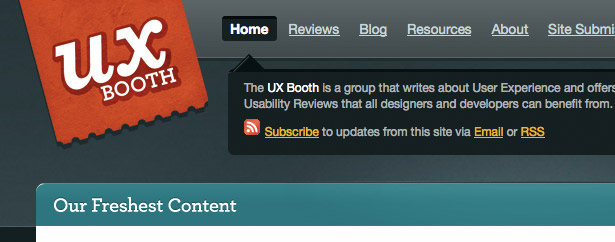
UX Booth has a nice, large logo in the top left area of the page, which is one of the first things that you notice when you arrive at the site:
7. Value proposition
When a visitor arrives on your site for the first time they take the first few seconds to orient themselves. Is this the right site? Does this look interesting? What is this all about? To answer these questions you should provide a clear and concise value proposition to your visitor.
This value proposition should be a short statement in a prominent location on your page. It should preferably be located next to the site's logo so that when a new visitor reads the title of the site or business they'll follow on to the value proposition.
In a few words explain exactly what benefit your site provides to the visitor, so that they'll know not only what your site is about, but why they should keep using it.
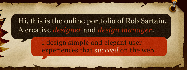
Rob Sartain's Prime Cut Design has a great value proposition in the header of their site. It's highly visible, concise, and clear; and it covers both, the 'what' and the 'why':
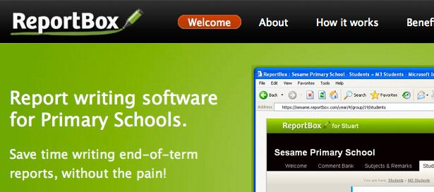
The ReportBox website features a clear value proposition underneath the logo and navigation. The large font size ensures that it's one of the first things that you'll read:
8. Tone of voice
The language you use on your website needs to reinforce your brand's character and personality. If your brand is a friendly and down to earth, and your audience are young, tech savvy people, then informal and fun tone of voice may work well for you.
On the other hand, if you're making a website for an investment bank, the tone of voice should reflect that by being much more formal.
It's not just about what you say -- it's about how you say it. You can say the same thing in different voices and get the same meaning across, but the personality that this voice emanates will be different; so choose a tone of voice that suits your brand's character and audience.
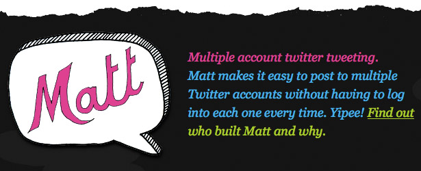
Matt, a simple web app that helps you use multiple Twitter accounts, features hand drawn illustrations and a friendly tone of voice, ideal for the young, tech savvy audience:
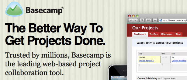
37signal's Basecamp website takes a more formal, yet simple and concise tone, focusing on their business audience:
9. Uniqueness
Getting all of the above elements will only get you so far though, because there is another very important thing to consider when building your brand: uniqueness.
If your website looks just like the competition, then is it really memorable? How would potential customers differentiate between the two? By putting in that extra effort to create a unique image you'll not only stand out from your competitors, you'll be more memorable, and that means a better chance that your visitors will come back for more.
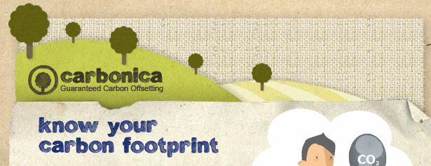
Carbonica's website features many recycled paper textures, hand drawn fonts and cut-out style illustrations. This earthy imagery helps promote the sustainable image that Carbonica strives for and is different enough to be memorable:
Conclusion
Building a strong brand is important not only for big corporations, but also for small companies and even personal websites and blogs. Branding helps people differentiate between competition and quickly judge quality.
The web is an excellent platform to build your brand, so it's important not to ignore branding when working on your website. Make sure to utilize all the various techniques to make it powerful and effective.
Written exclusively for WDD by Dmitry Fadeyev. He runs a blog on usability called Usability Post.
Which techniques are the most effective for brand building? Please share your comments with us...
WDD Staff


Read Next

20 Best New Websites, April 2024

Exciting New Tools for Designers, April 2024

14 Top UX Tools for Designers in 2024

What Negative Effects Does a Bad Website Design Have On My Business?

10+ Best Resources & Tools for Web Designers (2024 update)

3 Essential Design Trends, April 2024

How to Plan Your First Successful Website

15 Best New Fonts, March 2024

LimeWire Developer APIs Herald a New Era of AI Integration

20 Best New Websites, March 2024

Exciting New Tools for Designers, March 2024
