
Update: Gmail Rolls Out Support for Responsive Design, Improved Font Styling + CSS for Accessibility
In the early morning hours of September 30th, Gmail started rolling out changes to support what the email world has been clamoring for for so long: embedded styles and responsive design.
What are we talking about?
Gmail has not historically supported classes or id’s in the <head> of an email, which forced email designers to use inline CSS to style their emails. Now, Gmail will support embedded CSS with classes and id’s, which removes the need for inline CSS in Gmail. This also means Gmail will finally support media queries—and responsive email.
Just catching up on the news? Follow along our updates in the Live Ticker as we monitor the roll-out, or read a summary of all expected changes and what they mean for email marketers below.
The Gmail Update Live Ticker
Here’s a current view of Gmail email clients that have been updated:
Gmail Client | Update Rolled Out |
Desktop webmail |  |
Mobile webmail |  |
Gmail Android app (Gmail account) | |
Gmail Android app (Gmailified account) | |
Gmail Android app (POP/IMAP account) | |
Gmail iOS app | |
Inbox by Gmail (webmail) | |
Inbox by Gmail (iOS) | |
Inbox by Gmail (Android) | |
G Suite Basic (formerly Google Apps for Work) | |
Google Apps Free Edition (legacy) | |
November 7, 11:30am EDT
A major update to the Gmail iOS app includes the rendering update to support <style> and media queries! All Gmail mobile apps now support responsive email. We also see all G Suite accounts with the rendering update as well.
October 12, 9:00am EDT
We are starting to see G Suite accounts outside of U.S. (which includes Litmus Previews) get the rendering update. We will update the rollout chart when we see that all of our accounts have the update.
October 4, 9:30am EDT
We have released a full rollout chart above. Please note that Gmail has renamed its account plan names.
For G Suite Basic (formerly Google Apps for Work) accounts, it appears the updates have only possibly been rolled out to U.S. accounts. For Litmus users, please note that our G Suite Basic Email Previews (still currently titled Google Apps) use UK-based accounts, which currently have not been given the update.
October 4, 4:00am EDT
The rollout to support media queries now looks to be complete across both the Gmail and Inbox by Gmail apps on Android. While some people have noticed changes in media query support on their iOS apps, support is not consistent across all accounts yet.
September 30, 8:00am EDT
Changes were rolled out to the Gmail App on Android as well. Classes and id’s are being picked up in the head of the email. We also see media query support for some Android Gmail App accounts, but support is not consistent across all accounts we’ve tested. Support might be rolling out gradually across regions.
Updates are now also rolling out to Inbox by Gmail, with support for id’s and classes in the head of the email.
September 30, 5:30am EDT
Gmail appears to be rolling out updates to its rendering engine gradually. Gmail web clients are supporting classes and id’s in the <head> across all browsers (Chrome, Safari and Firefox) and both are being correctly referenced in the HTML.
We also see media queries support across Gmail’s web clients:
So far, however, neither style tags in the head of the email nor media queries are supported by Inbox by Gmail or the Gmail app.
September 29, 11:55pm EDT
It’s happening! Gmail has begun rolling out changes to its rendering machine. Stay tuned for updates as we monitor the roll-out.
What These Changes Mean For Email Geeks
On August 31, 2016, Gmail announced they would begin supporting the CSS property display: none; and supporting <style> and media queries.
This is just one part of an overall effort to expand CSS support in Gmail and to give email designers more control over how their messages are rendered.
– Pierce Vollucci, Product Manager at Google
This is huge news for the email community, and will have major implications on email design and development.
GMAIL TO SUPPORT RESPONSIVE EMAIL AND <STYLE>
Gmail has not historically supported classes or id’s in the <head> of an email, which forced email designers to use inline CSS to style their emails. Now, Gmail will support embedded CSS with classes and id’s, which removes the need for inline CSS in Gmail. This also means Gmail will finally support media queries—and responsive email.
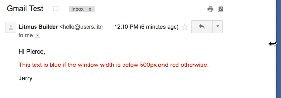
In other words, the following code will now render properly in Gmail:
<html>
  <head>
    <style>
      .colored {
        color: blue;
      }
      #body {
        font-size: 14px;
      }
      @media screen and (min-width: 500px) {
        .colored {
          color:red;
        }
      }
    </style>
  </head>
  <body>
    <div id="body">
      <p>Hi Pierce,</p>
      <p class="colored">
        This text is blue if the window width is
        below 500px and red otherwise.
      </p>
      <p>Jerry</p>
    </div>
  </body>
</html>
You can view a full list of supported CSS at the bottom of this post, or in Gmail’s official documentation. Here is a full list of upcoming media query support:
Supported types
- all
- screen
Supported queries
- min-width
- max-width
- min-device-width
- max-device-width
- orientation
- min-resolution
- max-resolution
Supported keywords
- and
- only
WHAT THIS MEANS FOR EMAIL
These updates signal a major turning point in email development and workflow, allowing designers and marketers to create more accessible email campaigns without the need for CSS inlining.
Market impact: Media queries will soon be the standard
Many emails rely on media queries to fine-tune content and design to create a more usable experience across a wide range of screen sizes. However, media queries don’t work everywhere. The most notable, and frustrating, lack of support historically came from Gmail, which is famous for stripping code from the the <head> along with any styles and media queries contained within.
With Gmail’s support for media queries, over 75% of email clients will support responsive design. We hope this becomes the norm with other email clients like Windows Phone following suit.
Reduced need for hacky layout structures like Fab Four
To combat Gmail’s lack of support for media queries in the, email geeks have looked high and low for workarounds. One such workaround is the Fab Four technique, which involves the CSS calc() function and the three width, min-width and max-width properties.
Email designers, it’s time to say goodbye to these complicated layout structures. But, keep in mind—you still need tables for Outlook. (We haven’t created an email standard….yet).
However, hybrid/spongy development still has its place in email development as a baseline structure for problematic clients like Outlook.
Say goodbye to CSS inlining
“Inlining” styles moves the CSS and associated formatting instructions from the style block in the <head> of your email into the <body> of the HTML. Historically, if styles were not moved inline, the styling in the body of your email would not display in Gmail.
With these updates, inlining CSS will no longer be necessary. Email designers can now use embedded styles placed in the <head> of HTML documents. Embedded CSS will be supported in all major email clients.
Emails will become more accessible
Accessibility in email is essential for a campaign’s success. If a subscriber can’t read and interact with your email, there is no way for them to take action.
With embedded CSS support, email designers can separate styling from content and use semantic, accessible markup for their emails.
While large text and touch-friendly buttons help to improve accessibility, so does preparing your HTML for use with a screen reader. With this in mind, ensure a healthy balance of text and images in your design, and tailor the written content in your email to deliver the main message.
With additional support for CSS-based screen reader settings like pitch, pitch-range, speak-punctuation, and speech-rate, Gmail has made it even easier for marketers to make their emails more accessible.
Typography support will increase
Another major change coming with these updates is additional support for CSS font properties. For example, Gmail will begin supporting attributes like column-count and column-gap, which allows for the creation of columns of text without tables. In addition, font-kerning and font-variant-caps will enable additional font styling. However, it does not appear that web fonts will be supported in the upcoming release.
Additional support for background is coming
Gmail is introducing additional support for CSS background properties such as background-clip, background-position, and most importantly, background-size. With background-size support, emails can have scalable and responsive background images.
TEST YOUR EMAILS IN GMAIL
How will these changes impact your email? Use Litmus to instantly preview your email in Gmail—and 70+ other email clients. Note that these changes aren’t live yet, but will be reflected in Litmus Instant Previews as soon as Gmail pushes them live.
Official Documentation
For the first time ever a major email client has published official CSS and HTML support documentation. This is a major industry first. Thanks, Gmail!
The following CSS properties will be supported in Gmail and Inbox by Gmail:
- azimuth
- background
- background-blend-mode
- background-clip
- background-color
- background-image
- background-origin
- background-position
- background-repeat
- background-size
- border
- border-bottom
- border-bottom-color
- border-bottom-left-radius
- border-bottom-right-radius
- border-bottom-style
- border-bottom-width
- border-collapse
- border-color
- border-left
- border-left-color
- border-left-style
- border-left-width
- border-radius
- border-right
- border-right-color
- border-right-style
- border-right-width
- border-spacing
- border-style
- border-top
- border-top-color
- border-top-left-radius
- border-top-right-radius
- border-top-style
- border-top-width
- border-width
- box-sizing
- break-after
- break-before
- break-inside
- caption-side
- clear
- color
- column-count
- column-fill
- column-gap
- column-rule
- column-rule-color
- column-rule-style
- column-rule-width
- column-span
- column-width
- columns
- direction
- display
- elevation
- empty-cells
- float
- font
- font-family
- font-feature-settings
- font-kerning
- font-size
- font-size-adjust
- font-stretch
- font-style
- font-synthesis
- font-variant
- font-variant-alternates
- font-variant-caps
- font-variant-east-asian
- font-variant-ligatures
- font-variant-numeric
- font-weight
- height
- image-orientation
- image-resolution
- isolation
- letter-spacing
- line-height
- list-style
- list-style-position
- list-style-type
- margin
- margin-bottom
- margin-left
- margin-right
- margin-top
- max-height
- max-width
- min-height
- min-width
- mix-blend-mode
- object-fit
- object-position
- opacity
- outline
- outline-color
- outline-style
- outline-width
- overflow
- padding
- padding-bottom
- padding-left
- padding-right
- padding-top
- pause
- pause-after
- pause-before
- pitch
- pitch-range
- quotes
- richness
- speak
- speak-header
- speak-numeral
- speak-punctuation
- speech-rate
- stress
- table-layout
- text-align
- text-combine-upwrite
- text-decoration
- text-decoration-color
- text-decoration-line
- text-decoration-skip
- text-decoration-style
- text-emphasis
- text-emphasis-color
- text-emphasis-style
- text-indent
- text-orientation
- text-overflow
- text-transform
- text-underline-position
- unicode-bidi
- vertical-align
- voice-family
- width
- word-spacing
- writing-mode
GET THE LATEST DELIVERED STRAIGHT TO YOUR INBOX
We’ll keep you posted about any additional changes in the Gmail rollout and how it will affect you. Subscribe to our weekly newsletter and get the latest content for email design pros delivered straight to your inbox. Every week.
Kevin Mandeville
Kevin Mandeville was a Product Manager at Litmus
 Blog
Blog 