Now, you know me. I’m the forgiving type. I try not to let things rankle me. But there comes a time in every fan’s life when he must stand up and say: No more.
I’m talking, of course, about the poser Kermit. It’s all wrong. Wrong, wrong, wrong, and I just won’t ever be happy again until it’s fixed.
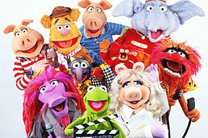
A poser, for folks who might not know, is a Muppet that’s been specially made for promotional photos. They’re not made as puppets — they’re really more like poseable full-body dolls. They’re made by the Muppet builders, so usually it’s hard to tell them apart from the actual puppets — but if you’re looking at a Muppet or Sesame photo, and it’s not from an actual show or live appearance, then it’s probably a poser. You see them a lot on merchandise — records, DVD’s, calendars, books — those are all posers.
Most of the time, posers are our friends. Many of the photos we’ve loved since childhood are made with posers. We love the posers more than we love members of our own family.
But when a poser goes rogue, that’s a problem — especially when the bad poser is Kermit. Cause I don’t know as you’ve noticed, but Kermit is the main character, and he gets used a lot.
So a bad Kermit is gonna get noticed… and since 1996 or so, we’ve had a very bad Kermit.
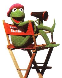
The Bad Kermit — otherwise known as Flathead Kermit — first showed up around 1996, to promote Muppets Tonight:
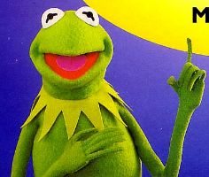
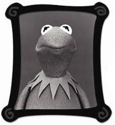
So you can see the problem, right? Tell me that it’s not just me. Your Good Kermit has kind of a rounded head, and his eyes are pointed a little bit towards each other. Your Bad Kermit has a flat head, and his eyes are both pointed straight ahead.
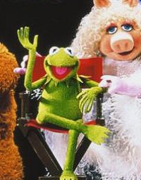
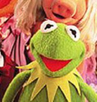
Good Kermit:

and Bad Kermit:

It’s easy to tell the difference, because the Good Kermit makes you feel like going up to him and saying: Hi Kermit, ol’ buddy ol’ pal, let me buy you a drink. The Bad Kermit makes you feel like sitting in a corner and shivering.
It’s the eyes, obviously. As anyone who knows anything about the Muppets will tell you, the eyes are the key to the character. Properly focused eyes make the difference between an old friend and a dead piece of foam. Good Kermit has eyes that invite you in; they feel warm and welcoming. Flathead Kermit has eyes like a zombie, a reincarnated and soulless thing.
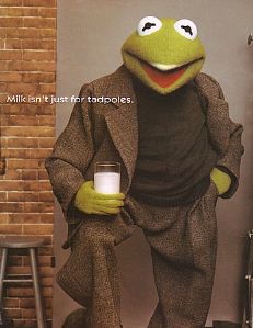
So why, then, is this the Kermit that’s been used for the past seven years to promote the Muppets? These promotions are supposed to make the Muppets look cool, and current. Instead, they just turn out to be embarrassing, like these ads for milk and the new quarters:

I mean, they have to know there’s something wrong there, don’t they? It’s the same people taking the pictures, it’s the same people doing the licensing. They must be able to tell the difference like we can. Somebody could just reach over and say, y’know, if we could twist these eyeballs in a little bit… Why hasn’t anybody done that yet? It’s like Kermit’s had spinach in his teeth for seven years, and everybody’s too polite to say anything about it.
So, for those of you joining us late, we’re discussing the difference between Good Kermit:
and Bad Kermit:

Not to put too fine a point on it.
You want worse? Here’s worse. A year ago, they started using modern-looking drawings to promote the Muppets. And what did they base the drawings on?

Now, that’s just asinine, isn’t it? There’s no reason for that. It just makes you want to sit down and cry.
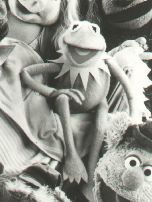
But that’s not even the worst thing. The very worst thing is this: In 2000, they made a new poser for the Muppet’s 25th anniversary… and this is what the new poser looks like:

It’s worse! It’s twice as bad. Unbelievable. He doesn’t have the flat head anymore — but now the eyes are even more unearthly and dead-looking. And then what did they up and do? They used that head — that hideous, boss-eyed head — for the damn “25 Years” logo.
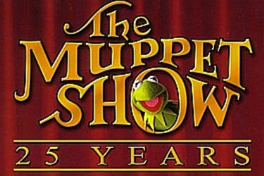
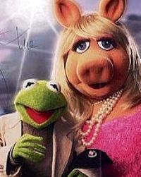
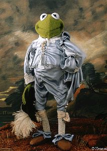
And that logo is on every piece of merchandise that they’ve made in the last two years. And the thing that’s really frustrating is that there’s absolutely no reason on this earth why they should use that head for the anniversary logo — the worst poser Kermit they’ve ever made. It’s just a photo; they could just as easily have used this one:

It wouldn’t have cost them any more, it wouldn’t have been any harder to produce — and it would look ten times better.
I wish I could say that the problem was being fixed, but in fact, this summer, it’s reaching new levels of unreasonableness. For the cover of the John Denver Rocky Mountain Holiday DVD, they took an old photo with a perfectly acceptable Kermit head, and they replaced it with our old friend Flathead Kermit:
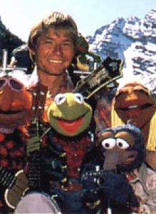
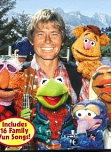
Again: simply uncalled for. I have no problem with technical jiggery-pokery on the photos, as long as the end result looks better. John is more central in the new photo, and it’s good to have Fozzie on the DVD cover. But the Flathead Kermit just makes it all look worse, and there’s no reason for it.
So, if there’s anybody reading this who works at Henson and has any power at all over this: Please. Cut it out. Either get a new Kermit poser made, or — if that’s not possible — then just use old photos.
I don’t know if a better looking Kermit will sell more DVD’s, or get you a new TV-movie. But it wouldn’t hurt — and, frankly, it would show the world that you actually care about the stuff you’re putting out.
So, folks: This is how we’ll know if the Henson family buying back the company makes any difference. The Kermit poser is our canary in a coal mine: If he looks good, then the air is clear. When they pitch that broke ass poser out the window and get back to the Kermit we love, that’s when the Henson company will be back on track. Wait and see.
Thanks to R.D. and Wozza for Kermit photos
by Danny Horn