Is the Gradient Making a Comeback?
One of the techniques shunned by designers at the beginning of the flat design era is making a comeback. Almost overnight, it seems that gradients are popping up in website designs everywhere.
From backgrounds to image overlays to subtle textures on user interface elements, the two-color effect is back in a big way. It’s also a little different this time around. Here’s what you need to know before using gradients again (and plenty of examples to spark your creativity).
2 Million+ Digital Assets, With Unlimited Downloads
Get unlimited downloads of 2 million+ design resources, themes, templates, photos, graphics and more. Envato Elements starts at $16 per month, and is the best creative subscription we've ever seen.


Trendsetters Lead the Way
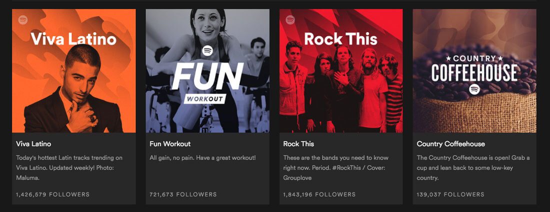
Spotify led the charge with duotone color trends earlier this year and two-color overlays have almost become a visual symbol of the brand. If you look closely though, Spotify uses duotone with a distinct gradient, balancing bright pops of color or using a single bright hue that fades to light or dark.
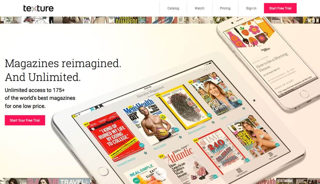
Other big brands are also moving back to the gradient for their messaging. Texture, the online magazine provider, is using a full-screen gradient for its design.
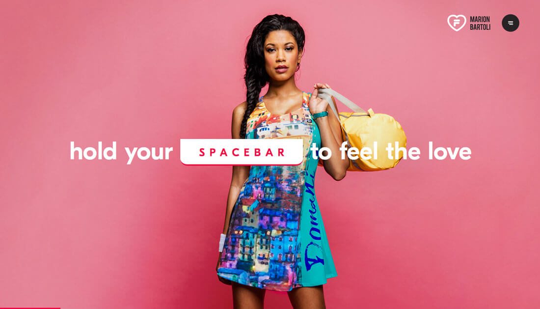
But these aren’t the only examples of new-style gradients. They are popping up in designs for everything from retail to portfolios.
There aren’t any distinctive rules for use of gradients either. They might include multiple colors, radiate from the center, come from a corner or fall horizontally. Gradients might be the major visual in the display or a simple feature.
What’s particularly nice is that designers are using the effect in plenty of different ways. And they actually look pretty cool.
Gradients with Flat Colors
While gradients were tossed in the era of flat design, their comeback incorporates plenty of flat elements, particularly color. Some of the biggest, boldest examples of color in gradients are hues “borrowed” directly from flat design palettes.
These color choices help give gradients a modern feel that seems to mesh with other website trends. You can mix this style of gradient with a flat aesthetic, or add a gradient to a Material Design interface or even try a muted color combination in the background of a minimal project.
What’s nice about the color option is that it really is a complement to other trends, making it an easy transition design if you want to employ a bit of a redesign but aren’t ready to completely ditch your current aesthetic.
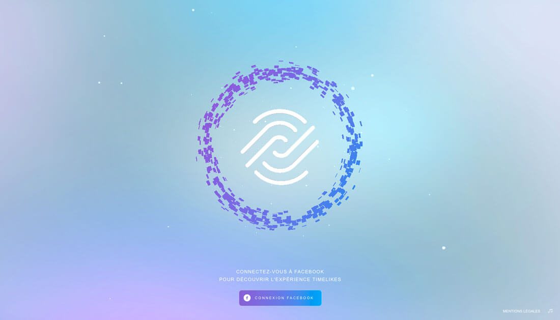
Two-Tone is In

Duotone gradients are a big deal. Again, this is a combination of trends that seems to be a good fit.
The downside to the two-tone concept is that it is being used … a lot. There seems to be a whole school of designs out there with the same gradient pattern using different colors. (And many using variants of blues and greens.)
That’s the one caution with trends: Make it your own. Don’t just repeat what someone else has already done.
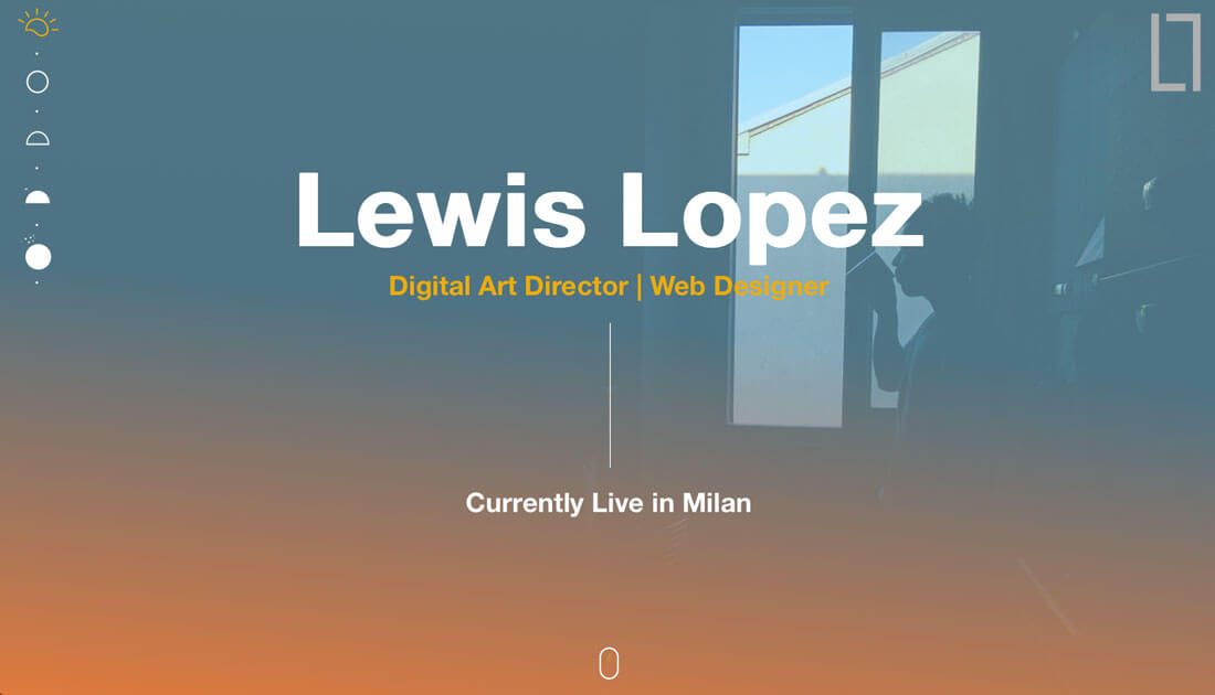
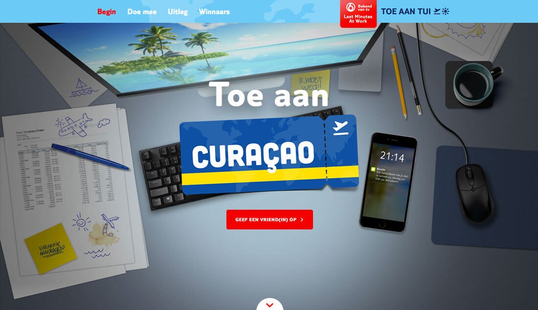
Background Images with Gradients
Backgrounds with depth are coming back thanks to gradients. This is something that will likely continue to grow as more websites and designers try to incorporate more realism and three-dimensional bits into design thanks to virtual reality.
While the flat aesthetic is sleek and easy to look at, the major flaw is that it lacks an element of reality. Just think about nature. Look to the sky at any given time. You’ll most likely see graduated color – blues, reds, yellows, purples.
This is the same concept behind gradients and shadows. They help add a level of depth and reality to the design when done well. (So keep them simple and subtle if this is the effect you are going for.)
Image Overlays with Gradients
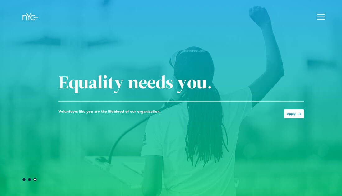
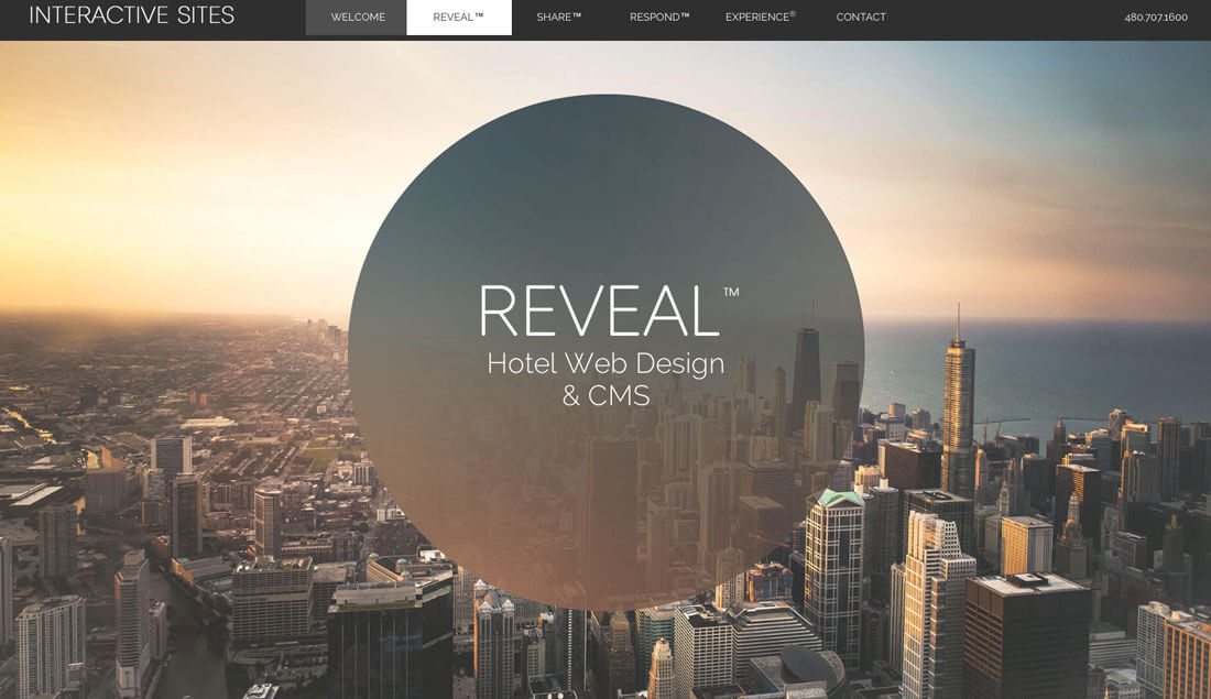
Images with color overlays have been a popular design choice for some time, so it is no surprise that a shift from a single-color overlay to a gradient overlay is popping up.
This effect is a nice option for large images, such as hero headers and to help focus users on certain design elements or create a place to type or calls to action that’s a little more readable.
The trick with gradients on top of photos is creating a balance between the image and the color. Do the hues match the meaning of the image? Can you still clearly see and understand what is happening in the photo? It can be tricky to combine these elements in a way that maintains the integrity of the image and overall message.
Subtle Gradients for UI Elements
While not as popular as some of the other gradient styles, some designers are adding gradients back into user interface elements. These gradients tend to be more subtle and are single color.
It was a dominant style in the early Apple iOS/iPhone era, but feel out of favor.
Admittedly, this use of gradients seems to work best for larger elements. In smaller icon-type spaces, the gradient can be a little harder to see and even a bit distracting. In a large space it can help draw the eye and focus to a call to action or oversized button.
As with any type of gradient, the user shouldn’t see a gradient and stop to think “wow, that’s a cool gradient.” It should be invisible to a degree. Gradients should only enhance the user experience, not call attention to the aesthetics (unless you are a designer looking for that sort of thing).
Conclusion
I’ll be the first to admit, I was kind of sad when gradients went out of fashion. So I am pretty excited to see this trend return and this iteration is really interesting.
Gradients with big color and as a way to add interest to images is something that has an almost timeless element to it. The simple complexity is appealing and interesting. Credit to all you designers out there pushing this technique back into the mainstream.