Roughly once a year, we blog about browser usage, based on visitors to our applications.
This year, I’ve taken logs since April 2015, run them through some one-off analysis code and plotted results using matplotlib. These stats cover all our servers worldwide. I’ve broken them down by continent and I’ve also split out results for pages that only admin users use. Since our customers are primarily government organisations, the numbers for admin pages mostly correspond to what government employees are using.
For those who only have time to look at one chart
This is the one chart that makes me most happy.
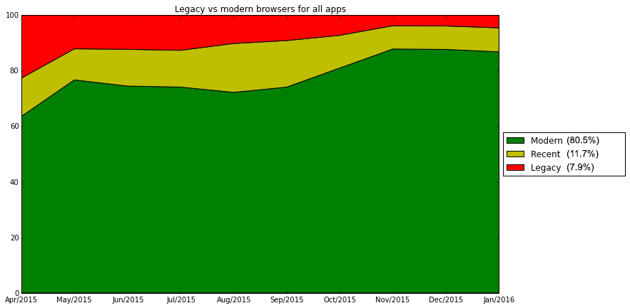
The red represents people using bad web browsers that make me unhappy: IE7 and IE8. The yellow portion of this chart represents people using somewhat nicer web browsers – IE9 and IE10. The green portion of this chart represents people using high-quality, modern web browsers that are pleasant to develop software for – such as Firefox, Safari, Chrome, Edge and IE11.
This chart makes me happy because it shows that about 80% of people visiting our sites are using high-quality, modern web browsers, and that this number portion is going up. ♥
(NB: I’ve omitted February 2016 from this (and all the other monthly charts) because we’re only partway into February, so there isn’t enough data yet to draw valid conclusions for February.)
Worldwide browser usage
The first thing I’m interested in knowing is how often our sites were visited from desktop devices vs mobile devices. This chart gives the split for January and February 2016:
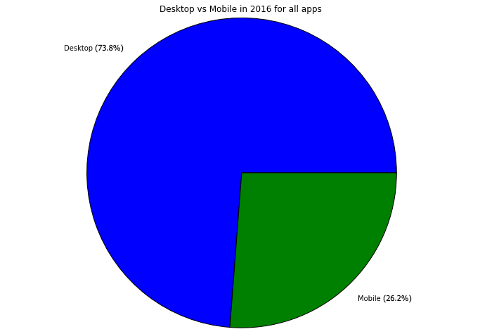
We’re still mostly seeing hits from desktop browsers – which is understandable, since a) responding to a consultation is something that can take a while and b) a good number of participants will be at in a workplace/at a desk when they respond. It’s exciting to see people are using our sites from mobile devices too, though.
The next thing I’m interested in knowing is: which browsers are our visitors on desktops using?
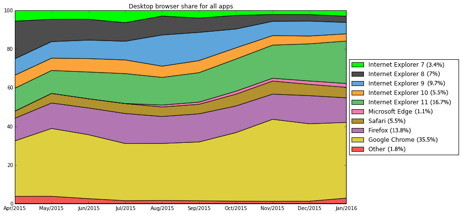
I’m glad to see usage of both Internet Explorer 7 and 8 shrinking over the course of the last nine months. Given that Internet Explorer 11 and Microsoft Edge (the two latest browsers from Microsoft) are growing by about the same amount as IE7 and IE8 are shrinking, it looks like people are upgrading all the way to the newest available browsers, which is great news.
On the bottom of the chart, you can see that Google Chrome is responsible for a large quantity of hits all by itself, so it looks like Google’s advertising for its browsers has been paying off.
The next thing I’d like to know is what browsers the mobile visitors are using:
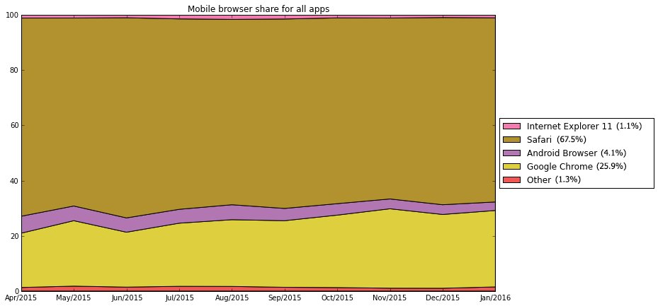
This isn’t quite as pressing as the desktop browsers breakdown, because there isn’t such a disparity in technical quality between the different widely-used mobile web browsers. Apple’s Safari, Google Chrome, mobile Internet Explorer 11 and Android’s built-in browser are all technologically excellent and currently very easy to write good software for.
It’s interesting to see that we receive more hits from Apple’s Safari on iOS devices (iPhones, iPads and iPods) than from Android devices running Google Chrome or the Android Browser, despite the fact that Android devices are sold very widely at low price points. There isn’t any clear trend of market share change between the two.
What browsers are people in government using?
This chart shows what desktop browsers are being used in the admin sides of our products. (I’m only showing desktop browsers here because the people who use our apps as admins very nearly never use mobile browsers to do so.)
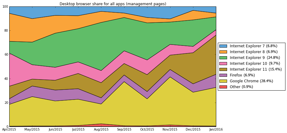
You can see that the variance in this chart is much higher than all the previous charts. The number of requests sampled for measuring admin usage is a small portion of the apps’ total usage, so there are accordingly fewer total hits.
While the chart is fairly chaotic at all points, I’m quite happy to see that there’s clear evidence here that many admin users have been upgraded away from IE7, 8 and 9 and on to IE11. I’m also very glad to see that the portion of admin users using IE10 has shrunk rather than grown in the last couple of months, since this indicates that peoples’ computers are being updated all the way to the very latest version of Internet Explorer available, rather than just bumped up to the next one.
Seeing Chrome and Firefox usage go up is also pleasant. It’s hard to claim a clear trend here because there is a lot of noise in this data, but it does look like a growing portion of admin users have had their IT department either allow them to use or provide them with one of these two evergreen browsers.
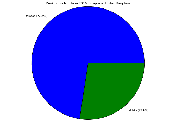
What browsers are people using in the United Kingdom?
In the United Kingdom, we see a slightly higher proportion of mobile device visits than elsewhere:
This chart shows the desktop browser breakdown in the United Kingdom:
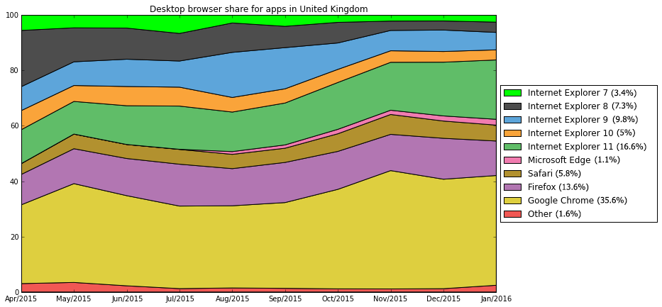
Again, I’m glad to see IE7 and IE8 shrinking and that people are upgrading from them to Internet Explorer 11 and Microsoft Edge. This is pretty much identical to our worldwide chart.
Here’s the chart for mobile browser share in the UK:
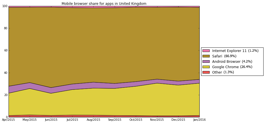
This, too, is almost identical to the worldwide chart.
What browsers are people using in Australia?
We see less mobile uptake in Australia than in the UK, but more than in New Zealand.
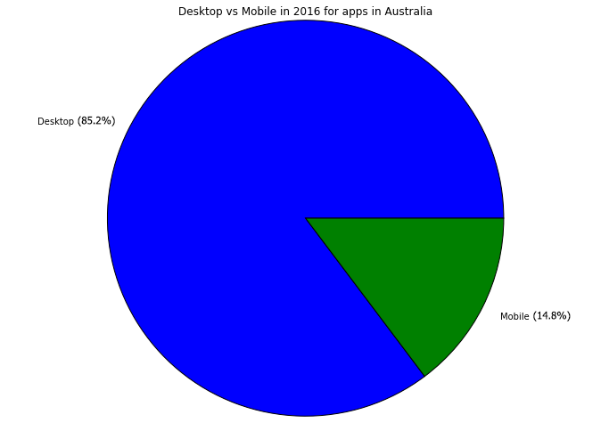
Here’s a breakdown of the desktop browsers in Australia:
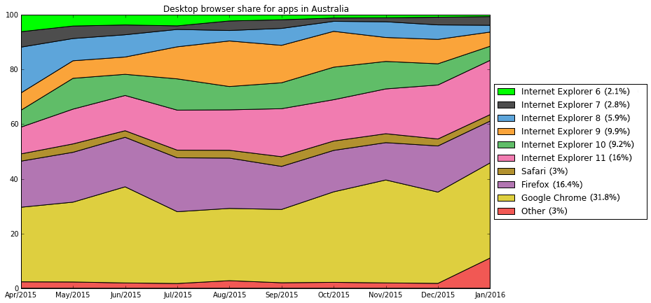
We were receiving a relatively large amount of traffic from a single location where people were still using Internet Explorer 6, which has slowly dwindled. There’s a distinct trend in the last couple of months for IE7 through IE10 to go away in favour of IE11, which is a good sign. I’m not quite sure why the “Other” line suddenly jumps up at the end…
Here’s a breakdown of the mobile browsers we see in Australia:
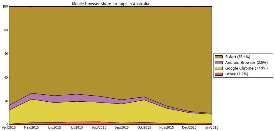
It looks like almost everyone in Australia who bought a smartphone or tablet went with an iPhone or iPad, and the fact that that market share grew in December is interesting. Perhaps a large number of people in Australia got shiny new Apple hardware for Christmas this year!?
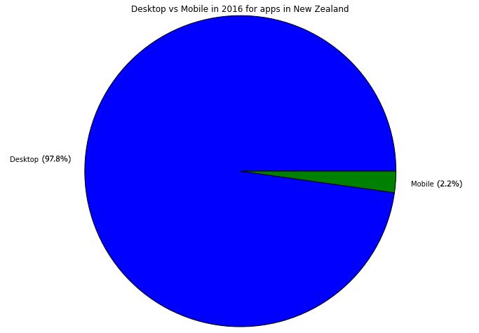
What browsers are people using in New Zealand?
The vast majority of people who visit our sites in New Zealand are doing so using desktop browsers:
I won’t dive into those mobile users because there aren’t enough of them to draw good conclusions, but here’s the breakdown of the desktop usage:
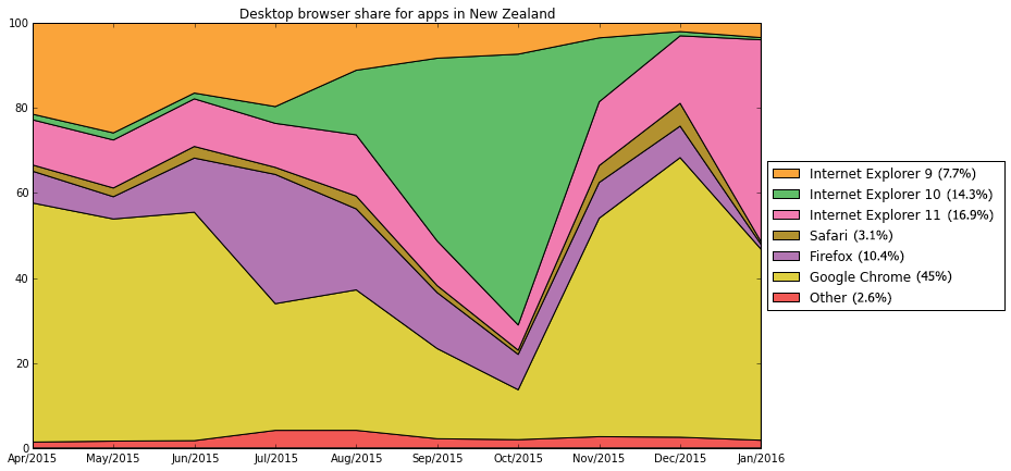
This one is intriguing. It looks like a large number of the visitors to our sites in New Zealand started using IE10 in October (or we gained a large amount of traffic from a single group of people using IE10 in October) and then they were immediately upgraded, by December, to IE11 and other current-generation web browsers.
It looks like these numbers include a lot of people using corporate- or government-managed machines with active, diligent operations teams keeping them up to date.
Small print
These statistics are compiled from visits to all three of our products: Budget Simulator, Citizen Space and Dialogue.
For comparable browser usage statistics from previous years, see our posts from 2015, 2014 and 2013.
