The following common mistakes keep coming up in the inbound.org community’s super generous critiques of members’ landing pages. I’ve personally used some of these lessons to double my conversion rate. Your mileage may vary, but there’s a lot of potential in what’s written below.
No. 1: Your headline copy does not convey the benefit of your offer.
In David Ogilvy’s celebrated book, Confessions of An Advertising Man, he writes that once you’ve written your headline, you’ve spent 80 cents on your dollar.
Let’s see how people mess this up.

“Strengthen brand and make connections” is vague. What does this mean in terms of tangible, measurable and measurable?” says Joel Klettke, of Business Casual Copywriting, critiquing this landing page for a guide to LinkedIn company pages.
Solution: Get potential customers to describe why someone should buy from you. Using your customers’ words, write your headline based on benefit to the customer.
No. 2: Your writing is unclear.

Responding to the headline on the landing page above, Jason Quey of The Storyteller Marketer explains how this content falls short as a B2B lead-gen offering:
“The promise feels too vague.”
Solution: Have some friends sit down next to you and read your copy (preferably on the landing page itself, so they experience it laid out as visitors would) out loud, and paraphrase each line or two. You can also do this via 70% discounted usability testing on MTurk. Avoid clever copy and be specific.
No. 3: Your page has too many conversion goals

After reading this landing page critique, Sarah Bernier-Danks of Think SEM points out herself that their page is trying to do too much:
“It’s confusing because they have multiple offers per landing page. Again, we’re at the client’s mercy on this, but we’re trying to get them to whittle it down to one (or at most two).”

In responding to constructive criticism, Josh Boles of the Paradigm Group explains how his landing page got overwhelmed:
“Makes sense that blog posts are not landing pages [i.e. we need to remove the sharing buttons and newsletter call to action]. Never really thought about that so will amend to a real landing page!”
Solution: Have a single goal per page.
No. 4: Your copy is disproportional to the conversion you seek
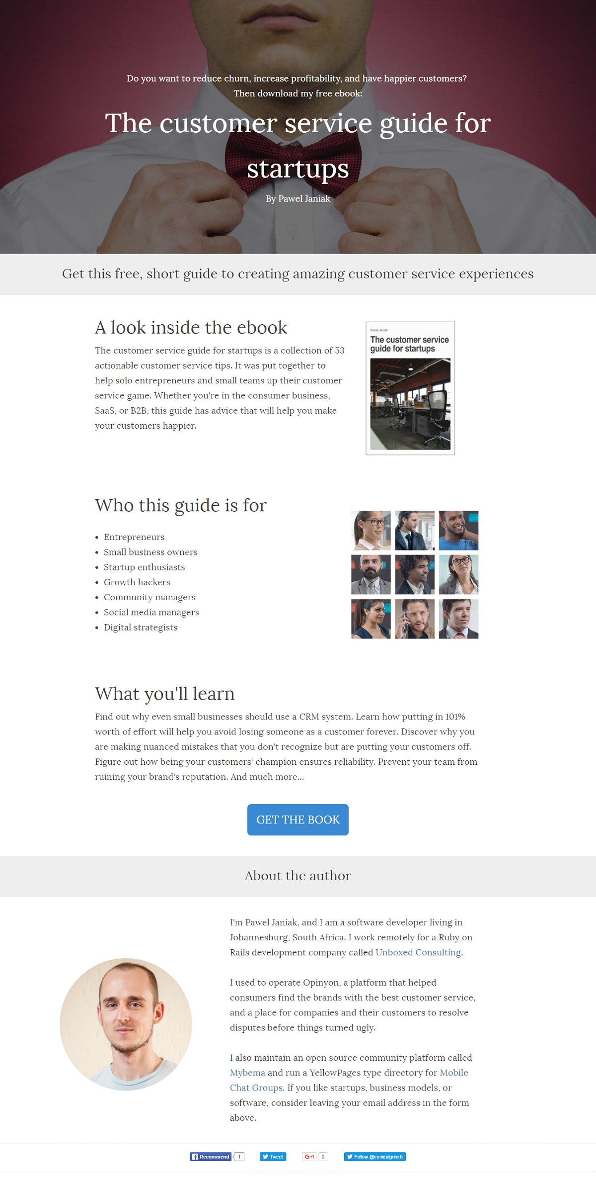
Write just enough to persuade. Then stop. This customer service ebook (critique here) makes a simple conversion (name and email) complicated with excess copy. Look at how long it scrolls just for a simple click through button call to action!
Conversely, if your product carries a high-price, you need longer copy than a cheap product. But even then the goal is only enough copy to persuade.
Look at this page seen on Inbound:

Would you spend $1500 for a sales training system based on a headline, a one minute video and testimonial? Probably not.
Solution: Cut 80% of the copy away. Usually. (Hat tip: Steve Krug’s Don’t Make Me Think.)
When in doubt, consider these factors:
- Price
- Urgency
- Complexity
- Safety
- Privacy
No. 5: The page doesn’t work the way visitors expect it to
Most visitors to your page are going to understand things the same way. Is visitors’ understanding the same as yours?

“It’s not clear when I need to pay. If I fill out the form on this page, am I brought to a page where I need to enter payment details? [They weren’t requested on this page.] If so, people may think its a scam (that you’ll take the money and run). If you only have to pay later, after the job is done, that’s great….but you should make this clear on the site.”
– Barry Buckman, of Ecommerce Innovators, commenting on this cleaning company’s page.
Solution:
Discover how others view your page using usability testing. See link in lesson 2 above for a guide to doing usability testing cheaply.
#6 – Your Landing Page Don’t Earn My Trust
“There’s a HUGE component missing: Actual testimonials from retirees […] the nail in the coffin is seeing 65 year old Mrs. Jones saying how much she loves living in Panama.”
– Joel Klettke explaining how to persuade more seniors to retire to Panama. (Note: They’ve since applied many of these suggestion so I can no longer screenshot the page as it was.)

On the above pic: “Right now your site is totally faceless. All of the photos of people on the site are obviously stock photos. Even the “about us” page has no real information.”
– Barry Buckman on that same cleaning company’s critique (see #5 above).
Solution:
Tout what third parties have said about you, how much you’ve sold (number of units or customers) or famous customers.
#7 – You Haven’t Done Your Market Research & Don’t Understand The Customer.
This is slightly less common, but typically is about an unusual idea that got developed and only then does the entrepreneur search for customers. You don’t know what
That’s like being in open heart surgery and realizing the person actually needed their shin bone realigned. #WhatDoWeDoNow
I’m not going to share examples because it may embarass some folks.
Solution:
Buy Ash Maurya’s Running Lean and then devour Customer Dev Labs … Justin’s content is groundbreaking and extremely valuable, as a log of practical experience applying Running Lean. This experience-based talk on lean can also interest you. Apply their methods to interview potential customers and learn what their major pain points are.
#8 – You Haven’t Addressed The Risk In Your Offer.
You wouldn’t take a blood test unless the needle was new/sterile, would you? Why expect anything different from visitors?

Similarly, responding to a landing page for a course on creating a copywriting business (above), Bhaskar Sarma, of Pixels and Clicks, writes
“The biggest problem IMO is that I, the reader still doesn’t know if your plan will work. You have mentioned that this is your experiment and you are asking me to pay to take a peek behind the screen. What if you fail? What’s the guarantee that my investment won’t go to waste? “
Solution:
Ask yourself what do people have to lose by converting, then address that. Imagine if a gym offered shuttle service that picks you up at your door twice a week, addressing the big risk of not showing up.
#9 – You Aren’t Segmenting Your Traffic On The Landing Page
TheProspectingSystem (mentioned above in point 4) has a new homepage that uses lots of Inbound’s tips! For instance, it segments visitors. The table of contents’ modules are not loaded by default, but shown only if someone clicks to view them.

Segmenting personalizes copy by allowing visitors to choose what to read. According to the book Honest Seduction, this can increase conversion up to 10x!
Solution:
Figure out what people care to find out, and give them links to those pages – within the main copy area – so they can find out more on their own and sell themselves on your offer.
(For the authoritative book on segmentation for conversion, get ion interactive’s Honest Seduction.)
#10 – Your Design Distracts The Eye
One common trick to lower conversion rates is causing the eye to flick between many loud visuals. It works a treat below!
Josh Garofalo, of Sway Copy, makes the point regarding Agent Pipeline:
“Riddled with distractions – achieve zen-like focus on landing page you must. I’d have a strong headline/subhead, any other text that supports the goal (get contact info), and get rid of the rest.”
Likewise Lennon Rubin, of Smooth Conversion, explained to this ecom store that they were drawing people’s eyes all over the place:
“Check your analytics […] If any elements on the page aren’t getting any engagement, remove them.”
Solution:
Tom Maiaroto of Shift8Creative, one of Inbound’s most generous landing page critics, explains the principle:
“You want elements on the page to guide your visitors, not distract them from understanding what the page is about.”
The practice: Start by designing for an old 320 pixels wide screen to force yourself to focus on the essentials. That’s actually my key tip for better homepage design.
Summary:
- Convey your offer’s benefit in the headline.
- Write clearly, i.e. specifically and in terms everyone understands.
- Set one goal per page.
- Make copy proportional to the conversion you seek.
- Cause your site to work the way visitors understand it to work.
- Earn my trust with third party endorsements.
- Research your market’s problems and demographics.
- Eliminate or reverse the risk in your offer.
- Segment the traffic according to the visitors’ needs.
- Simplify the design by eliminating visual distractions.
What would you spend the money on if your site earned 30% more revenue? Contact me at Gab@ConversionRateOptimization.co or 1-802-321-0111