Skip to content
Biz & IT

Dark Patterns are designed to trick you (and they’re all over the Web)

No, it's not only you—some user interfaces today intentionally want to confuse and enroll.

Yael Grauer | 199

Allow Harry Brignull to explain.
It happens to the best of us. After looking closely at a bank statement or cable bill, suddenly a small, unrecognizable charge appears. Fine print sleuthing soon provides the answer—somehow, you accidentally signed up for a service. Whether it was an unnoticed pre-marked checkbox or an offhanded verbal agreement at the end of a long phone call, now a charge arrives each month because naturally the promotion has ended. If the possibility of a refund exists, it’ll be found at the end of 45 minutes of holding music or a week’s worth of angry e-mails.

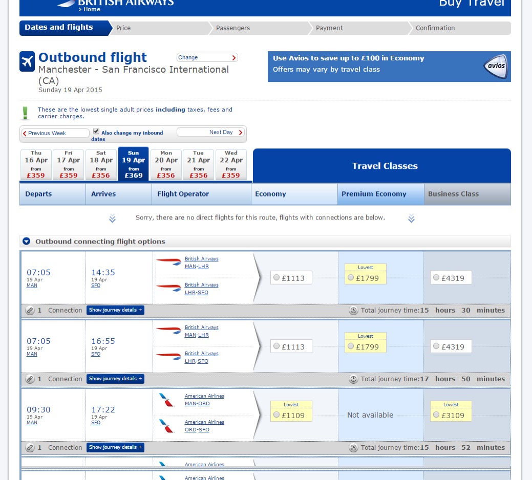
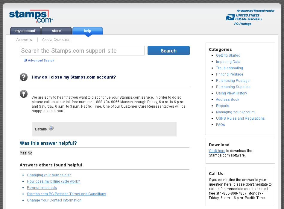
Everyone has been there. So in 2010, London-based UX designer Harry Brignull decided he’d document it. Brignull’s website, darkpatterns.org, offers plenty of examples of deliberately confusing or deceptive user interfaces. These dark patterns trick unsuspecting users into a gamut of actions: setting up recurring payments, purchasing items surreptitiously added to a shopping cart, or spamming all contacts through prechecked forms on Facebook games.

Dark patterns aren’t limited to the Web, either. The Columbia House mail-order music club of the '80s and '90s famously charged users exorbitant rates for music they didn’t choose if they forgot to specify what they wanted. In fact, negative-option billing began as early as 1927, when a book club decided to bill members in advance and ship a book to anyone who didn’t specifically decline. Another common offline example? Some credit card statements boast a 0 percent balance transfer but don’t make it clear that the percentage will shoot up to a ridiculously high number unless a reader navigates a long agreement in tiny print.

Ars Video


“The way that companies implement the deceptive practices has gotten more sophisticated over time,” said UX designer Jeremy Rosenberg, a contributor to the Dark Patterns site. “Today, things are more likely to be presented as a benefit or obscured as a benefit even if they’re not.”

When you combine the interactive nature of the Web, increasingly savvy businesses, and the sheer amount of time users spend online, it’s a recipe for dark pattern disaster. And after gaining an awareness for this kind of deception, you’ll recognize it’s nearly ubiquitous.

The lowest flight prices are listed up top, right? Right??!
The lowest flight prices are listed up top, right? Right??! Credit: DarkPatterns.org

Shades of grey

With six years of data, Brignull has broken dark patterns down into 14 categories. There are hidden costs users don’t see until the end. There’s misdirection, where sites attract user attention to a specific section to distract them from another. Other categories include sites that prevent price comparison or have tricky or misleading opt-in questions. One type, Privacy Zuckering, refers to confusing interfaces tricking users into sharing more information than they want to. (It’s named after Facebook CEO Mark Zuckerberg, of course.) Though perhaps the worst class of dark pattern is forced continuity, the common practice of collecting credit card details for a free trial and then automatically billing users for a paid service without an adequate reminder.

But while hackers and even SEO firms are often distinguished as “white hat” or “black hat,” intent isn’t always as clear when it comes to dark patterns. Laura Klein, Principal at Users Know and author of UX for Lean Startups, is quick to point out that sometimes it’s just a really, really poor design choice. “To me, dark patterns are very effective in their goal, which is to trick the user into doing something that they would not otherwise do,” she said. Shady patterns, on the other hand, simply push the company’s agenda over the user’s desires without being explicitly deceptive.

Examples of bad design choices that may be accidental aren’t hard to find. British Airways lists flights that are the second-lowest price as the lowest, and it’s hard to tell whether this misdirection is intentional. And examples of deceptive patterns that are, strictly speaking, completely legal are a dime a dozen. There’s the unclear language hidden in 30-page Terms of Service agreements, which lull users into a sense of complacency as they hit “agree” on every page. Sometimes users agree to allow apps to post on their Twitter feed or Facebook walls but later forget that this feature is enabled. The app doesn’t let them know at the moment it’s going to post, of course.

“The companies that know what they’re doing operate in sort of a safe zone where they’re not likely to be prosecuted or get into trouble legally,” Brignull explained.

Over time, users have been desensitized to these permissions. There are subscription sites that renew without a reminder a few days in advance or ones that are very easy to sign up for online but then force users to cancel by phone during business hours. And the vicious cycle of online advertising is even more difficult to pierce. There are those ads that follow you around the Web, known as behavioral targeting, or those ads based directly on things like your Web history or search terms. Opting out of this is so difficult that UX designer and Dark Patterns contributor James Offer considers that a dark pattern in its own right.

Even though the line between outright deception and poor user design is often hard to distinguish, Brignull said “there are some sites where it’s clearly intentional—they’re doing too many things for it to be by accident.” As an example, he points to The Boston Globe, which was recently called out for multiple dark patterns. Among the offenses, the site didn’t inform subscribers of price increases and buried rates in the site’s FAQ.

This sleight of hand is not as fun nor as harmless as 1980s British magician Paul Daniels.
This sleight of hand is not as fun nor as harmless as 1980s British magician Paul Daniels. Credit: Gary Stone / Getty Images

Gripped by numbers

Dark patterns may create short-term benefits for companies, but don’t they erode consumer trust over time? Why do this? UX designers told Ars that Dark Patterns are likely a response to company cultures focused on number-based metrics above all else.

“I am a huge fan of metrics, but it is one of the dangers of entirely metric-driven companies,” said Klein. “If you’re too metrics-driven, you’re only going to be focused on what moves a particular metric, and you will use any hack or any trick or any deceptive technique to get there.”

Klein believes many of the worst dark patterns are pushed by businesses, not by designers. “It’s often pro-business at the expense of the users, and the designers often see themselves as the defender or advocate of the user,” she explained. And although Brignull has never been explicitly asked to design dark patterns himself, he said he has been in situations where using them would be an easy solution—like when a client or boss says they really need a large list of people who have opted in to marketing e-mails.

“The first and easiest trick to have an opt-in is to have a pre-ticked checkbox, but then you can just get rid of that entirely and hide it in the terms of conditions and say that by registering you’re going to be opted in to our e-mails,” Brignull said. “Then you have a 100-percent sign-up rate and you’ve exceeded your goals. I kind of understand why people do it. If you’re only thinking about the numbers and you’re just trying to juice the stats, then it’s not surprising in the slightest.”

“There’s this logical positivist mindset that the only things that have value are those things that can be measured and can empirically be shown to be true, and while that has its merits it also takes us down a pretty dark place,” said digital product designer Cennydd Bowles, who is researching ethical design. “We start to look at ethics as pure utilitarianism, whatever benefits the most people. Yikes, it has problems.”

You can check out anytime you like, but you can never leave

Perhaps the most frustrating thing about dark patterns is how difficult it is to get companies to make changes. They are often unresponsive to user concerns, and it’s much easier (and more profitable) to placate individuals than it is to change an unethical design for the masses. But when Offer received a refund after accidentally purchasing cancellation protection with a concert ticket, he didn’t think that was good enough. He considered contacting the UK’s Citizen Advice Bureau, but then thought it would just be so much work to try to do so.

Sometimes even when users are aware of strange charges, they don’t think the amount of time it would take to fix the issue is worth it. After all, companies often have a ready response—there are opt outs available, even if the process is obscure and far from transparent, or perhaps users should read the Terms of Service agreement closer despite 4-point font. About six months ago, I complained to my cable company that I was being charged for Starz—which I didn’t recall signing up for. The bill was misleading and made it seem like I was not being charged to boot. The customer service representative was ready: if I’d downloaded the PDF version of the bill rather than the one that’s viewable on the website, the price breakdown would have been more obvious.

It’s true that users with eagle eyes and knowledge of these nuances can sometimes circumvent misleading opt-ins. Klein recently did just that when she got a push notification on her phone from Verizon letting her know that she had a voicemail message. Ultimately, the notification was trying to get her to sign a giant terms and conditions page. “It was apparently asking me if I want to see my visual voicemail—and by the way, we’ll charge you $2.99 a month,” she said. "They had given me a free month that I didn’t ask for, and when I went to check my voicemail it asked me to sign up, but it wasn’t clear. It was a wall of text I had to read.”

Just checking a voicemail and clicking “yes” would sign a user up for the service, but Klein was able to recognize what happened. Others aren’t so lucky. In fact, some users who don’t check their statements closely may not even be aware of surreptitious charges.

Oh, sure I'll sign up for a one-month free trial from Stamps.com (thanks podcast!). Wait, what's this charge? Why was I auto-enrolled in month two and now unable to close my account online??? Credit: DarkPatterns.org

Legal solutions

If dark patterns are better designed and more abundant than ever, is there any way to slow the practice down? One possible solution is a legal one. “I’ve recently started to find the idea of better regulation appealing,” said Brignull. “If you put consumer laws in place that’ll prevent a company from doing something, they’ll follow the laws, but as soon as it’s just down to ethics, it’s anybody’s guess how they choose to behave, or to rationalize things in their mind to see something as ethical when maybe it’s not, or the consumer wouldn’t see it that way.”

The Federal Trade Commission Act’s prohibition on unfair and deceptive acts or practices does extend to online advertising, marketing, and sales. Regulation is tricky, however, because—again—many dark patterns are technically legal, skirting the rules without breaking them. Some deceptive patterns that are used in the US are illegal in other countries even.

That said, lawsuits can be effective. Lately, subscription sites have been coming under legal fire. JustFab (the owner of ShoeDazzle and Fabletics) paid a $1.88 million fine to settle allegations of deceptive marketing. After the legal settlement, JustFab now posts a total of 14 notifications about its subscription service and requires readers to affirm their decision to become members two times, according Bloomberg.

Other sites are following suit. Stamps.com paid out $2.5 million in a lawsuit similar to JustFab; Blue Apron and Birchbox are facing lawsuits as well. A site called AdoreMe.com has also been hit with a lawsuit that even prompted design action. The site opts first-time users into a VIP membership with a recurring monthly subscription, but now the company has made changes to its website to make it easier for users to cancel… which led to a 30-percent increase in refunds and a 15-percent decrease in subscriptions. Still, the negative option billing—which requires users to opt out of specific sales to avoid a charge—remains. The practice continues to be legal with some stipulations.

Generally, the problem with litigation is that it often is so specific that it only dissuades one type of problem while leaving others in play. Last October, LinkedIn paid $13 million to settle a lawsuit after its “add connections” feature led users to send multiple spammy e-mails to their business contacts. Although users had agreed to let LinkedIn scrape their e-mail address book, they had only agreed to send one message asking someone to connect on the site. A judge said that the second and third e-mails “could injure users’ reputations by allowing contacts to think that the users are the types of people who spam their contacts.”

However, that settlement did nothing to end a separate LinkedIn dark pattern. The site recently touted two-step verification in response to its own password sloppiness as login credentials for as many as 117 million accounts popped up on the Dark Web. These days LinkedIn continually solicits users who have not shared their phone number to do so in the name of added security and the ability to reset passwords if locked out of an account. What the site doesn’t tell users is that doing so will make the phone number discoverable to others by default. Only after a user starts the process does any notification appear: “Your phone number helps us keep your account secure. It also helps people who already have your number discover and connect with you.”

It’s not initially clear whether there’s an option to turn off this discoverability—but there is an option. Buried under Privacy and Settings, users can use 2FA while also disabling discoverability. So just because a specific company stops spamming users doesn’t mean it won’t sneakily use phone numbers given for security reasons to push a feature many won’t realize they’re signing up for.

“It’s a bit like the Wild West, isn’t it?” said Brignull. “Technologies move much faster than people who try to do consumer protection for society.”

Other fixes

If legal means prove ineffective, advocates are now pushing for a technical solution. This is playing out right now in the battle between tracking blockers, such as Privacy Badger, and sites that seek to track users—even ones who have specifically requested not to be tracked through the universal Web tracking opt out Do Not Track.

In the face of public pressure, Facebook cracked down on unwanted game invites from games like Candy Crush, which have pre-selected checkboxes for players to invite all of their friends. “It’s very easy if you’re not paying attention to accidentally spam all of your friends on Facebook, and it makes it easier to do the thing you wouldn’t want to do than the thing you would want to do,” said Klein. But since Facebook enabled changes, users can now block specific games from sending them invitations and requests (and see the game if other people have it installed). They can ignore app invites from specific people as well.

The key to reining in Candy Crush was not the backend of Facebook, however—it was that consumer pressure. Take for instance, Ryanair. In many ways, the company was the poster child for dark patterns. The budget European airline’s website previously required users to opt out of purchasing priority boarding, airport transfers, sightseeing tours, cabin bags, phone cards, and more. Even when the controversial corporation was forced to stop opting people in for travel insurance, it still hid a “do not insure” option within its menu.

Today, insurance is offered as a separate opt-in, and a marketing team is slowly revamping the company’s website. What changed? Net profit plummeted. “Their well-known dark patterns started to work against them eventually. Now they’ve stopped using them,” Brignull said.

Still, there’s no clear solution to the dark pattern problem in the near future. A public looking for more speed and ease will simply continue to butt heads with companies wanting more and getting better at finding digital sleight of hand. But sites like Brignull’s and advocate designers like Klein are at least raising awareness. Now we know, and knowing is half the battle. The other half is just finding the checkboxes in those dense Terms of Service.

Yael Grauer (@yaelwrites) is an independent tech journalist based in Phoenix. She's written for WIRED, Slate, Forbes, and others. Her PGP key and other secure channels are available here: https://yaelwrites.com/contact/. She previously wrote about VPNs for Ars.

199 Comments