Crafting a Successful Onboarding Experience for New Users
The term onboarding comes from the HR department. It was originally used to refer to new hires and having them “acquire the necessary knowledge, skills, and behaviors to become effective organizational members and insiders.” If you replace the aspect of new hires with new users the idea is exactly the same.
Think of it as part of the whole signing up user journey. Onboarding is part of the funnel and it’s part of the user’s first experience with you app. Onboarding experiences can be good or bad. However, I’ve found that app which see onboarding holistically within the whole picture – from getting the user to click the sign up CTA to the user using the product – have the best of experiences.
What does the user need?
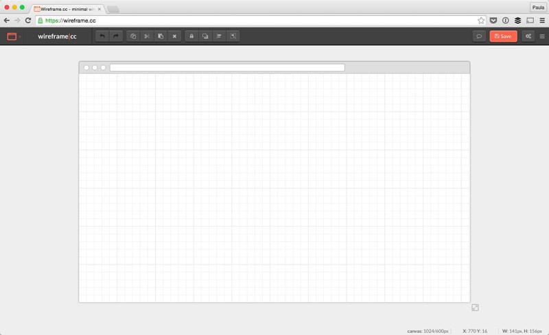
Let’s starts with the purpose of creating the onboarding experience. What does the user need? What kind of information do they need to acquire in order to be successful with using your product? Do they even need an account in order to use your product? If not that affects how the user. I don’t need an account to use wireframe.cc but, it is handy if I want to save my work. Since I don’t need an account, I can start using the app right away and it’s a pretty intuitive app.
The onboarding experience here is pretty minimal but I do have everything I need in order to use this product.
Do you really need their email?
What about something more complicated? What about onboarding for an app like Slack? In order to use Slack, I do need an account. Therefore the onboarding starts on their home page.
With Postcards Email Builder you can create and edit email templates online without any coding skills! Includes more than 100 components to help you create custom emails templates faster than ever before.
Free Email BuilderFree Email Templates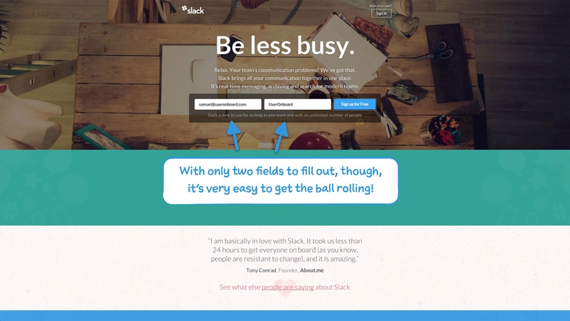
Again, in Slack’s example, they require the user to validate their email before you’re able to enter their messaging app. Although you are free to download and install it without validating the email first. Most apps do ask for email verifications and some block access at some point if a user does not do this. But not all of them. This is something to be mindful of all well. How crucial is an email verification in getting the user? Decide and incorporate accordingly.
Here is another example of account creation from Eventbrite. First, you create an account by providing an email and password. Then you are asked to validate your email. (Sort of, you’re not actually asked, you’re not told what to do next but I digress.) When you click the link in the email to activate your account you’re taken to a page that tells you to create a new password.
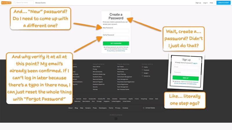
Think about that for a second. What a waste of time. What a great way to annoy the bejeezus out of someone. What an awful onboarding experience. Don’t ever do this to anyone!
Does the user need a profile?
As with most thing, the extent of a user’s profile varies from app to app. Some apps don’t have them and some require a memoir. Go figure. Only ask your new users the information that helps them be successful. In the below screenshot it may seem like Zendesk is not asking for a lot. After all, they only ask for a user’s name and a phone number which is optional. Yet, it doesn’t tell me why I, as a user, should provide either.
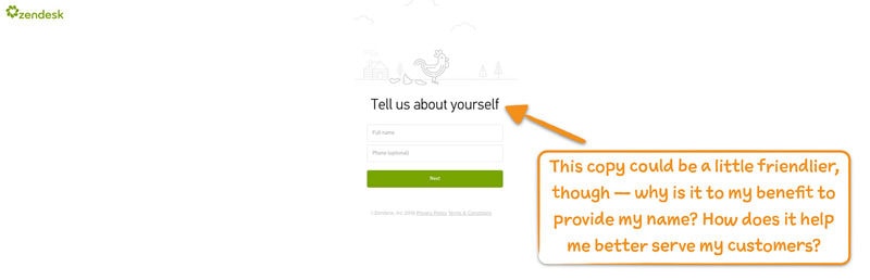
Personally, I don’t like giving out my phone number to companies for two reasons. They never call me, so it’s a waste of my time to fill out, and I never know why they would need to call me anyways. Most companies communicate via email anyways.
With Startup App and Slides App you can build unlimited websites using the online website editor which includes ready-made designed and coded elements, templates and themes.
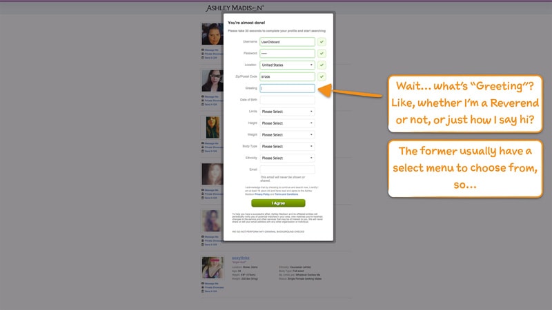
Try Startup App Try Slides AppOther ProductsHere is an example from Ashley Madison. You need some information to be on an online dating – can you call Ashley Madison online dating since it’s for affairs? – in order to help facilitate better matching. That’s kind of obvious but, if you look at the form in the screenshot below some of those fields just plain don’t make sense. You want the profile creation to make sense. You need it to so that users fill it out correctly.
Be clear on next steps
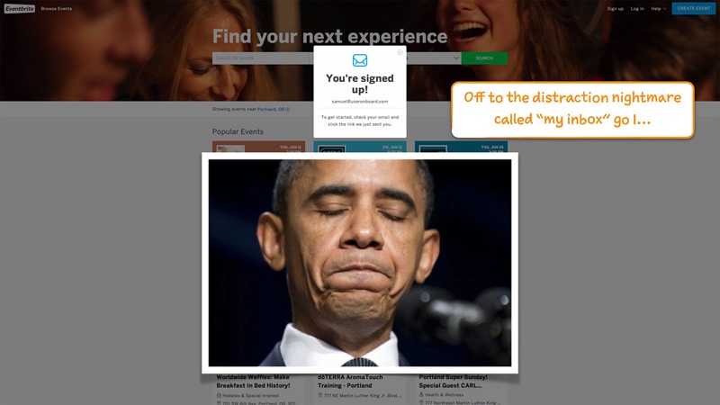
This is just some good general advice but always indicate what the user needs to do next. We can debate button copy all day long if it should say “Continue” or “Next” or something more personable. However, that’s not the point. The point is when the button and action are missing it’s a really big problem. Check out the two screenshots below.

The above screenshot is from Zendesk. And, like, the hell am I supposed to do with that? The below screenshot is of Eventbrite. And, the hell am I supposed to do with that too? #fail
What about a walkthrough?
A walkthrough could be a good intro to a very complicated product that cannot be redesigned. I am a firm believer that walkthroughs, and FAQs for that matter, are failures of the interface’s design. Anything design and product can be made intuitive. However, I do understand sometimes we can’t just spend an infinite amount of time redesigning and perfecting the product we are working with.
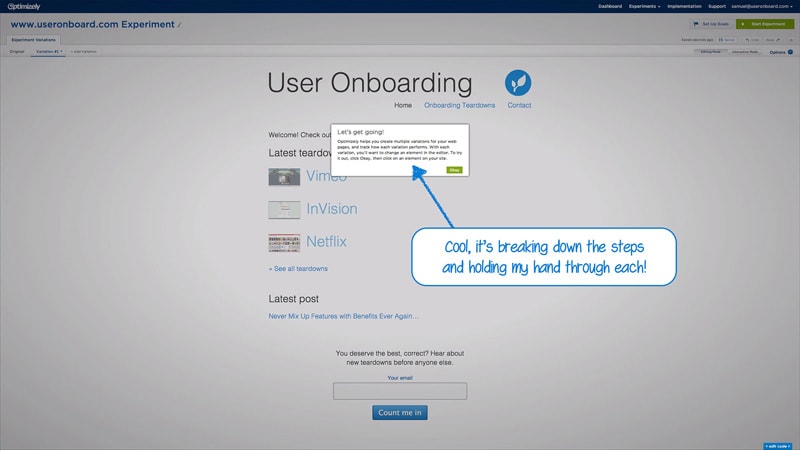
An app like Optimizely can definitely use a walkthrough; it’s a complicated product to get the hang of so it’s a nice introduction to a brand new users. Like with everything, just make sure the walkthrough is too well thought out.
The experience needs to belong
My last piece of advice when creating an onboarding experience is to make sure it matches everything, you know, like the branding.
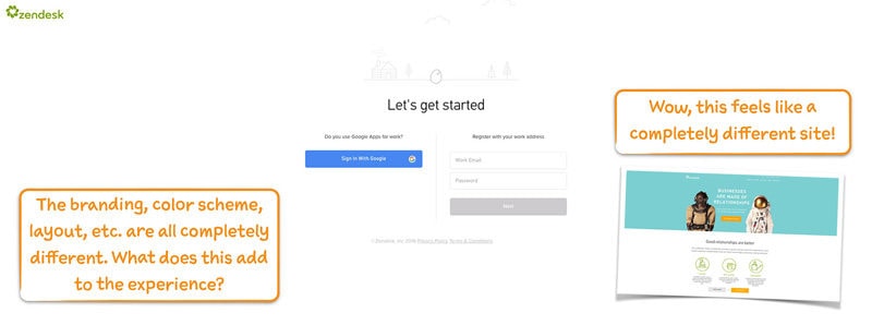
Above is one more screenshot from the onboarding experience from Zendesk. You can check out the whole experience and commentary of Zendesk’s onboarding by UserOnboard. (I got all my screenshots from that site by the way, if you’re looking to check out the other examples.)
Anywho, you want the whole first experience to feel smooth, cohesive and holistic. You want it to be as pleasant as possible. Having broken accessibility, like unclear UI labels, redundant tasks or different styling breaks this smoothness.
Conclusion
Onboarding experiences can be a wonderful way to get a new user psyched about your app or product. It’s all about balancing usability and user experience but it’s not rocket science. Onboarding is supposed to get the necessary information they might need in order to effectively get started in using your product. Like I said, not rocket science!
My overall advice is to think of onboarding all the whole process from signing up to using the product. It’s not the thing after a credit card is on file. It’s not the thing after a profile is filled out. And, above all, don’t ever let it be a walkthrough if you can help it!