The marketers for a typeface called “Dyslexie” claim the font can make reading “easy and enjoyable for people with dyslexia”. The reasoning behind the font’s design is intriguing. But before you get too excited — the scientific evidence supporting Dyslexie’s usefulness is far from conclusive.
Created by Dutch designer Christian Boer, Dyslexie has been around for years, but got a lot of press at the beginning of last year. In November 2014, the font featured prominently at the Istanbul Design Biennial, which garnered coverage from publications like USA Today, NPR and The Guardian.
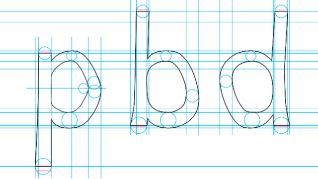
These articles, for all intents and purposes, are interchangeable. Dyslexie, the narrative goes, incorporates a number of typographical features — for example, heavy base lines, larger openings and alternating stick and tail lengths — that supposedly make it harder for the brains of people with dyslexia to rotate, swap, mirror and otherwise confuse letters while they’re reading. The resulting typeface is said to make reading “easier and enjoyable for people with dyslexia”. The website for the Dyslexie campaign calls the font “revolutionary”.
The problem with these claims is that there’s no conclusive evidence to back them up. Even the results of “representative research” cited on the Dyslexie website fail to establish a clear, significant benefit to reading with Dyslexie.
This information was first brought to my attention by Kevin Larson, a cognitive psychologist and member of the Microsoft Advanced Reading Technologies group. Studies that have compared the reading speed of people with dyslexia presented with Dyslexie with Arial have found no statistical difference between the two, said Larson. And from a legibility standpoint, he quips, “Arial isn’t even that great a typeface.”
Larson’s claim checks out. In 2010, in her Master’s thesis titled “Special Font For Dyslexia?”,
Renske de Leeuw compared Dyslexie to Arial in reading tests of dyslexic and non-dyslexic readers. Test subjects actually read one more word per minute with Arial than Dyslexie (80.0 vs 79.0); and while readers of Arial registered 0.4 more errors per minute (1.7 vs. 1.3), neither difference was statistically significant.
Larson then referred me to this post by Chuck Bigelow — a MacArthur Fellow renowned for his creation of the Lucida typeface family — for his take on typography and dyslexia. Sez Bigelow (emphasis added):
In preparing a literature review on dyslexia and typography for a major font vendor, I surveyed more than fifty scientific papers and books about dyslexia, paying special attention to those with typographic relevance. In the scientific literature, I found no evidence that special dyslexia fonts confer statistically significant improvements in reading speed compared to standard, run-of-the-mill fonts. Some studies found that for certain subsets of reading errors, special dyslexia fonts do reduce error rates for dyslexic readers, yet for other subsets of errors, special dyslexic fonts were no better, or in some cases worse; hence, the findings on reading errors are mixed.
Bigelow reviews de Leeuw’s thesis in more detail than I have here, and his analysis is well worth the read. He also dissects another, later Master’s thesis from the University of Twente
by Tineke Pijpker, which examined “whether a yellow background and the special font Dyslexie could improve the reading performance of dyslexics”:
Again, there was no improvement in reading speed with the Dyslexie font compared to Arial. Pijpker also discusses reading accuracy comparing the fonts and background colour. There was no significant difference between Dyslexie and Arial on white backgrounds, but there was a significant advantage for dyslexics of a lower reading level for the Dyslexie font on yellow background compared to Arial on a yellow background. There were no significant font or colour advantages for higher reading level dyslexics nor for non-dyslexic readers.
Bigelow points also to a 2013 study by Luz Rello & Ricardo Baeza-Yates that compared “Open Dyslexic” — another typeface said to ease reading for people with Dyslexia — with Arial, Computer Modern, Courier, Garamond, Helvetica, Myriad, Times and Verdana. The study’s authors conclude that Open Dyslexic “did not lead to a better or worse readability. As in [De Leeuw’s thesis], OpenDys did not lead to a faster reading.” What’s more, when study participants were asked to rate the typefaces according to preference, Open Dyslexic ranked dead last:
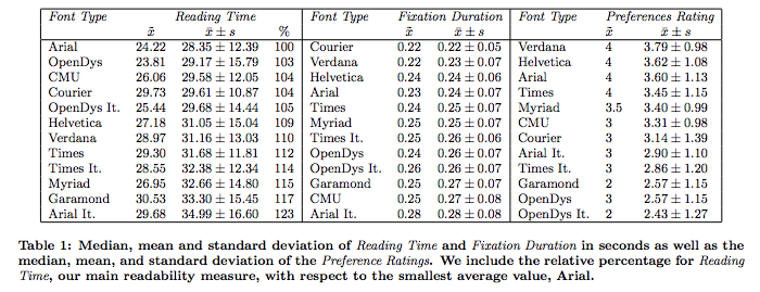
Via Rello and Baeza-Yates, 2013
“Although it appears that the current crop of special fonts for dyslexia offer little or no advantage,” says Bigelow, “there are… a few other studies involving typography and dyslexia that are more promising.” For those studies (which examine the benefits of things like larger type size, shorter line-length and increased letter-spacing), I refer you to Bigelow’s post. For now, let’s turn our attention back to Dyslexie.
What does the Dyslexie campaign have to say about these conflicting findings? I emailed them to find out. In my email, I reference Pijpker and de Leeuw’s research, specifically, and note that the evidence in support of Dyslexie’s improved readability seems contradictory. Reprinted here is the Dyslexie campaign’s response:
The Dyslexie font is made as a graduation project in 2008 done by Christian Boer. After his graduation he thought only he and the people giving feedback on his design would use the font. But overloaded by positive reactions of so many people with dyslexia we continued to provide the Dyslexie font and this is where it is today. For us it is amazing that a typeface get so well known and used all over the world by people with dyslexia or other disablities. Dyslexie font is driven by positive feedback from our users. We provide the font for free for home users so they can easy try if they can benefit from the Dyslexie font [They still sell it to businesses, schools, and publishers — Ed.]. If you go to the website www.dyslexiefont.com users can read the tekst on our website in the Dyslexie font. They can try reading in our font before they have to download it.
It is true though that the result of the research are not the same. There are comparisons like they both have a conclusion telling that there is more research required to determine the benefits of our Dyslexie font. Good to know is that the both conclusions are telling us that there are no negative effects for dyslectics or non dyslectics using the font. So aslong our current users are giving us the positive feedback we will be happy continue developing the font.
We agree with the researchers that there must be done more research. We totally support initiative to do more research to determine the benefits of the Dyslexie font. So if there are Universities or students who would help us clarify if the Dyslexie font can significant improve reading for dyslectics, please feel free to contact us. We are willing to help as much as needed to get more and more results what can help the people with dyslexia around the world.
The upshot? If Dyslexie works for you, great. But calling it “revolutionary”, at this juncture, is flat out misleading.
Comments
One response to “Special Fonts To Help Dyslexics Might Not Actually Help”
Interesting article, given I’m a typographer. Has anyone done studies into what happens when you ask someone with dyslexia to read one of those jumbled paragraphs of text such as … “Aoccdrnig to a rscheearch at Cmabrigde Uinervtisy, it deosn’t mttaer in waht oredr the ltteers in a wrod are, the olny iprmoetnt tihng is taht the frist and lsat ltteer be at the rghit pclae. The rset can be a toatl mses and you can sitll raed it wouthit porbelm. Tihs is bcuseae the huamn mnid deos not raed ervey lteter by istlef, but the wrod as a wlohe.”
Does dyslexia occur uniformly across all languages? Are there less sufferers in countries that use a pictograph and ideograph based written language for instance?