Monochromatic Color: How to Use It Effectively
While the thought of completing a design project with only one color might be intimidating, it can actually result in a pretty awesome aesthetic. Monochromatic color options are also a hot concept and can work for a lot of project types.
Monochromatic color is rooted in color theory and takes more than just picking a color and designing everything with it. You’ll want to consider the meaning and associations of the color you choose and how to make that hue work with other components in the page. Here, we’ll explore ways to help you better understand and effectively use monochromatic color in any of your design projects.
2 Million+ Digital Assets, With Unlimited Downloads
Get unlimited downloads of 2 million+ design resources, themes, templates, photos, graphics and more. Envato Elements starts at $16 per month, and is the best creative subscription we've ever seen.


What is Monochromatic Color?

The basic definition of monochromatic color is to use a single base color and shades, tints and tones of that hue. Some purists may argue that the initial color option must come from the color wheel as one of the primary, secondary or tertiary colors, but for design purposes that does not necessarily hold true. (Although every color can be traced back to the wheel in some form.)
To simplify, monochromatic color starts with a single hue – anything from red to beige to purple – and the design is created with a palette using derivatives of that color. Sounds simple, right?
Create a Monotone Color Palette

The top consideration in monotone color palettes is contrast. The biggest dilemma that designers face in monochrome color projects is that nothing stands out in the design or everything fades into a singular background. You can eliminate this feeling with sharp contrast.
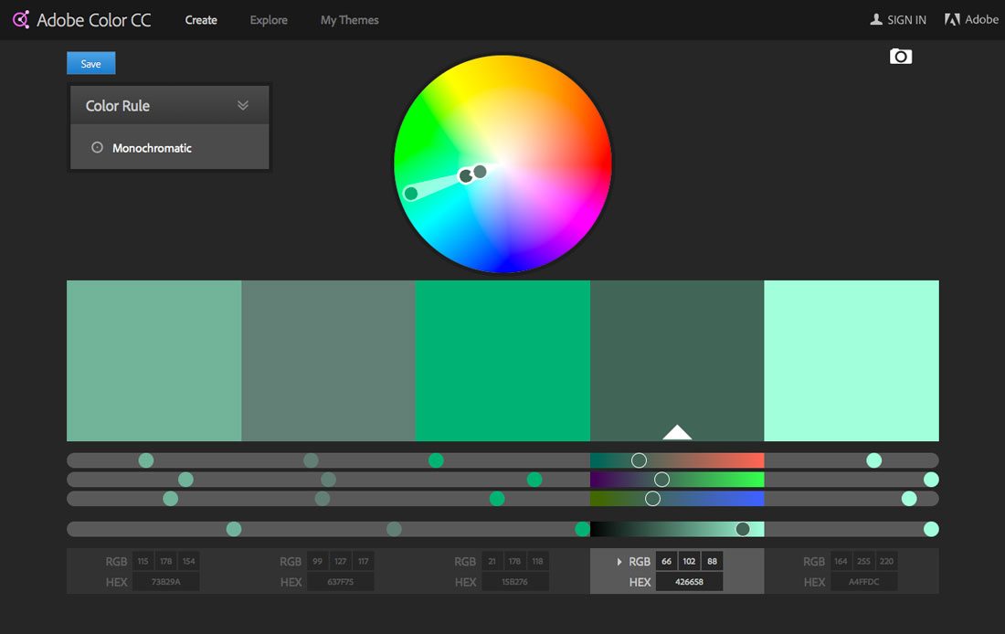
Creating a monochromatic color palette starts with picking a base color. If you are doing this for an established brand, using a color from your stylebook is recommended for most projects. Then start creating lighter and dark variants of the color as secondary options. You can create this palette on your own or use a tool such as Adobe Color CC, which includes a monochromatic color tool. (That’s how the palette above was created.)
Starting with a base color, you’ll likely need a minimum of two other options – a darker version of the color and a lighter version. As with any other type of color palette, you’ll need to determine what the use for each color variation is and how it will appear throughout the design. Generally, the rules for using monochromatic color are no different than any other palette; the main difference is that every color is from the same base.
Shades, Tints and Tones
Shades, tints and tones are your biggest tools when planning for a monochromatic color scheme. Get familiar with each because you’ll use them to create and mix-and-match within this type of color framework.
Here are the definitions you need to know:
- Base color: The dominant color selected for the color palette. It is the starting point from which all other color choices are derived.
- Hue: One of the 12 purest colors from the color wheel – primary, secondary or tertiary. (This is probably not vital to your design but is good to have in your back pocket.)
- Shade: A color and the addition of black to make it darker.
- Tint: A color and the addition of white to make it lighter, such as a pastel.
- Tone: A color and the addition of grey to pull back the intensity of a color. (Most colors fall in this category in relationship to hue.)
Benefits of Going Monochrome
Monotone color palettes can work for a number of reasons. The use and popularity of monotone options is not limited to any one type of design either. While single-color is popular in website design right now, it is also a favorite of interior designers and for package design.
Benefits of monotone color schemes include:
- One color automatically creates a sense of simplicity and harmony.
- It can be easy to design, because you don’t have to worry about matching colors.
- It sets the scene for a minimal style that gives content room to shine.
- Monotone backgrounds allow contrasting elements room to be seen.
- Monotone color schemes provide some accessibility benefits when it comes to users with color blindness.
- Single-color can make an impression, especially with a strong or unusual base color.
Forget the “Rules”

Designers using monochromatic design outlines tend to fall in one of two camps – monochromatic purists and those who “break the rules” by adding one more color.
Sometimes the thing that can really make a monochromatic outline work is an accent color that stands in complete contrast to the rest of the design. Think about green color palette for a website; now think about the call to action buttons. Would they work better in another shade of green, or as red buttons?
Monotone color schemes can work brilliantly with imagery that is part of the same color family, but consider a monochromatic outline for the website design with visuals that are all in contrast to that color element. The images will immediately become the focal point of the design because of the contrast used.
Black and white color schemes, which you can argue as being monochromatic or not, can especially benefit from the use of an element of color contrast to set elements apart. While adding another color to a monotone color scheme is not truly monotonous, it can add that extra bit of contrast or element of surprise to help users navigate and use your design. Just that extra color sparingly and intentionally for the best results.
Another “rule” of monotone color design is that designers often use it for an entire project. Consider creating monochromatic elements and incorporate them into the design for touches of the trend. 450 GSM (above) does this beautifully with the origami-style bird on their landing page.
Combining Trends
Now that you are convinced that a monochromatic color scheme is right for your next project, consider combining it with other trends. (That’s one of the beauties of trying new color techniques, you can combine them with almost any design trend.)
These websites are using monochromatic color and other design trends in inspiring ways.
Monochrome and Minimal

The super-simple site for the Jeet Grid System is easy to see and read thanks to clean lines and a minimal style design. The mint and mint shade add to this minimal effect.
Monochrome, Background Video and Color Overlay

Tennis Au Feminin uses a navy color overlay to turn everything on the homepage into a monochromatic element. There are enough bits of contrast in the background video to pull it all together. (And just look at how many trendy elements are used in this design without feeling overwhelming?)
Monochrome and Flat
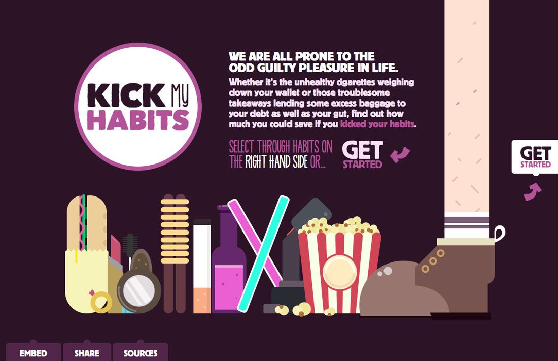
Kick My Habits combines flat design concepts with a background and color scheme rooted in a single hue. The purples grab your attention while the other elements – the illustration in particular – help pull you through the site.
Conclusion
Monochromatic color is an option that can work for big brands and small. It can be an easy color pattern to implement and design if you think about contrast from the start.
Monochromatic color can also leave a lasting impact on users and spark visual interest, especially when used with a color that is not commonly seen or associated with your designs. It’s fun to play with because there are so many different ways to play with this color option. Start small with a two-tone hover action or single-color style business card. Monochromatic color options are almost limitless.