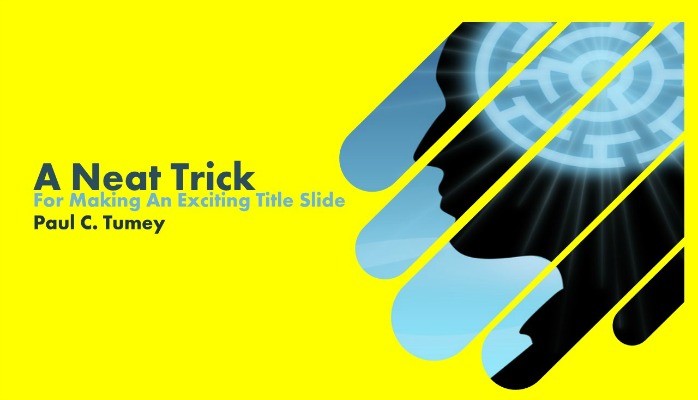
A Neat Trick For Making an Exciting PowerPoint Title Slide: The "Popsicle Stick" Effect
First impressions matter. In PowerPoint presentations the first impression your audience gets of you could be from your title slide. Think about it: this image, representing you, could be on the screen for several minutes before you start speaking.
As a professional with over twenty years' experience doing this, I think it’s worth putting in a little extra effort to make a professional, polished and — dare I say it? — impressive title slide.

Here’s a neat trick for making an exciting PowerPoint title slide with a slanted “popsicle sticks” layout like the example above. This design can be easily created and adjusted to fit your colors and branding elements.
I think of title slides as being similar to the cover of a book, magazine, or CD. The idea is to capture the attention and interest of people so they will want to explore the content within. Sure, in business arenas, it is acceptable to simply type in a title, your name, a date and call it a title slide. But it actually doesn’t take that much more effort to create a title slide that will help make a strongly positive first impression.

I’ve worked with event producers at conventions and seminars. From them, I’ve learned the first slide goes on screen while people are taking their seats. These professionals call the first slide a walk-in slide, because that’s what’s on screen as people are walking into the venue. This should give you a clue as to how important this first slide can be.
You don’t need to be a designer to pull this off. But, if you make a walk-in slide with this tip, people might think you’re a designer!
Step One
First, you need to make a colored background. This is actually a key part of the design. Don’t be too concerned about what color to use at this point — we’ll come back to color selection later. Draw a rectangle to fill your slide and make sure it has no outline.

Step Two
Now, select the Rounded Rectangle shape and draw a long thin bar, as shown in the illustration. Again: no outline. If you click on the bar after you’ve drawn it, you’ll see there is a small yellow handle. Click and drag that handle to adjust the rounded corners to be as round as possible. The end result should look a bit like a popsicle stick!

Step Three
Click on the rotate handle and position the shape so that it points diagonally into the slide (about a 320 degree angle). The top end of your popsicle stick should go off the slide.

Step Four
Duplicate this shape so that you end up with a set of five. You can vary this number, but generally odd numbers of shapes are waaaay more interesting (my college art teacher taught me this). Arrange them into a pattern so they form a kind of “V” that points down and into the slide. Keep some space between them, but not too much.
You can also make the middle shapes a bit thicker. It’s not too important to be precise in sizing and spacing here — just do what looks good.

Step Five
Select all the shapes (hold the shift key down and click on each shape) and group them together. It is mission-critical to group the shapes — otherwise this effect will not work.

Step Six (Where the Magic Happens)
Go to Shape Fill and select “Picture.” Navigate through your files to select the photo you wish to use. For this layout, a horizontal photo will work best. Obviously, choose a photo that is relevant to your content. Once you select the picture, your shapes will fill with it.
You should have one image, broken into the five popsicle sticks — neat!
If you do this step and get five weirdly stretched images, you need to make sure you grouped the shapes together and that you selected the entire container for the group, and not one shape inside the container.

Step Seven
Click on the background shape and set the color so that it compliments your image. In my first example, I chose a bright yellow to contrast with the rich blues of my image. If you have a dark image, you might want to choose a light color, or vice versa.
Another option is to use the eyedropper tool in the Shape Fill menu (of PowerPoint 2013 and higher) and select a color from the image itself. It’s best to look for a color that works as an accent in the image, not the most pervasive hue.

Step Eight
As a last touch, you might create two thin bars as shown and layer them on top of your image. When you match the color of the background, this will add a nice "margin effect" to the image.

BONUS: More Examples
Once you make this slide, it is easy to adjust. Here are some variations on this design that I quickly made from the original.


And, of course, you can play with this technique to create other designs, such as this one:

My YouTube Video of This Tutorial
Hire me to elevate your communications! Contact me today at: paultumey@gmail.com or at 206-437-4991.
Agency Search Firm - Agency M&A - Independent Consultant
7yPaul Tumey - I followed your advice and created a great new introductory slide for a presentation I'm making out of town in about a week. Your step-by-step advice got me through all my concerns about getting it right. The result is a fresh new opener that I'm looking forward to displaying. Thanks for sharing your expertise! You are the best at what you do.
Agency Search Firm - Agency M&A - Independent Consultant
7yThis is great Paul. I'm going to try it as I prepare my next PPT.