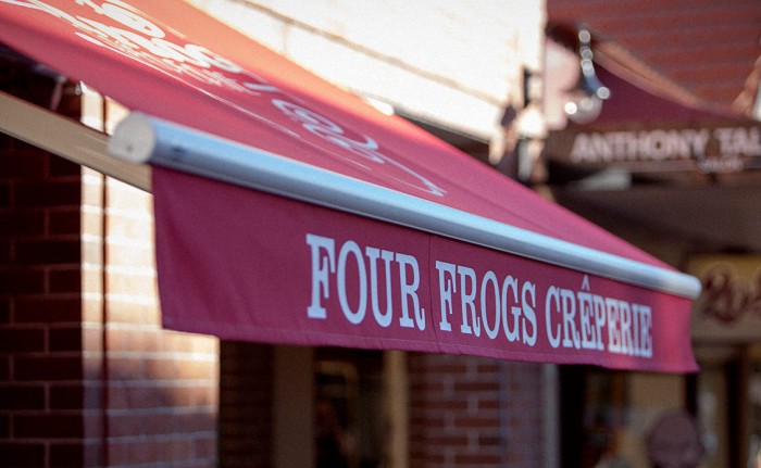
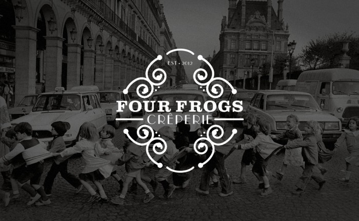
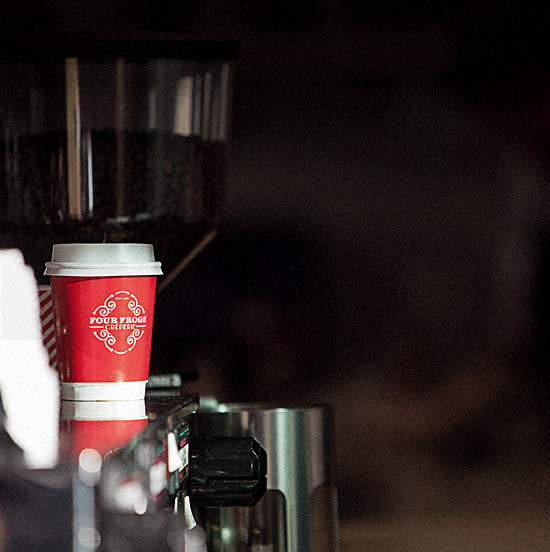
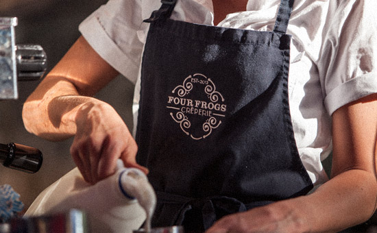
Although there isn’t much to show, the brand identity for Four Frogs Creperie is worth covering. The identity for this restaurant is spearheaded by a simple type treatment enclosed with geometric flourishes. The type is a combination of traditional serif supported by a notoriously sexy Art Deco typeface. The color palette is limited to black, white and creating a highly contrasted, confident tone. Designed by the National Grid.
tng_four_frogs_07

tng_four_frogs_05

tng_four_frogs_04

tng_four_frogs_01

Discuss this Project

Leave a Reply

This site uses Akismet to reduce spam. Learn how your comment data is processed.

The Forktales Podcast™: Interviews with restaurant industry leaders and visionaries

Restaurant and advertising industry headlines and thinking

Reviews of restaurant experiences from around the globe 

Reviews of our favorite design, business, & restaurant books

Our favorite typography and fonts

Inspiration in your inbox

Get the latest inspiration in your inbox every Monday morning, for FREE!

"*" indicates required fields

This field is for validation purposes and should be left unchanged.

Delicious Bits in your Inbox!

Get the latest and greatest content delivered to your inbox for free!

"*" indicates required fields

This field is for validation purposes and should be left unchanged.