Infographics are (still) popular. Clients ask me about them all the time. I ask them to tell me about the last three infographics they remembered.
The response is generally full of stammering as they grope for an answer. Rarely do I get specifics. Even when I do they say things like ‘that infographic about craft beer’. When I ask where the infographic came from? Crickets.
Can you name the brands associated with infographics? The brands that come up most often are Mint and OK Cupid. Everyone else is an also ran. And that’s the thing. For all of their popularity, you won’t remember that infographic.
Or, at least, you won’t remember it the right way.
Triangle Of Memory
To understand why infographics are so problematic we need to look at how we remember content.
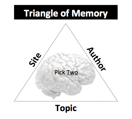
The triangle of memory is a variant of the project management triangle that includes better, faster and cheaper attributes, of which you can only have two at any given time. You can have a project fast and cheap but it won’t be better. You can have a project fast and better but it will cost you an arm and a leg.
In terms of memory, we don’t have a massive tag based annotation system in our brains. (That’s what Delicious is for.) Instead, we remember content at a very basic level: site, author and topic. This is why I tell clients to make their content cocktail party ready.
Because you remember ‘that post on Moz about Hummingbird‘ or ‘Danny Sullivan’s analysis of New York Times subscription costs‘.
It’s site and topic, but not the author. It’s author and topic but not site. Rarely it is author and site but not topic. Examples of this might be ‘the latest column by Krugman in the New York Times’ or ‘last week’s episode of John Oliver on HBO’.
I’m not saying you never get all three. You hit the three cherries jackpot once in a while. But it’s rare. Counting on it is like counting on winning at the casino game at https://www.bettingnews.com/.
The Infographics Monster

The problem with infographics is that they destroy the triangle of memory. They gobble up one of those three memory attributes leaving you with only one left to use. It’s always ‘that infographic’. And like it or not the attribute most people select is the topic, resulting in the phrase ‘that infographic about …’.
That means your site or brand disappears! And no. No one remembers (and may not even see) your logo that you’ve slapping on there.
‘That infographic about AdWords conversion rates’ is done by who exactly? Where do I find it again? Ah, never mind. Or worse yet they search for it and they find something or someone else instead.
If users don’t remember that it’s your brand or site, have you really succeeded?
Wasted Attention

Not only are infographics often costly (both in time and money) but you’ve wasted that sliver of attention you’ve worked so hard to earn.
Here you’ve got the eyeballs of a user and they leave without remembering who you are or where they saw it. Heck they might even attribute it to the platform where they discovered it such as Facebook, Pinterest or Google+.
Winning the attention auction isn’t easy and when you do win it you better ensure you’re using that attention wisely. I’d argue an infographic is wasted attention. It’s attention without any lasting value. It’s empty (branding) calories.
When Infographics Work

By and large I steer clients away from infographics and prefer to have them work on other content initiatives where they’ll build brand equity. But that’s not to say that infographics can’t work. They can. But it takes a serious commitment and attention to execution.
Doing one or two infographics is like flushing a fist full of hundred dollar bills down the toilet. If you’re going to do infographics, do infographics. Commit to producing one every month for 18 months.
Consistent engaging infographics is what makes your brand stick. It’s why Mint and OK Cupid succeeded where so many others failed.
I’d also argue that infographics must make users LOL or OMG. If they don’t provoke one of those two reactions then you’re not going to gain traction or attention.
The other way to go is to leverage the infographic into other channels and make it repeatable. Search Engine Land’s Periodic Table of SEO Success Factors (a bit of a mouthful) was printed and handed out at SMX Advanced and has been updated three (?) times now.
It’s an iconic piece pushed through multiple marketing channels to reinforce the site and brand. That’s how you do it.
Don’t Talk To Me About Links
I know some of you are about flexing your fingers about to type out a comment about how your infographic obtained 12 links with an average DA of 49.

Links aren’t the goal of your infographic campaign. Your customers don’t care if you’re on some cheesoid infographic aggregator site. Instead I want to know if that infographic won the brand more true fans. Did it increase the brand’s visibility? Because those things will lead to long-term authority and, by the way, downstream links.
If you’re in such desperate need of links there are far better and cheaper ways to earn them than the branding black hole known as the infographic.
Visibility

Another argument for infographics is that they provide you with more visibility. If I see an infographic and then I see a Slideshare deck and then I search and I find a blog post over the course of weeks or months, then perhaps the brand or site begins to sink in.
In principle, I agree. But that only works if I associate that infographic with the other pieces of content and that I have those other pieces of content, which all support my site or brand.
In other words, you better have a comprehensive content strategy (including promotion) that doesn’t rely on just one tactic or medium. I like Jason Miller’s idea around Big Rock Content, though I think the missing ingredient is being memorable.
TL;DR
Infographics are a poor way to build your brand and earn true fans because they destroy the triangle of memory. A successful infographic campaign must be part of a larger content strategy, focusing on repeatable efforts that make people LOL or OMG and can be pushed through multiple marketing channels to reinforce the site or brand.
The Next Post: StumbleUpon Remarketing
The Previous Post: Social Signals and SEO

9 trackbacks/pingbacks
Comments About You Won’t Remember That Infographic
// 37 comments so far.
Victor Pan // June 26th 2014
The other day, I was asked about the best infographic creation tool. You know, for those entrepreneurs on a shoestring budget.
*Facepalm*
Go big or go home. If you don’t have a story and content strategy to follow-up, then you’re just throwing money into the fire. (Time is money)
AJ Kohn // June 26th 2014
Thanks for commenting Victor. And yes, the bits about low-cost infographic creations tools would up being edited out. But you’re right. It’s the wrong way to think about infographics from the word go.
Tad Chef // June 26th 2014
The LOL/OMG really works. The two infographics I remember most vividly are The ROI of Your Mom and How Sitting Kills You.
AJ Kohn // June 26th 2014
Thanks Tad. Those are great examples of LOL and OMG. I think it’s important to understand that OMG has different levels as well and can be different based on your audience.
Now, that said, do you remember the brand (no cheating by searching) associated with those two infographics you mention?
andrew // June 26th 2014
Substitute “infographic” throughout this post with any content type [article, whitepaper, video, etc.] and the point stands. But I suppose the difference is that people erroneously think that infographics are some sort of content marketing magic bullet that doesn’t have to follow the rules.
Love the Triangle of Memory concept, btw. Will be stealing that and attributing it like this: “Some guy wrote on BlindFiveYearOld about the Triangle of Memory.” Hope that’s ok 🙂
AJ Kohn // June 27th 2014
Feel free to steal and attribute Andrew. Too many do think that infographics are a silver bullet and the problem is ‘infographic’ always gobbles up one of your two attributes of memory. That doesn’t happen nearly as much with posts, videos or whitepapers. ‘That video from Grace Helbig on The Oscars’ or ‘That whitepaper on inbound marketing from Hubspot’.
Alexandru Cobuz // June 26th 2014
Regarding infographics, I think it’s a good way to say something about a certain type of data. Describing information in a better sense way. I doubt you will keep your audience to read 2000 words, but fore sure you can keep them to watch at an infographic, because it’s a better way to tell a story. At least that’s how I see things,
AJ Kohn // June 27th 2014
Alexandru,
Thanks for your comment. I think Edward Tufte groans looking at what most do with visualizing data. Most have simply become a series of charts jammed together with a ‘cool’ design. And the problem with that is you retain (remember) very little of what you just saw.
So I might not keep them for all 2,000 words but I bet they’ll remember more of what they read than what they glanced at for 15 seconds.
Britt // June 26th 2014
Guilty as charged: “I know some of you are flexing your fingers about to type out a comment about how your infographic obtained 12 links with an average DA of 49.”
AJ Kohn // June 27th 2014
Britt,
Thanks for the comment and I’m happy to see you can admit to it!
Carlos // June 26th 2014
Hi AJ,
Thanks very much for the post. Great stuff.
A couple of suggestions if I might and these are no big deal but for what they are worth as my contribution to your blog since I have nothing more intelligent to say about what you actually wrote :)…
Within the blog post you say “By in large I steer clients…”. I think you meant to say “By and large…”.
And if I may suggest…lose the TL;DR thingy. It looks strange to me. I still can’t remember what it is though I did Google it once and found out what it was back some time. I just can’t remember what Google said it was. Lots of folks who won’t even think to Google are going to think you just made some sort of typing error and will never guess you actually mean something by using TL;DR – LOL. I know it’s cool with the intellectual internet crowd and all that but…well…aside from that it’s kinda dorky if you ask me. Like something a Geek would use to where no one else would understand what in the world he is saying.
Nothing against Geeks mind you. I kinda consider myself one – of sorts. But it’s good to write for everyone and lots of folks – even me, aren’t going to bother to try and remember what that TL;DR thingy is since we don’t ever use it ourselves and where hardly anyone else…anywhere…that I have seen at least, uses it.
For what it’s worth.
You do a GREAT job on your blog by the way. Yours is one of the one’s that I definitively keep reading!
Carlos
AJ Kohn // June 27th 2014
Thanks Carlos.
I did mean to say ‘by and large’. A shame that spellcheck doesn’t catch malformed idioms.
I’ll think about the TL;DR suggestion. I do prefer cognitive ease so if it’s tripping people up then it could be a problem. On the other hand, I think most probably grok that it’s a wrap up and perhaps using it makes the post (or the blog itself) more memorable. Food for thought.
Matthew Barby // June 27th 2014
Hey AJ,
Another great post. I’ve always been cautious when clients come to me asking to simply ‘make an infographic’ – especially when they don’t have an idea in mind beforehand. It’s not always a terrible idea to focus on the right medium/format first, but in most cases it just restricts the idea process.
Any infographic, video, text-based article, image, etc. should have a story behind it. One of the infographics that I will always remember is from Trucker Classifieds (http://www.truckerclassifieds.com/truckpocalypse/) where they put together this interactive piece around what would happen if all the trucks in the US stopped running; aptly named, Truckpocalypse.
There’s a story there and it takes the user on a journey. Not only that but it has lead on to a range of content campaigns that they’ve produced off the back of this. People seem to get obsessed around creating ‘cool’, ‘new’ content (which is fine), but they forget to ask the basic question of “how would my audience prefer to consume the information I’m displaying?”
Most of the infographics will give some good insights, but the information could be presented so much better in a different format.
Anyway, great stuff, AJ. Keep it up 🙂
AJ Kohn // June 27th 2014
Matthew,
You’ve presented a ton of valuable stuff here that makes my post even better. So let me just tease out a few things from your comment.
Starting with the medium is a bad idea.
Wanting to do an infographic because you think it’s cool doesn’t mean it’s right for you or your audience.
Infographic vs Interactive
The Truckpocalypse example you provide is, in my mind, an interactive and not an infographic. I LOVE interactives because they live on your site and the memory triangle isn’t destroyed. That’s because most will refer to it as ‘that cool thing on Truckpocalypse’ or something similar. In addition, you force people who like it to link to YOUR site. This is a much better way to earn links.
Information Presentation
Delivering your information so that it is easy to digest and RETAIN is what data visualization is about. A simple chart, even with fun design, might be a far better way to do so than some scroll happy Infographic. Nor do you have to cobble together multiple data points just to satisfy some infographic ‘law’ about length.
You’re making me think I might need to revise this post now. I really appreciate the thoughtful contribution.
Raja // June 27th 2014
Infographics when used like a meme like the lol and omg example works wonder! For me it has worked…
AJ Kohn // June 27th 2014
Good to hear it Raja. LOL and OMG have worked well for me (and plenty of others) too.
Adeel Qamar // June 28th 2014
Nice post bro. Really you have changed my mind about infographics. Although this type of content do well on social media sites but it can never be a long term source of traffic.
These can only be used for link building purposes.
Johnathon S. Richter // June 29th 2014
I couldn’t agree more. Simplicity is genius, if we are talking about retention and recall, simple charts and easy to navigate content trumps complex infographics every day of the week.
Though the infographic likely looks cooler.
Thanks for sharing.
AJ Kohn // June 29th 2014
Thanks for the comment Johnathon and I completely agree. Simplicity – one really impactful chart – is far better for retention and recall. And that’s what matters at the end of the day.
Jason Miller // June 30th 2014
Hey AJ,
Interesting post, but I disagree with encouraging against infographics. I have had tremendous success at both LinkedIn and Marketo with infographics for both brand awareness, lead gen, links, referral traffic, eyeballs, breaking down a complex story, I could go on and on about the multi-benefits I have found.
When used as part of an overall integrated marketing approach that includes Demand Gen, PR, Social and Content, infographics can be a very powerful tool. As I mentioned before, creating infographics just to be creating infographics, well, that’s a waste of time.
Great meeting you at the SEJ summit by the way.
Jason
AJ Kohn // July 01st 2014
Jason,
Great meeting you and your presentation was one of the reasons I got off my duff and blogged about this.
So, ‘as part of an overall integrated marketing approach’ I might (probably would) agree with you. However, the vast majority of businesses do not have that. They’re trying to pick a few tactics that will move the needle and that’s where I find infographics to be a waste of time and resources.
And as I mentioned, even with an integrated approach a lot of it has to do with having enough people looking at it and remembering where it ‘belongs’. Both LinkedIn and Marketo have fairly established ‘lists’ and known brands which make getting the initial exposure and recall a bit easier.
I view infographics as a knuckleball and far too many have a knuckleball problem.
andrew // July 01st 2014
@Jason Miller: I don’t think you’re actually disagreeing with the premise here. AJ is talking about weaving infographics consistently into a larger strategy if you’re going to do them at all, which it sounds like what you’re doing and probably why you’re having success:
“Consistent engaging infographics is what makes your brand stick. It’s why Mint and OK Cupid succeeded where so many others failed.”
Todd // July 03rd 2014
I think most people miss the point with infographics. If you think “I want an infographic”, you’re already on the wrong track. The business objective and understanding of the audience should drive the medium used.
If you’ve got killer information that is of value to your audience and it can be transferred well to them in visual/infographical (I know, sweet word) form, then why not use that? I most certainly can remember images, infographics, and other visuals that took complex subjects and made them simpler to grasp. We often forget that some people can pull concepts, meaning, and understanding easily from written or verbal communication only, while many benefit greatly from (info)graphic representation.
To me, as with all things, digital, it just depends on how, when, and why they are used.
This infographic (http://www.1800petmeds.com/education/pit-bull-facts-and-myths.htm) generated thousands of Facebook fans (valuable for the business based on an actual business objective and KPI) 100’s of links from good sources – not just people embeding or content aggregators, and had another interesting effect where suddenly search engines seemed to find the site a bit more relevant for pit bull related terms (pit bull food, pit bull toys, etc.) = $$$. Not saying the infographic DIRECTLY did that, but those o-so-valuable side-effects seemed to come into play.
Use the tool right, understand what makes them work, you’ll do fine. Use it wrong, and you’ll get a nice penalty and have wasted lots of $$$.
Georgeous // July 07th 2014
Best thing about this article:
TL;DR !!! 😀
Jimmy // July 07th 2014
Here’s irony for you: After reading this entire piece on my cell phone, I closed the tab before realizing I had no clue who wrote it or which site it was on…
AJ Kohn // July 08th 2014
Thanks for the comment Jimmy and … somehow you did make it back here so something stuck in your head. How did you re-navigate back here? I’m guessing by topic, right?
Feng Shui Master // July 07th 2014
I thought infographic is the next best thing in SEO. You have proven me wrong.
RYAN B // July 08th 2014
Enjoyed reading your piece. I am currently studying marketing at a University in the Chicago area and felt compelled to ask what other tactics or content initiatives do you feel are more valuable or worthwhile that would do a better job of obtaining all sides of the triangle of memory?
I understand gaining awareness of your brand or website likely requires a multifaceted approach, but what in your opinion are some key techniques that would be a better use of your time and the client’s other than working on an infographic that likely will do little to generate recognition?
Generally speaking, is there a certain mix of different techniques that you have found to consistently generate the response or return on investment desired or has been more successful?
David Diamond // July 10th 2014
AJ, I loved reading this because I sometimes think I’m the only person in Marketing that doesn’t value the infographic. While your take on the memory triangle is compelling (and memorable!), I’ve taken a different approach: My argument is that we learn only tweetable tidbits from infographics; we don’t learn anything useful. It’s like the goal for an infographic is Likes, pluses and shares more than anything else.
I wrote about this in my own blog and on CMSWire too. If it’s okay with you, may I update the page behind this link with a link to this article?
http://damsurvivalguide.com/2013/07/31/kill-the-infographic/
Alexandra Nicola // July 18th 2014
I do agree that there is a good way to include infographics into your strategy and a bad one. But creating infographic in a constant rithm can help your content marketing but that is only if you integrate them correctly. I consider them better as visual elements for explaining longer or more complex subjects.
Adrian Meli // July 22nd 2014
This is somewhat counterintuitive but makes sense the way you lay it out. While I think we are drawn to visual representations, I can think back to plenty of great images that I do not associate with a specific creator. I guess the key is if you decide to use them to make sure you are consistently branding with them. This rings true to me:
“Doing one or two infographics is like flushing a fist full of hundred dollar bills down the toilet. If you’re going to do infographics, do infographics. Commit to producing one every month for 18 months.
Consistent engaging infographics is what makes your brand stick. It’s why Mint and OK Cupid succeeded where so many others failed.”
Jennifer // August 05th 2014
Great article! It is an important (and entertaining) read. I couldn’t think of any of the brands in the past few infographics I’ve seen, but I can recall the font!
John Andrews // September 11th 2014
Nicely summed up. Thanks for sharing. Even though infographics are usually quite interesting some people tend to exploit them a lot nowadays. But I do agree that they are still a very powerful tool.
Arun Kumar V वाघचौरे (@arunkw) // September 15th 2014
Primary purpose of Infographics is to provide information in an appealing manner such that it helps people. If you look at it only from marketing angle you would be heart broken. Further more once you have seen any infographicraphics you need to book mark it and tag it and keep it in evernote/xmark or whatever you are comfortable. In this century we don’t want to memorize or remember whos who? what brand and what shit. Main purpose is how can I consume and get benefit for myself.
AJ Kohn // September 17th 2014
Arun,
Thanks for your comment and point of view. Unfortunately the purpose of an Infographic is marketing. The vehicle to do so is providing information in an appealing manner. I hate to break it to you, but brands don’t produce these things just for fun or out of the goodness of their hearts. And while your Ayn Rand like ethos may work for you it won’t for the brand.
Finally, the act of bookmarking doesn’t really solve the problem. You still have to remember to find it in whatever service you use and have to determine how you filed it. Memory again. Even if you rely on your bookmarking service frequently and precisely, that is not how the majority of users wind up using them. Bookmarking winds up being a graveyard of ‘that thing I thought might be interesting or useful one day’.
Rose // December 26th 2014
“I think Edward Tufte groans looking at what most do with visualizing data.” Great remark. I agree. One of our divisions produced an infographic that was nicely produced, attractive … but that I didn’t personally find engaging or with valuable, usable information. Now, though, there’s an expectation for our team to produce an infographic. I’d prefer to pull together a multi-part strategy as you outlined, with an infographic supported by a white paper, slideshare or other content. And it needs a call-to-action, too, in my POV, to extend the value. Thanks for the article and the comments. Good information to share with others.
AJ Kohn // December 28th 2014
Thanks for the kind words and comment Rose. I think many Infographics can be attractive. They are easy to sell internally because they have sizzle. You can elicit oohs and ahhs over them. But people confuse that aesthetic reaction for marketing value – of which I believe there is usually very little.
Sorry, comments for this entry are closed at this time.
You can follow any responses to this entry via its RSS comments feed.