:format(webp)/cdn.vox-cdn.com/uploads/chorus_image/image/64897379/459303254.0.0.0.0.jpg)
American politicians, and Americans themselves, love to call themselves “a nation of immigrants”: a place where everyone’s family has, at some point, chosen to come to seek freedom or a better life. America has managed to maintain that self-image through the forced migration of millions of African slaves, restrictive immigration laws based on fears of “inferior” races, and nativist movements that encouraged immigrants to assimilate or simply leave.
But while the reality of America’s immigrant heritage is more complicated than the myth, it’s still a fundamental truth of the country’s history. It’s impossible to understand the country today without knowing who’s been kept out, who’s been let in, and how they’ve been treated once they arrive.
Where we come from
1) We’re all immigrants
:format(webp):no_upscale()/cdn.vox-cdn.com/uploads/chorus_asset/file/2745164/Screen_Shot_2014-12-19_at_11.31.55_AM.0.png)
This map from the 2000 census colors each county according to which country most of its residents cite as their “ancestry.” What might be most surprising about this map is the predominance of light yellow in Appalachia; in those counties, more people say their ancestry is simply “American” than anything else. But this is a strikingly recent phenomenon: the number of people saying their ancestry was “American” nearly doubled from 1990 to 2000. It’s amazing that in a country that’s been around for more than 200 years — with many family lineages having lived in the New World for even longer — most people are still able to identify their ancestry based on the countries in which their families lived before they immigrated to the United States.
2) The very first American migration
:format(webp):no_upscale()/cdn.vox-cdn.com/uploads/chorus_asset/file/2747144/journal.pone.0000829.g002.0.png)
Even the first Americans were immigrants — it’s generally accepted that they came across “Beringia” (the land that’s now the Bering Strait, the body of water between Russia and Alaska) at least 20,000 years ago (and possibly as long as 30,000 years ago). But scientists are still trying to piece together when the first Americans came through Beringia; how many of them there were; and whether they came all at once, or in multiple waves.
This map, from a 2007 paper, is based on an analysis of mitochondrial DNA — which children inherit only from their mother, making it easier to trace one line back for many generations. The researchers hypothesize that the group that came to Beringia from Asia, approximately 25,000 years ago, actually stayed in Beringia for some time before some of them came through to the Americas. Then, however — according to this analysis — they populated the Americas fairly quickly, spreading as far south as Chile by 15,000 years ago. The analysis also suggests that some early Americans migrated back to Asia from Beringia, while other, newer waves of immigrants crossed to America.
3) America has more immigrants than anybody
:format(webp):no_upscale()/cdn.vox-cdn.com/uploads/chorus_asset/file/11583701/15.0.png)
Later waves of European immigration killed off most of the first Americans (largely through European diseases, which traveled through the Americas much more quickly than European humans did). That set the stage for European Americans to rebrand the United States, in particular (where indigenous populations were almost completely “replaced”), as a “nation of immigrants.” Even today, America is still home to more total immigrants than any other country in the world. In this map, each country’s size is distorted to reflect the size of its immigrant population. It’s based on 2005 data, but a 2013 UN report shows that 19.8 percent of the world’s international migrants live in the United States.
4) ...but as a share of the population, the US doesn’t crack the top 10
:format(webp):no_upscale()/cdn.vox-cdn.com/uploads/chorus_asset/file/2900474/Screen_Shot_2015-01-03_at_5.29.47_PM.0.png)
As much as American politicians pat themselves on the back for representing “the most welcoming country in the world,” there are smaller countries that have been more open to immigrants in recent decades. So on this chart from the Organisation for Economic Co-operation and Development (OECD), which measures the percentage of each country’s population that was made up of immigrants in 2000 (the orange dot) and 2010 (the blue bar), America doesn’t even hit the top 10. Some of the countries that outrank the United States are tiny — it’s much easier for 40 percent of Luxembourg’s population to be immigrants, since the country has only 540,000 people, than it would be for the United States — but medium-size countries like Canada, Australia, and Spain also outrank the United States.
5) The simplest explanation of how immigration to America has changed
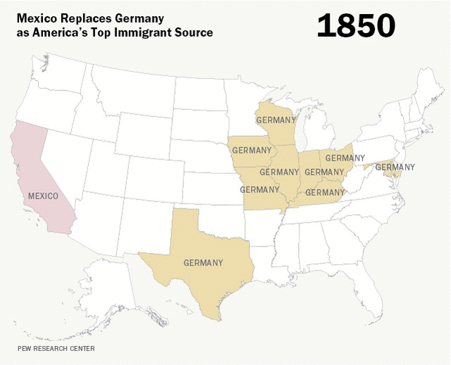
If this feature were called “A nation of immigrants in one map,” this is the one we’d show you. The bottom line: before 1965, Germany sent more immigrants to America than anyone else; after 1965, Mexico did.
Here’s why: from World War I to 1965, the immigration system was designed, essentially, to keep the United States white. Rice University sociologist Stephen Klineberg has called it “unbelievable in its clarity of racism.” Each country was given a certain quota of immigrants who were allowed to come to the United States each year, based on who’d been in the country in 1890.
Combined with existing laws that prevented any Asian Americans from coming into the country, the laws of the 1920s basically froze the demographics of the immigrant population in place until 1965.
6) The Danish Utahns, and other immigrant enclaves
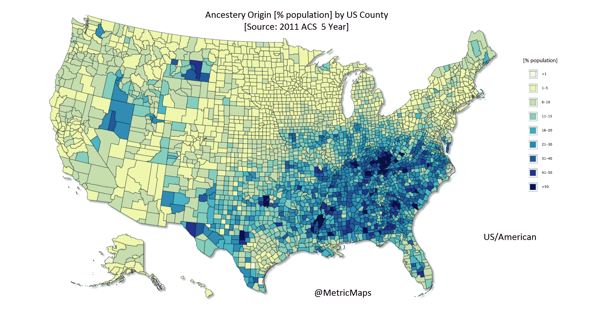
This GIF, compiled by internet hero @MetricMaps, tracks where immigrants from different countries have settled in the United States. The result is an exhaustive portrait of more than two dozen different native countries and regions. Some ancestry groups pop up in interesting places, revealing forgotten pockets of American history — the Danish population in Utah, for example, is the result of an extremely early wave of Danish conversion to the Church of Jesus Christ of Latter-Day Saints (Mormons).
Forced migration, then and now
7) Forced migration built America
:format(webp):no_upscale()/cdn.vox-cdn.com/uploads/chorus_asset/file/2893056/Screen_Shot_2014-12-31_at_10.03.48_AM.0.png)
The American myth about “a nation of immigrants” excludes millions of forced migrants to America from Africa, who were brought to the US over two centuries of the trans-Atlantic slave trade. It’s hard to overstate how much slaves built America: according to historian Steven Deyle, the value of all slaves in 1860 was seven times the value of all currency then in circulation in the United States. Slave labor built the agrarian economy of the South and fed the cotton mills of the industrializing North. But slaves had no way to become citizens, build wealth, or bring their families — they had no opportunity to practice the self-reliance that America often expects of its immigrants.
8) The first illegal migrations were of trafficked slaves
:format(webp):no_upscale()/cdn.vox-cdn.com/uploads/chorus_asset/file/2893058/Screen_Shot_2014-12-31_at_10.07.07_AM.0.png)
The forced migration of Africans to America also represents the first unauthorized migration to the United States. The Constitution banned the “importation” (trafficking) of slaves into the United States after 1809, but black-market slave trading continued until the Civil War. According to historian David Eltis of Emory University, 1.5 million Africans arrived in the Americas after the countries they landed in had theoretically banned the slave trade. Because there were no restrictions on voluntary migration to the United States until the 1880s, these were the first people to come to the country illegally.
The Atlas of the Transatlantic Slave Trade documents 78,360 slaves landing in mainland North America from 1800 to 1865 — about 20 percent of all arrivals over the 200 years of the slave trade. (Since slave importation wasn’t banned until 1807, many of those arrivals could have been legal.)
9) Modern-day forced migration: human trafficking
:format(webp):no_upscale()/cdn.vox-cdn.com/uploads/chorus_asset/file/2745622/Human-Traffickg-New-Middle-Passage.0.jpg)
Large-scale human trafficking is no longer legal, let alone widely condoned. But it still happens. This graphic is one attempt to map the global reach of the contemporary human-smuggling industry.
A report by the Urban Institute in 2014 interviewed 122 victims of labor trafficking in the United States, and found that 71 percent of those trafficked actually had legal visas when they arrived in the country. But because immigrant workers’ legal status is tied to their employer, most victims who escaped their traffickers had lost their legal status by the time they were connected to law enforcement. Furthermore, the report found, public officials often encountered labor-trafficking victims and failed to realize what was going on — or, worse, sided with the traffickers and threatened to report the victims to federal immigration agents.
A nation of immigrants
10) The most famous immigrant in American history
:format(webp):no_upscale()/cdn.vox-cdn.com/uploads/chorus_asset/file/2900496/Screen_Shot_2015-01-03_at_5.43.04_PM.0.png)
Give me your tired, your poor;
Your huddled masses yearning to breathe free;
The wretched refuse of your teeming shore;
Send these, the homeless, tempest-toss’d, to me;
I lift my lamp beside the golden door.
—Emma Lazarus, 1883
Of course, the Statue of Liberty was itself an immigrant. It was designed and cast in copper in France over the span of a decade, from 1876 to 1884, as an intended gift from the French government to the United States. But the statue then had to wait in France for several months until the Americans had done enough work on its pedestal. It was then shipped to the United States in 350 separate pieces, housed in 214 crates, to be assembled by American workers once it arrived.
11) An insanely detailed map of immigrants in America from 1903
:format(webp):no_upscale()/cdn.vox-cdn.com/uploads/chorus_asset/file/2900510/Screen_Shot_2015-01-03_at_5.49.44_PM.0.png)
This exhaustive map includes 51 infographics (for each state plus Washington, DC). The right column of the infographic covers how many immigrants settled in the state each year; the left column shows their occupations. The top depicts the ethnic mix, color-coded by race: Teutonic, Keltic, Slavic, Iberic, Mongolic, and “all others.”
At the time, those racial labels were real — and the source of anxiety. A medical journal article from this era expressed concern about the “preponderance of the Iberic and Slavic races” among recent immigrants, because of “their poorer physical and mental equipment” compared to “Celtic and Teutonic” immigrants.
12) How charities helped immigrants become American
:format(webp):no_upscale()/cdn.vox-cdn.com/uploads/chorus_asset/file/2900512/Screen_Shot_2015-01-03_at_5.52.11_PM.0.png)
The organization Hull House (founded by Jane Addams) was devoted to serving Chicago’s urban poor; in the process, it set the template for charity in America. And most of Chicago’s urban poor were immigrants: in 1890, in fact, immigrants made up 77 percent of the city’s population. To better tailor its services to the communities it served (and to assist the federal government in its study of urban “ghettos”), Hull House researchers produced maps like this one, which shows the ethnicity of each immigrant family living in a given tenement block.
The result was that Hull House increasingly focused on teaching English, civics, and other skills that would help immigrants and first-generation Americans assimilate — what would be called the “Americanization” movement. The existence of organizations like Hull House, which were willing to take the time to help immigrants acclimate to America and learn things (like English) that they needed to succeed, was an important factor in helping the European immigrants of 100 years ago assimilate to the point where they simply counted as “white” Americans.
13) Are today’s immigrants less Americanized?
:format(webp):no_upscale()/cdn.vox-cdn.com/uploads/chorus_asset/file/2909816/Picture11-500x381.0.png)
The “Americanization” movement of the early 1900s wasn’t just about how to help immigrants. It was also grounded in the belief that immigrants should be welcomed to the United States only if they wanted to, and could, be successfully assimilated into America. That idea survives today, in everything from the metaphor of the country as a “melting pot” to the demand that immigrants “learn English.” But while “learning English” is shorthand for assimilation, and despite fears that this generation of immigrants is less assimilated than their forerunners, immigrants to America in the late 20th century were much more likely to know English when they got here, or to pick it up quickly, than the immigrants who lived at Hull House. Even Latino immigrants, who lag behind other immigrants (who tend to be more educated) in how long it takes them to speak English, perform much better than the European immigrants of the 1880s.
14) The grandchildren of today’s Latino immigrants barely speak Spanish
:format(webp):no_upscale()/cdn.vox-cdn.com/uploads/chorus_asset/file/3536154/pew_crop.0.png)
Second-generation Latinos — the children of immigrants — tend to be fully bilingual; this might mean they’re used to speaking with their parents in Spanish but using English outside the home, or just that they’re in situations where they deal with Spanish and English speakers pretty much equally. And with the third generation, who are grandchildren of immigrants, bilingualism fades quickly. In fact, the proportion of immigrants who speak mostly English (35 percent) is bigger than the share of Latinos who are thoroughly bilingual in the third generation.
15) Immigrants are saving the Midwest
:format(webp):no_upscale()/cdn.vox-cdn.com/uploads/chorus_asset/file/2697896/Screen_Shot_2014-12-18_at_2.11.36_PM.0.png)
More Americans are leaving Middle America than moving there (with the exception of North Dakota). But immigrants are forestalling Middle America’s demographic decline. A Chicago Council study in 2014 found four metro areas (including Davenport, Iowa, on the Illinois border, and Duluth in eastern Minnesota) that grew between 2000 and 2010 solely because of the immigrant population, and another five where immigrants made up more than 50 percent of the metro area’s total growth over that time. But immigrants might be having an even bigger impact in rural areas in Middle America, where the demographic crunch is most acute. In Kansas, immigrants make up 5.3 percent of the rural population; in Nebraska it’s 4.8 percent. Just as importantly, immigrants are making these areas demographically younger. The Chicago Council report found that Wichita, Kansas, for example, lost 24 percent of its 35- to 44-year-old, native-born population from 2000 to 2010 — but its immigrant population in that age range grew by 87 percent.
A nation of (immigration) laws
16) 200 years of immigration in one gorgeous visual
:format(webp):no_upscale()/cdn.vox-cdn.com/uploads/chorus_asset/file/3506536/immigration200years.0.jpg)
It’s easy now to assume that Mexico has always been among the main sources of immigration to America. But as this wonderful chart by Natalia Bronshtein (using 200 years of government data) shows, that’s not even close to true. There’s an interactive version on Bronshtein’s website: you can hover over any color, at any point, and see the exact number of immigrants who became residents from that country in that decade. But taken as a whole, the chart tells a very clear story: there are two laws that totally transformed immigration to the United States.
17) The 1920s law that made immigration much less diverse — and created illegal immigration as we know it
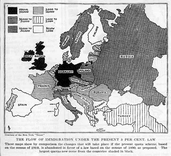
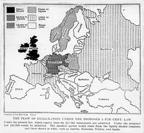
Because the quota laws were passed in the early 1920s, but were based on immigration flows from 1890, they actually rolled back immigration from certain countries. Politicians were worried that new immigrants from Southern and Eastern Europe (largely Italians and Jews) were genetically “inferior” immigrant stock was threatening Americans’ quality of life. This pair of maps, from the New York Times, shows the effects of the primary quota law: the National Origins Act of 1924. The map to the left of the slider shows annual immigration to America from various European countries before the law was passed; the map to the right of the slider shows the quotas imposed for each country under the law. The National Origins Act forced the legal immigrant population to plummet — and made “illegal immigration” a widespread phenomenon for the first time in American history. It hasn’t stopped since.
18) How America began to rely on Mexican labor
:format(webp):no_upscale()/cdn.vox-cdn.com/uploads/chorus_asset/file/2916072/image_3_773.0.jpeg)
With World War II causing labor shortages, the United States started to encourage seasonal labor from Mexico. As the map shows, the 2 million braceros who came under the program (from 1942 to 1964) migrated from all over Mexico to most of the United States. Most worked in agriculture, under punishing conditions: according to some reports, braceros were sprayed directly with DDT (an insecticide now known to be carcinogenic and toxic to humans). The bracero program was supposed to prevent migrants from settling in the United States by sending 10 percent of their paychecks back to Mexico. But many braceros returned to Mexico only to discover their money had not. Many Mexican Americans are descended from braceros, and the memory of their mistreatment colors their opinions of guest-worker proposals today.
19) America’s only been a global destination for the past 50 years
:format(webp):no_upscale()/cdn.vox-cdn.com/uploads/chorus_asset/file/2748294/Dashboard_1.0.png)
The modern era of immigration to America began in 1965, when the restrictionist quotas of the National Origins Act were replaced by the Immigration and Nationality Act. It’s only in this era that immigration to the United States has really become a global phenomenon — with European and Mexican immigrants joined by Asian, Central and South American, and African immigrants. There are still more immigrants from some countries than from others — in 2013, there were twice as many naturalized US citizens from Mexico as from any other country — but as this chart shows, immigration to the United States has never been more globally balanced.
20) How to come here the right way
:format(webp):no_upscale()/cdn.vox-cdn.com/uploads/chorus_asset/file/2744794/07cf533ddb1d06350cf1ddb5942ef5ad.0.jpg)
From one perspective, there are plenty of ways to come to the United States legally — there’s an alphabet soup of visas, not to mention immigrant Americans’ ability to sponsor family members for green cards. But the overwhelming majority of the world’s non-American population isn’t eligible for any of these paths. In other words, there’s no legal immigration “line” for them to get into. Furthermore, there are far too many qualified applicants for most available visas — causing years-long (or even decades-long) backlogs for Mexican, Chinese, Indian and Filipino immigrants hoping to bring their parents, adult children, or siblings to the United States. This flowchart, from Reason Magazine, shows who’s able to come “the right way” and who isn’t. Spoiler alert: most aren’t, and most of those who are will have to wait a long time.
21) The era of unauthorized immigration: 1996–2006
:format(webp):no_upscale()/cdn.vox-cdn.com/assets/4242917/newimmigrants2.png)
This chart documents the biggest wave of unauthorized migration in US history: from 1996, when the economy was booming and a law made it harder for unauthorized immigrants to “get legal,” to the US recession of the late 2000s. The line graph (and the left y-axis) shows how many immigrants entered the country illegally each year; the bar chart (and the right y-axis) shows the estimated number of unauthorized immigrants living in the United States at that time.
Nativism, then and now
22) One reason some Americans fear immigrants? They overestimate how many there are
:format(webp):no_upscale()/cdn.vox-cdn.com/uploads/chorus_asset/file/2909756/what-percentage-of-people-are-immigrants-guess-actual-value-difference_chartbuilder.0.png)
Americans have an unfortunate tendency to overestimate how many people in the United States are immigrants — possibly because many white Americans assume that most Latinos in the United States are immigrants (and some assume most Latinos in the United States are unauthorized immigrants). Fears of America being overrun by immigrants make a little more sense if you think that a third of people living in the United States are immigrants already.
23) America’s first single-issue party was anti-immigrant
:format(webp):no_upscale()/cdn.vox-cdn.com/uploads/chorus_asset/file/2871814/MillerSewardB_091014.0.jpg)
The American Party of the 1840s and 1850s was often called, and is remembered today as, the “Know-Nothing Party.” In the 1856 presidential election, as shown here, Maryland sent its electoral votes to the party (which had nominated former President Millard Fillmore). The leading Know-Nothing in Congress, Lewis Charles Levin of Pennsylvania, was also the first Jewish member of the US Congress. American nativists have usually been more afraid of some kinds of immigrants than others — and one way for an immigrant to assimilate into American life is to play the “good immigrant,” attacking the bad ones.
24) When Louisville rioted against Catholic immigrants
:format(webp):no_upscale()/cdn.vox-cdn.com/uploads/chorus_asset/file/2873760/riot.0.jpg)
In 1855, the Know-Nothing Party was beginning to take over politics in Louisville, Kentucky. The night before a local election in August, Know-Nothings armed with torches paraded through the city’s Catholic areas, telling voters to “keep their elbows in.” That day — fueled by rumors that hundreds of armed Germans were taking over polling places, and that an Irishman had killed a Know-Nothing — the Know-Nothings exploded into wholesale rioting in the Irish and German sections of town. At least 22 people were killed — and probably many more. From the blog the Public I: “The death toll would have been higher but in the German district one of the first buildings looted was Armbruster’s brewery. The rioters got so drunk they could only satisfy themselves with torching the building before passing out.”
25) An 1885 “vice map” of San Francisco’s Chinatown
:format(webp):no_upscale()/cdn.vox-cdn.com/uploads/chorus_asset/file/2900524/Screen_Shot_2015-01-03_at_5.59.30_PM.0.png)
The first immigration restrictions in US history were passed in 1882, when the Chinese Exclusion Act more or less eliminated legal immigration from China. This created a market in human smuggling and trafficking — especially of young Chinese women. The US Customs and Border Protection website is still proud of the agency’s work in “kidnapping” Chinese women “in order to save them” from brothel owners and human traffickers. But as this “vice map of Chinatown,” created by the City of San Francisco, shows, attempts to “save” immigrant victims from their traffickers often bled into prejudice against the immorality of the immigrant community itself.
26) Fears of an immigrant “fifth column” bought into Nazi propaganda
:format(webp):no_upscale()/cdn.vox-cdn.com/uploads/chorus_asset/file/2750398/6a00d83542d51e69e20120a8e2b56d970b.0.jpg)
One of the recurring themes in American nativism is the fear that immigrants will be more loyal to their native countries than to their adopted ones — including in times of war. This map, from a book of Nazi propaganda, tried to exploit those fears. It sent the message that every one of the 20 million German Americans in the United States could be counted on to stand with their homeland rather than with the country that their families had lived in for (in some cases) generations. But the fear was groundless. The United States never had a substantial Nazi-sympathizer movement — and the closest thing to it were the “isolationists,” who were interested in staying out of World War II not because they were loyal to Germany, but because they didn’t feel any connection to Europe.
27) Japanese internment camps
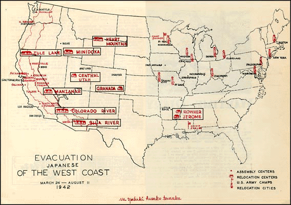
During World War II, fears of an immigrant fifth column led President Franklin D. Roosevelt to order 120,000 Japanese Americans into internment camps in the western United States. The majority of internees were American citizens, and many were born in the United States. Internment ended in 1944, before Japan surrendered to the United States. But many internees had lost their homes and belongings. Several thousand German Americans and Italian Americans, among others, were also put into camps during World War II. But the scope of the Japanese internment is striking — especially because no Japanese American was ever found guilty of espionage.
28) Langston Hughes’s doodles turn a pro-immigrant map into an anti-Jim Crow one
:format(webp):no_upscale()/cdn.vox-cdn.com/uploads/chorus_asset/file/2748518/1079649_quarter.0.jpg)
While other Americans worried that immigrants were a threat to a country at war, the Council Against Intolerance made this illustrated map to argue the opposite: that prejudice itself would weaken the United States against its enemies. It’s a relatively early example of an idea that’s become popular in recent decades: that diversity itself is what makes America strong, and that difference is something to be celebrated rather than eliminated. This particular copy of the council’s map was owned by Langston Hughes, who penciled in a couple of illustrations of his own — including a burning Ku Klux Klan cross near Louisiana — making the point that the people most interested in preserving differences between groups tend to be the ones least interested in tolerance.
A bordered country
29) This is what the border actually is

Popularly, “the border” is a line between United States and Mexico. But officially, it’s a 100-mile area that stretches all the way around the United States — covering as much as two-thirds of the nation’s population. The legal definition of the border matters because the government has long said it can do things “at the border” to track down unauthorized migration and smuggling that it can’t do other places, from setting up “checkpoints” within the United States to check drivers’ citizenship to straight-up racial profiling. As recently as 2011, Border Patrol officers were boarding buses in upstate New York to ask passengers for IDs, and responding to police calls in Forks, Washington. New guidance from the federal government, which came out in December 2014, has opened the door to narrowing the definition of the “border” — but it’s not clear whether it will.
30) The militarization of the US/Mexico border
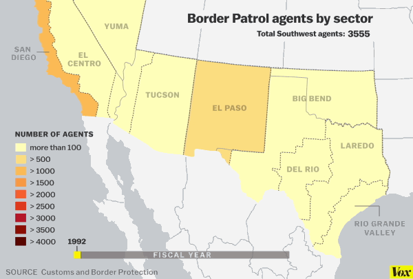
Increasing border security is a very recent phenomenon: the number of Border Patrol agents on the United States/Mexico border has more than quadrupled from 1995 to 2014. The militarization of the border hasn’t been evenly spaced: it’s concentrated on the areas that people are most likely to cross. The buildup was supposed to stop unauthorized entrances, but it also made it harder for unauthorized immigrants to leave the United States if they ever wanted to return. Immigrants who were used to splitting time between their jobs in the United States and their families at home moved their families to the United States instead — and the unauthorized population grew, and settled.
31) A volunteer effort to identify immigrants who died crossing the border
:format(webp):no_upscale()/cdn.vox-cdn.com/uploads/chorus_asset/file/2745030/Screen_Shot_2014-12-19_at_11.13.03_AM.0.png)
The more agents there are on the high-traffic sectors of the border, the more immigrants try to brave the stretches too dangerous for Border Patrol. That’s made the border more lethal: immigrants often die of thirst or heat exposure when crossing the desert. Some citizen groups attempt to provide water stations to keep migrants safe, though they’ve had to face court cases arguing that they’re trying to encourage people to come to the United States illegally. Officials in Pima County, Arizona, working with a human rights group, use GIS mapping to track deaths of migrants along the border. They’ve recorded 2,187 deaths in Arizona alone from 2001 to 2014.
32) La Bestia
:format(webp):no_upscale()/cdn.vox-cdn.com/uploads/chorus_asset/file/2751862/rutasmigration.0.jpg)
Mexican freight trains carry cargo-like cars and plastics northward to the United States. They also, for years, have carried Mexican and Central Americans hoping to cross. Hopping “La Bestia” (the popular term for immigrants stowing onto Mexican freight trains) has become a symbol of unauthorized migration to the United States — not just in politics, but in American popular culture. It’s also an illustration of just how far “border security” can stretch outside of the United States’ own territory. In 2014, the Mexican government agreed to force the major freight lines to travel more quickly — a plan that will take a few years — in the hopes that it will be harder for would-be migrants to catch rides. But just as border militarization in the United States simply made the journey more dangerous for desperate migrants, the question will be whether a faster Bestia will deter migrants or punish them.
33) The maps you need to understand the 2014 “border crisis”

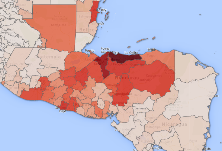
Scholars of immigration agree that people make the decision to migrate based on two types of reasons: “push factors” that lead them to leave their country of origin, and “pull factors” that lead them to come to one new country in particular. When tens of thousands of Central American families and unaccompanied children presented themselves to border agents in Texas in the spring and summer of 2014, many Americans and politicians blamed “pull factors” like President Obama’s Deferred Action for Childhood Arrivals program. But a map created by the Department of Homeland Security, depicting where unaccompanied child migrants were coming from, told a different story: migrants were leaving some of the most dangerous communities in the most dangerous countries in the world.
A borderless world
34) Immigrants come from everywhere
:format(webp):no_upscale()/cdn.vox-cdn.com/uploads/chorus_asset/file/2747784/Screen_Shot_2014-12-19_at_12.39.59_PM.0.png)
As noted above, since 1965, immigration to the United States has become a truly global phenomenon. It’s one thing to know that, but it’s another thing to see it in front of you.
35) Remittances: the foreign aid program bigger than foreign aid
:format(webp):no_upscale()/cdn.vox-cdn.com/assets/4202951/Screen_Shot_2014-03-28_at_2.08.31_PM.png)
Many immigrants send money back home — called remittances — either to help them save up and buy property to return to their home countries or to support family members who can’t come to the United States themselves. Immigrants officially sent $51 billion in remittances home in 2012 — far larger than the US government’s foreign aid budget of $39 billion that year. This map shows that the countries that receive the most remittances aren’t always the countries with the most emigrants in the United States — they’re the poorest countries with large US-emigrant populations.
36) The hidden diversity of America’s immigrants
:format(webp):no_upscale()/cdn.vox-cdn.com/uploads/chorus_asset/file/2748850/lP8kMJX.0.png)
The stereotypical face of immigration to America in 2015 is a Latino one. Americans routinely overestimate how many Latinos are immigrants, and particularly how many are unauthorized immigrants. And it’s true that Latin American countries send more immigrants to the United States than other regions. Because of that, it’s sometimes necessary to dig a little deeper to see how diverse the immigrant population really is. If this map of New York showed the most popular non-English language in each neighborhood, it would likely be monotonous. But by showing the most popular language that isn’t English or Spanish, it shows that New York is still a quilt of dozens of different immigrant communities.
37) The twin cities of El Paso and Ciudad Juarez
:format(webp):no_upscale()/cdn.vox-cdn.com/uploads/chorus_asset/file/2748444/640px-El_Paso_2C_Texas.0.jpg)
El Paso and Ciudad Juarez might be the world’s strangest twin city. The separation of the US border helps create vastly different environments in the two cities: El Paso is far more affluent than its Mexican twin; Juarez is a global crime capital, while El Paso has long been one of the safest cities in the United States. But they’re undoubtedly two halves of the same metropolitan area. In 2011, 14,000 people crossed one footbridge between the two cities on a daily basis. This colorized NASA photo shows buildings in gray and vegetation in red. The band of vegetation in the lower right of the photo might be the first thing you notice: evidence of a visible barrier separating Mexicans and Americans. But in the heart of the city, in the center of the photo, it takes tracing the Rio Grande to tell where Mexico ends and America begins.
Learn more
Hondurans fled to the US because their lives were in danger. The US sent them back.
An awesome map of the last time each European country was occupied
40 maps that explain the Middle East
Credits
Editor: Ezra Klein
Original developer: Yuri Victor
Special thanks: Matt Yglesias, Joss Fong