
How many times has a client, manager, or colleague from a different department asked you to deliver something because it’s trendy?
They’ve seen it, they want it. Relevance, be damned.
How often has this trend been completely unsuitable for your website project? Saying “no” and explaining why a trend makes no sense for your website can be a challenge, so it’s helpful to understand what value a trend can add, and how to apply it effectively in your circumstances.
Parallax scrolling as a web design trend was born from the 2D video game world, originally as a hack for the platform to create a sense of depth in a scene. Noticing the rise in parallax scrolling over the last two years, a designer recently decided to apply the style to his newest web project: a landing page for a small line of retail products.
While scrolling, lifestyle shots of the products should move slowly in the background while descriptions of the products should move quickly in the foreground, producing a parallax effect. In practice, however, the parallax scrolling would, by its nature, prevent the faster-moving descriptions from lining up with their slow-moving photos.
This highlights what can go wrong when applying a popular technique because it’s trendy instead of using it because it’s right for the job. So let’s look at when it can be helpful.
Creating Depth with Parallax
Animals use motion parallax to determine their distance from an object — picture a bird bobbing its head up and down to figure out how close they are to animals in their surroundings. When you scroll a web page, the parallax effect creates the illusion of depth because your direct action (scrolling, rather than bobbing your head) affects the relative position of elements, just like moving through the real world does.
This interaction leads to feeling like you’re a part of the scene, immersing you in the content, enticing you to explore further. Scrolling allows you to actively engage with what you’re seeing, and be immediately rewarded with the unveiling of more visual content:
As such, the parallax effect is an excellent technique to use in visual story telling. It’s highly engaging, encourages interaction, and lets you guide your user through a story. In practical terms, this could be a:
- homepage : telling the brand story, sharing your values, and establishing credibility;
- product page : demonstrating the benefits of a product visually;
- user guide : elucidating each step of a process in easily digestible chunks; or
- landing page : walking the visitor through a single, narrow concept in a highly engaging format before leading you to a larger, more content-heavy website.
Let’s look at examples of each of these use cases in turn.
Brands
Sony mixes the parallax effect in the scenery of its “Be Moved” landing page with scroll-activated animations in a stellar example of sharing a brand’s values. The landing page tells the story of how Sony strives to combine engineering and artistry, and shows the brand living this value by crafting smooth interactions with big visuals.
Sony also lets you explode and assemble their products via scrolling activated animations, showing you the devices in 3D, from different angles, and relative to other recognizable objects:

Products
SWISS uses the parallax effect to conjure depth and illustrate movement through the sky to showcase their airline. Essentially, their product is the magic of flight, so they use this visual story-telling format to give you a glimpse into the experience:
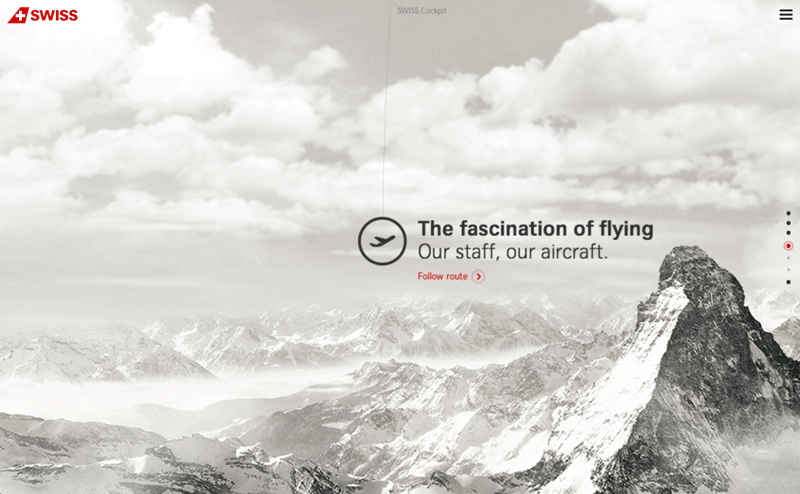
Beyond the landing page, the main SWISS website also uses the parallax effect in small doses for a cohesive user experience.
Saucony uses the parallax effect to keep your attention on their core offering: the shoe itself. Everything else serves as supplementary information to that one single focus:
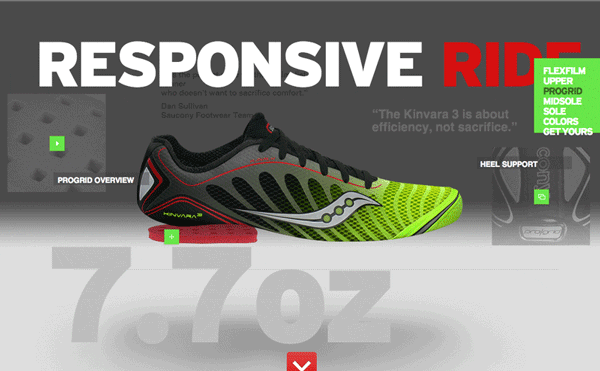
When using parallax on a product sales page, be careful not to slow down the purchasing process. This effect should help customers make purchasing decisions faster because there’s greater transparency as they can visualize the product. It shouldn’t take the user any longer than usual to get to the checkout.
Processes
Typically, you’ll find parallax scrolling applied on long, single-page designs with sparse content, big visuals, and lots of animations or fancy transitions. Make Your Money Matter shows how you can use the parallax effect together with these other design elements to demonstrate a process. You could apply the style to any step-by-step process, such as a user guide, form filling, or item purchase, to lead a user through it.
This case for parallax usually features other persuasive design techniques. For example, you might gamify your website by showing progress through the parallax page, encouraging users to finish a task. This leads to increased engagement or conversions. You could show the progress using a countdown, a visible navigation progress bar or just by making it clear right from the start that you must scroll to learn more.
Landing pages
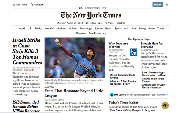
Finally, parallax scrolling is excellent for landing pages. You can focus the user on a single story to gain buy-in from them first before providing further options for engaging with your product, service, or community. For example, check out the NY Times Tomato Can Blues:
At the conclusion of your landing page’s story, link to your full, content-heavy site with its extended navigation, complex structure, and detailed content:
Another advantage to this approach is that you can create quite separate and distinct pages from your main website. You can host the landing page on a separate domain, outside of the restrictions of a CMS, and outside the constraints of an existing style guide or site structure.
Consider the earlier example of SWISS air: their swish parallax landing page lives at www.world-of-swiss.com/en while the rest of their site lives over at www.swiss.com/us/en.
Content marketing benefits from separate landing pages with parallax scrolling too. Brands can create wonderful, shareable content experiences. These landing pages are primarily geared towards the social media strategy, encouraging brand loyalty with “sharing” as the main Call To Action. This works best with businesses that have high repeat purchases (or engagement in a subscription model) and referral traffic. Try using a fun, interactive landing page with parallax scrolling to drive engagement.
The future of parallax
The parallax trend might be on the way out now, but Google Trends predicts it has some life yet. Hopefully you’ve seen from the outline above that every trend that comes and goes can be examined for the valuable, salient details.
Those essential elements may find new life in the next trend.
 Diana MacDonald
Diana is a professional Jill of all trades. Her digital work reflects her honesty, attention to detail, and appetite for new technology. Some say it's like a subtle cool breeze on a warm Summer's day. You might find her on Twitter, but she doesn't say much because she's shy.