We just shipped version 3.0 of Quartz, which you are looking at right now. It’s our second major redesign in as many years, a rapid pace of reinvention that makes good on our promise to continually evolve and improve on what a purely digital news organization can be.
You can get a good sense of what’s new by simply poking around the site, but we wanted to highlight a few big changes.
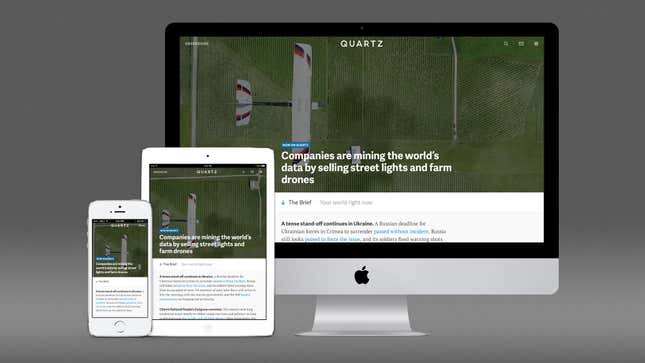
Our first homepage
Yes, the homepage is still dead, which is why our new front door is quite different from most. Now, when you come to qz.com, we are offering an efficient briefing on global business news, called the Brief. It’s intended to be read straight through, like a well written memo from a trusted advisor. What it’s not is a sea of headlines, like you find on the homepages of many news sites.
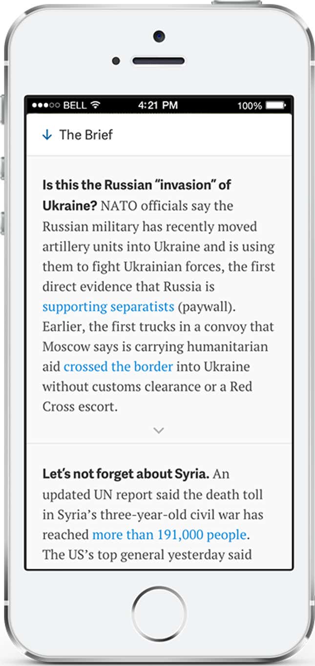
Think of the Brief as a continually updated version of our popular morning email, the Daily Brief, which will continue to be published as usual. As always, we will link you to the best sources for each story, whether that’s us or someone else. Some notes in the Brief, denoted by an arrow, can be expanded to reveal more information about developing news. Our journalists around the world will be keeping the Brief updated at all times, so loyal readers can check in at any time of day. It works particularly well on your phone.
The Brief replaces our original “homepage,” which was no homepage at all: We just dropped you into our top story. That was out of recognition that people increasingly prefer to find links through email, Facebook, Twitter, and other forms of social media. And, indeed, the vast majority of readers visit through our side door, which we expect to continue. The Brief is for those of you who want even more from Quartz throughout the day.
You can also access our own top stories at the top and bottom of the new homepage, or by tapping the ☰ icon in the site’s header.
More beautiful stories
Our cardinal design principles have always been to stay out of your way, let the stories shine, and make sure it all works well on your phone. With this version, we tried to improve on each of those goals and make adjustments based on what we know about usage of the site.
We took an award-winning design and made it cleaner and fresher. Quartz stories now have more room to breathe on PCs and tablets, taking advantage of the space those devices offer. Perhaps the most noticeable difference is that the queue of headlines that used to appear on the left side of the page is now collapsed by default because it wasn’t much used. You can always tap or click the header to get it back.
On phones, where the design was already quite clean, we found ways to make it even less cluttered. The header now gets out of your way, leaving maximum space for reading the story. We think it will really shine as phone screens get bigger and bigger.
Quartz stories are written with charts and photos as much as words, so we also took pains to improve the display of both images and typography. You will notice the fruits of that effort throughout, including a refresh of our house style for data visualization. Our obsessions—the issues that animate our newsroom—also have gorgeous new homes. For example, check out our page for The Sea.
More beautiful advertising
We are committed to making the advertising on Quartz as high-quality as the stories that come from our newsroom. That’s one reason we have never run a standard ad unit on the site and have no plans to do so. Quartz remains a banner-free zone.
Engage ads, which run between our stories, are bigger and more beautiful in this new version. The idea is to give our partners an even better canvas on which to tell their stories, and the first results of that effort are on the site right now. Bulletins, our form of sponsor content, have also been upgraded with the same features as story pages, while retaining the clear labels that distinguish them from our journalism.
Getting rid of cruft
And as we add things to the site, it’s important that we also take some away. We are removing two features because they are little used: starring stories to read later and highlighting passages to share with others. Those of you who miss the functionality should know we still believe in the spirit of experimenting with tools like these.
With this version, we are also dropping our previously limited support for Internet Explorer 8, something Microsoft has set a timetable for doing itself. Users of IE 9 will continue to receive a stripped-down version of the site, but c’mon, update your browser.
* * *
Quartz is for people who are excited by change, and there are certainly a lot of changes here. We hope you will let us know what you think. If anything appears to be broken, please alert us at support@qz.com. We’ll continue to improve the site based on your feedback.
Everyone at Quartz contributed to this project, but particular thanks are due to Micah Ernst, Anis Hoffman, Yitz Jordan, Daniel Lee, Sara Lerner, Eric Trott, Amalia Viti, John West, and Sam Williams.
Most of all, we want to thank you, our readers, for helping us build this thing from scratch. We’ve come a long way together since Sept. 24, 2012, and it’s early yet, indeed…