CSS Grid Layout: An Event Apart Boston 2016
6 likes2,910 views

This document provides an overview and introduction to CSS Grid Layout. It discusses defining a grid with properties like display: grid, grid-template-columns, grid-template-rows, and fr units. It covers placing items on the grid using line numbers, line names, and grid areas. It also demonstrates rearranging the layout at different breakpoints and using implicit rows.

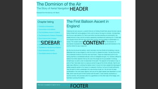
![Using line names
We name lines when
creating the grid. The name
goes in square brackets.
.cards {
display: grid;
grid-gap: 20px;
grid-template-columns: [side-start] 1fr
[main-start] 1fr 1fr
[main-end];
grid-template-rows: [main-start] 200px 200px
[main-end];
}](https://image.slidesharecdn.com/css-grid-60-aeabos-2016-160516205730/85/CSS-Grid-Layout-An-Event-Apart-Boston-2016-28-320.jpg)

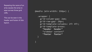
![Lines define Grid Areas
By creating lines named
main-start and end for
rows and columns, grid has
created me a named grid
area called ‘main’.
I can use that to position
my element rather than the
line numbers or names.
http://cssgrid.me/051617
.cards {
display: grid;
grid-gap: 20px;
grid-template-columns: [side-start] 1fr
[main-start] 1fr 1fr
[main-end];
grid-template-rows: [main-start] 200px 200px
[main-end];
}
.card:nth-child(1) {
grid-area: main;
}](https://image.slidesharecdn.com/css-grid-60-aeabos-2016-160516205730/85/CSS-Grid-Layout-An-Event-Apart-Boston-2016-30-320.jpg)


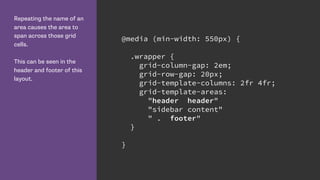
![Name lines with the name
in square brackets.
Remember we are naming
grid lines and not grid
tracks. .wrapper {
display: grid;
grid-row-gap: 10px;
grid-template-rows:
[row-header-start] auto
[row-content-start] auto
[row-panel-start] auto
[row-footer-start] auto [row-footer-end];
}](https://image.slidesharecdn.com/css-grid-60-aeabos-2016-160516205730/85/CSS-Grid-Layout-An-Event-Apart-Boston-2016-54-320.jpg)


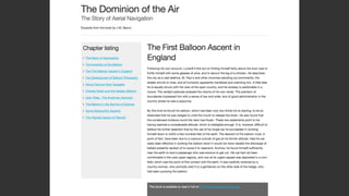
![We can give multiple grid
lines the same name.
This means we can use
the span keyword to span
n number of lines, rather
than specifying a specific
grid line.
.wrapper {
grid-template-columns:
repeat(4, [col-a] 200px [col-b] 100px);
}
.content {
grid-column: col-a 2 / span 2;
}
.aside {
grid-column: col-a 2 / span col-b 2;
}](https://image.slidesharecdn.com/css-grid-60-aeabos-2016-160516205730/85/CSS-Grid-Layout-An-Event-Apart-Boston-2016-78-320.jpg)
![Defining the 12 column
grid.
The repeat keyword
repeats the pattern of
columns or rows the
number of times specified
before the comma.
.wrapper {
display: grid;
grid-template-columns: repeat(12, [col] 1fr );
grid-template-rows: repeat(5, [row] auto) ;
grid-column-gap: 1em;
grid-row-gap: 15px;
}](https://image.slidesharecdn.com/css-grid-60-aeabos-2016-160516205730/85/CSS-Grid-Layout-An-Event-Apart-Boston-2016-82-320.jpg)


More Related Content
What's hot (20)
Similar to CSS Grid Layout: An Event Apart Boston 2016 (19)


More from Rachel Andrew (15)


Recently uploaded (20)


CSS Grid Layout: An Event Apart Boston 2016
- 1. CSS Grid Layout Rachel Andrew An Event Apart Boston, May 2016 https://www.flickr.com/photos/djprmf/15495738517
- 3. Falling Cubes by Gregor Adams CSS3 Working Clock by Ilia
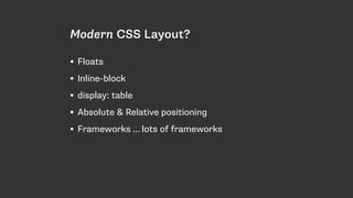
- 4. Modern CSS Layout? • Floats • Inline-block • display: table • Absolute & Relative positioning • Frameworks … lots of frameworks
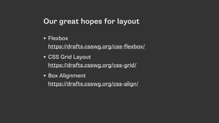
- 5. Our great hopes for layout • Flexbox https://drafts.csswg.org/css-flexbox/ • CSS Grid Layout https://drafts.csswg.org/css-grid/ • Box Alignment https://drafts.csswg.org/css-align/
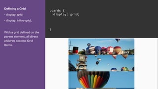
- 7. Defining a Grid - display: grid; - display: inline-grid; With a grid defined on the parent element, all direct children become Grid Items. .cards { display: grid; }
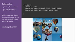
- 8. Defining a Grid - grid-template-columns - grid-template-rows With these properties we define an explicit grid. This one has 3 column tracks and 3 row tracks. http://cssgrid.me/05161 .cards { display: grid; grid-template-columns: 250px 250px 250px; grid-template-rows: 200px 200px 200px; }
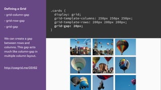
- 9. Defining a Grid - grid-column-gap - grid-row-gap - grid-gap We can create a gap between rows and columns. This gap acts much like column-gap in multiple column layout. http://cssgrid.me/05162 .cards { display: grid; grid-template-columns: 250px 250px 250px; grid-template-rows: 200px 200px 200px; grid-gap: 20px; }
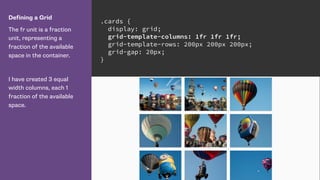
- 10. Defining a Grid The fr unit is a fraction unit, representing a fraction of the available space in the container. I have created 3 equal width columns, each 1 fraction of the available space. .cards { display: grid; grid-template-columns: 1fr 1fr 1fr; grid-template-rows: 200px 200px 200px; grid-gap: 20px; }
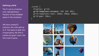
- 11. Defining a Grid The fr unit is a fraction unit, representing a fraction of the available space in the container. We have created 3 columns, the units add up to 4. The space is spilt into 4 equal parts, the first 2 tracks are given 1 part, the fine track 2 parts. .cards { display: grid; grid-template-columns: 1fr 1fr 2fr; grid-template-rows: 200px 200px 200px; grid-gap: 20px; }
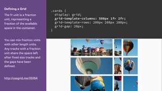
- 12. Defining a Grid The fr unit is a fraction unit, representing a fraction of the available space in the container. You can mix fraction units with other length units. Any tracks with a fraction unit share the space left after fixed size tracks and the gaps have been defined. http://cssgrid.me/05164 .cards { display: grid; grid-template-columns: 500px 1fr 2fr; grid-template-rows: 200px 200px 200px; grid-gap: 20px; }
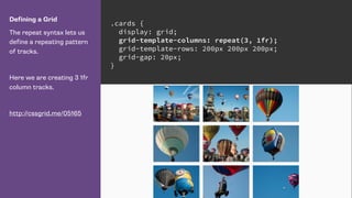
- 13. Defining a Grid The repeat syntax lets us define a repeating pattern of tracks. Here we are creating 3 1fr column tracks. http://cssgrid.me/05165 .cards { display: grid; grid-template-columns: repeat(3, 1fr); grid-template-rows: 200px 200px 200px; grid-gap: 20px; }
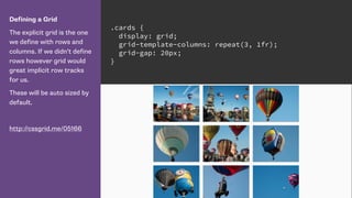
- 14. Defining a Grid The explicit grid is the one we define with rows and columns. If we didn’t define rows however grid would great implicit row tracks for us. These will be auto sized by default. http://cssgrid.me/05166 .cards { display: grid; grid-template-columns: repeat(3, 1fr); grid-gap: 20px; }
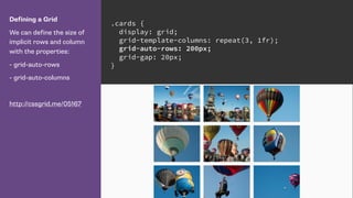
- 15. Defining a Grid We can define the size of implicit rows and column with the properties: - grid-auto-rows - grid-auto-columns http://cssgrid.me/05167 .cards { display: grid; grid-template-columns: repeat(3, 1fr); grid-auto-rows: 200px; grid-gap: 20px; }
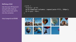
- 16. Defining a Grid Use the auto-fill keyword and grid will create as many tracks that will fit into the container. http://cssgrid.me/05168 .cards { display: grid; grid-template-columns: repeat(auto-fill, 200px); grid-gap: 20px; }
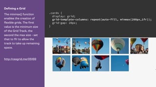
- 17. Defining a Grid The minmax() function enables the creation of flexible grids. The first value is the minimum size of the Grid Track, the second the max size - set that to 1fr to allow the track to take up remaining space. http://cssgrid.me/05169 .cards { display: grid; grid-template-columns: repeat(auto-fill, minmax(200px,1fr)); grid-gap: 20px; }
- 18. Placing Items on the Grid
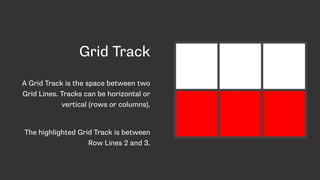
- 19. Grid Track A Grid Track is the space between two Grid Lines. Tracks can be horizontal or vertical (rows or columns). The highlighted Grid Track is between Row Lines 2 and 3.
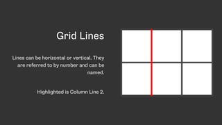
- 20. Grid Lines Lines can be horizontal or vertical. They are referred to by number and can be named. Highlighted is Column Line 2.
- 21. Grid lines relate to writing mode. In a right to left language such as Arabic the first column line is the right-hand line.
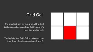
- 22. Grid Cell The smallest unit on our grid, a Grid Cell is the space between four Grid Lines. It’s just like a table cell. The highlighted Grid Cell is between row lines 2 and 3 and column lines 2 and 3.
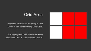
- 23. Grid Area Any area of the Grid bound by 4 Grid Lines. It can contain many Grid Cells. The highlighted Grid Area is between row lines 1 and 3, column lines 2 and 4.
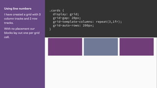
- 24. Using line numbers I have created a grid with 3 column tracks and 2 row tracks. With no placement our blocks lay out one per grid cell. .cards { display: grid; grid-gap: 20px; grid-template-columns: repeat(3,1fr); grid-auto-rows: 200px; }
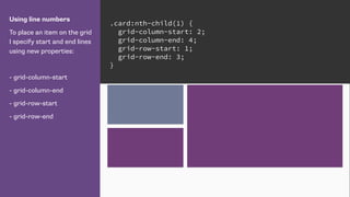
- 25. Using line numbers To place an item on the grid I specify start and end lines using new properties: - grid-column-start - grid-column-end - grid-row-start - grid-row-end .card:nth-child(1) { grid-column-start: 2; grid-column-end: 4; grid-row-start: 1; grid-row-end: 3; }
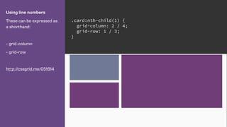
- 26. Using line numbers These can be expressed as a shorthand: - grid-column - grid-row http://cssgrid.me/051614 .card:nth-child(1) { grid-column: 2 / 4; grid-row: 1 / 3; }
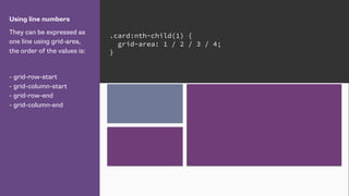
- 27. Using line numbers They can be expressed as one line using grid-area, the order of the values is: - grid-row-start - grid-column-start - grid-row-end - grid-column-end .card:nth-child(1) { grid-area: 1 / 2 / 3 / 4; }
- 28. Using line names We name lines when creating the grid. The name goes in square brackets. .cards { display: grid; grid-gap: 20px; grid-template-columns: [side-start] 1fr [main-start] 1fr 1fr [main-end]; grid-template-rows: [main-start] 200px 200px [main-end]; }
- 29. Using line names Use the name instead of the line number as the value of the placement properties. http://cssgrid.me/051616 .card:nth-child(1) { grid-column: main-start / main-end; grid-row: main-start / main-end; }
- 30. Lines define Grid Areas By creating lines named main-start and end for rows and columns, grid has created me a named grid area called ‘main’. I can use that to position my element rather than the line numbers or names. http://cssgrid.me/051617 .cards { display: grid; grid-gap: 20px; grid-template-columns: [side-start] 1fr [main-start] 1fr 1fr [main-end]; grid-template-rows: [main-start] 200px 200px [main-end]; } .card:nth-child(1) { grid-area: main; }
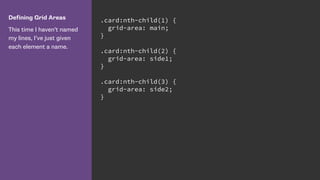
- 31. Defining Grid Areas This time I haven’t named my lines, I’ve just given each element a name. .card:nth-child(1) { grid-area: main; } .card:nth-child(2) { grid-area: side1; } .card:nth-child(3) { grid-area: side2; }
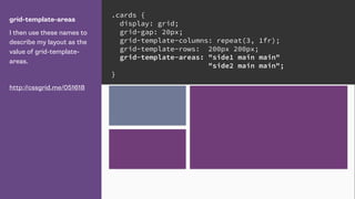
- 32. grid-template-areas I then use these names to describe my layout as the value of grid-template- areas. http://cssgrid.me/051618 .cards { display: grid; grid-gap: 20px; grid-template-columns: repeat(3, 1fr); grid-template-rows: 200px 200px; grid-template-areas: "side1 main main" "side2 main main"; }
- 33. Much Magic.
- 36. The HTML around my page content. The various areas of my page are child elements of a div with a class of wrapper. <div class="wrapper"> <header class="mainheader"></header> <div class="panel"></div> <div class="content"></div> </div>
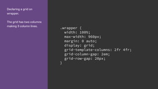
- 38. Declaring a grid on wrapper. The grid has two columns making 3 column lines. .wrapper { width: 100%; max-width: 960px; margin: 0 auto; display: grid; grid-template-columns: 2fr 4fr; grid-column-gap: 2em; grid-row-gap: 20px; }
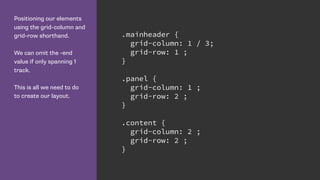
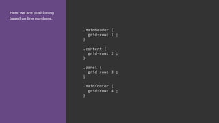
- 40. Positioning our elements using the grid-column and grid-row shorthand. We can omit the -end value if only spanning 1 track. This is all we need to do to create our layout. .mainheader { grid-column: 1 / 3; grid-row: 1 ; } .panel { grid-column: 1 ; grid-row: 2 ; } .content { grid-column: 2 ; grid-row: 2 ; }
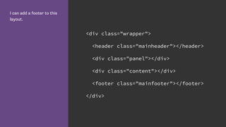
- 43. I can add a footer to this layout. <div class="wrapper"> <header class="mainheader"></header> <div class="panel"></div> <div class="content"></div> <footer class="mainfooter"></footer> </div>
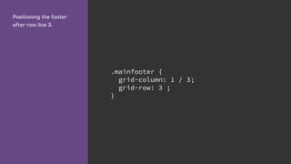
- 44. Positioning the footer after row line 3. .mainfooter { grid-column: 1 / 3; grid-row: 3 ; }
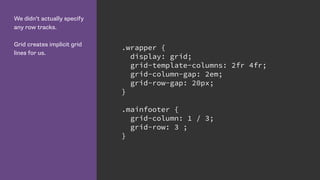
- 46. We didn’t actually specify any row tracks. Grid creates implicit grid lines for us. .wrapper { display: grid; grid-template-columns: 2fr 4fr; grid-column-gap: 2em; grid-row-gap: 20px; } .mainfooter { grid-column: 1 / 3; grid-row: 3 ; }
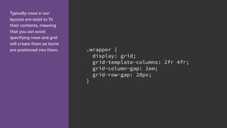
- 47. Typically rows in our layouts are sized to fit their contents, meaning that you can avoid specifying rows and grid will create them as items are positioned into them. .wrapper { display: grid; grid-template-columns: 2fr 4fr; grid-column-gap: 2em; grid-row-gap: 20px; }
- 48. Grid is “table like” however … • Unlike a table for layout Grid does not rely on your content being a particular order in the source. • Being entirely described in CSS we can move things around the Grid at different breakpoints, introduce or redefine a Grid for any breakpoint.
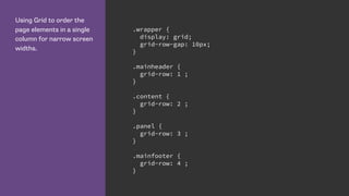
- 49. Using Grid to order the page elements in a single column for narrow screen widths. .wrapper { display: grid; grid-row-gap: 10px; } .mainheader { grid-row: 1 ; } .content { grid-row: 2 ; } .panel { grid-row: 3 ; } .mainfooter { grid-row: 4 ; }
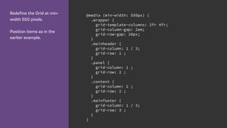
- 51. Redefine the Grid at min- width 550 pixels. Position items as in the earlier example. @media (min-width: 550px) { .wrapper { grid-template-columns: 2fr 4fr; grid-column-gap: 2em; grid-row-gap: 20px; } .mainheader { grid-column: 1 / 3; grid-row: 1 ; } .panel { grid-column: 1 ; grid-row: 2 ; } .content { grid-column: 2 ; grid-row: 2 ; } .mainfooter { grid-column: 1 / 3; grid-row: 3 ; } }
- 52. Named Grid Lines
- 54. Name lines with the name in square brackets. Remember we are naming grid lines and not grid tracks. .wrapper { display: grid; grid-row-gap: 10px; grid-template-rows: [row-header-start] auto [row-content-start] auto [row-panel-start] auto [row-footer-start] auto [row-footer-end]; }
- 55. Here we are positioning based on line numbers. .mainheader { grid-row: 1 ; } .content { grid-row: 2 ; } .panel { grid-row: 3 ; } .mainfooter { grid-row: 4 ; }
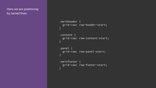
- 56. Here we are positioning by named lines. .mainheader { grid-row: row-header-start; } .content { grid-row: row-content-start; } .panel { grid-row: row-panel-start; } .mainfooter { grid-row: row-footer-start; }
- 57. Named Areas
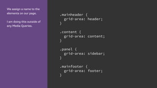
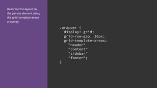
- 59. We assign a name to the elements on our page. I am doing this outside of any Media Queries. .mainheader { grid-area: header; } .content { grid-area: content; } .panel { grid-area: sidebar; } .mainfooter { grid-area: footer; }
- 60. Describe the layout on the parent element using the grid-template-areas property. .wrapper { display: grid; grid-row-gap: 10px; grid-template-areas: "header" "content" "sidebar" "footer"; }
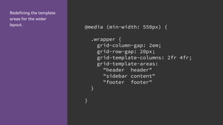
- 63. Redefining the template areas for the wider layout. @media (min-width: 550px) { .wrapper { grid-column-gap: 2em; grid-row-gap: 20px; grid-template-columns: 2fr 4fr; grid-template-areas: "header header" "sidebar content" "footer footer" } }
- 66. Repeating the name of an area causes the area to span across those grid cells. This can be seen in the header and footer of this layout. @media (min-width: 550px) { .wrapper { grid-column-gap: 2em; grid-row-gap: 20px; grid-template-columns: 2fr 4fr; grid-template-areas: "header header" "sidebar content" "footer footer" } }
- 67. Repeating the name of an area causes the area to span across those grid cells. This can be seen in the header and footer of this layout. @media (min-width: 550px) { .wrapper { grid-column-gap: 2em; grid-row-gap: 20px; grid-template-columns: 2fr 4fr; grid-template-areas: "header header" "sidebar content" " . footer" } }
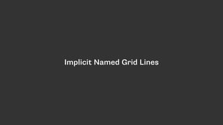
- 69. Implicit Named Grid Lines
- 70. Named grid areas create four implicit named lines. You can use these in the same way as lines you have explicitly named. .wrapper { .wrapper { grid-column-gap: 2em; grid-row-gap: 20px; grid-template-columns: 2fr 4fr; grid-template-areas: "header header" "sidebar content" "footer footer" } } .test { z-index: 100; background-color: red; grid-column: content-start; grid-row: content-start / footer-end; }
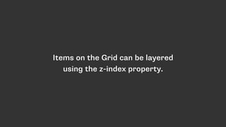
- 72. Items on the Grid can be layered using the z-index property.
- 73. A 12 column, flexible grid
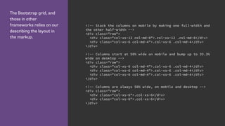
- 74. The Bootstrap grid, and those in other frameworks relies on our describing the layout in the markup. <!-- Stack the columns on mobile by making one full-width and the other half-width --> <div class="row"> <div class="col-xs-12 col-md-8">.col-xs-12 .col-md-8</div> <div class="col-xs-6 col-md-4">.col-xs-6 .col-md-4</div> </div> <!-- Columns start at 50% wide on mobile and bump up to 33.3% wide on desktop --> <div class="row"> <div class="col-xs-6 col-md-4">.col-xs-6 .col-md-4</div> <div class="col-xs-6 col-md-4">.col-xs-6 .col-md-4</div> <div class="col-xs-6 col-md-4">.col-xs-6 .col-md-4</div> </div> <!-- Columns are always 50% wide, on mobile and desktop --> <div class="row"> <div class="col-xs-6">.col-xs-6</div> <div class="col-xs-6">.col-xs-6</div> </div>
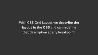
- 75. With CSS Grid Layout we describe the layout in the CSS and can redefine that description at any breakpoint.
- 76. getskeleton.com
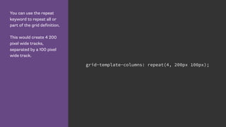
- 77. You can use the repeat keyword to repeat all or part of the grid definition. This would create 4 200 pixel wide tracks, separated by a 100 pixel wide track. grid-template-columns: repeat(4, 200px 100px);
- 78. We can give multiple grid lines the same name. This means we can use the span keyword to span n number of lines, rather than specifying a specific grid line. .wrapper { grid-template-columns: repeat(4, [col-a] 200px [col-b] 100px); } .content { grid-column: col-a 2 / span 2; } .aside { grid-column: col-a 2 / span col-b 2; }
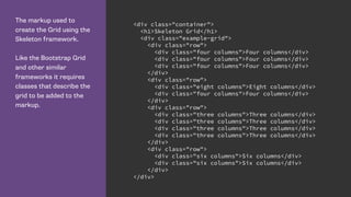
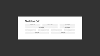
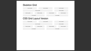
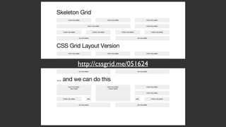
- 79. The markup used to create the Grid using the Skeleton framework. Like the Bootstrap Grid and other similar frameworks it requires classes that describe the grid to be added to the markup. <div class="container"> <h1>Skeleton Grid</h1> <div class="example-grid"> <div class="row"> <div class="four columns">Four columns</div> <div class="four columns">Four columns</div> <div class="four columns">Four columns</div> </div> <div class="row"> <div class="eight columns">Eight columns</div> <div class="four columns">Four columns</div> </div> <div class="row"> <div class="three columns">Three columns</div> <div class="three columns">Three columns</div> <div class="three columns">Three columns</div> <div class="three columns">Three columns</div> </div> <div class="row"> <div class="six columns">Six columns</div> <div class="six columns">Six columns</div> </div> </div>
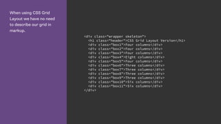
- 81. When using CSS Grid Layout we have no need to describe our grid in markup. <div class="wrapper skeleton"> <h1 class="header">CSS Grid Layout Version</h1> <div class="box1">Four columns</div> <div class="box2">Four columns</div> <div class="box3">Four columns</div> <div class="box4">Eight columns</div> <div class="box5">Four columns</div> <div class="box6">Three columns</div> <div class="box7">Three columns</div> <div class="box8">Three columns</div> <div class="box9">Three columns</div> <div class="box10">Six columns</div> <div class="box11">Six columns</div> </div>
- 82. Defining the 12 column grid. The repeat keyword repeats the pattern of columns or rows the number of times specified before the comma. .wrapper { display: grid; grid-template-columns: repeat(12, [col] 1fr ); grid-template-rows: repeat(5, [row] auto) ; grid-column-gap: 1em; grid-row-gap: 15px; }
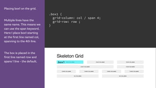
- 83. Placing box1 on the grid. Multiple lines have the same name. This means we can use the span keyword. Here I place box1 starting at the first line named col, spanning to the 4th line. The box is placed in the first line named row and spans 1 line - the default. .box1 { grid-column: col / span 4; grid-row: row ; }
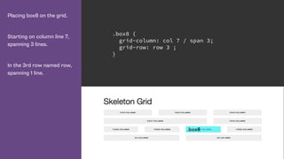
- 84. Placing box8 on the grid. Starting on column line 7, spanning 3 lines. In the 3rd row named row, spanning 1 line. .box8 { grid-column: col 7 / span 3; grid-row: row 3 ; }
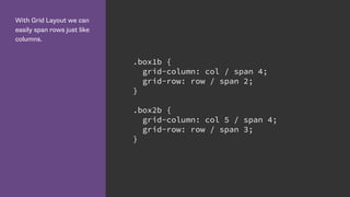
- 86. With Grid Layout we can easily span rows just like columns. .box1b { grid-column: col / span 4; grid-row: row / span 2; } .box2b { grid-column: col 5 / span 4; grid-row: row / span 3; }
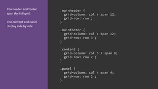
- 88. The header and footer span the full grid. The content and panel display side by side. .mainheader { grid-column: col / span 12; grid-row: row ; } .mainfooter { grid-column: col / span 12; grid-row: row 3 ; } .content { grid-column: col 5 / span 8; grid-row: row 2 ; } .panel { grid-column: col / span 4; grid-row: row 2 ; }
- 90. The header and footer span the full grid. The content and panel display side by side. .mainheader { grid-column: col / span 12; grid-row: row ; } .mainfooter { grid-column: col / span 12; grid-row: row 3 ; } .content { grid-column: col 5 / span 8; grid-row: row 2 ; } .panel { grid-column: col / span 4; grid-row: row 2 ; }
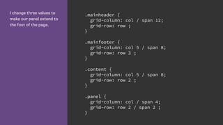
- 91. I change three values to make our panel extend to the foot of the page. .mainheader { grid-column: col / span 12; grid-row: row ; } .mainfooter { grid-column: col 5 / span 8; grid-row: row 3 ; } .content { grid-column: col 5 / span 8; grid-row: row 2 ; } .panel { grid-column: col / span 4; grid-row: row 2 / span 2 ; }
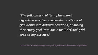
- 93. Grid Item Placement Algorithm
- 94. http://dev.w3.org/csswg/css-grid/#grid-item-placement-algorithm “The following grid item placement algorithm resolves automatic positions of grid items into definite positions, ensuring that every grid item has a well-defined grid area to lay out into.”
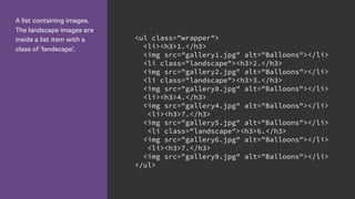
- 96. A list containing images. The landscape images are inside a list item with a class of ‘landscape’. <ul class="wrapper"> <li><h3>1.</h3> <img src="gallery1.jpg" alt="Balloons"></li> <li class="landscape"><h3>2.</h3> <img src="gallery2.jpg" alt="Balloons"></li> <li class="landscape"><h3>3.</h3> <img src="gallery8.jpg" alt="Balloons"></li> <li><h3>4.</h3> <img src="gallery4.jpg" alt="Balloons"></li> <li><h3>7.</h3> <img src="gallery5.jpg" alt="Balloons"></li> <li class="landscape"><h3>6.</h3> <img src="gallery6.jpg" alt="Balloons"></li> <li><h3>7.</h3> <img src="gallery9.jpg" alt="Balloons"></li> </ul>
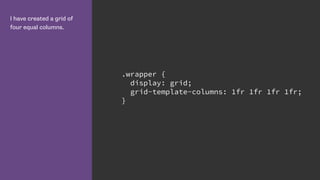
- 97. I have created a grid of four equal columns. .wrapper { display: grid; grid-template-columns: 1fr 1fr 1fr 1fr; }
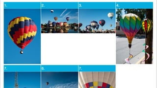
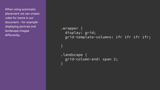
- 99. When using automatic placement we can create rules for items in our document - for example displaying portrait and landscape images differently. .wrapper { display: grid; grid-template-columns: 1fr 1fr 1fr 1fr; } .landscape { grid-column-end: span 2; }
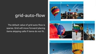
- 100. grid-auto-flow The default value of grid-auto-flow is sparse. Grid will move forward placing items skipping cells if items do not fit .
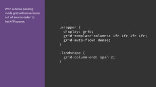
- 101. With a dense packing mode grid will move items out of source order to backfill spaces. .wrapper { display: grid; grid-template-columns: 1fr 1fr 1fr 1fr; grid-auto-flow: dense; } .landscape { grid-column-end: span 2; }
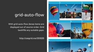
- 102. grid-auto-flow With grid-auto-flow dense items are displayed out of source order. Grid backfills any suitable gaps. http://cssgrid.me/051626
- 103. Is Grid a competing specification to Flexbox?
- 104. Grid and the Box Alignment Module
- 105. CSS Box Alignment Module Level 3 “This module contains the features of CSS relating to the alignment of boxes within their containers in the various CSS box layout models: block layout, table layout, flex layout, and grid layout.” - https://drafts.csswg.org/css-align/
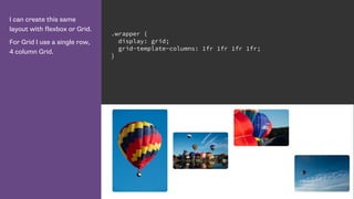
- 106. I can create this same layout with flexbox or Grid. With flexbox the items are laid out in a row. .wrapper { display: flex; } .wrapper li { flex: 1 0 25%; }
- 107. I can create this same layout with flexbox or Grid. For Grid I use a single row, 4 column Grid. .wrapper { display: grid; grid-template-columns: 1fr 1fr 1fr 1fr; }
- 108. Flexbox alignment properties for the three landscape images. http://cssgrid.me/051627 .wrapper li:nth-child(2) { align-self: center; } .wrapper li:nth-child(3) { align-self: flex-start; } .wrapper li:nth-child(4) { align-self: flex-end; }
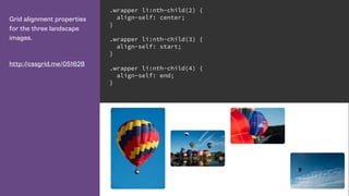
- 109. Grid alignment properties for the three landscape images. http://cssgrid.me/051628 .wrapper li:nth-child(2) { align-self: center; } .wrapper li:nth-child(3) { align-self: start; } .wrapper li:nth-child(4) { align-self: end; }
- 110. When should we use Grid instead of Flexbox then?
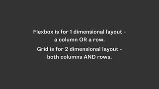
- 111. Flexbox is for 1 dimensional layout - a column OR a row. Grid is for 2 dimensional layout - both columns AND rows.
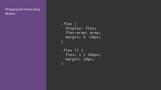
- 112. Wrapping list items using flexbox. .flex { display: flex; flex-wrap: wrap; margin: 0 -10px; } .flex li { flex: 1 1 200px; margin: 10px; }
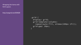
- 114. Wrapping list items with Grid Layout. http://cssgrid.me/051629 .grid { display: grid; grid-template-columns: repeat(auto-fill, minmax(200px 1fr)); grid-gap: 20px; }
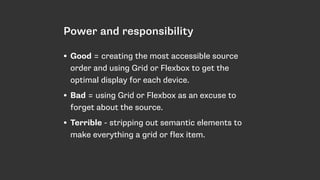
- 117. Power and responsibility • Good = creating the most accessible source order and using Grid or Flexbox to get the optimal display for each device. • Bad = using Grid or Flexbox as an excuse to forget about the source. • Terrible - stripping out semantic elements to make everything a grid or flex item.
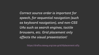
- 118. https://drafts.csswg.org/css-grid/#placement-a11y Correct source order is important for speech, for sequential navigation (such as keyboard navigation), and non-CSS UAs such as search engines, tactile browsers, etc. Grid placement only affects the visual presentation!
- 120. Nested Grids and Subgrids
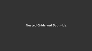
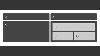
- 121. In this markup the boxes e, f and g are children of the element with a class of d. http://cssgrid.me/051632 <div class="wrapper"> <div class="box a">A</div> <div class="box b">B</div> <div class="box c">C</div> <div class="box d"> <div class="box e">E</div> <div class="box f">F</div> <div class="box g">G</div> </div> </div>
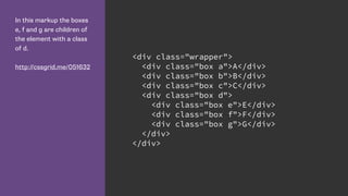
- 122. I have declared a grid on the wrapper div, and positioned the immediate children - the elements with classes a to d. http://cssgrid.me/051632 .wrapper { display: grid; grid-gap: 10px; grid-template-columns: repeat(4, 1fr); } .a { grid-column: 1 / 3; grid-row: 1; } .b { grid-column: 3 / 5; grid-row: 1; } .c { grid-column: 1 / 3; grid-row: 2; } .d{ grid-column: 3 / 5; grid-row: 2; }
- 124. To make box d a grid itself I declare a grid as normal then position the children of this element. They take their grid lines from the grid declared on box d. .d{ grid-column: 3 / 5; grid-row: 2; display: grid; grid-gap: 10px; grid-template-columns: 1fr 1fr; } .e { grid-column: 1 / 3; grid-row: 1; } .f { grid-column: 1; grid-row: 2; } .g { grid-column: 2; grid-row: 2; }
- 126. Declaring a subgrid
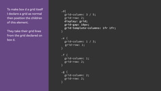
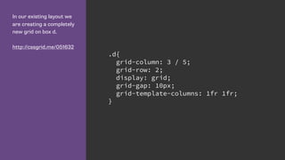
- 127. In our existing layout we are creating a completely new grid on box d. http://cssgrid.me/051632 .d{ grid-column: 3 / 5; grid-row: 2; display: grid; grid-gap: 10px; grid-template-columns: 1fr 1fr; }
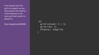
- 128. If we declare that this grid is a subgrid, we can then position the children of this element on the same grid their parent is placed on. http://cssgrid.me/051633 .d{ grid-column: 3 / 5; grid-row: 2; display: subgrid; }
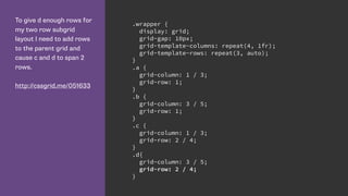
- 129. To give d enough rows for my two row subgrid layout I need to add rows to the parent grid and cause c and d to span 2 rows. http://cssgrid.me/051633 .wrapper { display: grid; grid-gap: 10px; grid-template-columns: repeat(4, 1fr); grid-template-rows: repeat(3, auto); } .a { grid-column: 1 / 3; grid-row: 1; } .b { grid-column: 3 / 5; grid-row: 1; } .c { grid-column: 1 / 3; grid-row: 2 / 4; } .d{ grid-column: 3 / 5; grid-row: 2 / 4; }
- 130. http://dev.w3.org/csswg/css-grid/ “The following features are at-risk, and may be dropped during the CR period: - the subgrid value”
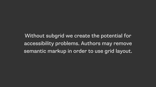
- 131. Without subgrid we create the potential for accessibility problems. Authors may remove semantic markup in order to use grid layout.
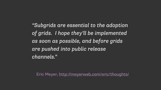
- 132. Eric Meyer, http://meyerweb.com/eric/thoughts/ “Subgrids are essential to the adoption of grids. I hope they’ll be implemented as soon as possible, and before grids are pushed into public release channels.”
- 133. Get involved with developing specs! • While a spec is being developed your feedback is wanted and can be included in the spec. • Wait until browsers ship and you lose that chance. • It just got easier. Last week the CSS WG voted to move spec issues to GitHub. http://logs.csswg.org/irc.w3.org/css/2016-05-10/#e684439
- 135. Browser Support All my examples work in Chrome unprefixed - you need to enable the Experimental Web Platform Features flag. Mozilla are currently implementing Grid in Firefox. Enable the flag if not using a Nightly of Dev Edition. You can also use Webkit nightlies/Safari Developer Preview. The work in Blink and Webkit is being done by Igalia, sponsored by Bloomberg. IE10 and up has support for the old syntax, with an -ms prefix. Grid is on the Edge backlog, marked as High Priority. There is a Polyfill under active development: https://github.com/FremyCompany/ css-grid-polyfill/
- 136. More code! I am creating a list of examples and information at: http://gridbyexample.com