This map, created by Finnish designer Annukka Makijarvi, is the best infographic I have seen in a very long time. Hover over to zoom:
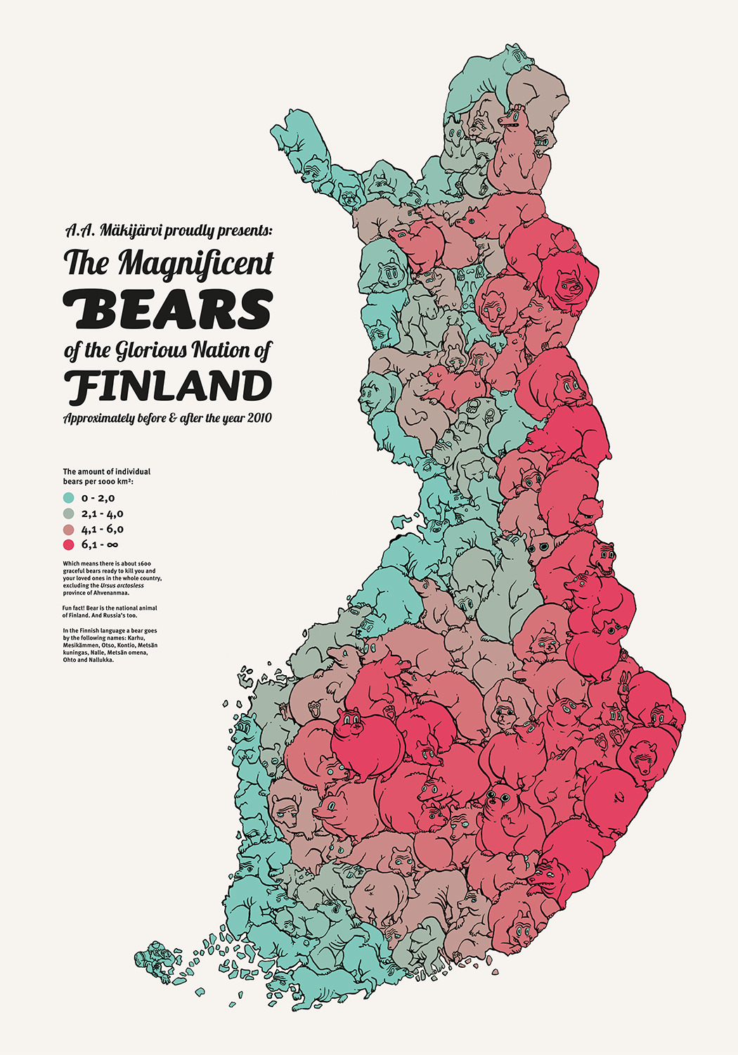
(Annukka Makijarvi)
As you can see if you hover over the map key, the reddest areas of the map (concentrated, unsurprisingly, along Finland's eastern border with Russia) are the parts of the country with the most bears. Those areas, as well as the less bear-heavy regions to the west and south, are represented on the map by bears.
It's silly, but it's still effective in communicating information. Just like graphs don't always need to start at the y-axis to get the point across, an illustrated infographic can add art without sacrificing clarity.