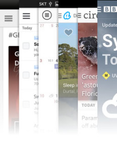
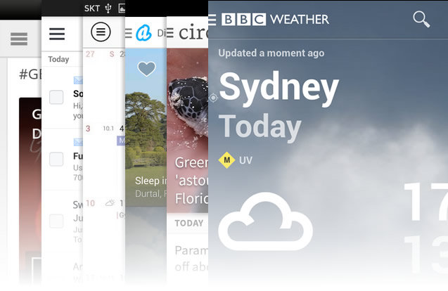
The ‘hamburger icon’. Most of us are familiar with it, have likely seen it countless times and have even tapped it more than once on our mobile devices.
You may know it by one of its other names. The ‘three line menu‘, the ‘drawer‘, the ‘menu icon‘, ‘side swipe‘, ‘three stripes‘ or the generic ‘navicon‘ are just a few names associated with this symbol.
You could even possibly know it as the ‘heaven/sky’ trigram in taoist cosmology.
Regardless of the name you give this commonly used icon, it’s certainly been the subject of many debates. Recently Annarita Tranfici looked at it from a UX perspective. Today, I’d like to take a look at it in terms of pure graphic design.
Instead of solely focusing on whether the design and inclusion is counterintuitive or intuitive, I’d like to find out whether we can find something better. Not only that, but figure out whether a change in design will be effective or if a different alternative altogether should be examined and developed.
Making the ‘Hamburger’ Icon
Before debating the relative merits of the hamburger icon, it could be useful to know where it began. To many, it felt seemed to arrive from nowhere as an overnight sensation. Today it’s difficult to visit mobile site without seeing that familiar three-lined enigma in an upper corner.
Research will typically deliver a range of origin stories.
Some have said Apple kicked it off back in 2007 (iPhone). Others point to Google Chrome, while others still will swear that it started with apps like Facebook and Path.
So far, I’ve seen little hard evidence to back any of these claims, although the first mention I could find of the term ‘hamburger icon’ was in a Chrome discussion from late 2011. But while one shouldn’t be too quick dismiss things based solely on a lack of documentation, we can say that the graphic form of the icon did not originate with any of the aforementioned companies.
The hamburger icon graphic appears to be much older than we might suspect. As far as anyone can tell, it was the Xerox Star where we first saw the icon way back in 1981. Check this out.
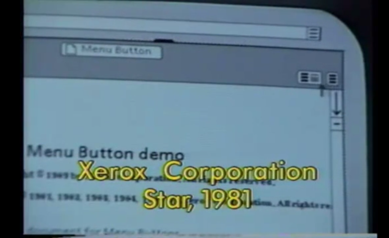
That’s right, we have a 30+ year old icon.
While it does seem we can credit Xerox with being the first company to use the icon, we have to give the credit to Norm Cox, the designer of the interface system.
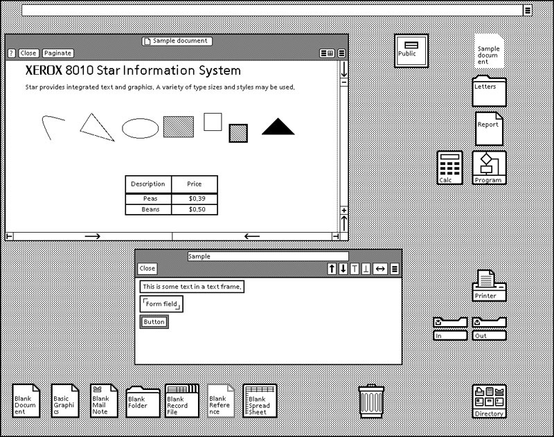
Despite the fact that some people give the icon some flak for acting as a menu icon it should be noted that when Cox created the symbol it was meant to act as a “container” for contextual menu choices.
His goal was to not only create a functional and memorable “road sign” but to also have the design mimic a menu list.
All credit goes for this find goes to to Geoff Alday. It was thanks to his inquiries and this email exchange that the mystery behind the origination of the three lined icon was solved.
The question of who first referred to it as the ‘hamburger’ icon remains a mystery for now, but if you have a theory, don’t hesitate to share.
The Great Debate
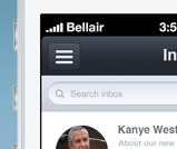
Since we now know who designed the navicon it’s time to address what is going on in regards to the icon in the design community. Now earlier I noted that the icon has been the topic of recent discussions and debates and it’s true, it has.
I’ll admit that I’m not one to bother with current events but I have stumbled on many articles in the past week that appeared to lobby against the ‘hamburger’ icon. Another admission, I had no idea people were even calling it that, I actually clicked on the articles because I wanted to know what it was. Regardless, it’s clear that there are different groups lobbying for and against the icon.
So what are people saying?
In short, a lot. You will find articles and forums that say the ‘hamburger’ icon is a problem because it conceals content from users. This is said to be non-UX friendly as it can have users forgetting to execute actions they would usually have had the content been placed right in front of them instead of hidden.
Another issue that some have taken up with the icon is the fact that if you are not mobile literate you won’t even realize that those three lines indicate a menu. This is sort of in the same vein as the “younger generations won’t get that the floppy disk icon means save” argument. The only difference here is that people have switched it around to say that “older generations won’t recognize the hamburger icon for what it is”.
There are many other arguments raised by developers, designers and UX enthusiasts including the “three click” rule and the fact that it isn’t so much the icon itself but it’s technique.
Possible Visual Solutions
Technique and rules aside, at least for the moment, let’s talk about possible visual solutions. Could a change in design help? The truth is that we really don’t know unless we try. Here are some ideas that have been suggested or already implemented.
Mobile First Approach
While not exactly a visual solution in the sense of changing the icon itself, author Paddi MacDonnell suggests in the last half of article How to Solve the Hamburger Icon Problem that mobile developers should simplify their sites and apps to their most simplest forms. This strategy insists that with a reduced functionality you therefore reduce the number of options ergo the need for the “hamburger” icon is removed
While this seems to be a good way to go idyllically, I’m not too certain that users and developers alike will be too thrilled with the reduction of content and function just for the sake of revealing typically hidden content and options.
Remember that the great thing about mobile devices is that we can access the same information from our devices on the go as we would when sitting at our computers.
Text Approach
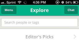
Morten Rand-Hendriksen who is a specialist in WordPress, web development and design as well as an educator suggests that instead of going the icon route that we replace the “hamburger” with text. In this instance the icon would be swapped out with the word “menu”. He isn’t excessively harsh towards the “hamburger” icon but he does make some interesting points in his article The Hamburger is Bad for You. He also goes on to suggests some other methods to battle your craving of using the “hamburger”.
The idea of switching out an image for text may seem like an odd choice for some especially if you’re trying to simplify but it does remove the confusion of the three lines for those who are not familiar with it.
The Grid Approach
So far I have only seen this Google use this in production, and that’s only if you are using your desktop or laptop. If you visit any Google affiliated page while using your mobile device, you will still see the standard three line icon. However, desktop or laptop users see a grid comprised of nine mini squares.
Some might argue this still hides the menu but let’s not forget that this challenge is all about finding an improved visual solution. I haven’t seen any chatter about the use of the grid in lieu of the three lines so this might be a possible alternative.
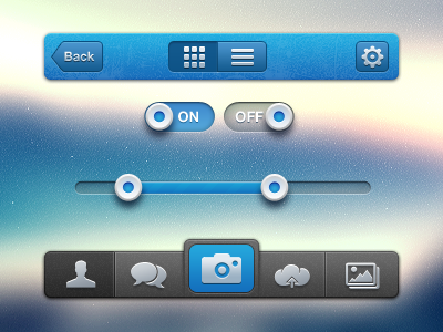
The Button Approach
The button approach adds a tweak to standard navicon design. The icon takes on a buttonized state to re-inforce the idea of interactivity. You typically see the navicon overlayed on a header or something similar.
Because the design isn’t flat it hints at more interactivity. With the button approach you either create a border around the icon or set it inside of a block. Some websites have already implemented this.
Exis web ran a test with this method and while the tests still indicated that the hamburger icon is not a desirable solution, the “button approach” was clicked on more than the other two options.
You can check out the test and read up on it in their Mobile Menu AB Testing article.
Challenge : Now it’s your turn.
What do you think about the burger? Love it? Hate it? Indifferent?
Do you have a better solution to the three lines? If you do I want you to share it either through the comments or you can tweet them to me. This can be a quick mockup design in Photoshop, Illustrator or whatever you prefer.
If you want to add some CSS animation to show it in action, even better.
Should it remain hidden to reduce the visual clutter, or is there a better and more user-friendly way for it to be implemented?
 Gabrielle Gosha
Gabrielle is a creative type who specializes in graphic design, animation and photography.