


Can you guess a way to a successful design of your web or mobile product? One that will help you get much bang for the buck when marketing your site or app to end users? Well, that's not easy, but there're certain cognitive and emotional strings you can play on to get more users to literally fall in love with your product and create buzz around it.
Having talked to the Intersog UX / UI designers, I've compiled a list of the 5 psychological triggers you should consider when designing UX of your web or mobile solution, both enterprise and consumer facing.
1. Achievement
As one of the key motivation drivers, Achievement entices reward pathways that make your user feel good, appreciated and willing to interact with your product. It's also an important element of gamification, as most of us like competition and playing games.
This trigger is just perfect for socially oriented and eCommerce sites / apps. By applying Achievement, you provide user with challenges and meaningful rewards for overcoming them. Some use cases are:
- setting goals for users and letting them achieve new ranks, badges and statuses in exchange for unlocking them
- using leaderboards, i.e. letting users view and compare each other's progress while interacting with your web and/or mobile product
- using banners with special offers and discounts, and promo codes
2. The Bandwagon Effect
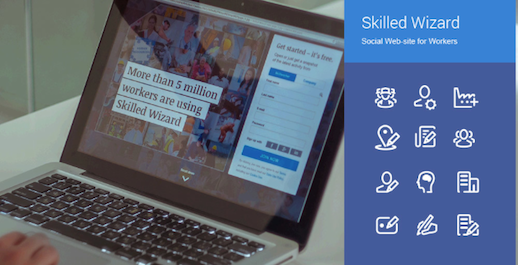
By applying it, you give your potential user an impression that there's much hype around your product and, thus, motivate them to join the caboodle. It's an effective trigger in getting users to buy something from your web store or foster an online community of your brand fans. Some use cases are:
- create imagery of real people enjoying using your product or service
- enable social sharing and user reviews on each item's page in your app or site
3. Chunking
As a design term, chunking was first introduced back in 1956 by George A. Miller whose research demonstrated that without chunking any type of information, be this numbers or text, is hard to perceive by users. In 2014, this trigger remains very effective in web and mobile design, as breaking the information into blocks or sections of 3 to 6 items helps enhance working memory in users.
Do not use chunking just for the sake of your layout (e.g., number of items in a dropdown list), but rather - use it to better present your information for users to be able to recall it at a later time. Yet, avoid overloading them with too many blocks or section items (no more than 6 is a rule of thumb!). This trigger works great with product catalogues in your web or mobile store.
4. The Zeigarnik Effect
Apply this trigger to have more users complete the checkout and/or endorse your product, get more blog signups, etc. The Zeigarnik Effect proves to have an impact on our short-term memory, and drives us to reach closure by completing tasks. Psychologists admit that tasks left uncompleted may cause depression and bad feelings.
Read more about ios app development.
Use this UX trigger to have a certain control over user behavior on your website or within your mobile app. Always remind users about their uncompleted tasks and make it easy for them to return to them later. Don't forget to provide your user with a sense of closure after they've reached a desired goal (e.g., a progress bar or a task completion confirmation message). Social networking sites and apps use this trigger quite effectively! Just log into your LinkedIn account right now to be reminded that your profile isn't yet fully complete ;)
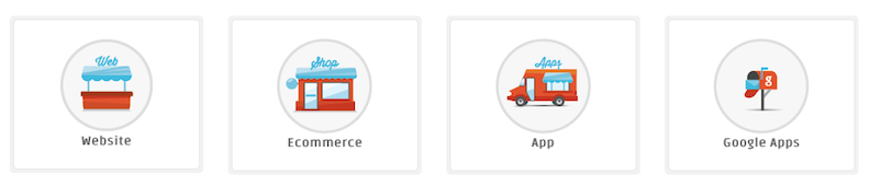
5. Visual Metaphor
Of course, stock images are really very helpful as far as web or mobile design is concerned, but nothing can be as attractive and motivating for users as content-rich images and graphics. According to the eye tracking studies by Nielsen Norman Group, "users pay close attention to photos and other images that contain relevant information but ignore fluffy pictures used to "jazz up" web pages". So, custom imagery is what you should aim for if you really want to offer an attractive product to users.
Using visual metaphors, i.e. images that demonstrate similarity between two or more things that seem to be dissimilar at first sight, can help you better showcase your products / services and beautify your user experience. Apply visual metaphors to guide users to more detailed information about your product or the next steps you expect them to make on your site / app. Some examples of visual metaphors are: font icons, infographics, mood pictures, sketches, etc.
Would you like to learn more
about talent solutions

No matter what triggers you choose to use to improve your web / mobile UX design, remember that aesthetic appeal is critical for capturing your user right after they've landed on your webpage or downloaded your app. Don't rely on great functionality alone - users won't give you a single chance if your product doesn't provide a great look and feel! Believe the designers!
Do you use any of these or other triggers to improve your UX design?
Images source: intersog.com