


Editor’s Note: This is the first in a monthly series of book reviews by the Search Engine Journal editorial team. Join us each month to discuss our picks on Facebook, Twitter, and Google+ using the hashtag #SEJBookClub and via the comments below.
Want to see what other books we’ve covered? Read our other reviews in the SEJ Book Club archive.
“This book changed my life,” he said.
I can’t help but react skeptically whenever anyone says something like that.
Perhaps I’m getting crotchety in my old age, but nowadays it feels like we all tend to skew to hyperbole.
Maybe it’s just a survival mechanism developed in the era of Facebook/Snapchat/that meme/viral blah/Instagram: it’s never been so easy to get our 15 minutes, yet so hard to stand out from the noise. We’ve really got to go the extra mile to get people to raise an eyebrow. Especially. ESPECIALLY people who are steeped in marketing copy 24/7. Ahem.
Search Engine Journal’s CTO, Slobodan Manic, was the speaker. Slobodan is the mastermind behind all SEJ’s technology choices, strategy, and direction. He happens to be pretty passionate about website design.
“No, really. Anyone who has a website, should read it,” he extolled. The book was “Don’t Make Me Think”, by Steve Krug (affiliate link)
Fine. I go to Amazon, and Look Inside!…
I see that it’s about “designing great, usable Websites”.
The book has lots of pictures.
It looks shorter than I expected.
OK, I’ll give it a whirl…
That was two years ago. Fast forward to today: I’ve followed what appears to be a fairly standard evolution of many who read it.
I’ve…
- …got the 2nd and 3rd editions, in both Kindle and paperback. Because.[pullquote]…he remarked that one of my UI choices was “stupid” (he wasn’t known for mincing words) and would result in confusing the users.[/pullquote]
- …referenced it constantly during the redesign project for SEJ, launched a couple of months ago.
- …sent copies to business associates.
- …namechecked it in convos/threads, using a cringeworthy acronym “DMMT”!! (hey, it’s shorter to type).
- …expanded its application beyond websites. I apply DMMT kung fu to emails I send, spreadsheets I create. Anytime I want someone to do something, I use the principles I learned in Don’t Make Me Think.
But did it change my life? I still hesitate to apply that all-encompassing phrase. But it certainly improved the way I do everyday things, on an everyday basis, which is a pretty profound change when I think about it.
So what’s so great about this book anyway?
The ‘Don’ts’
Preface: as Mr. Krug writes in the book, you may find a lot of this just seems like “common sense”. But, like a lot of common sense, it only seems obvious after it’s been pointed out.
1. “Don’t Make Me Think”
It’s the “first law of usability”. It’s the best answer to “What’s the most important thing I should do if I want to make sure my site or app is easy to use?”
A website’s first priority is to be as self-explanatory as possible. 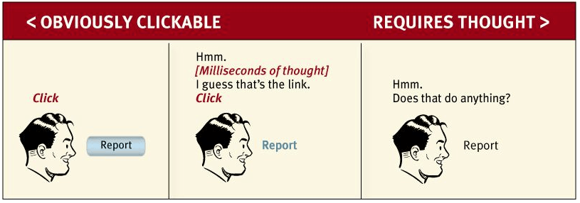
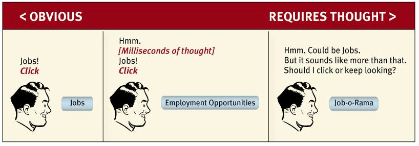 From the book:
“As a rule, people don’t like to puzzle over things. They enjoy puzzles in their place– when they want to be entertained or diverted or challenged– but not when they’re trying to find out what time their dry cleaner closes.
[If] the people who built the site didn’t care enough to make things obvious–and easy– [it] can erode our confidence in the site and the organization behind it.”
The best thing about this rule is that it’s a constant. Websites have changed so much over the years, but many of the guiding principles of what makes a good website, have not.
In fact, one could argue that the guiding principles of usability have remained constant throughout human history, even… here’s a medieval monk who contacted helpdesk over a confounding new technology called a “book“.
2. Web Visitors Don’t Scrutinize, They Scan
When we set out to design a website, a strange suspension of reality sets in. We design a site as if people are going to pour over our pages. Study every word. Explore every link.
But as soon as we go to someone else’s website, reality is back: we glance, we skim, we skip over lots of stuff. We click on the first link that looks vaguely promising. Then we scan and click again.
And we’re happy to keep scanning and clicking, as long as it’s effortless. One way to make things more effortless, is optimizing your website’s copy for scanning.
Tips on Optimizing Text for Scanning
- Use lots of headings
- Short paragraphs
- Use bulleted lists (see what I did there)
- Highlight key terms
3. Don’t Deplete the Reservoir of Goodwill
Have you read the studies that say willpower is actually a limited resource? It can get fatigued from overuse. Apparently it’s why we tend to snack late at night, for example, because the mental stamina that’s been keeping us from succumbing to our temptations all day is out of gas.
Mr. Krug describes the concept of website visitor “goodwill” in a very similar fashion. Visitors have a finite amount of tolerance for not finding what they need or having to puzzle over elements.
Deplete a visitor’s goodwill, and they may not just leave in frustration. They are also much less likely to come back, and could harbor long-lasting negative impressions of your company. Usability research shows repeatedly that in fact, users do judge a book by its cover. In an oft-cited 2002 Stanford study led by Dr. B.J. Fogg, 75% of users made judgments about a company’s credibility based on the company’s website design.
Things that diminish goodwill
- Hiding the information I want. Restaurant hours, support numbers, contact us forms, sale items. Make me hunt for those things, and my goodwill is rapidly diminishing.
- “Punishing me for not doing things your way”. Forcing users to use hyphens in social security numbers. Parentheses in phone numbers. Please don’t make me do the work to format your data.
- Asking me for TMI (Too Much Information). Recently I registered for a wine festival. “Company” and “Occupation” were required fields. More than just annoying, it makes me feel paranoid about their intentions for that data.
4. Don’t Dismiss Usability Tests: They’re easier and cheaper than you think
Back in the day when I was a green, wet-behind-the-ears product manager, I attended my first usability test. It was for a mobile app for which I had designed the UI.
The test was held in a traditional lab setup with test participants and facilitators behind one-way glass, and on the other side, the stakeholders. The stakeholders being me, my boss and several other colleagues from my company who were there to observe how my app did. Gulp.
A well-known mobile usability expert was supervising the testing. While looking over at me, he remarked loudly that one of my UI choices was “stupid” (he wasn’t known for mincing words) and would result in confusing the users. I died a thousand deaths…until a string of participants completed the prescribed task in question without a hitch.
The usability expert sputtered and stormed out of the room. I felt triumphant (and relieved!). But truth be known, I got lucky with that one.
Turns out there were lots of other tasks that didn’t go so well in testing. Tasks that I thought for sure were slam dunks. Why was that?
As someone who could see the product on the back of my eyelids, I knew too much. My assumptions (“everybody knows what THAT is“), my agenda (“the user HAS TO click on that headline, I think it’s fantastic“) produced a bias.
Bias doesn’t mean our designs will be inherently flawed, but it does mean we need fresh eyes to validate what we think will work does actually work.
And when marketing locks horns with the design team over such things as image carousels: “effective product displays or the devil’s spawn”?? Usability testing can end the endless debates definitively.
The book covers in detail the different ways you can test usability, from $10K elaborate science lab setups like the one I attended, to free. Yes free.
Why should you test your site?
- “If you want a great site, you’ve got to test.” As I mentioned, the barrier to entry for testing can be quite minimal. Grab your niece, your neighbor, someone who doesn’t have any advance knowledge of the site. If you’ve got a notebook and a computer, you’re fully equipped to run your first usability test.
- “Testing one user is 100% better than testing none.” For usability testing, some data is truly better than none.
- “Testing one user early in the project is better than testing 50 near the end.” We’ve all heard and used the logic that “we can always change it /fix it later, even after it goes live.” But in reality, once in use by your visitors, it may not be that easy. When my local grocery store re-arranged the aisles, I groused about it for months afterwards “Dang it, THE COOKIES USED TO BE RIGHT HERE”. Get your testing done early, and you’ll have less to course-correct (and fewer changes to annoy your users with) later.
In Summary
If you only read one UX book in your life, make it Don’t Make Me Think. If you have a stake in your company’s website (and these days, who doesn’t?), I’m hereby assigning it to you for required reading.
If you do read it, or have already read it, I’d love to know what you think in the comments below.
Image credits: Shutterstock and Don’t Make Me Think by Steve Krug. Used with permission.
Next Month’s Book Club: July’s selection is “Virtual Freedom: How to Work with Virtual Staff to Buy More Time, Become More Productive, and Build Your Dream Business” by Chris C. Ducker. You can pick it up on Amazon or listen to in I’m looking forward to SEJ Managing Editor Kelsey Jones taking us through it.
Want to see what the SEJ Book Club has read or is planning on reading next? Check out our GoodReads profile and add us as a friend!
This post contains Amazon affiliate links.
