

Forms
Forms are necessary for gathering information about users, clients, and customers. You can’t get around using them, but they shouldn’t be unbearable to fill out. Forms should have very few questions as to what information a website is looking for. One of the biggest problems of online forms is when there are no instructions.Formatting
When asking someone for specific information, emphasize what it is you are looking for. If you require a special format for something, such as a date, time, or any other formatted information, it should come with an example. Nothing is more annoying than filling out a form, only to receive an error message when you’re finished.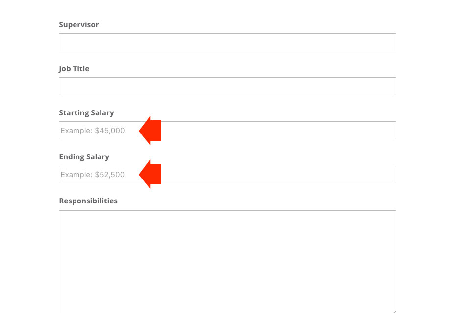
Placeholder text
It’s nice when a designer goes a little above and beyond and gives you a hint at the type of information they are looking for, by providing placeholder text in the form field. While this is extremely convenient, there have been several times when I have encountered placeholder text that doesn’t go away when you start typing in the form field. This is a huge point of frustration for any user, because they have to stop typing, select everything, and delete it, starting all over again. They also might select the unnecessary type and delete that, causing an interruption in their thought process while filling out the form. Whenever using placeholder text to hint at the type of information you are looking for, make sure it goes away when someone selects that input field.Error messages
There’s nothing more frustrating than trying to do something on a website, only to receive an error message, without enough information, or any at all. If a website user encounters an error, there should be an explanation of what is incorrect and how to fix it. For example, if you log into a site with a username and password, if you make a mistake with one, you should be told which. With so many logins to websites out there, it’s easy to accumulate multiple variations of usernames and passwords. There are some cases when I have had to modify my usual username and password combination, because it didn’t meet the requirements of a website’s registration, such as 2 capital letters, or a number, letter, and punctuation or symbol. Other examples would include: if passwords don’t match, during the registration process, show an error message before submitting. Another example might be if a username is already taken, show that before someone submits their registration. No one likes having to redo something, especially after receiving poor instructions. You’ll have a lot higher engagement if you make it easy for users to provide you with the correct information the first time.Large, fixed navigational headers
I’m not sure how this became popular, but I’ve seen it a lot, on many sites around the web. The issue with such a large header and all of those navigational elements is when you scroll down the page, it blocks a lot of content. This is especially frustrating when there are parts you need to get to, or when the content would otherwise fill the height of the browser, but part of it is concealed by navigation.Especially On Mobile
What’s even worse is that sometimes, when a site is brought down to mobile size, the large header is still kept in place. This is a bad experience all around, because space is already limited on smartphone screens. It doesn’t need to be taken up by a nav menu that could otherwise be hidden. If there are certain nav elements that need to stay visible, turn those into small icons, or place them somewhere out of the way.Low contrast
My eyes are good, but I am not a fan of trying to visually discern charcoal text or icons on a black background. No one should have to go through that. Contrast is key, especially in web design.
Text
Any text should be easily read, with enough weight to make it easy to read. 100 weight fonts have virtually no place on the web (except in a few special cases). Using a super thin font on a smartphone is simply asking for trouble. There has to be enough visual contrast there for your eyes to make out the letterforms.Color
For all elements of a website, there should be plenty of easily discernable contrast between colors. Any and all text should have a high rate of contrast from its background. That goes for any links, navigational elements or icons, too. It shouldn’t be difficult to find what you are looking for.Calls to actions
Just like other links and navigational elements, your call to action elements should display a high level of contrast. If you want a website visitor to take action, make it prominent, easy to read, and load and clear. Far too many times you’ll see a call to action with a button that doesn’t stand out enough from the background. Sometimes, it’s not a button at all, and it’s just a simple text link surrounded by white space.Touch targets on mobile
I see this on a lot of mobile sites and it is one of the most frustrating elements to deal with. If you have a button or a link to click, give it enough space so that users don’t accidentally hit the wrong thing. On a smartphone, make sure that any buttons or links are far enough away from the edge or the corner of their screen, so they can be easily tapped. Many times, a button placed too close to any of the 4 corners of a screen is too difficult to tap precisely. If you have larger fingers, the smartphone may not register your action at all. This causes the user to have to tap several times to get the feature to work. Space for these elements is extremely important.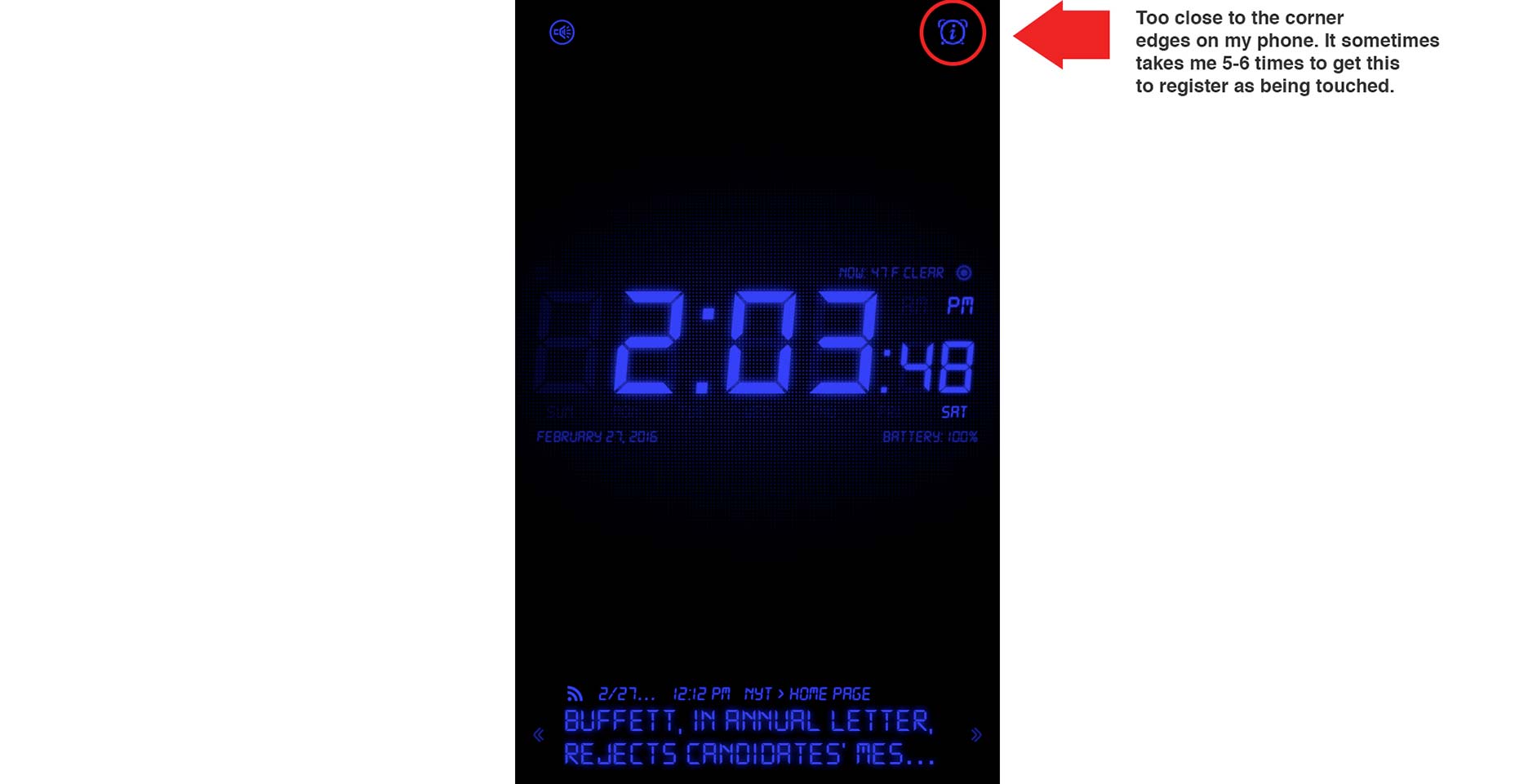
Conclusion
These common UX problems can be easily avoided with a little extra work and forethought. If you want your website visitors to use and enjoy your site, it is important to make the process easy and fluid. Avoiding having your users repeat actions and processes over again cuts down on frustration and provides the user experience everyone expects from a well-designed site. Featured image, UX design image via Shutterstock.James George
James George is a Professional Web & Graphic Designer. He owns Design Crawl, a site for graphic designers featuring free vector graphics and templates. He also owns G Squared Studios, which handles web design in Knoxville.


Read Next

3 Essential Design Trends, May 2024
Integrated navigation elements, interactive typography, and digital overprints are three website design trends making…

How to Write World-Beating Web Content
Writing for the web is different from all other formats. We typically do not read to any real depth on the web; we…
By Louise North

20 Best New Websites, April 2024
Welcome to our sites of the month for April. With some websites, the details make all the difference, while in others,…

Exciting New Tools for Designers, April 2024
Welcome to our April tools collection. There are no practical jokes here, just practical gadgets, services, and apps to…

How Web Designers Can Stay Relevant in the Age of AI
The digital landscape is evolving rapidly. With the advent of AI, every sector is witnessing a revolution, including…
By Louise North

14 Top UX Tools for Designers in 2024
User Experience (UX) is one of the most important fields of design, so it should come as no surprise that there are a…
By Simon Sterne

What Negative Effects Does a Bad Website Design Have On My Business?
Consumer expectations for a responsive, immersive, and visually appealing website experience have never been higher. In…

10+ Best Resources & Tools for Web Designers (2024 update)
Is searching for the best web design tools to suit your needs akin to having a recurring bad dream? Does each…
By WDD Staff

3 Essential Design Trends, April 2024
Ready to jump into some amazing new design ideas for Spring? Our roundup has everything from UX to color trends…

How to Plan Your First Successful Website
Planning a new website can be exciting and — if you’re anything like me — a little daunting. Whether you’re an…
By Simon Sterne

15 Best New Fonts, March 2024
Welcome to March’s edition of our roundup of the best new fonts for designers. This month’s compilation includes…
By Ben Moss

LimeWire Developer APIs Herald a New Era of AI Integration
Generative AI is a fascinating technology. Far from the design killer some people feared, it is an empowering and…
By WDD Staff