When it comes to calls to action, ‘button color’ is one of the classic metrics to A/B test. It’s also a hot discussion topic on design forums, if this Stack Exchange UX discussion is anything to go by.
In the discussion, a user asks:
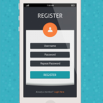
Which option is more intuitive for the user?
Here are the two options he presents:


Whilst one reader dismissed the options out of hand — citing the reasons as being 10% of males are red/green color blind — the question certainly raised a lot of intelligent debate.
This includes discussion on the psychological meaning of color, along with the platform used and the physical placement of the buttons.
The Meaning of Color
As far as standard online usage goes, red has been commonly associated with the delete button. It also typically denotes danger in Western civilisations — think of stop signs, fire engines and tail lights.
This is likely to be the reason for using red for delete buttons — it naturally gives us pause due to its connotations.
Of course, color psychology isn’t hard-wired into our brains. Like spoken language, we learn it from childhood, and, like language, it varies from region to region, and even era to era. Today most parents would get strange looks if they dressed their baby boy in pink, yet this was the norm a hundred years ago.Check out this great color wheel for a quick reference guide to what colors mean in various cultures. This is an ideal tool if you’re thinking of retargeting your site design for particular geographic regions.
This is true when it comes to your phone too: the red button warns us that we’re going to cut off a call, whilst green gives us the message that we’re going ahead with than call. There’s little getting away from what red means in Western societies.
Green also means ‘go’ in many countries, as well as a sense of nature, and gives us a sense of ‘going forward’ and growth.
However, as one discussion participant pointed out, it also raises questions surrounding ‘false positives’.
Both ways seem to pose a false-positive paradigm. This can be simpler and not have to force the user to spend time making sense of the color-to-label association.
In order to overcome associations, the commenter points out that it’s more effective to simply de-emphasize the button that you prefer the user not to take. This means the user can spend less time processing what should be a simple choice. For you consider, that they initiated the action. The confirmation of that action shouldn’t need to be a 50/50 yes/no question. This can be done most effectively by simply muting the color that you don’t expect the user to take. This could be a duller green or even more effectively as a neutral gray color.
Case Studies
The great ‘red vs green’ war has been a long-running battle on the web, with no definitive winner.There are plenty of case studies to be found online, but many of them are conflicting. This is more than likely due to what’s being tested for what platform, rather than being as straightforward as ‘Red Beats Green‘, as put forward by HubSpot concerning the Performable A/B testing.
In this test, two pages were used — the original page used a green button color and a duplicate page used a red button. They found that, interestingly, in this case the green had a much bigger impact than red and drove conversions 21% higher.

The test was carried out over a few days of traffic and the pages received around 2000 visits, with button clicks being measured by Performable. Every other single aspect of the page was the same yet the results far exceeded what was expected.
Similarly, a test run by Dmix comparing the feeback for red and green buttons also increased conversion rates — this time by a huge 34%.

This, as well as further tests that use red vs green (or a deep orange in place of red) all reported that red converted at a higher rate.
What Does it Mean?
Going back to the original discussion, it can often be the ‘pairing of colors’ rather than the actual colors themselves which could give the designer a problem. Whilst the participant that cited color blindness as a reason to avoid the red/green nexus was shot down in flames — they may have had a point.

As you can see in the diagram, people that suffer from color blindness see red and green very differently and it’s hard to distinguish one from another. As red and green are opposite each other on the color wheel, they are complimentary colors, so lack contrast.
The way that we process and interpret color means that if you place a red and green button together, the easiest route for our brain is to take no action at all. As we’re all well-accustomed to CTA buttons, using both red and green together actually has the opposite effect to what we’re attempting to do. We get locked by analysis paralysis.
With this in mind, choose either green OR red for a call to action — but never both — is the best way to avoid this issue. It’s also worth thinking about contrast with other colors on the page. Clearly, if you have a predominantly green page, then a green button is unlikely to stand out.
What about Orange?
As we saw earlier early, some designers opt for a dark orange color instead of red, as this contrasts better with some backgrounds. To test background colors and button colors for contrast, try Joe Dalson’s Color Contrast Comparison tool to make sure that there is enough of a difference for color blind people to see the button clearly. You should also test the contrast of the text color used on the button for best results.
I came across an article recently that said orange is the future when it comes to CTA buttons. That’s certainly been the case for Amazon — always obsessive user-testers — which uses orange in most of its most important call to actions. But what associations does the color carry?
Orange isn’t as intense as red and is thus more inviting, without having the association of urgency. It’s a friendly color and one that works well with brands that prefer to come across as sociable and approachable.
However, since red is associated with urgency, I still believe it is the default choice for CTA button, simply because it psychologically prompts the user into taking immediate action.
All in all, it seems that red is the color for CTA buttons, preferably used on its own, tested for contrast when button text is used and against the site’s background colors.
Green can work too, but you can’t argue with weight of studies that underline red’s effectiveness. Whether that will be enough to satisfy the ongoing red vs green row however, is debatable.
Frequently Asked Questions (FAQs) about Button UX: Red vs Green
Why is the color of buttons important in UX design?
The color of buttons plays a crucial role in UX design as it can significantly influence user behavior and decision-making. Colors can evoke certain emotions and reactions, and using the right color for your buttons can help guide users towards taking the desired action. For instance, green is often associated with positive actions and progress, while red can signify stopping or caution. Therefore, understanding the psychological impact of colors can help designers create more effective and intuitive user interfaces.
What is the psychological impact of using red and green buttons?
Red and green are two colors that carry strong psychological connotations. Red is often associated with urgency, danger, or stopping, while green signifies safety, progress, or affirmation. Therefore, using a red button could potentially discourage users from clicking, while a green button could encourage them to proceed. However, the impact can also depend on the context and overall design of the interface.
How can I decide which color to use for my buttons?
The choice of color for your buttons should be guided by the action you want users to take. If you want to encourage users to proceed or confirm an action, green could be a good choice. On the other hand, if you want to warn users or discourage them from taking a certain action, red could be more appropriate. However, it’s also important to consider other factors such as your brand colors, the overall design of your interface, and cultural considerations.
Can I use my brand color for buttons?
While it’s possible to use your brand color for buttons, it’s not always the best choice. The color of your buttons should primarily be determined by their function and the action you want users to take. If your brand color aligns with these considerations, it could be used for your buttons. However, if it doesn’t, it might be better to choose a color that does.
Are there any cultural considerations when choosing button colors?
Yes, cultural considerations can play a significant role in how colors are perceived. For instance, while red is often associated with danger or stopping in Western cultures, it can signify luck and prosperity in some Asian cultures. Therefore, it’s important to consider your target audience and their cultural context when choosing button colors.
How does the use of red and green buttons affect accessibility?
The use of red and green buttons can pose accessibility challenges, particularly for color-blind users who might struggle to distinguish between these colors. Therefore, it’s important to also rely on other design elements, such as text labels, shapes, or placement, to convey the function of your buttons.
Can the size and shape of buttons influence user behavior?
Yes, besides color, the size and shape of buttons can also influence user behavior. Larger buttons are generally more noticeable and easier to click, which can encourage user interaction. Similarly, certain shapes can be more intuitive or familiar to users, making them more likely to take the desired action.
How can I test the effectiveness of my button colors?
You can test the effectiveness of your button colors through user testing and A/B testing. User testing involves observing how users interact with your interface, while A/B testing involves comparing two versions of a design to see which performs better. These methods can provide valuable insights into how your button colors are influencing user behavior.
Can I use other colors besides red and green for my buttons?
Absolutely. While red and green are commonly used for buttons due to their strong psychological connotations, you can use any color that aligns with your design goals and brand identity. The key is to ensure that your button colors are intuitive, accessible, and effective in guiding user behavior.
What are some best practices for designing buttons in UX?
Some best practices for designing buttons in UX include using colors that align with the desired user action, considering cultural and accessibility factors, using clear and concise labels, ensuring that buttons are large enough to be easily clicked, and testing your design with real users. It’s also important to maintain consistency in your button design throughout your interface to provide a seamless user experience.
 Kerry Butters
Kerry is a prolific technology writer, covering a range of subjects from design & development, SEO & social, to corporate tech & gadgets. Co-author of SitePoint’s Jump Start HTML5, Kerry also heads up digital content agency markITwrite and is an all-round geek.