
Data visualization is one of the most important tools we have to analyze data. But it's just as easy to mislead as it is to educate using charts and graphs. In this article we'll take a look at 3 of the most common ways in which visualizations can be misleading.
Truncated Y-Axis
One of the easiest ways to misrepresent your data is by messing with the y-axis of a bar graph, line graph, or scatter plot. In most cases, the y-axis ranges from 0 to a maximum value that encompasses the range of the data. However, sometimes we change the range to better highlight the differences. Taken to an extreme, this technique can make differences in data seem much larger than they are.
Let's see how this works in practice. The two graphs below show the exact same data, but use different scales for the y-axis:
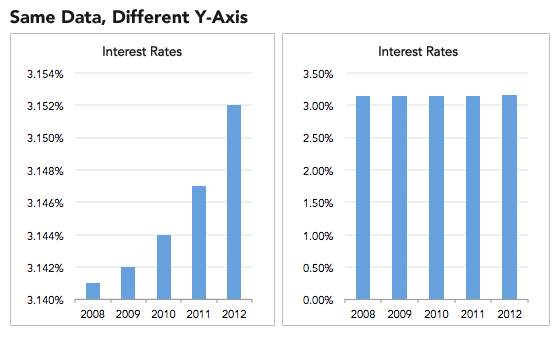
On the left, we've constrained the y-axis to range from 3.140 percent to 3.154 percent. Doing so makes it look like interest rates are skyrocketing! At a glance, the bar sizes imply that rates in 2012 are several times higher than those in 2008. But displaying the data with a zero-baseline y-axis tells a more accurate picture, where interest rates are staying static.
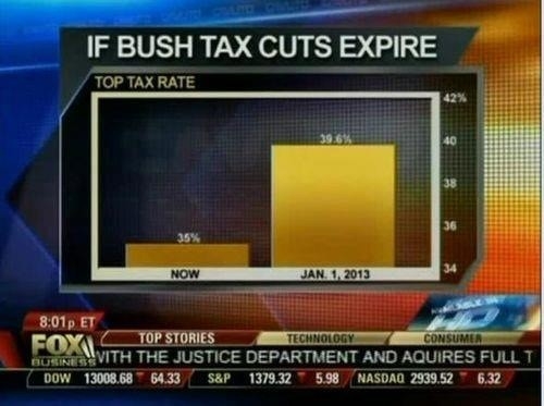
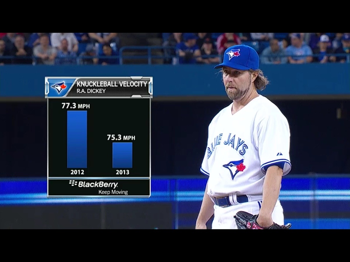
If this example seems exaggerated, here are some real-world examples of truncated y-axes:
Cumulative graphs
Many people opt to create cumulative graphs of things like number of users, revenue, downloads, or other important metrics. For example, instead of showing a graph of our quarterly revenue, we might choose to display a running total of revenue earned to date. Let's see how this might look:
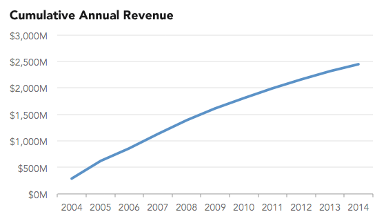
We can't tell much from this graph. It's moving up and to the right, so things must be going well! But the non-cumulative graph paints a different picture:
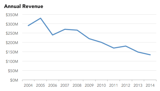
Now things are a lot clearer. Revenues have been declining for the past ten years! If we scrutinize the cumulative graph, it's possible to tell that the slope is decreasing as time goes on, indicating shrinking revenue. However, it's not immediately obvious, and the graph is incredibly misleading.
There are lots of real-world cases of cumulative graphs that make things seem a lot more positive than they are. A prominent example is Apple's usage of a cumulative graph to show iPhone sales.
Ignoring conventions
One of the most insidious tactics people use in constructing misleading data visualizations is to violate standard practices. We're used to the fact that pie charts represent parts of a whole or that timelines progress from left to right. So when those rules get violated, we have a difficult time seeing what's actually going on. We're wired to misinterpret the data, due to our reliance on these conventions.
Here's an example of a pie chart that Fox Chicago aired during the 2012 primaries:

The three slices of the pie don't add up to 100 percent. The survey presumably allowed for multiple responses, in which case a bar chart would be more appropriate. Instead, we get the impression that each of the three candidates have about a third of the support, which isn't the case.
Another example is this visualization published by Business Insider, which seems to show the opposite of what's really going on:
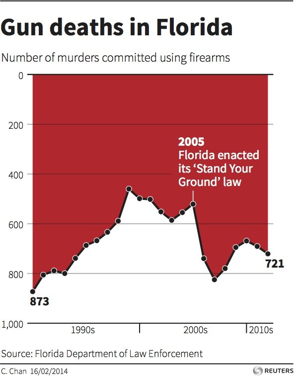
At first glance, it looks like gun deaths are on the decline in Florida. But a closer look shows that the y-axis is upside-down, with zero at the top and the maximum value at the bottom. As gun deaths increase, the line slopes downward, violating a well established convention that y-values increase as we move up the page.
There's a simple takeaway from all this: be careful when designing visualizations, and be extra careful when interpreting graphs created by others. We've covered three common techniques, but it's just the surface of how people use data visualization to mislead.
Ravi is co-founder of Heap, a data analytics company.
Do you have an example of a particularly poorly built visualization? Let us know on Twitter.