A few weeks ago I published an article highlighting popular tools and other considerations to check your site’s accessibility. There I briefly touched on the possible errors these tools look for in your code and how to avoid them. In this post, I will talk about guidelines for making a website accessible by adhering to WCAG 2.0 (Web Content Accessibility Guidelines).
In order to get a clear understanding of the different kinds of accessibility issues and how users take advantage of assistive technologies to overcome them, you may want to read through the essential components of web accessibility before we proceed.
Page Title
The page title is the text included in the title tag. It is shown in the title bar of some browsers, and appears in search results and bookmarks as a page’s heading. It is also read by screen readers when a page is loaded. Although a non-screen reader user can avoid reading an inappropriate title, a screen reader will always read it out. Therefore, the title should be chosen with care.
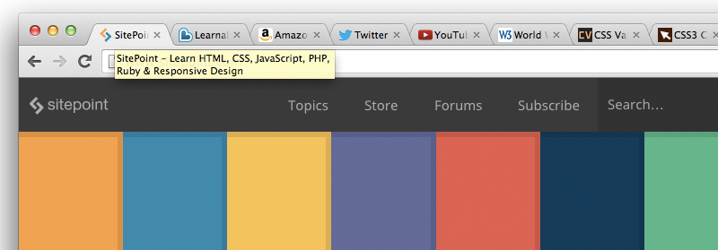 SitePoint’s home page with its title displayed in a tool tip.
Guidelines for Page Titles
- Make sure the title adequately describes the nature of the page and is of an appropriate length.
- Two pages on one website should not share the same title.
- A screen reader will read out the title every time it changes, so don’t change the page title except in rare cases (for instance, in a chat application).
Images
Images are of practically no use to blind users. It is important to provide associated alt text with the image that appropriately describes the image. The alt text must not describe the image only but it should also provide the same user experience. For instance, alt text for an image of the “world” icon, used for notifications on Facebook, should read “notifications” rather than “world” or “planet earth”.
The alt text for an image is read out by screen readers, so images used for decorative purposes should almost always be include as backrounds in CSS or else have a null or empty value for their alt attribute, which will instruct the screen reader to ignore the image.
You might wonder: Why not just exclude the alt attribute altogether, rather than include an empty value? This is because if the alt text is absent, a screen reader reads out the src attribute instead – the path to the image! Naturally, you don’t want this, so it’s best to include decorative images via CSS or else include the alt attribute, but leave it empty.
The alt attribute has another use. If the user has switched images off in order to save bandwidth, the alt text is generally displayed in place of your disabled image. This way you’ll know what the image is for without downloading it.
Guidelines for Accessible Images
- As mentioned above, the alt text must explain the image’s purpose, rather than just describing the image.
- Make sure you include any text that is a part of the image in the alt text.
- Provide a null or empty alt attribute for images that convey no useful meaning, like those used for decorative purposes.
- If an image is complex, like a graph, the description should be what the image is about and the data in the image should be presented elsewhere on the page.
- The alt text should be precise and should never contain superfluous words like “Image of” or “Link to”.
How to Check Image alt Text
An easy way is to check the alt text for many different images is to use the Web Accessibility Evaluation Tool (WAVE), which lists the alt text of every image in a URL and will display an error if images have missing alt text.
Headings
Most CSS developers understand how to use headings (h1, h2, and so on). Early on in the CSS movement, however, many pages looked like this:
<div class="heading">HTML</div>
<div class="text">
    <p>HTML is the language of the web.</p>
    <div class="subheading">br tag</div>
    <p>br is used to insert line breaks.</p>
    <div class="subheading">p tag</div>
    <p>p is used to create paragraphs.</p>
</div>
<div class="heading">CSS</div>
<div class="text">
    <p>CSS is used for styling</p>
</div>
As you can see, no headings are used but instead the elements are styled using various classes. A much more accessible way to represent this is with headings:
<h2>HTML</h2>
<p>HTML is the language of the web.</p>

<h3>br tag</h3>
<p>br is used to insert line breaks.</p>

<h3>p tag</h3>
<p>p is used to create paragraphs.</p>

<h2>CSS</h2>
<p>CSS is used for styling.</p>
A proper heading structure must be maintained and styling should be applied to the HTML elements. Fortunately, most developers today have good habits and do this quite well for the most part.
Guidelines for Headings
- All pages must have use at least one heading.
- Text that serves the purpose of headings or subheadings must be wrapped with proper heading markup.
- A proper hierarchy of headings must be maintained.
How to Check Heading Accessibility
Although checks without a tool are possible by comparing markup to the visual structure of the page, it’s generally advisable to use a tool like WAVE or the W3 HTML Validator.
Color Contrast
As the color contrast between the background and foreground decreases, it becomes difficult to distinguish what is being presented – be it text or images. It also becomes difficult for people with color blindness to read low contrast text, because the colors appear as different shades of grey (depending on the severity of their disability).
It is said that one in twelve people have some sort of color deficiency. This means that a huge number of people are not able to see your website the way you do.
Guidelines for Color Contrast
- While designing your website, make sure your color contrast is high in order to maximise readability.
- Avoid using background images that have a wide range of colors.
How to test color contrast
- Use a browser add-on like Grayscale Tool for Chrome, to see what a web page looks like in greyscale.
- Use a color contrast checker tool like Check My Colors (which checks your whole page for low contrast) or Contrast Ratio (which gives you a WCAG score after inputting the text and background colors you intend to use).
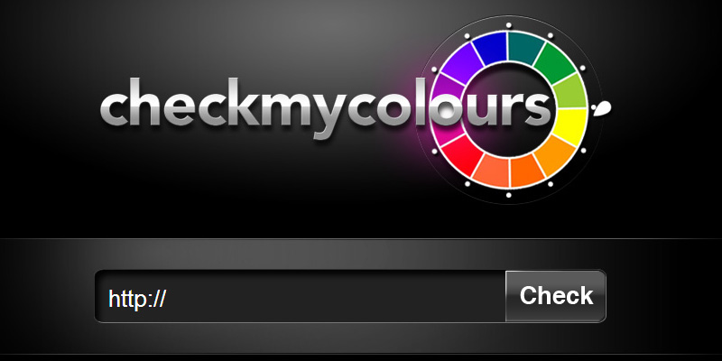 checkmycolours.com Contrast testing tool.
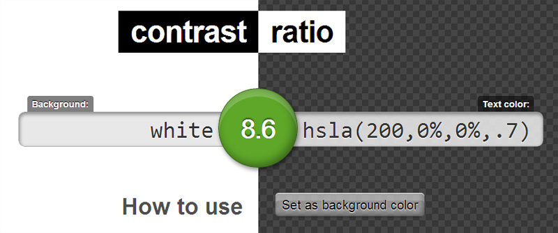 Lea Verou’s contrast testing tool.
Keyboard Access
People who are unable to use a mouse with precision rely exclusively on the keyboard for navigation of websites. For such users, the website must be navigable using only the keyboard, and keyboard focus on certain elements must be visible.
Guidelines for Keyboard Accessibility
- Every element should be accessible through the keyboard: links, buttons, form fields, and controls for WYSIWYG editors or media players.
- In drop-down menus, ensure that every item is keyboard-accessible using the tab or arrow keys.
- Ensure that the user can tab out of elements that they tabbed into, and not get stuck on one.
- Check the shifts of focus in reading order as you tab through the content — from top-to-bottom and left-to-right (opposite for right-to-left languages like Arabic).
- Visual focus shouldn’t be lost.
How to Check for Keyboard Access
- Click on the address bar using your mouse and do not use the mouse again. Instead, use the tab key to move through elements, and use SHIFT+Tab to move backwards.
- In drop-down menus or other elements, you may need to use the arrow keys in place of the tab key to navigate.
- Make sure you don’t lose visual focus when tabbing through the data.
Using BAD
The Before After Demonstration (BAD) is a demo created by W3C that shows an inaccessible website, explaining the issues with it and the same website after following the general accessibility guidelines.
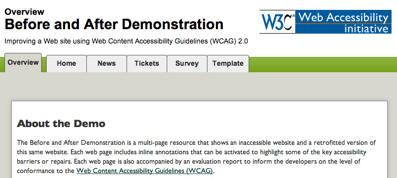 W3.org’s Before and After Demonstration.
You can compare the pages within the demo to gain a better understanding of web accessibility.
Conclusion
With knowledge of web accessibility checks, you should contact website owners and/or the developers about your findings and encourage them to fix their errors. However, you should also consider a proper way of approaching them.
We have covered a few topics pertaining to checking the accessibility of a website, but there are many other checks that we haven’t discussed. The complete list of easy checks for web accessibility can be found on W3C’s initial review of web accessibility.
And it should be noted that accessibility is always an ongoing task. Even if a website passes all website accessibility checks, there may still be areas that are hard to access via the keyboard or using a screen reader or other assistive device. Nothing beats actual testing, so continue to test even after all technical tests have been passed.
Frequently Asked Questions on Website Accessibility
What is website accessibility and why is it important?
Website accessibility refers to the design of websites that are usable by people with disabilities. It is important because it ensures that all users, regardless of their physical or cognitive abilities, can access, understand, navigate, and interact with the web. It also ensures that they can contribute to the web when necessary. Website accessibility is not only a matter of social inclusion but also a legal requirement in many jurisdictions.
How can I test my website for accessibility?
There are several tools available online that can help you test your website for accessibility. These tools can help identify issues such as missing alt text for images, insufficient color contrast, missing form labels, and more. Some popular tools include WAVE, Accessibility Checker, and Siteimprove’s Accessibility Checker.
What are some common accessibility issues to look out for?
Some common accessibility issues include lack of keyboard accessibility, missing alt text for images, poor color contrast, lack of clear headings, and missing form labels. These issues can make it difficult for users with disabilities to navigate and understand your website.
How can I make my website more accessible?
There are several ways to make your website more accessible. This includes using alt text for images, ensuring sufficient color contrast, using clear headings, providing keyboard accessibility, and using clear and simple language. It’s also important to provide transcripts for audio content and captions for video content.
What is alt text and why is it important?
Alt text, or alternative text, is a brief description of an image that is displayed when the image cannot be loaded or is being read by a screen reader. It is important for accessibility because it allows users with visual impairments to understand the content of the image.
What is keyboard accessibility and why is it important?
Keyboard accessibility refers to the ability to navigate a website using only the keyboard. This is important for users who have motor disabilities and cannot use a mouse, as well as for users who are blind and use screen readers.
What is color contrast and why is it important?
Color contrast refers to the difference in color between text and its background. Good color contrast is important for readability, especially for users with visual impairments or color blindness.
What are clear headings and why are they important?
Clear headings are used to structure content and make it easier to navigate. They are important for accessibility because they help users with cognitive disabilities to understand the content and navigate the website.
What are form labels and why are they important?
Form labels are used to identify the purpose of form fields. They are important for accessibility because they help users with cognitive and visual impairments to understand what information is required in each field.
What is simple language and why is it important?
Simple language is clear, concise, and easy to understand. It is important for accessibility because it ensures that users with cognitive disabilities, as well as users who are not fluent in the language of the website, can understand the content.
 Shaumik Daityari
Shaumik is a data analyst by day, and a comic book enthusiast by night (or maybe, he's Batman?) Shaumik has been writing tutorials and creating screencasts for over five years. When not working, he's busy automating mundane daily tasks through meticulously written scripts!