The Power of Bubble Charts
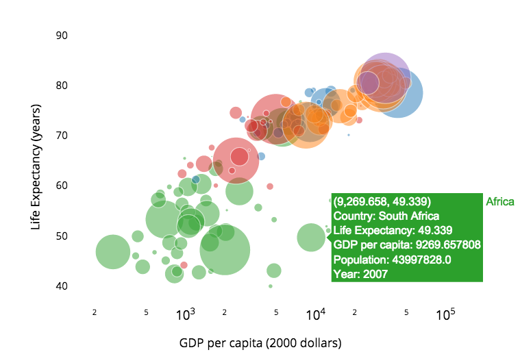
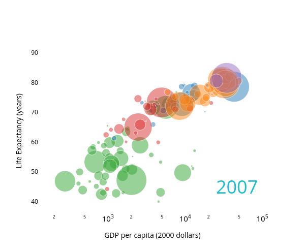
A bubble chart is similar to a scatterplot, but while scatterplots usually represent two variables — one on the x axis and one on the y — a bubble chart can represent a third variable by circle size. The bubble chart below is based on the work of Hans Rosling, a pioneer in data visualization and statistics who has made brilliant use of bubble charts (you can see him speak here in a seriously super great video). But before you watch the video or read on, look at the above graphic. It actually stores data on not three, but four variables. Can you see what they are? Click for more.
Data in Four Dimensions
In the graphic below:
- The x axis measures GDP per capita
- The y axis measures life expectancy
- Marker size measures total population
- Color measures region (Africa, Americas, Asia, Europe and Oceania)
The strength of a bubble chart is it allows us to easily compare multiple variables against each other. For example, in the graph above we could compare:
- X vs Y: e.g. to see that life expectancy increases linearly with an exponential increase in GDP (this is the relationship shown in a simple scatterplot like the one below).
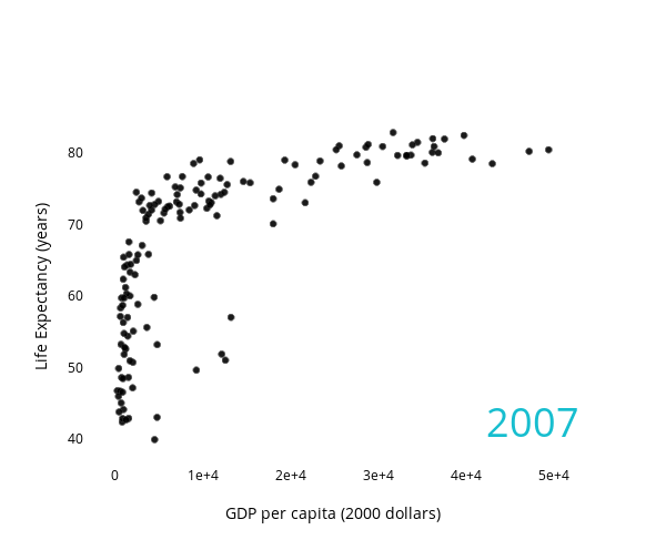
(Note: this x axis is linear instead of logarithmic to emphasize the relationship.) - X vs Y vs Color: e.g. almost all of the lowest GDP and lowest life expectancy countries are African (green).
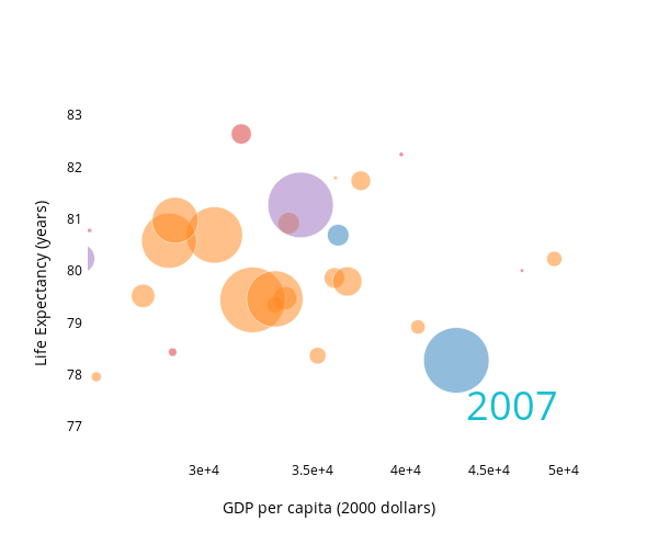
- X vs Y vs Size: e.g. as we see by zooming in on the largest (x,y) pairs, the highest GDP and life expectancy countries are disproportionately countries with larger populations.
If we were only interested in two of these four variables, a straight scatter plot might be the best solution, but the strength of a bubble chart is it allows for fluid visual storytelling. The viewer can find more than one compelling story in the chart, and choose between them.Bubble Charts in Plotly
We’ve made it quick and easy to create a bubble chart in Plotly. If you’re making a graph from the Plotly grid, just click the bubble chart icon. Select your x and y columns, just like for a scatterplot, and a third column for marker size. We’ll create a graph where the areas of the markers will be proportional to the data. This should make sense, a country with a population of 2 million should be represented by a circle twice the size as a 1 million person country. Because in Plotly (and almost all graphics software) circular markers are measured by diamter (proportional to radius), and the area of a circle is given by πr2 (proportianal to radius2), we do a little conversion for you.
If you’re graphing bubbles through our API, make sure you do the same conversion, and make your marker size (i.e. diameter) proportional to the square root of your data. You can see a Python example of a scripted bubble chart here (you’re really just making a scatter plot with the marker object’s “size” parameter as a variable), or check out this iPython notebook for some more examples.Visual Hierarchy
Size, color, and position (i.e. (x,y) coordinates) can be used to represent data, but they also affect a graph’s visual hierarchy, which is the order in which the eye notices features or objects. We notice colorful features over gray ones, bright colors over dull ones, and, in general, colors that differ from their surroundings. Check out a zoomed in view of our graph, focussing on the smallest (x,y) values.
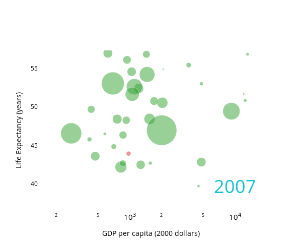
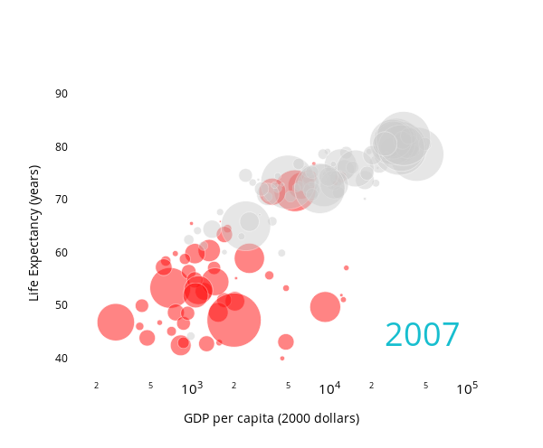
While the bulk of these countries are African, the eye is immediately drawn to the red dot, which represents Afghanistan (which, in 2007, had understandably low life expectancy and GDP). Note that these two colors, red and green, are very high contrast. They are also known as complementary colors, which sit opposite each other on the color wheel. Position and size also affect visual hierarchy. The eye is drawn to larger circles, as well as circles which fall outside of the general spatial trend.Understanding visual hierarchy can help you build a graph which guides the reader towards a specific story. The graph below, for example, is clearly primarily concerned with African nations.
A bubble chart allows you to play with multi-dimensional data: telling dozens of different stories, or emphasizing one story, in a single graph.
 collectionofthings liked this
  cruisertom liked this
 plotlyblog posted this