The science of cartography is well known for its biases. After all, map-makers are always influenced by the technological, social, and political contexts of the era in which they draw their maps.
What this means is that virtually all maps start to look pretty funny after enough time has passed, as maps inevitably reveal as much about their makers - and that generation's attitudes and preoccupations - as they do about the world around us.
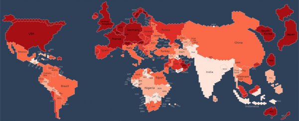
And perhaps you won't find a better example of this phenomenon than this amazing map created by the Oxford Internet Institute, which portrays what the world looks like when based purely on each country's respective Internet population.
In the map, which if you look close enough is actually made up of little hexagons, each hexagonal blip represents approximately 470,000 people online.
While the shape and position of individual nations has been retained as much as possible, because each country has a vastly different number of Internet users, it means some countries have expanded in size significantly while others with less than 470,000 Internet users have seemingly disappeared off the face of the Earth. (No Netflix for you, Iceland! In fact, no you… at all.)
For example, Japan and the UK now positively dwarf Australia, while Russia has shrunk down to about the same size as France and Germany.
In addition to manipulating scale based on the numbers of Internet users in each country, the map also colour-codes nations to indicate the percentage of their current populations online. Dark red means 80–100 percent of the country is online, while white means only 0–20 percent of the nation is connected to the Internet.
India stands out here in particular; while its comparatively large size on the map shows that a lot of Indians are Internet users, its colouring reveals they form a distinct minority within the country (with only 0–20 percent of people online). In stark contrast is China, the biggest Internet population depicted, and with 40–60 percent being Internet users.
The Institute based its map on figures recorded by the World Bank in 2013, which show that Asia is far and away the leader in Internet penetration, with its 1.24 billion Internet users accounting for almost half (46 percent) of the world's online population.
While some countries are experiencing rapid growth in internet connectedness (with Africa in particular seeing strong gains in penetration), the Institute says the map is a reminder of how far we still have to go in getting the people of the world online:
"[It] is important to realise and remember that despite the massive impacts that the Internet has on everyday life for many people, most people on our planet remain entirely disconnected. Even today, only a bit more than a third of humanity has access to the Internet."