The world wide web places an abundance of data at our fingertips. Due to the sheer volume of this data, presenting it in a way that stands out, or in a way that gets your message across, can often prove tricky. This is where data visualizations come in.
In this article, I will guide you through the creation of a data visualization, namely US vehicle recalls for the month of January 2015, using the dimple.js JavaScript library built on top of D3.js.
Setting the Goal
The NHTSA/ODI provide a recall file (which is accessible via their website) containing all NHTSA safety-related defect and compliance campaigns since 1967. Our goal is to extract the data for a given month (January 2015), and to create a bar chart from it, depicting the total number of vehicle recalls by maker.
This data visualization will not be explanatory (we will show raw data), and hardly exploratory (there’s not much narrative for the viewers to build from that data). I do however, intend to display additional information next to the chart when a user hovers over one of the bars.
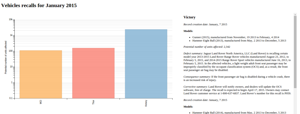
This is what we’ll end up with:
You can see a (smaller) live demo at the end of the article or view the original on CodePen.
Working with Data
Keeping Only the Data we Need
All of the files mentioned in this section can be found on our GitHub repo.
The original file FLAT_RCL.txt (link) is a tab-separated values file which contains a lot of data—109,682 records to be exact. There is an accompanying file RCL.txt (link) which details the columns pertaining to this data.
As we are only interested in the data for January 2015—or rather the records for which the Record Creation Date is January 2015—the rest of the records can be removed. To do this, I am using the OpenOffice Calc spreadsheet program (although any other spreadsheet software will suffice). The resulting file, RCL_January_2015.csv (link) only counts 201 records.
We now need to reduce the columns to a subset of those available, namely:
Record Creation Date, Maker, Model, Model Year, Begin Date of Manufacturing, End Date of Manufacturing, Potential Number of Units Affected, Defect Summary, Consequence Summary, and Corrective Summary. We can then add the columns names to the first line of the resulting CSV file, RCL_January_2015_clean.csv (link).
This gives us the raw data we need for our visualization.
Create the Data Structure
Now we need to manually group the recalls by maker, combining those records that have the same defect. We need to ensure that the combined records are sorted by date, then by model and that they have a cumulative potential total number of units affected.
We are going to use a JSON data structure for this grouping.
To illustrate this, let’s process the first three entries of the RCL_January_2015_clean.csv file. These can be grouped into one line stating that the MCI’s J4500 from the years 2013, 2014 and 2015, which have the same years of manufacturing, present the same defect. The potential number of units affected already groups these three models together in the dataset.
Here is the JSON data structure we are going to use:
{
  "items": [
    {
      "item": {
        "date": "",
        "models": [
          ""
        ],
        "units": "",
        "defect": "",
        "consequence": "",
        "corrective": ""
      }
    }
  ]
}
After iterating this process (and escaping the double quotes), we now have the CSV file RCL_January_2015_json.csv (link). For the sake of brevity, our working example will show only the first three makers of the original file (3 out of 46).
Binding Data to the D3 Object
D3 provides out-of-the-box support for data file formats, such as CSV, TSV, or JSON. An Ajax call is performed to fetch the file, then it is parsed and transformed into a JavaScript array. The CSV file we have created can be fetched with the following code:
d3.csv("RCL.csv", function (data) {
  // process the data
});
We can also define the JavaScript array directly in the code, which we are going to do here for the purposes of our CodePen demo. The data structure has been kept as close as possible to the array D3 would have created from the CSV file.
data = [
  {
    'Record creation date':'20150105',
    'Maker':'MCI',
    'Potential number of units affected':'109',
    'JSON data': '{
      "items":[
        {
          "item": {
            "date":"January, 5 2015",
            "models":[
              "J4500 (years 2013, 2014, 2015) ..."
            ],
            "units":"109",
            "defect":"...",
            "consequence":"...",
            "corrective":"..."
          }
        }
      ]
    }'
  },
  ...
];
And Now, Let’s Dive in!
<div id="RecallsChart"></div>
<div id="RecallDetails"></div>
The HTML is straightforward: two divs, one for the chart (RecallsChart), the other to display additional details if the user hovers over one of the bars (RecallDetails).
var svg = dimple.newSvg("#RecallsChart", 800, 560);
var myChart = new dimple.chart(svg, data);
myChart.setBounds(60, 30, 710, 355)
We first add an SVG object to the div element, referencing it by its id. Then we link our data to our new chart, which will be rendered in the SVG. Finally, we manually set the chart bounds to position it correctly within its parent div.
var x = myChart.addCategoryAxis("x", "Maker");
x.addOrderRule("Maker");
x.title = '';
We set the x-axis of the chart to the Maker field of our data—we use the addCategoryAxis method as the makers constitute categorical data. We order the makers alphabetically using the addOrderRule method and hide the x-axis title (which would have been the maker), as the makers names are self-explanatory.
myChart.addLogAxis("y", "Potential number of units affected");We set the y-axis of the chart to the Potential Number of Units Affected field of our data. We could have used the addMeasureAxis method here, which defines a linear axis from the given values, but as the maker Victory has more than 20 times the potential number of units affected than either MCI or Thor, the resulting column would have dwarfed the two others. In this case, a logarithmic scale gives more room for smaller values, so we use the addLogAxis method, which defaults to base 10.
var mySeries = myChart.addSeries(["Maker", "JSON data"], dimple.plot.bar);Now that we have defined our axes, we can tie them together to render a graphic. For this we select a bar chart via dimple.plot.bar, and we tie it to the Maker data field. The second array element, JSON data, will tie the JSON part of our data to each bar and enable us to access the correct data when hovering over the bar with the mouse.
mySeries.getTooltipText = function (e) {
  var datum = jQuery.parseJSON(e.aggField[1]);
  var titles = [];
  titles['date'] = 'Record creation date';
  titles['units'] = 'Potential number of units affected';
  titles['defect'] = 'Defect summary';
  titles['consequence'] = 'Consequence summary';
  titles['corrective'] = 'Corrective summary';
  var html = '';
  html += '<span class="maker">'+e.aggField[0]+'</span>';
  html += '<br /><br />';
  $.each(datum.items, function(index1, element) {
    $.each(element, function(index2, item) {
      $.each(item, function(key, value) {
        if (key === 'models') {
          if (value.length == 1) {
            html +=  '<strong>Model</strong>:';
          }
          else {
            html +=  '<strong>Models</strong>:';
          }
          html += '<ul>';
          $.each(value, function(vk, val) {
            html += '<li>'+val+'</li>';
          });
          html += '</ul>';
        }
        else {
          html +=  '<em>'+titles[key]+'</em>: '+value+'<br /><br />';
        }
      });
    });
  });
  $("#RecallDetails").html(html);

  return [
    "Maker: " + e.aggField[0],
    "Potential number of units affected: " +
      parseInt(e.cy).toLocaleString('en')
  ];
};
By default, tooltips are displayed when hovering with the mouse over a plot unit (here, a bar) and show the axes and series data. In our case: the maker (x-axis value), the potential number of units affected (y-axis value), and the plain text value of our JSON data.
The getTooltipText function is overloaded here to process the JSON data and display it in another div to the side. It returns an array of the data we want to display as a tooltip, namely the maker’s name (the first aggregate field of our data line) and the number of units affected (which we get from the y-axis, and which we localize to the generic English number format via the built-in toLocaleString JavaScript method).
But let’s get back to the JSON data parsing.
The two aggregate fields we are accessing (aggField[0] and aggField[1]) match the data fields array we previously set as series (["Maker", "JSON data"]), with aggField itself being a property of the underlying element object.
We parse the JSON string with jQuery’s parseJSON function, set an array of full length titles matching the keys of our JSON object, then, by iterating over the JSON object, we build an HTML string to add to the div with the id RecallDetails.
myChart.ease = "elastic";
myChart.draw(1000);
We finally draw the chart with an aesthetic transition using the elastic ease with a one-second delay.
x.shapes.selectAll("text")
  .style("text-anchor", "end")
  .each(function () {
     var rec = this.getBBox();
     d3.select(this)
       .attr("transform", "rotate(-90," + (rec.x + rec.width) + "," + (rec.y + (rec.height / 2)) + ") translate(5, 0)");
  });
Did I say finally? Well, here we add another aesthetic trick to the x-axis labels.
By default, the x-axis labels are written horizontally. But they can easily overlap, so we are going to write them vertically instead. This is where dimple’s exposure of its underlying D3 objects comes handy. Please note that we can only change it once the chart has been drawn, hence after the myChart.draw() call.
To do this, we first select each label text, or rather the matching SVG shape linked to the x-axis for each label. The getBBox() method belongs to the InterfaceSVGLocatable and returns an SVGRect object that defines the bounding box, exposing its coordinates, height and width. We then perform a rotation of the SVG box, and a slight vertical translation to put it closer to the x-axis line.
And here is the end result:
See the Pen Vehicles recalls for January 2015 by SitePoint (@SitePoint) on CodePen.
The width of this pen has been reduced in order to fit it into the article. You can see the original CodePen here
Conclusion
In this article we have seen how to clean-up and prepare data for data visualization, specifically defining a data structure to match the final result we had in mind. We used both the dimple.js and D3.js libraries, with some limited calls to jQuery (mostly related to JSON processing). We have drawn the bar chart from our data, with a bit of exploratory interaction by overloading dimple’s tooltip feature. We have also accessed the underlying D3 object to manipulate the x-axis labels.
As a side note, SVG is now widely supported, but it is good practice to check it beforehand (with Modernizr for instance), and to provide with a fallback such as a PNG image wherever needed. Of course, the conditional loading of D3.js and dimple.js should also be taken into account.
If you want to dive deeper into data visualization, Udacity offers a self-paced MOOC entitled Data Visualization and D3.js that covers visualization concepts, the use of D3.js and dimple.js, narrative structures and animation. Also, Mike Bostock’s site (the creator of D3.js) is the perfect source if you want to understand the concepts behind this library, while both dimple and D3 provide a list of examples to learn from.
Frequently Asked Questions (FAQs) about Creating Data Visualizations with JavaScript, Dimple, and D3
How can I create a multiline chart using Dimple and D3?
Creating a multiline chart using Dimple and D3 involves several steps. First, you need to set up your HTML file and include the D3 and Dimple libraries. Then, you need to load your data, which can be in various formats such as CSV, JSON, or TSV. Once your data is loaded, you can create a new SVG object and set its dimensions. After that, you can create a new Dimple chart, specify the axes, and add the lines for each data series. Finally, you can customize the chart’s appearance and add interactivity if needed.
What are the differences between D3 and Dimple code for line charts?
D3 and Dimple are both JavaScript libraries used for creating data visualizations, but they have some differences. D3 is a low-level library that provides a lot of flexibility and control, but it can be complex and verbose. On the other hand, Dimple is built on top of D3 and provides a higher-level API that simplifies the process of creating common types of charts, including line charts. However, it may not provide as much flexibility as D3 for more complex or custom visualizations.
How can I add interactivity to my Dimple chart?
Adding interactivity to a Dimple chart can enhance the user experience and provide additional insights. You can add tooltips that display more information when the user hovers over a data point. You can also add event listeners that respond to user actions such as clicks or mouse movements. For example, you could highlight a line or show a detailed view of the data when the user clicks on it.
How can I customize the appearance of my Dimple chart?
Dimple provides several options for customizing the appearance of your chart. You can change the colors, fonts, and sizes of the elements. You can also adjust the scales and axes to better represent your data. For example, you can use a logarithmic scale for data that spans several orders of magnitude, or you can rotate the labels on the x-axis for better readability.
How can I handle missing or inconsistent data in Dimple?
Handling missing or inconsistent data is an important part of data visualization. Dimple provides several methods for dealing with such data. You can use the dimple.filterData() method to filter out unwanted values, or you can use the dimple.addMeasureAxis() method to aggregate data and fill in missing values. You can also use D3’s data manipulation functions to clean and preprocess your data before visualizing it.
How can I create a bar chart using Dimple and D3?
Creating a bar chart with Dimple and D3 involves similar steps to creating a line chart. You need to load your data, create an SVG object, and create a new Dimple chart. However, instead of adding lines, you add bars using the dimple.addSeries() method. You can also customize the appearance of the bars and add interactivity as needed.
How can I export my Dimple chart as an image or PDF?
Exporting a Dimple chart as an image or PDF can be useful for sharing or presenting your data visualization. You can use D3’s node() method to get the SVG element of the chart, and then use a library such as canvg or jsPDF to convert the SVG to an image or PDF. Note that this may require additional setup and dependencies.
How can I animate my Dimple chart?
Animating a Dimple chart can make your data visualization more engaging and dynamic. You can use D3’s transition methods to animate changes in the data or the chart’s appearance. For example, you can animate the lines in a line chart to smoothly transition from one state to another when the data changes.
How can I create a scatter plot using Dimple and D3?
Creating a scatter plot with Dimple and D3 involves similar steps to creating a line or bar chart. You need to load your data, create an SVG object, and create a new Dimple chart. However, instead of adding lines or bars, you add points using the dimple.addSeries() method. You can also customize the appearance of the points and add interactivity as needed.
How can I create a pie chart using Dimple and D3?
Creating a pie chart with Dimple and D3 involves similar steps to creating other types of charts. You need to load your data, create an SVG object, and create a new Dimple chart. However, instead of adding lines, bars, or points, you add a pie using the dimple.addSeries() method. You can also customize the appearance of the pie and add interactivity as needed.
 Alexis Ulrich
Alexis Ulrich is a full-stack web developer based in Paris, France. He is interested in the way content can be created, optimized, used and shared on the web. When not working on his pet sites (languagesandnumbers.com and mancko.com), he shares his MOOC experiences on web-technos.blogspot.com.