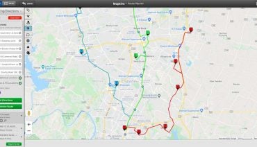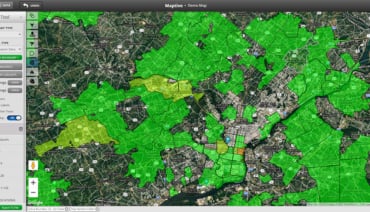
Maps tell stories. As we’ve written on this blog before, they are an important and useful tool in simplifying complex information for the purpose of educating groups, persuading people, or understanding ideas. Maps can change popular opinion. They can illustrate never-before-seen trends in the world. Maps are visuals, and visuals are compelling. It has been said that 90% of information transmitted to the brain is visual, and visuals are processed 60,000X faster in the brain than text. It’s why television and smartphones have become daily tools for consuming information.
In this blog, we want to illustrate the true power and value of maps by sharing seven compelling mapping-related visualizations. All of these interactive maps are from the New York Times—a media organization that frequently compiles and processes complex data about our world in an effort to shine light on problems and tell impactful stories.
Here are the 7 compelling maps we chose to feature:
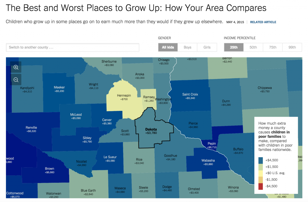
This first interactive map from the New York Times compiles relevant county data to illustrate the idea that location (i.e. where you grow up) impacts how much you earn or how successful you are later in life. Essentially, it’s attempting to tell a story about poverty and mobility trends in the United States. The data used to create this map comes from a study by Raj Chetty and Nathaniel Hendren of the Equality of Opportunity Project. This map can be used to determine what childhood in a particular county does to future income.
Source: The New York Times
This second interactive map from the New York Times uses census data from 2010 to map segregation in cities and neighborhoods across America. As you can see, rather than offering a complex table or diagram full of numbers, the map is instead using colors to identify trends. In the screenshot below, for example, you can see a trend of green in the Manhattan/Midtown area of NYC. In this interactive map, green represents white residents. The map allows you to search other areas around the country, and also features other large cities across the bottom. As you hover around the map, click on a particular neighborhood or area to view the percentage breakdown.
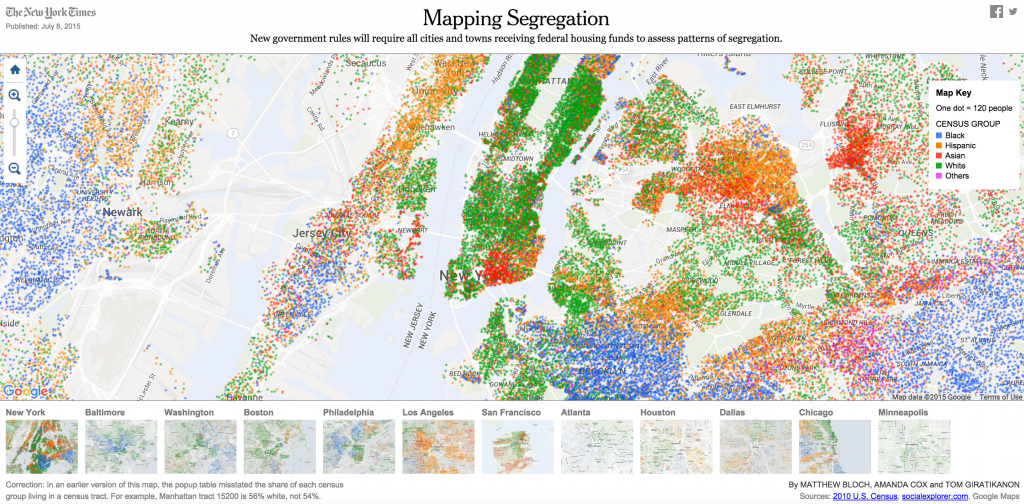
Source: The New York Times
This third interactive map from the New York Times is particularly interesting because instead of utilizing quantitative data to create their map, the makers used qualitative data to create a helpful reference tool and tell a story. The map offers a look into Africa. It highlights a handful of locations worth visiting. Each point can be clicked on to learn more about that particular area. For example, if you click on Tunis, you are directed to an article that features the best ruins worth visiting in the area. It’s a great example of how you can use maps to give virtual tours of a particular area.
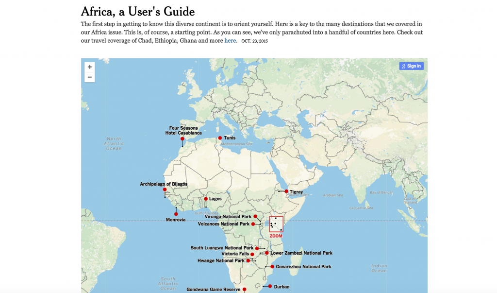
Source: The New York Times
This fourth interactive map from the New York Times is particularly interesting to us because it utilizes heat mapping, a feature we’ve recently added to our own Maptive tool! Again, this map is compelling because it uses colors to simplify or visualize complex data. In this map, you can see how drought has been affecting different areas across the country over time. The deeper colors represent more drought, the lighter colors less. We like this map because of the fact that it visualizes the passing of time in a very compelling way. According to the article that goes along with this interactive map, the patterns visualized are from the Drought Monitor, which has data going back to 2000.
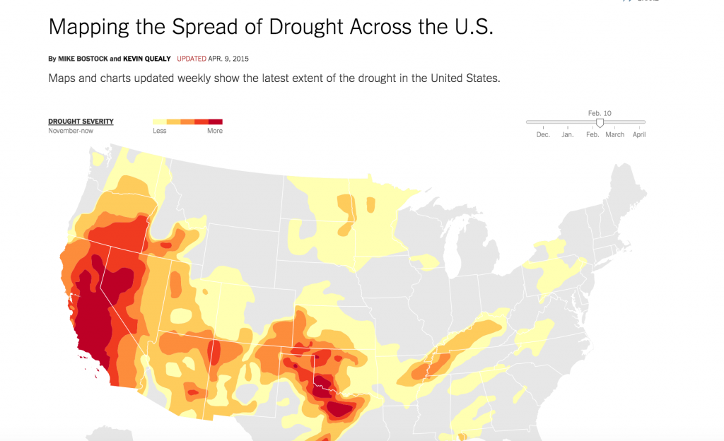
Source: The New York Times
This fifth interactive map from the New York Times is fairly similar to the second map featured in this article. It illustrates the prevalence of poverty across the United States. According to this map, the data is from census tract-level data from the 2008-12 American Community Survey. The view you see below is showing percent below the poverty line. Darker colors represent higher percentages. You can also switch the view of this map to show the number of people living in poverty. The map allows you to search other areas around the country, and also features other large cities across the bottom.
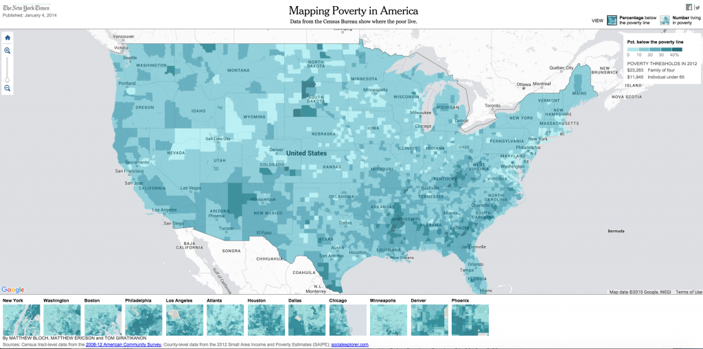
Source: The New York Times
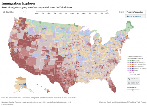
In this sixth interactive map from the New York Times, you see how foreign-born groups are settling across America. The data goes back all the way to 1880 and comes from the U.S. Census Bureau. In this map you can switch back and forth between percent of population and number of residents. You can also hover over the map to get specific data relating to counties within states. Like many other maps in this blog post, it utilizes color to identify and present trends in data.

Source: The New York Times
This final map from the New York Times is similar to the third map we shared above in that it presents a story. The map is a good example of the power visuals (specifically maps) can have in creating a story that can be understood by anyone, no matter how familiar they already are with the problem, situation, or story being presented. It’s another example of complex data being simplified. This particular map shows the clashes between Baltimore police and protesters after the funeral of Freddie Gray.
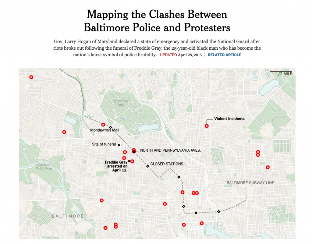
Source: The New York Times
Got another map you love that you think we should add to this list? Leave a link to it below, we’d love to take a look!