

Registering new users is the most basic, fundamental piece of the software business. If you don’t have customers, you don’t have money. With this in mind, you would think companies would devote time and energy into developing the perfect user registration process.
Unfortunately, most companies suck at it.
These are the keys to a better registration process: implement features to streamline the process, design your landing pages and forms to drive conversions, and develop an effective engagement strategy to ensure retention.
"App registration should be streamlined, well-designed, and include an effective engagement strategy."
Tweet This

On its own, all of that sounds a little high-level and abstract, which is why we’ve compiled a list of 7 hacks you can implement today, with examples, to boost your registration rate.
1. Give Your Customers The Option of Single Sign On
60% of web users have more than 5 unique passwords to keep track of, and 40% use the “Forgot Password” option at least once a month. Auth0 undercuts all of that frustration by offering Single Sign On (SSO), allowing customers to sign in through 30+ social platforms, and through other Passwordless authentication channels, like email or SMS.
And SSO isn’t just our preference. 77% of users say they prefer applications that offer them the choice of using social login, as opposed to requiring email registration.
This doesn’t mean you have to completely do away with email registration, some customers will always prefer it, but you need to offer SSO as an alternative. For a perfect example of this, look at Concierge Auctions' registration page:
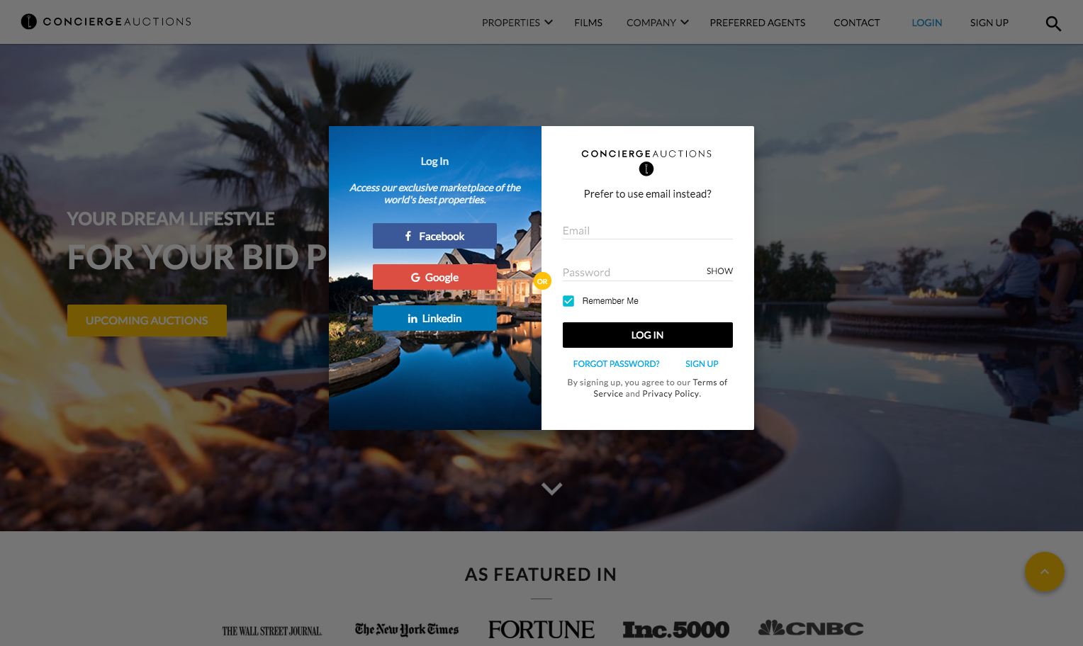
Just a simple hover form that offers you SSO, or the alternative to enroll with just an email and password.
2. Guide Your Customers' Eyes With Directional Cues
Placing your registration button front and center, for a lot of people, is the intuitive way to call attention to it. This is not enough. Using visual cues can boost a product’s visual engagement 14 times over.
THiNK Eye Tracking ran a study on a shampoo advertisement. In one ad, the model looked directly at the audience instead of the shampoo, and only 6% of the audience looked at the shampoo bottle. In the ad where model looked at the shampoo bottle, 84% of the audience followed her gaze to the bottle.
Cues like color, gestures, and placement can be used very effectively on landing pages to draw your customer’s eye to your call-to-action, as evidenced by AdEspresso, a Facebook ad optimization service:
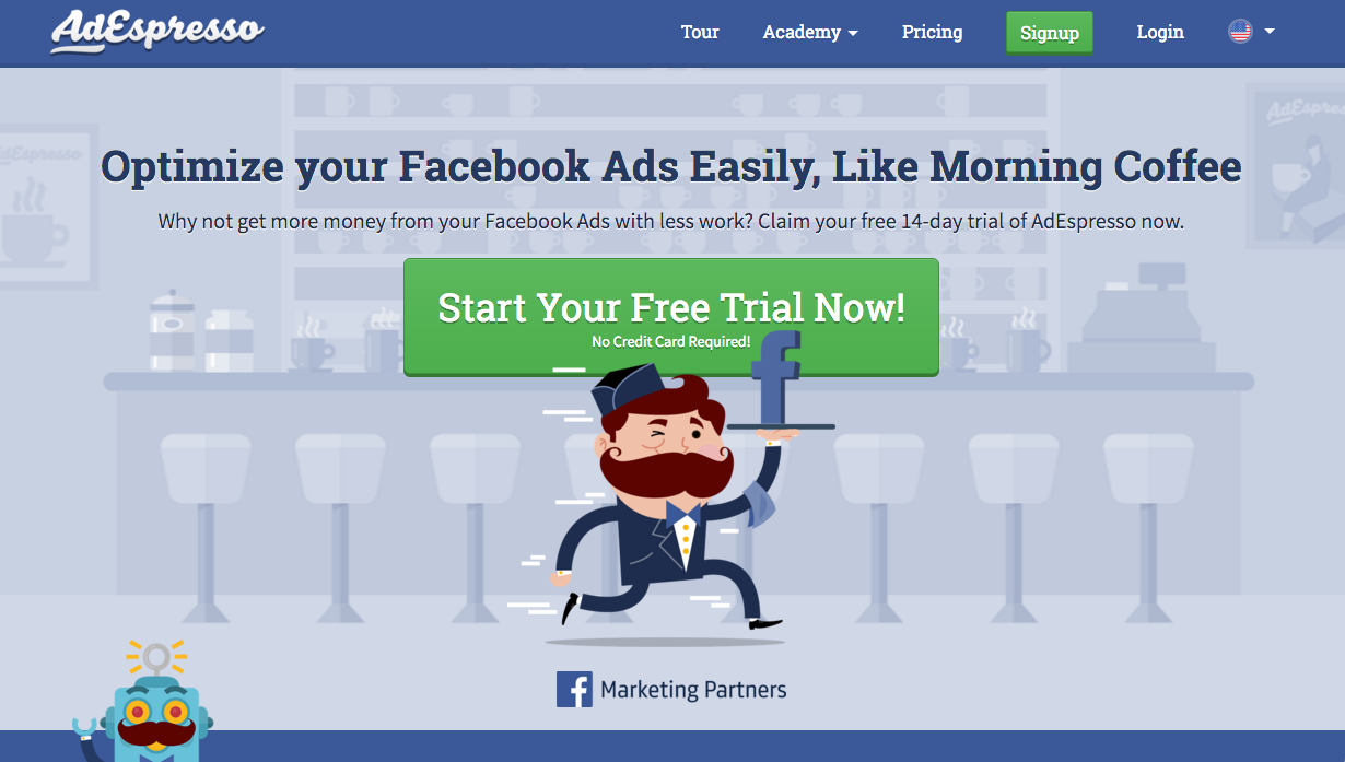
The mustachioed man is positioned just in front of the CTA, drawing your eye to it, which is encapsulated in the same green as the secondary “Signup” button in the navigation bar. Its placement in the center of the page, the way its color contrasts it from everything else, and the subtle overlap of the man and the button make it impossible for you to focus on anything else.
3. Collect Your Customers' Data Gradually With Progressive Profiling
We all know the frustration of trying to register for a service that wants your name, phone number, pet’s name, current address, and greatest childhood fear before you can make an account. In fact, 86% of users say they quit on registrations because they’re too long and too prying.
"86% of users say they quit on registrations because they’re too long and too prying."
Tweet This
Spare your customers this struggle by breaking your registration up into multiple stages—what is known as progressive profiling.
Pages that limit their forms to 2-3 fields have the highest conversion rates, and the contrast is stark. Just lowering from 4 fields to 3 increases conversion rates by 50%. By getting your customers to commit with a short form before easing them into a longer form, you engage what Dr. Robert Cialdini calls the principle of “Commitment and Consistency,” which dictates that people are much more likely to complete a task if they’ve already made some commitment to it, no matter how small.
Process Street, a process and workflow management service for teams, does this incredibly well:
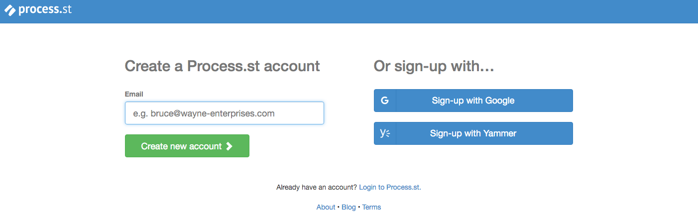
Just 1 text field, no visual distractions, and a clear communication of what they’re offering (a 14-day trial). That sort of form is a conversion machine.
Customers choose between either the ease of SSO, or filling out a single field for the email address. It doesn’t matter if the next page has more fields to fill out (it does), due to the principle of “Commitment and Consistency,” they’re much more likely to follow through.
4. Set Your Customers' Minds At Ease By Making Your Security Obvious
Even though you’re asking customers for the only the most necessary information, there is still a good chance they will be nervous about giving you their private data. Americans worry more about their data privacy than their income.
Minimize this anxiety by making it clear that your site is secure, and that you have high standards for privacy. You can explain some key points about your privacy policy on your landing page, so that your customer doesn’t have to dig through a massive “Terms and Conditions” document. You can also display that your site is compliant with security standards like SOC2 and HIPAA, something you get for free with Auth0, to reassure customers you take their privacy seriously.
InsightSquared, a sales performance analytics service, is offering a product that will be handling a lot of sensitive information, and so they offer both visible links to their privacy policy, and a TRUSTe security certificate:
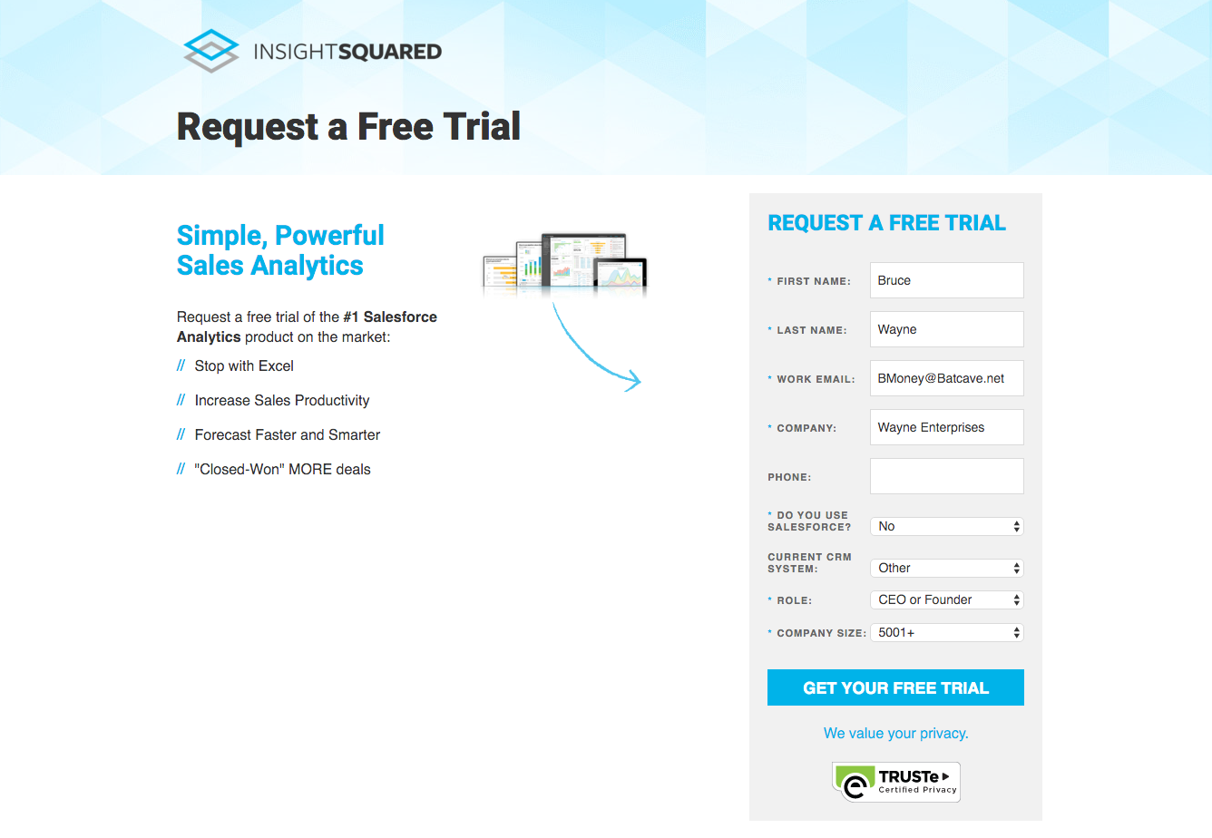
93% of Americans think controlling who has access to their data is important, while only 9% are confident they have control over that. You can appeal to 84% of Americans just by showing them you care about their privacy.
5. Save Your Customers Time By Evaluating Their Fields In Realtime
Filling out a long form, only to be told you have to do it all over again because your password didn’t contain a symbol, is an exhausting ordeal. If 86% of users quit on registration processes that take too long, you can’t afford for this to happen. Instead, use Auth0 Lock to validate your customer’s input as they type it:
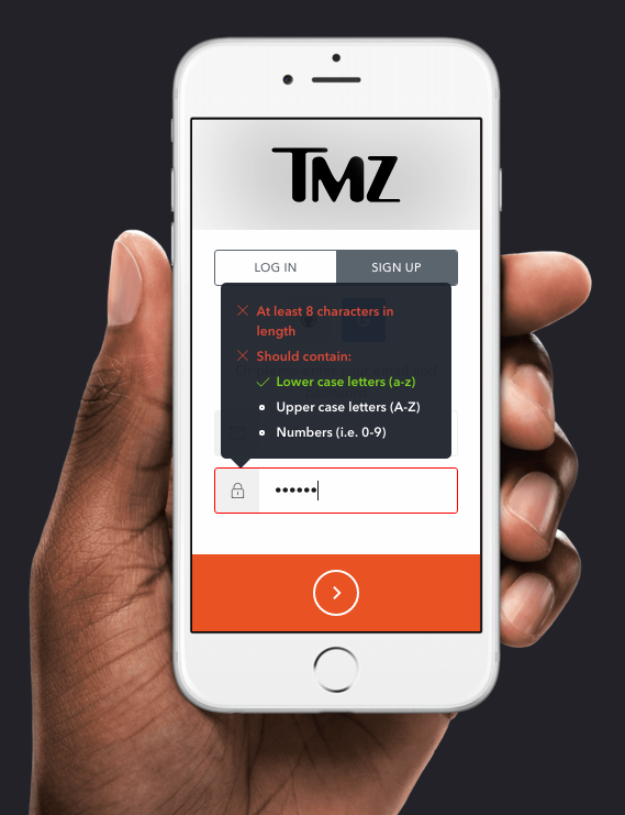
[source: Auth0]
Using inline validation like this can lead to a 22% increase in success rate, a 42% decrease in completion times, and a 31% increase in satisfaction.
Fubo.tv, a streaming service for worldwide soccer coverage and Auth0 customer, deploys a subtler inline validation process with Auth0:
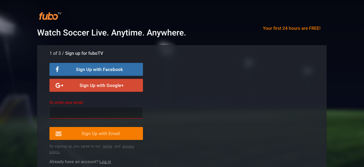
The “Sign Up with Email” button remains un-clickable until your input looks like an actual email address.
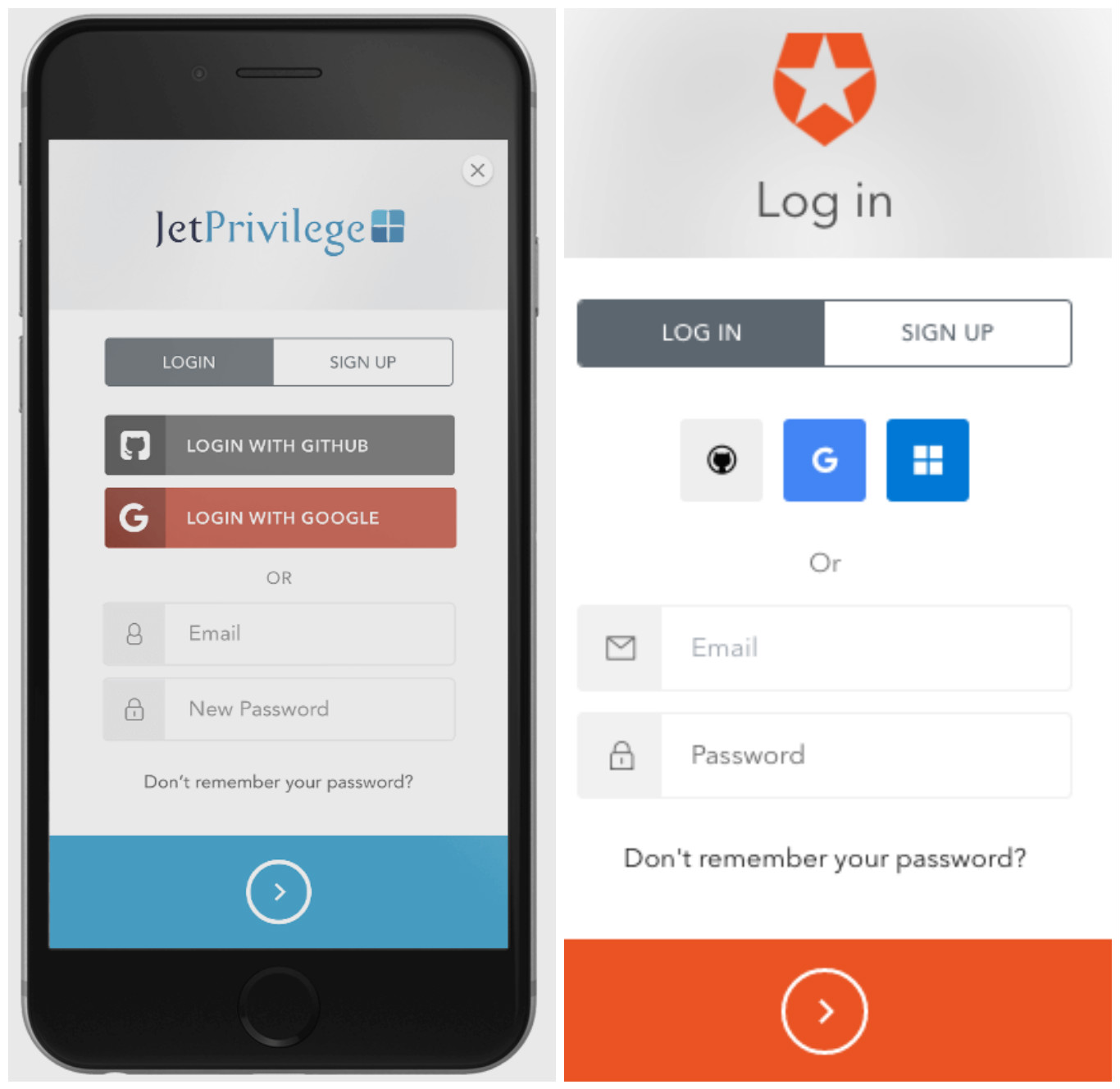
6. Free Your Customers Up By Supporting All of Their Devices
You don’t have an excuse for not offering mobile support—It’s 2016. 51% of all internet traffic comes from mobile, and Google is beginning to rank sites according to their mobile-friendliness.
You want customers to be able to register at any point in their day, whether they’re out and about with their smartphone, or at home in front of a computer. And you can offer this cross-device support securely, because Auth0 Lock can be deployed for Android and iOS. Whatever the platform, lock retains its look and function, as evidenced by this side-by-side comparison of Lock on a mobile device versus what a desktop version of Lock looks like:
This is important for all registration forms. You don’t want your mobile page to lose the content or style of your desktop page, but you want to optimize it for the smaller screen. Adopting a simple, vertically-aligned landing page with your key call-to-actions emphasized is a recipe for success.
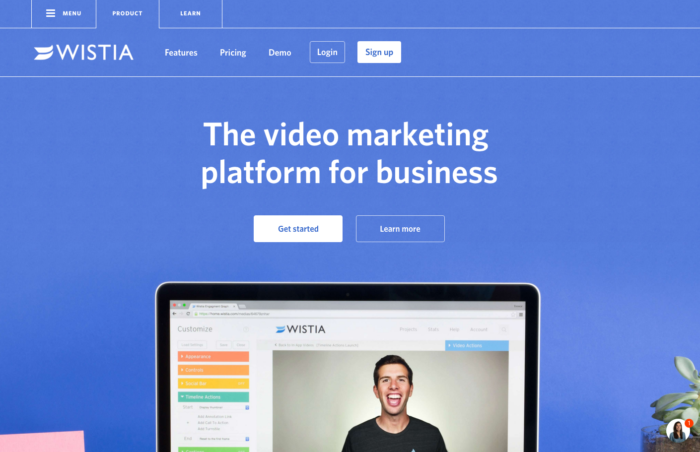
Wistia, a video hosting platform for businesses, does this very well with their mobile and desktop versions.
Desktop
Mobile
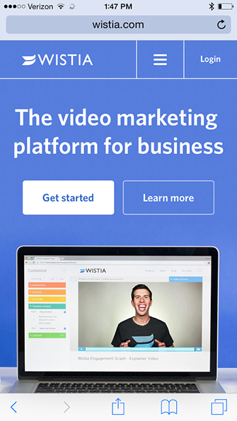
[source: Wistia]
The design remains remarkably consistent, but on the mobile version, the navigation bar is condensed into a dropdown menu, and the content stacks vertically so that the bright “Get Started” button is your central focus.
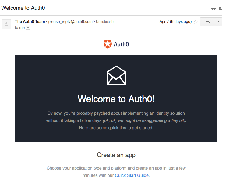
7. Email Your Customers Immediately After They Register
Getting customers to sign up is a big first step in the registration process, but retaining customers will take a bit more than good design. Engage them immediately with a targeted welcome email, and boost the chances that they stick around.
With Auth0 Rules, you can easily embed code in your site so that whenever a new user signs up, that data will be passed along to Segment, a platform that stockpiles data for other tools. Using Segment’s integrations with email automation software like Customer.io, you can create a system where every new user immediately receives a welcome email.
This is not an optional step. 77% of customers expect a welcome email, and welcome emails have open rate 4 times higher than other promotional emails. This is why whenever a new user registers for Auth0, they immediately receive this email:
Registration Is a Process, Not a Page
The registration process is the first part of the larger customer lifecycle, meaning that there is no one fix that will make everything better. The design of your landing page is critical, but if your registration process is drawn and convoluted, that nice design is useless. Similarly, getting more customers to complete your registration process will not lead you to growth unless you engage them early and often.
Implementing just one of these hacks will not guarantee a successful registration process. You need to use all of them, or as many as apply to you, in order to see—and profit from—that massive spike in registrations that you’re looking for.


