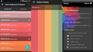
When it comes to designing large multi-artboard websites in Sketch App, Shared Styles, Text Styles and Symbols are your biggest allies. Nobody wants to keep recreating those call-to-action buttons over and over.
And while we could simply group (command+g) these button layers together and duplicate (command+d), what happens when we decide that these buttons actually need to be another colour? Styles and Symbols allow us to make mighty artboard-wide changes to a specific element.
Classing Reusable Styles
I’m going to start off with a rather cliché “here’s one we did earlier”; if you want to follow along step-by-step you can download the sample .sketch file here.
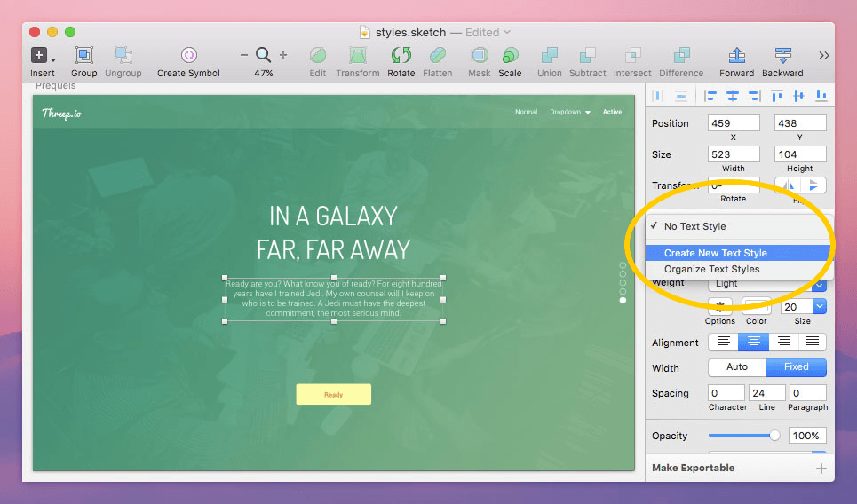
Start by selecting the middle body of text under the heading. On the right-hand side (The Inspector), click the dropdown box that says “No Text Style”, and then “Create New Text Style”.
Give this style a name – I chose “Header Text”. If you ever want to reuse this style anywhere else in the design, you can simply click on that dropdown box again and select “Header Text”.
If you code any CSS, then you’ll already know that this is exactly how we use CSS classes, and it should feel re-assuringly familiar.
You might find what we just did incredibly boring, but I swear to you, its true beauty will be much more apparent later on.
Defining Entire Elements with Reusable Symbols
Now…Symbols.
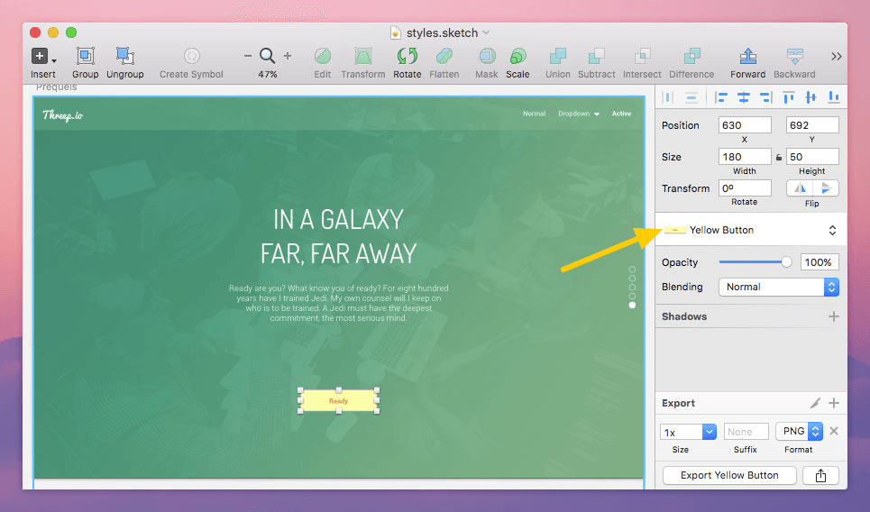
Symbols can be applied to Groups of layers only (select multiple layers, then hit command+g), which comes in handy when you need to reuse elements containing multiple layers but you’re not willing to “flatten” them.
Lets try it out on the yellow button – click the same dropdown box that now says “No Symbol” and then “Create New Symbol”. Let's call it “Yellow Button”.
Again, we’ll only experience the true magic of this later on.
Explaining Your Styles with the Sketch Notebook
Knowing why a given style was originally created is often the biggest challenge in returning to project files/graphics. At the time it was probably abundantly clear that the 'red buttons are for sale items' – but 7 months later someone is staring at those red buttons with a furrowed brow. What does it all mean??
Sketch Notebook is an add-on that’s going to let us leave comments on our artboards. For those that use our .sketch file afterwards, they’ll need to refer to these comments as a style guide when building upon the design or developing it with code.
First, navigate to Plugins → Reveal Plugins Folder, and then download the Sketch Notebook Plugin into that folder. If you use a plugin management interface such as Sketch Toolbox, you’ll find Sketch Notebook is downloadable from there too.
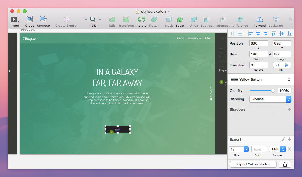
When you’re all set, click on the yellow button once again and run the keyboard shortcut; command+option+control+9.
Your comment should already have a title and it’ll be referenced by the number one. Add your comment, something along the lines of “Should be used as a call-to-action in the green header only.”
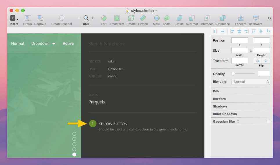
You'll notice that Sketch Notebook will automatically append a sidebar to the right-hand side of your artboard; the yellow button will have a “1” next to it that references your notebook comment.
Bonus: Creating a Separate Style Guide Artboard
Press “A” to begin choosing a new artboard. It doesn’t really matter what size the artboard is because this’ll only be an artboard for housing our reusable user interface elements as a separate style guide that can be referred to later on. You can declare sizes and a background colour in The Inspector.
Now we’ll start clicking on the elements that we want to copy over to our style guide artboard, in our case this is the “Header Text” and “Yellow Button”. Right-click and choose “Copy”, and then right-click again on our new artboard and choose “Place Here”. In the Layers Panel (on the left), double-check that we’re copying into the correct artboard; a simple drag and drop from the Layers Panel will do the trick.
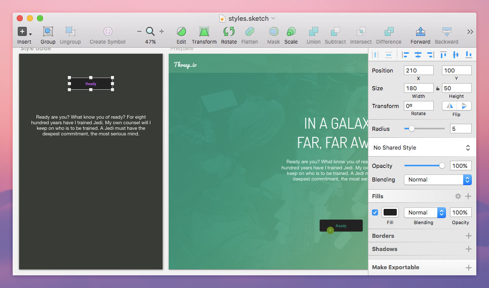
As you can see from the screenshot image above, I’ve used The Inspector to change the background colour of the button. Since the (imaginary) client has requested that all buttons now be black, it’s highly convenient that all of our buttons are linked by a common Symbol – “Yellow Button” – which triggers a document-wide change.
Similarly, Text Styles and Shared Styles will work the exact same way. Text Styles are for text layers, and Shared Styles are for every other type of layer and shape.
Sidenote #1:
Since the rounded-rectangle layer of the button is inside the Symbol/Group, command+left-click is required to “click-through” the Group and onto the selected layer.
Sidenote #2:
If you double-click on a Symbol, you can select the “Exclude Text Value From Symbol” checkbox, which means that despite the fact that all “Yellow Button” Symbols are syncing replicates of one another, the value of the text layer inside can be dynamic. For example, one of our buttons can read “Ready” and another can say “Lets Go”, but they’re still linked Symbols.
Now, when you need to make minor style changes, such as extra shadow on those buttons, or the size of the logo on all headers, you can do so in the style guide artboard, freely, and with the self-assurance that the entire document synchronises with it.
Conclusion
Employing the use of Styles and Symbols in Sketch App will save you bundles of time, both during the initial design stages and later on when the client needs you (sigh!) to make changes.
Stay ahead of the curve; don’t wait for the client to come to you, organise your artboards and be ready for the inevitable feedback stage.
 Daniel Schwarz
Previously, design blog editor at Toptal and SitePoint. Now Daniel advocates for better UX design alongside industry leaders such as Adobe, InVision, Marvel, Wix, Net Magazine, LogRocket, CSS-Tricks, and more.