Open Source enthusiasts have a lot to thank Ubuntu for. As one of the first mainstream Linux distributions, Ubuntu by Canonical contributed greatly to the perception of Linux and Open Source we have today. As today’s society becomes more and more ‘mobile’, it’s no surprise that Canonical wants a presence on mobile mediums too. Ubuntu for Phones is Canonical’s take on its operating system tailored for mobile devices. First introduced in 2013, it has struggled to gain traction, with the first Ubuntu Phone launching in January 2015 focused on early adopters and developers.
That said, Ubuntu for Phones utilizes a different User Experience and design philosophy, starting from the extensive use of gestures and edges, which is unique among mobile operating systems. The Ubuntu phone interface has been designed according to a philosophy called Suru, which is Japanese for crane. According to Canonical:
Suru represents the water bird’s elegance and effortlessness in flight where it’s mostly visible in the art of origami, which we have incorporated in our design.
In Suru, elements can break out of the grid. Canonical emphasizes that screen layouts retain a natural, rhythmic quality helping the user find things quickly and use them intuitively. In the following article I intend to get you familiar with these new and unique concepts of the User Experience in Ubuntu for Phones.
Introducing Scopes
With the duopoly of Android and iOS it has been hard for any potential game changer to break through, with the ‘Chicken and Egg’ analogy applying to new platforms that need apps to attract users, but need users to attract developers. With the goal to create a truly ‘mobile first’ user experience, does Canonical consider apps to offer the best experience? Apparently no.
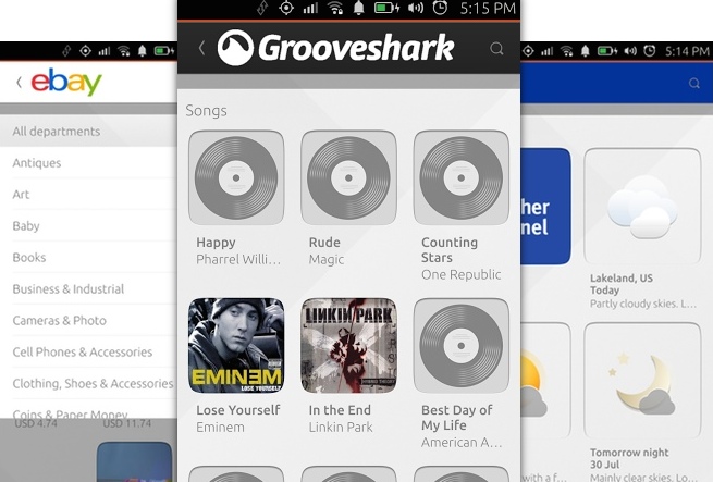
In our daily routine, we might install and launch three separate apps to check three different things. With a scope you can see all three items directly on the screen.
Scopes deliver content to the user outside of any app. Simple content like web or database queries, or finely grained, richly organized content deriving from multiple data sources lands directly in the user experience. Scopes are one of the core features of Ubuntu.
OMG! Ubuntu! describes the conceptual difference between apps and scopes pretty well:
- Apps are like books on a shelf: You take one down, find what you need, put it back. Repeat when needed.
- Scopes are the relevant pages: From those books pinned to your noticeboard right when you need them.
Ubuntu describes scopes as:
Individual home screens for different kinds of content.
Technicalities of Scopes
Currently, there are 2 kind of scopes:
- Aggregator: Gathers multiple content sources in one single view (e.g. ‘Today’, ‘News’, ‘Images’);
- Branded: Content and brand specific views (e.g. ‘Facebook’, ‘Instagram’).
Both kinds of scopes can be installed, configured and tweaked as wished.
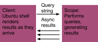
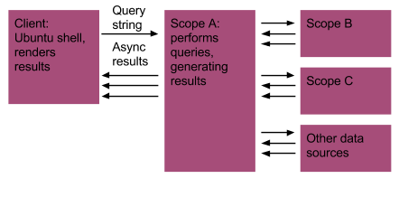
Technically, a scope is a query, offering content to the client that calls it.
As a concrete example, users may enter a search term in the Ubuntu shell, and later calls a scope. The scope processes its query and shows the results to the shell, rendering them afterwards.
The source called by the scope is not important here, meaning that a scope can call a scope (scopeception!). A scope can aggregate data from any data sources (including other scopes) and they can provide content even when there is no initial query string.
Note: A downside of scopes (currently at least) is that the user experience in case of no data connection is poor. Keep that in mind.
To dive deeper into how scopes work, read the technical introduction for scopes on the Ubuntu Developer Portal.
If you have ‘scopephobia’ and want to build apps the classic way, you can with HTML5 or QML. Check out the apps overview on the Ubuntu Developer Portal.
Gestures Guidelines
In comparison to Android or iOS, Ubuntu for Phones has a strong focus on touch gestures. There are even some interaction options that are not available without the use of gestures. Let’s have a look at them.
Bottom Edge Gestures
The Bottom Edge in Ubuntu for Phones provides a fully customizable space for your app experience, and is therefore a must-have. Note, that the user should be aware that there is a Bottom Edge available for them to use, so cues and guidance is vital.
The Bottom Edge offers a short and a long swipe view. It’s important to emphasize and understand the transformation from one to the other, making it a smooth experience for the user to make the most of it.
If you have trouble visualizing the Bottom Edge gesture, check out some examples.
Hint, Reveal and Commit
While sounding like a beginner guide for magicians, the ‘Hint, Reveal and Commit’ pattern is widely used in Ubuntu for Phones. It utilizes a progressive gesture to gradually reveal features/content from the Bottom Edge.
As you can guess, it consists of 3 steps:
- Hint: Alerts the user that the Bottom Edge is available and is critical if you use it in your app. Don’t make the hint too big if it remains on the screen for a long time. The hint defeats its purpose if it covers-up content.
- Reveal: With a stretch of the gesture we progressively reveal the first part of the change without actually making it happen, a sneak peek if you will. This is where the user can confirm or go back if they change their mind.
- Commit: The last
click
or confirmation. A changed Header will indicate the current position of the user inside the app. An option to go back to the previous screen is available.
Check out this video below for a visualization of the ‘Hint, Reveal and Commit’ pattern.
Natural Progression
Think about the possibility of having related features/content progressively laid out vertically when designing a fluid Bottom Edge experience. Any linear dimensions are great for this, such as space or time.
Left & Right
In a similar fashion to Google’s Inbox app or Mailbox by Dropbox, in Ubuntu positive actions always go on the right, negative on the left. As a rule of thumb negative actions (i.e. deletion) go on the left, and positive actions (i.e. finding new content) go on the right.
Check out the Developer Portal for more in-depth documentation on gestures and other design values. The same applies for more detailed examples and documentation on the features of the Bottom Edge.
Edges Overview
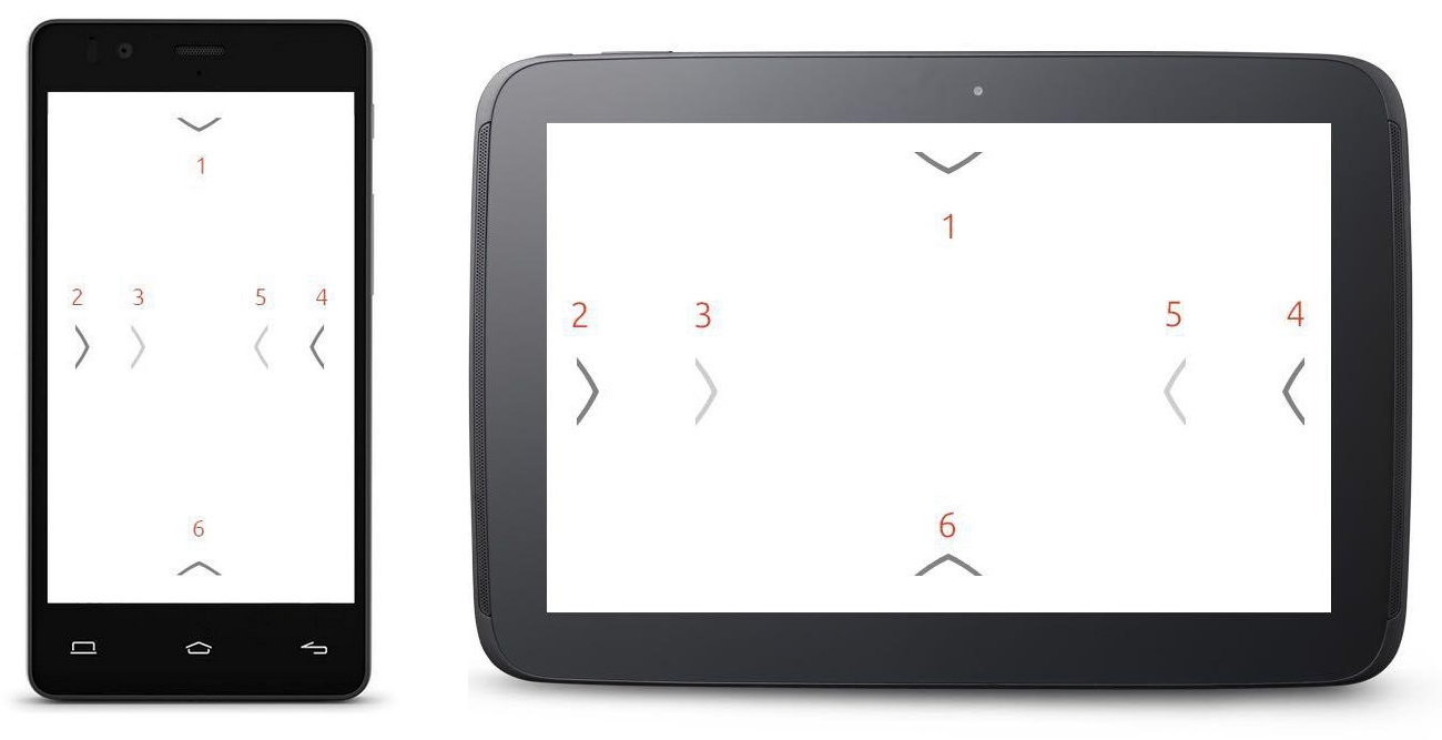
There are other device edges utilized by Ubuntu for phones:
- Top edge: Swipe down from the top edge to see the indicator menu that contains settings and notifications.
- Short swipe left: Reveals favorite apps from the launcher menu.
- Long swipe left: Once inside an app, long swiping left will take you back to the App screen.
- Short swipe right: Whilst in an app, short swiping right will sneakily reveal the last app you were in.
- Long swipe right: Will reveal an app stack where all the apps you have opened will be visible, like a stack of cards.
- Bottom Edge : Swiping up from the bottom can reveal whatever you choose. This can be controls, actions or more content.
Scoping the Future
There’s still a lot of work ahead for Canonical’s mobile operating system to properly gain traction as an alternative mobile operating system. With Blackberry and Microsoft fighting over the small slices of market share left, it will be interesting to see what happens next for Canonical. Nonetheless, Ubuntu for Phones has a unique user experience and design philosophy, which could prove useful if used right.
What are your experiences with Ubuntu for Phones?
 Elio Qoshi
Elio is a open source designer and founder of Ura Design. He coordinates community initiatives at SitePoint as well. Further, as a board member at Open Labs Hackerspace, he promotes free software and open source locally and regionally. Elio founded the Open Design team at Mozilla and is a Creative Lead at Glucosio and Visual Designer at The Tor Project. He co-organizes OSCAL and gives talks as a Mozilla Tech Speaker at various conferences. When he doesn’t write for SitePoint, he scribbles his musings on his personal blog.