


Kitchen Design

Decorating Guides

9 Kitchen Color Ideas With Staying Power
Stick to these classic color combinations for a kitchen that will never go out of style

If you’re looking for a timeless color scheme that will keep your kitchen out of the trends and in style for the long term, then look no further than one of these nine classic color combinations.
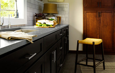
2. Black and White
A black and white scheme, especially with a checkerboard floor, is one of the most iconic styles, and it can work in any size space. It’s safest to stick to about 10 to 20 percent black to keep the kitchen from feeling too dark. Feel free to cheat by using a charcoal off-black or some pale gray to subdue the drama.
Additionally, black window sashes are a timeless detail and an excellent way to add some black to a kitchen in an architectural way that doesn’t feel intrusive.
Shop for wall and floor tile
3. Black, White and Wood
To warm up black and white, add wood floors and wood accents for a look that feels lively despite not having any true — and possibly trendy — colors. In a larger kitchen, try black cabinets with a white island to make the island a focus. In a smaller kitchen, reverse the colors to keep the walls open and airy.
To warm up black and white, add wood floors and wood accents for a look that feels lively despite not having any true — and possibly trendy — colors. In a larger kitchen, try black cabinets with a white island to make the island a focus. In a smaller kitchen, reverse the colors to keep the walls open and airy.
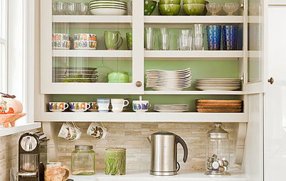
4. Olive
Pulling color inspiration from food is an excellent way to stay timeless, and olive green is one of the most understated and tasteful hues there is. Instead of accent colors, mix it with warm metals and woods. Look to olives, herbs and champagne for color references when choosing finishes — they’ll always be kitchen-appropriate.
Pulling color inspiration from food is an excellent way to stay timeless, and olive green is one of the most understated and tasteful hues there is. Instead of accent colors, mix it with warm metals and woods. Look to olives, herbs and champagne for color references when choosing finishes — they’ll always be kitchen-appropriate.
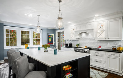
5. Off-White and White
If a crisp white kitchen is too stark for you, but you like the timeless serenity, use a mix of off-whites to create an architect’s dream palette. Accentuate with pure white to make the subtle details come alive.
If a crisp white kitchen is too stark for you, but you like the timeless serenity, use a mix of off-whites to create an architect’s dream palette. Accentuate with pure white to make the subtle details come alive.
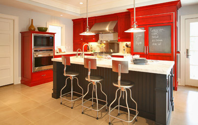
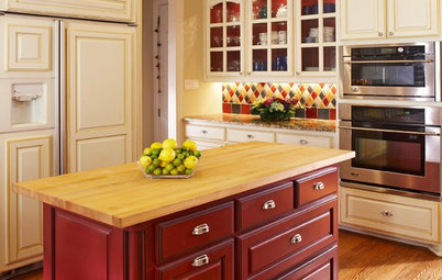
7. Italian Red
What is more kitchen-appropriate than tomato red? One of the safest ways to add red is through accessories. That way you know you won’t overdose on the color, which is easy to do with bright red walls, because the paint is guaranteed to seem bolder on the walls than the color swatch suggests.
However, red cabinetry can be beautiful, especially when applied only to the lowers (and picked up in details like red spices in clear jars). Look to authentic Italian food packaging for inspiration. This red will always feel tasteful.
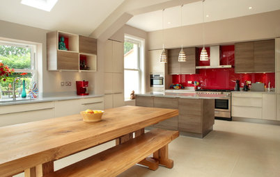
8. Red, White and Blue
This classic color trio mixes some of the most ideal hues for a kitchen: white for a sense of modern cleanliness; blue for beautiful, livable softness; and red for that appetite-inducing punch. If you’re unsure how to implement this combination, trying using navy blue just for accents low to the ground, like the island face or seating, and keep red for small accents, like curtains, books and towels.
This classic color trio mixes some of the most ideal hues for a kitchen: white for a sense of modern cleanliness; blue for beautiful, livable softness; and red for that appetite-inducing punch. If you’re unsure how to implement this combination, trying using navy blue just for accents low to the ground, like the island face or seating, and keep red for small accents, like curtains, books and towels.
For an edgier twist, reduce the white to an accent, replacing it with stone, gray or more blue. Put the red and blue right next to each other, and the colors become extra vivid and create a sense of lively energy.
9. Trend Colors
If you have an unstoppable craving for some hot colors, have no fear. Add them to one of the above schemes through small accents such as bar stools, lamp cords, placemats, slipcovers, knobs, art or simply fresh flowers, and you can easily update the look without changing the base every time your tastes change.
More on Houzz
5 Fresh Kitchen Color Palettes10 Times to Hire a Color Consultant
Get home design ideas
Find design and building professionals near you
Shop for furniture and other home products


One of the best aspects of blue is that, while any individual shade is bound to get dated, a combination of shades will always look beautiful. If you stick to neutrals and blues, you can easily add new accents over the years and never feel like you have to start from scratch to stay up to date.
Feel free to mix in green-blues, purple-blues or both. The overall effect will still read as monochromatic, and you can adjust the vibe by replacing one or two items.
Find a kitchen designer near you