Across the population, spatial reasoning abilities vary widely from person to person. However, it’s fair to say that designers generally have above-average abilities to visualize and understand how websites work. That’s often why we are drawn to design in the first place.
So does that make us ideal candidates for designing websites?
Well, actually no.
In order to offer a smooth user experience for all, you need to be able to ‘walk in the shoes’ of your users. This can be surprisingly hard if you’re a savvy, sophisticated websites user.

The reality is, even though designers might have the technical skills to create websites, we are often not well set up to design them. For this reason, a huge factor in user interface design is user testing, but that doesn’t mean that we can’t make intuitive decisions.
Forget balance, color sense, or other classic designer traits. Empathy is unrivalled as a skill a user interface designer should have. Walking in somebody else’s shoes (or seeing through their eyes may be a better metaphor), can be a temporary replacement for having a user/tester at hand.
Let’s take a look at some disabilities that we so often forget.
Color Vision Deficiency
Color vision deficiency is the most widespread impairment on this list, and so it’s the most neglected as well. It’s often wrongly described as color blindless and it affects about 8% of men (although it’s less for women) worldwide. If you’re not considering color vision deficiencies when you’re designing, you’re neglecting about 8% of the world right off the mark.
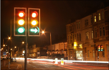
Color “blind” sufferers are not blind to color – they simply perceive colors differently and the most common impairment affects their visual understanding of red and green. It’s called Deuteranopia.

As you can see from the image, both red and green appear as two less-distinguishable shades of yellow. Since red and green are often associated with “yes” and “no”, for example when designing buttons, this leaves those with colour vision deficiencies in the dark (pun not intended!) about what the button does.
Lesson 1: we don’t all see the same thing.
Generic Visual Impairments
Let’s be honest: Most of us would find it hard to remember, let alone carefully consider all possible types of visual impairments, but there are some key tips to master that will benefit all kinds of visually impaired internet users.
You should already be using descriptive alt tags, underlining simple text-based links and correctly displaying abbreviations with a dot (for example “C.V.D” rather than “CVD”). I won’t bore you with a total yawn-fest since this stuff has been widely covered before.
Long story short: Screen readers require alt tags and correctly formatted abbreviations to correctly dictate to the user.
What all of these tips and techniques have in common though is that they’re made better with contrast. Contrast isn’t only improved by using sharp differences in colour and tonal value; you can add contrast by switching fonts to better differentiate between headings and text blocks, or even simply using negative space to make it clear when one section ends, and another one starts.
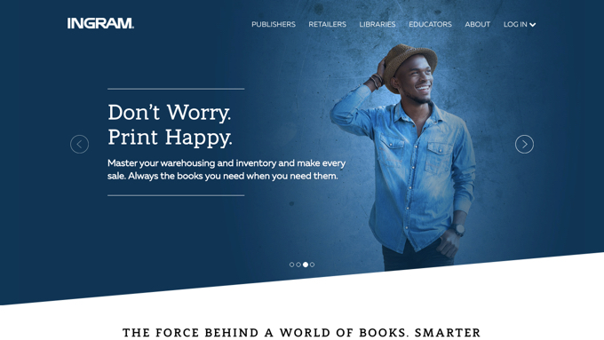
Here’s a smashing example by Ingram – notice the legible fonts (both serif and sans-serif), big text and terrific use of spacing, and all without sacrificing well-known trends and attractive imagery.
Generally – bigger, contrasted and obvious is the way forward.
Lesson 2: disabilities are more common than you think.
Dyslexia
Dyslexia is known as “the reading disorder” and it affects up to 7% of the world, making it the most common learning disability. Despite normal intelligence, those with Dyslexia can find it hard to spell words, “sound out” words or read quickly.
Any web design with a lack of contrast or low legibility is almost impossible to read for somebody with dyslexia. But how on earth do we fix that?
Actually, the solution is once again, contrast. Among other things, Dyslexic’s tend to “flip” letters. For that reason the letter b might be read as a ‘d‘ or the letter ‘p‘ may by read as a ‘q‘.
By using larger capital letters, extra kerning between characters, inconsistent heights, slanted forms and, if possible, having a completely unique design for each letter, dyslexic users can parse each sentence with ease.
Christian Boer, founder of the Dyslexie font (and a Dyslexic himself), explains in impressive detail how his research helped him read better. Any typography-nut will appreciate this research.

While there (sadly) aren’t a lot of fonts around that are designed specifically for dyslexic users, you can still identify Dyslexic-friendly fonts and use them in your web designs.
Lesson 3: aesthetics are useless if there’s no legibility.
Deafness
Deafness isn’t generally a high priority concern for most websites. I’m 85% deaf myself, but since webpages are mostly consumed by reading, not hearing, I mostly do okay. Video is one area that hard-of-hearing folk do have to deal with. Obviously, I’m not talking about background videos – as they’re noiseless – but intro videos.
Even though they convert well because they save the user from having to read (and they also cater to other disabilities, i.e. blind users), subtitles are so often forgotten about.
Lesson 4: a web design should never rely entirely on sound or video.
Motor Disabilities
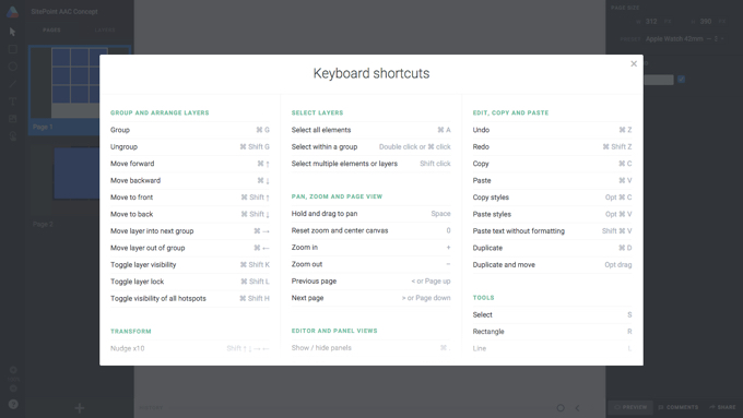
People with motor disabilities (elderly or otherwise) have trouble navigating with a mouse and keyboard. I must admit that I have trouble trying to activate Photoshop’s “Save for Web” feature (command+option+shift+s) and I’m not even disabled in this way.
Sketch handles this type of interaction much more efficiently. For example, Rectangle is simply “R”. Keyboard shortcuts are entirely feasible in web design too, Atomic.io and Dribbble both use this functionality.
Precision movement can be a tricky feat for those with motor disabilities, so it’s always best to use large tap targets that can be visually identified by dictation tools; i.e. don’t hide important information behind navigations or other hover-based components.
Lesson 5: fewer interactions make everyone happy.
Conclusion
Designing for the disabled doesn’t need to be hard. Actually, it’s quite simple and the results can have a positive impact on non-disabled users too. If you can minimise the amount of interactions needed to navigate a website then you’re offering a brilliant user experience to everyone, not only disabled users.
Designing for disabled users should be your #1 concern.
No website should come with the need for minimum physical requirements or an instruction manual. Many countries don’t even have access to the internet (60% to be exact), so let’s not make it awkward for those that do.
 Daniel Schwarz
Previously, design blog editor at Toptal and SitePoint. Now Daniel advocates for better UX design alongside industry leaders such as Adobe, InVision, Marvel, Wix, Net Magazine, LogRocket, CSS-Tricks, and more.