What Makes The Wall Street Journal Look Like The Wall Street Journal
A lesson in how tech, workflow, and design come together to make something look just so
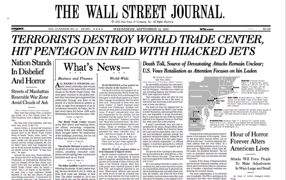
On the morning of Sept. 12, 2001, The Wall Street Journal was missing what most other papers on the planet considered a critical element: Photography of what had happened the day before.
The only image on the front page was a simple gray map of the East Coast, with black dots showing key places related to the terrorist attacks.
"We didn't run a photo, where I think every other paper in the world, including the international edition of the Journal, ran a photo," said senior visual editor Jessica Yu.
The Journal, which turns 125 today, long resisted photography. It was a numbers paper, the thinking went, devoted to covering the financial markets and forces that shape the economy. It was text heavy and serious and there was no room—nor any real need—for images.
Here's the first ever issue of the paper on July 8, 1889.
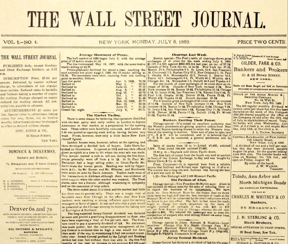
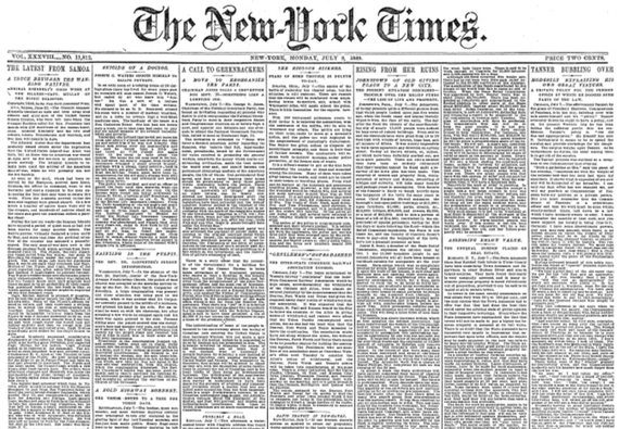
All that text and the Journal was still less dizzying than its old rival, The New York Times, on that day. (The Times was, for those who are counting, 38 years old when the Journal was founded.)
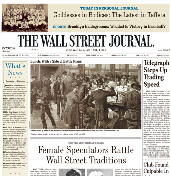
But compare the Journal's first-ever paper with this vision of how it might have covered the news from that day with 2014 sensibilities—and note that the paper keeps its two-cent price tag but acquires the mark of its modern owner, News Corp, in this alternate reality.
"I think the two most significant changes that the Journal has gone through have been the introduction of color and the introduction of photography," Yu said.
"Needless to say, we were not first when it came to photos and color but we've definitely adopted them in a big way," she continued. "We have humongous photos on our front page."
It took some major technological changes for that to happen. In fact, the same workflow that prevented photography for so long was also directly tied to all kinds of design decisions, including the use of the Journal's famous stipple drawings—those dotted portraits of columnists and newsmakers—and the typeface used in the paper.
"When I first joined the paper, they were still pencil editing, which really blew my mind," said Jim Pensiero, who is deputy managing editor at the Journal and has been on staff at the paper since 1984. "There was no technology in the newsroom at that time."
So the process of turning pencil-edited stories in the afternoon into newspapers that landed on subscribers' doorsteps the next morning was, by today's standards, almost unbelievably complex. The newsroom would fax its stories to composing rooms in places like Chicopee, Massachusetts and Naperville, Illinois, where the stories would be typed into a computer.
"From the computer, they then make cold type, strips of paper which you would then paste on a board," Pensiero said. "Once you made up the pages, the pages would then be photographed, and you'd make this huge negative. And from the huge negative, we would scan it—we were really quite visionary in digital scanning—then put them up on the satellite and they would end up at satellite printing plants."
From there, at 19 printing plants across the country, the Journal would be printed. And so, with each step that got the paper closer to being complete—to the point when it was transmitted to one of those 19 plants—the look of the thing warped. The contours of ink letters swelled along the way, which meant every decision about how the paper ought to look was tethered to this multistep process. It's why the Journal used a proprietary typeface called Dow Text, because for Dow Text to appear on the page the way the paper's leaders wanted it to, it had to bleed just enough but not too much.
"It's almost like taking a picture of a picture of a picture," Pensiero told me. "You imaged the words on this piece of paper. You put the piece of paper down on the board. You took a photograph of the piece of paper, You made a negative. You transmitted it. You reimaged it. You made a plate... Each time you did that, it kind of bled a little. Dow Text was meant to bleed through all of those reimagings and then, when you actually printed it, it looked fine."
Until, that is, the printing process simplified. When there were fewer steps, Dow Text bled less, and suddenly it looked "kind of thin and washed out." In 2005, the Journal began using a new typeface—this one called Exchange—in overseas papers. The paper rolled out Exchange domestically in 2007. "It's a little crisper for the electronic methods that we use for creating the paper," said Bob Rosenthal, a technology consultant at the Journal. "We have to look pretty close to really see the difference but it is a new typeface that has historical connections."
Another subtle change that happened around the time of the typeface switch: The iconic period at the end of "The Wall Street Journal" flag—the banner across the top of the front page that says the paper's name—was plumped up. "That round period became oval over the years," Rosenthal said. "It was somewhere around 2008 or 2009 when the design director redrew that banner completely and the period became circular again."
Today, photographs are a mainstay on the front page. (Online, the Journal has done much experimentation with visuals, with a major focus on video in recent years.) Getting to this point was gradual, just like the eventual oblongification of the period on the front page.
"We affectionately call the standalone photo on our front page the lion door," said visual editor Yu. That's because, as deputy editor in chief Matt Murray explained it to me, the first photos ever to appear on the front page were tiny rectangles pushed so far down on the page that, "somebody said, 'that looks like a cat door.'"
So, in classic Journal fashion, a more grandiose term—for larger and more centrally placed photos—was coined. Yes, the language of the Wall Street Journal's design is impossibly Wall Street-esque, steeped in the words of finance. There's talk of "diamonds," the dingbats used as bullet points on the front page, and "champagne," the shaded color of the paper beneath the front-page "what's news" column. It is these simple details, long-time Journal staffers say, that characterize the paper's aesthetic to its most devoted readers.
"What you have to remember about the Journal is that a lot of times the form follows the function," Pensiero said. "It wasn't designed to be Life magazine. It wasn't meant to be pretty... Sometimes human institutions become inertia-bound. We had a look and we kept it and we kept it and we kept it. Did we keep it too long? Maybe."
And yet, some traditions are worth keeping. Those famous stipples—hedcuts, as they're called in-house—can be done by computers these days. "But you do need a human eye to kind of distinguish hair and face and eyes," said Yu. "You can really tell [if a computer is behind a hedcut] when someone is cross-eyed." Her colleagues agree there's something special about the original method, which requires huge hand-drawn portraits that are covered in vellum, scanned, and then shrunk.
"I just don't think the ones I've seen done programmatically are as beautiful," Pensiero said.