Chunks and Chunking
Chunk: A piece or part of something larger. In the field of cognitive psychology, a chunk is an organizational unit in memory.
Chunks can have varying levels of activation — meaning they can be easier or more difficult to recall. When information enters memory, it can be recoded so that related concepts are grouped together into one such chunk. This process is called chunking, and is often used as a memorization technique. For example, a chunked phone number (+1-919-555-2743) is easier to remember (and scan) than a long string of unchunked digits (19195552743).
Chunk (UX): In the field of user-experience design, ‘chunking’ usually refers to breaking up content into small, distinct units of information (or ‘chunks’), as opposed to presenting an undifferentiated mess of atomic information items.
Presenting content in chunks makes scanning easier for users and can improve their ability to comprehend and remember it. In practice, chunking is about creating meaningful, visually distinct content units that make sense in the context of the larger whole.
Chunking Text Content
Users appreciate chunked text content. It helps avoid walls of text, which can appear intimidating or time-consuming. Chunking enables easy skimming — users’ preferred method of reading online.
Some of the most commonly used methods of chunking text content are:
- Short paragraphs, with white space to separate them
- Short text lines of text (around 50–75 characters)
- Clear visual hierarchies with related items grouped together
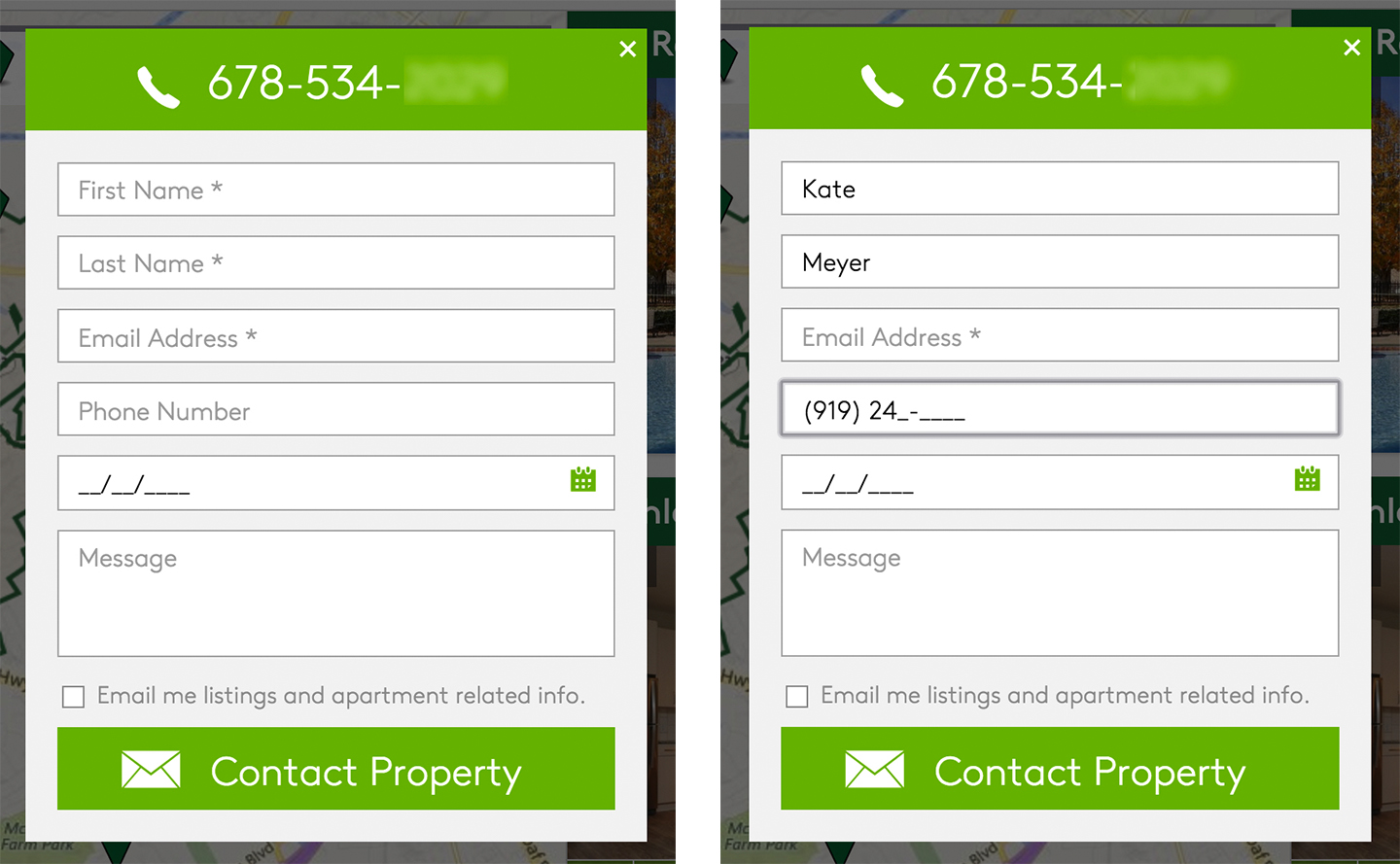
- Distinct groupings in strings of letters or numbers such as passwords, license keys, credit-card or account numbers, phone numbers, and dates (for example, 14487324534 vs 1 (448) 732 4534)
Chunked strings should use the most conventional format for each data type to minimize user slips. For example, credit card numbers are usually presented in 4 chunks of 4 digits each (e.g., 4111 1111 1111 1111 instead of 4111111111111111). Be aware that the standard format for some strings will vary by country.
|
+65-5555-5555 |
(01) 55 1234 5678 |
(919)-555-5555 |
|
Singapore |
Mexico |
United States |
Sample chunking formats for telephone numbers in three countries.
Although formatting improves scannability, it does make typing more difficult. Users should not have to type in formatting characters; instead, forms should use autoformattting — input fields should automatically chunk your users’ input.
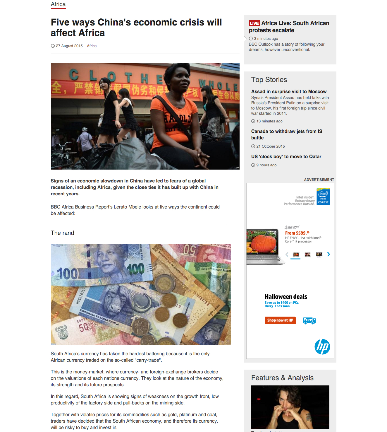
Simply chunking your text isn’t enough — you also need to support scanning by making it easy to quickly identify the main points of the chunks. You can do this by including:
- Headings and subheadings that clearly contrast with the rest of the text (bolder, larger, etc.)
- Highlighted keywords (bold, italic, etc.)
- Bulleted or numbered lists
- A short summary paragraph for longer sections of text, such as articles

Chunking Multimedia Content
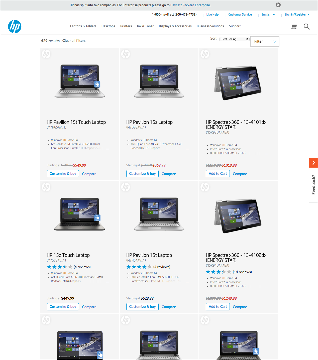
The key to effectively chunking multimedia content (text as well as images, graphics, videos, buttons, and other elements) is to keep related things close together and aligned (in accordance with the Law of Proximity in Gestalt psychology). Using background colors, horizontal rules, and white space can help users visually distinguish between what’s related and what isn’t.
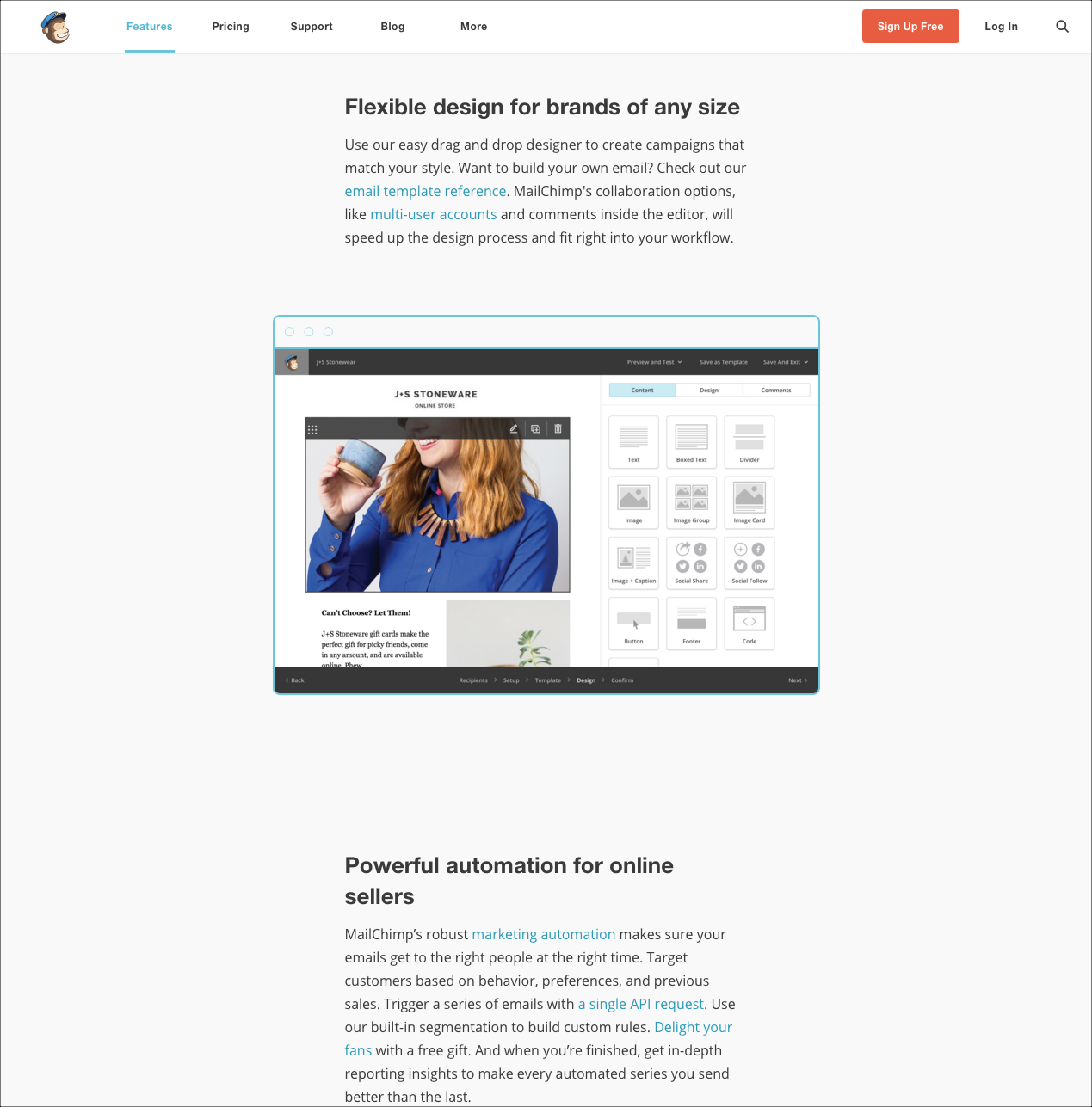
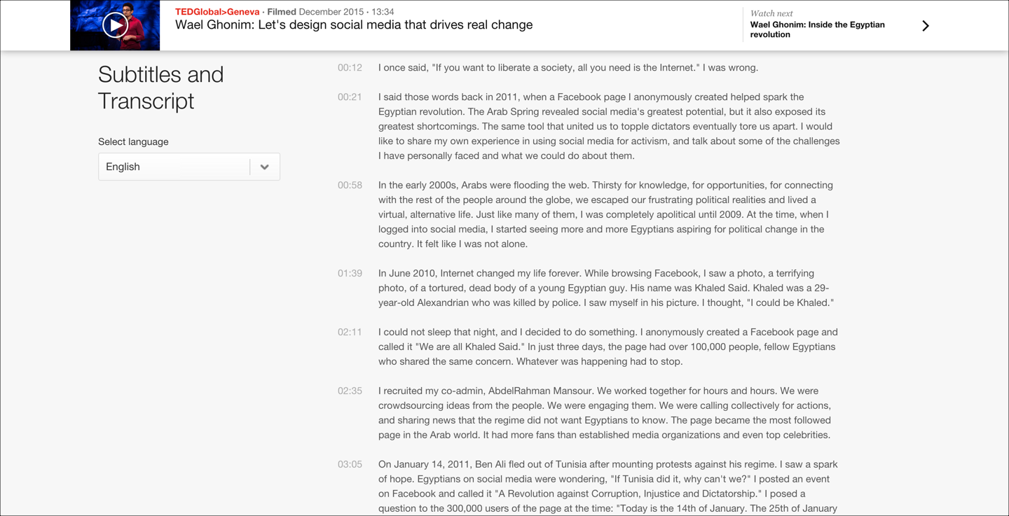
Other types of content (such as videos or graphics) can also be chunked. Just remember that the main idea of chunking is to divide information into clearly distinct groups of related content. For example, you can chunk video content into individually accessible chapters or topics, to allow users to easily navigate inside the video. Or you can group related tools in a crowded application toolbar to help users remember where to find them.
The Mythical Number Seven
You’ve probably heard of the ‘magical number seven,’ made famous by cognitive psychologist George Miller. In 1956, Miller found that most people can remember about 7 chunks of information in their short-term memory. What Miller found interesting, however, was not the number 7 itself. Instead, he was fascinated by the fact that the size of the chunks did not seem to matter — people could remember 7 individual letters, or 28 letters if they were grouped into 7 four-letter words. (In the former case, each unrelated letter counts as a chunk, whereas in the latter case, each word is a chunk.)
In the field of user experience, Miller’s magical number seven is often misunderstood to mean that humans can only process seven chunks at any given time. As a consequence, confused designers will sometimes misuse this finding to justify unnecessary design limitations.
For example, a designer may refuse to add more than seven options in a global navigation bar for fear of violating the magical number seven. However, the point of menus is reliance on recognition rather than recall: users don’t need to keep all of the menu items in their short-term memory, because all the available options are continuously displayed on the screen. So there are no usability gains to be made by limiting the number of menu items to seven. Menus can still be easy to use with more than seven choices, as long as the options are structured in a meaningful way.
The main takeaway from Miller’s research for UX professionals should be this: Human short-term memory is limited, so if you want your users to retain more, pack information into meaningful chunks. Don’t ask your users to hold more than a few pieces of information in their short-term memory at once. And don’t get hung up on the number seven — Miller himself titled his paper “The Magical Number Seven, Plus or Minus Two: Some Limits on Our Capacity for Processing Information.” Other researchers have suggested that the right number could be anywhere from three to six.
Whatever the average capacity of short-term memory may be, the specific capacity for individual humans will vary (it's one of the many causes for the huge variability in user performance). You could be one of the “plus-one” or “plus-two” people, especially if you’re a developer who makes a living from keeping lots of information in memory at once. (No, it's not that programming computers makes your brain grow until it strains against your skull. Rather, it's only people born with high-capacity brains who are attracted to a career that requires them to retain a lot of items in memory.) In contrast, many of your customers could easily be “minus-one” or “minus-two” people, which means that they will have great difficulty remembering things that you might find easy. The short-term–memory limits will additionally be impacted by users’ context: where they are and what else is happening around them while they use your interface. This point is discussed further in our UX Basic Training course and is one of the key reasons you can’t judge ease of use purely on the basis on whether you personally feel a design is easy to use.
Conclusion
Chunking is critical for presenting content that users can comprehend and remember easily. Use chunking for text and multimedia content alike to help users understand underlying relationships and information hierarchy.
Reference
George A. Miller, 1956. The Magical Number Seven, Plus or Minus Two: Some Limits on Our Capacity for Processing Information. Psychological Review 63 (2): 81–97.


