
Many tech companies these days obsess over constantly redesigning and tweaking their logos. In that context, IBM’s 43-year-old logo is veritably the branding equivalent of ancient sacred scripture.
Its iconic eight-bar logo is the marquee for IBM’s awakening to the power of design in the 1950s. The story goes that after seeing a particularly compelling store display of Olivetti typewriters in New York City, IBM’s then newly installed CEO, Thomas J. Watson, Jr. had an epiphany. “Good design is good business,” he declared. It became the company’s mantra and mandate and signaled a profound design-conscious evolution in the company’s operations. Until then, IBM reflected the conservative taste of Watson’s father who founded the company, an aesthetic that the younger Watson compared to a “first-class saloon on an ocean liner.”
Guided by Eliot Noyes, an architect who was the curator of industrial design at the Museum of Modern Art at that time, Watson sought to overhaul IBM’s image from a nondescript corporation that sold punch-card timekeeping machines, data-storage diskettes, and tabulating machines (with a rather generic name too—International Business Machines) to a company with a modern sensibility, a distinct character and a colorful lore, much like Olivetti.
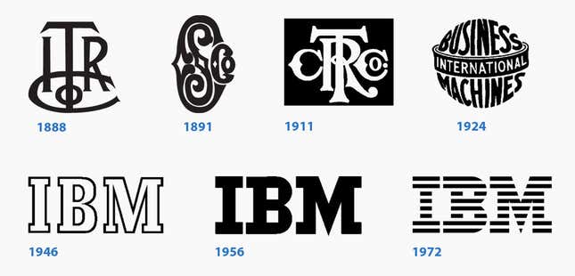
The IBM logo was designed by the pioneering graphic designer and art director Paul Rand, who is celebrated for translating the tenets of European modernism to American corporate communications—introducing motifs from Bauhaus, Cubism, de Stijl, and Constructivism in his commercial work. Until the Brooklyn-bred designer came to the scene, most advertising work was controlled by copywriters.
Along with Eero Saarinen, Isamu Noguchi, and Charles and Ray Eames (pdf), Rand was part of the design dream team that Noyes assembled for IBM. Aligning with Watson’s treatise on good design, Rand understood that a distinguishing mark was essential to a company’s success. “In the competitive world of look-alike products, a distinctive company logotype is one if not the principal means of distinguishing one product from that of another,” Rand wrote in the introduction of IBM’s logo-usage manual. “The value of the logotype, which is the company’s signature cannot be overestimated.”
Subtle, strategic changes
The logo’s redesign did not happen overnight. Working with IBM’s existing mark that already carried some cachet with its customers, Rand’s first design intervention was subtle. To improve the mark’s legibility, he replaced the font Beton with a similar but stronger-looking typeface called City. Rand tooled with the shape of the letterforms too, he lengthened the serifs and made the stacked squares in the letter “B” larger.
But there was still something about the shape of the logo that bothered the detail-oriented designer. “I felt there was a problem with the sequence, going from narrow to wide without any pause, without any rhythmic possibility,” explained Rand, bugged by the disparity in visual weight of the three letters. Experimenting with variations of the logo for over a decade, in 1972 Rand introduced stripes to establish a better sense of unity in the monogram and suggest a sense of movement. It has remained unchanged since then.
Beyond the page
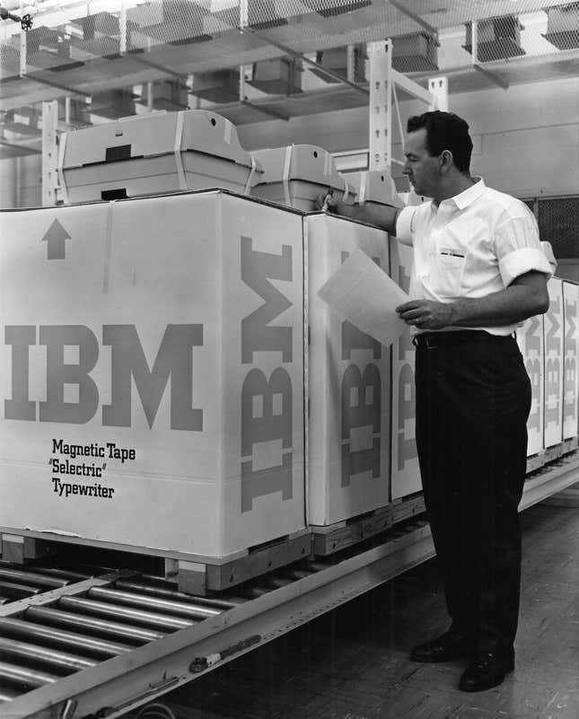
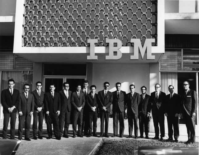
But Rand approached the logo redesign with more than aesthetics in mind. He made sure that the logo worked in all conceivable applications—brochures, magazine ads, TV commercials, stationery, communication materials, building signage, trucks, and packaging. At that time, this meant anything from diskette sleeves, to boxes of carbon paper, printer ribbons, ribbon cartridges and microprocessing cards to the repeating pattern on IBM’s egg-shaped pavilion at the 1964 World’s Fair.
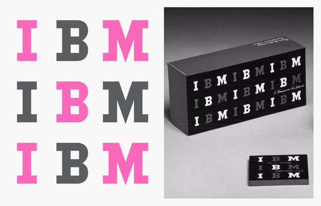
Rand, who also designed the logos for UPS, Westinghouse, Enron, ABC, and Steve Job’s short-lived NeXT, was known to present only one design concept to his clients. But the single design approach is not to speak of Rand’s stubbornness or lack of effort. Rand presented his proposals in the form of elaborate booklets that showcased the mark’s versatility across numerous spreads. In doing so, he was able to stretch the client’s imagination beyond the page.
Rand also wrote and designed guidance materials like the pamphlet Use of the Logo / Abuse of the Logo: The IBM Logo, Its Use in Company Identification and a frame-worthy “IBM House Style” poster showing the various sizes of the eight-bar logo. The specificity of the language on these materials testifies to Rand’s acuity about the quirks in the anatomy of the mark. “Black stripes are drawn thicker than white stripes. White stripes look thicker especially when lit (signs, TV screens). Black and white should appear similar optically,” Rand noted.
“As precise as he was in his own work, he was twice as precise in how others used his logos,” wrote Steve Heller, who collects many of Rand’s manuals and has written the quintessential biography on Rand.
Managing a modern brand
Like he did for many of his clients, Rand remained involved in the stewardship of IBM’s visual branding for decades. Today, that mantle partly falls on the shoulders of Terry Yoo, IBM’s VP of brand strategy and experience design. After so many years, does she ever feel tempted to redesign the logo? Considering the changes in tastes and technologies, is the demise of Rand’s type-and-stripe design in sight?
“You don’t throw away something that special very easily,” Yoo tells Quartz. She explains that Rand’s graphic legacy has actually given her and IBM’s many designers around the world a solid foundation to build upon, and one that they are very proud to have.
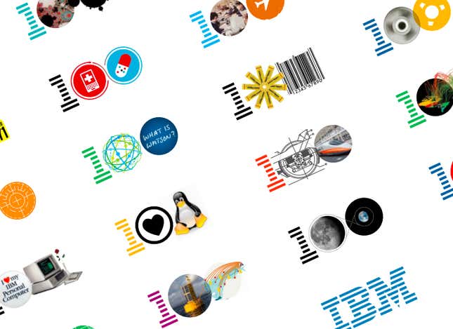
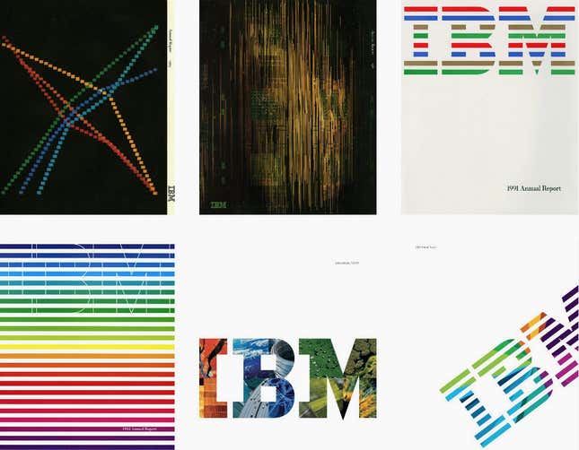
As much as he valued precision, Rand was not opposed to play. In 1981, Rand designed a witty rebus poster Eye-Bee-M to commemorate IBM’s THINK campaign. Under his guidance, IBM published reports, brochures, and advertisements that played with variations on the logo’s typography, stripe pattern, and color. After Rand’s passing in 1996, IBM continued the playful tradition in the covers of its annual reports, and memorably in the visuals for the 100 Icons of Progress for its centennial in 2011.
Yoo has a pragmatic outlook on how the IBM logo ought to be managed across the company with over 300,000 employees worldwide. Instead of constantly policing its use and insisting on stringent adherence to manuals, she spends time explaining the logic of how and why things are done, to champion and empower local expressions of IBM’s message using their graphic vocabulary. “The logo stays. If something has to change, we can work with the stuff around it,” she says.
“To build a great brand, you have to build a great company,” Yoo says, which is another way of saying that nitpicking at a company’s logo is not always the best solution—even when stocks fluctuate and things go a bit awry. Yoo’s tempered observation about a logo’s significance—even a great one like IBM’s—echoes Rand’s reflections too. He wrote, “It is only by association with a product, a service, a business, or a corporation that a logo takes on any real meaning. If a company is second rate, the logo will eventually be perceived as second rate.”